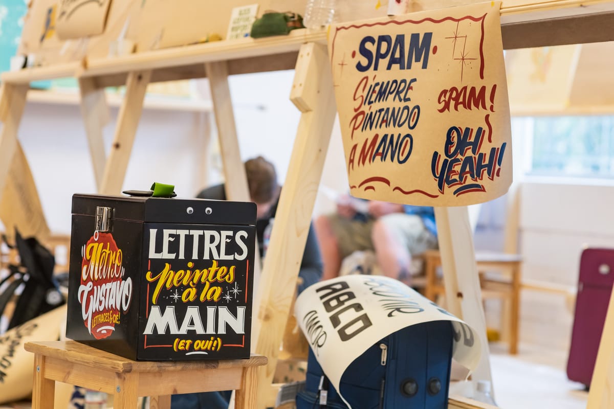
Signs of the Times: The Letterheads in 1981
Republishing the first ever article about the Letterheads from Signs of the Times in February 1981.
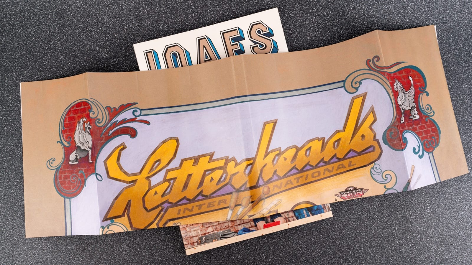
While working on BLAG 07, the Letterheads special, I dug out lots of the early press articles about the movement. In the process, I learned that the first ever piece of mainstream coverage came from Signs of the Times in February 1981. However, the actual text of the article remained elusive until Tod Swormstedt and Erin Holland at the American Sign Museum tracked down and scanned a copy for me in August last year.
The following is a reproduction of that original article, written by Gwen Colborne Arthur and introduced by then Signs of the Times editor Tod Swormstedt. I’ve added some additional contemporary links and hope you enjoy this bonus piece of Letterheads history, exactly 45 years after it first introduced the movement to the world. (I’ve left the title as it was first published, but there is a ‘sister of the brush’ included: Cher Flores of Rustic Sign Studio.)
Letterheads: “Brothers of the Brush”
Signs of the Times, February 1981
Nostalgia’s overrated. Idolising, or at least, idealising the past simply because it came before is pointless. Learning from yesterday, understanding why design took a particular direction, recognising the thought process of the old craftsmen oftentimes limited by a technology less advanced — this is the type of odyssey the Letterheads have been travelling since their formation in 1976 [sic]. It’s a celebration of skill, an appreciation and a revival of almost forgotten lost arts. It’s not an unselective evocation of an entire period of time. The Letterheads are a ‘picky’ lot: they don’t subscribe to a particular point-in-time. They don’t even promote the design of one certain era over the design of another.
But a casual sampling of their work shows this. Bob Mitchell and Mike Rielly, in many instances, rely on the use of contemporary graphics; Earl Vehill has adopted the Art Nouveau style of the 1920s; Mark Oatis, Noel Weber and John Frazier luxuriously recapture the earlier Victorian days, and finally, Cher and Rick Flores have the seeming ability to order and assemble time’s perspective into a single body of work.
In this way, the Letterheads sift through and glean design and ideas to their purpose. Again, they can reshape the past to their own functional present. “That's the beauty of being in this period that we’re in”, says Mark Oatis. “You can see the mistakes that everybody else made.” You can also see their talent.
Signs of the Times first became acquainted with these ‘Brothers of the Brush’ almost by accident. It was during Commercial Contest III that we noticed a curiosity: many of the entries which came from the Denver/Boise area were captioned: “Member of the Letterheads”. Who were the Letterheads, we mused, and how did this organisation get started?
When the contest judging results were tallied and, lo and behold, the Letterheads captured more than a fair share of awards, our curiosity was again aroused — this time to action. We assigned Gwen Colborne Arthur, Signs of the Times’ book division manager, to find out a little more about this commercial sign organisation.
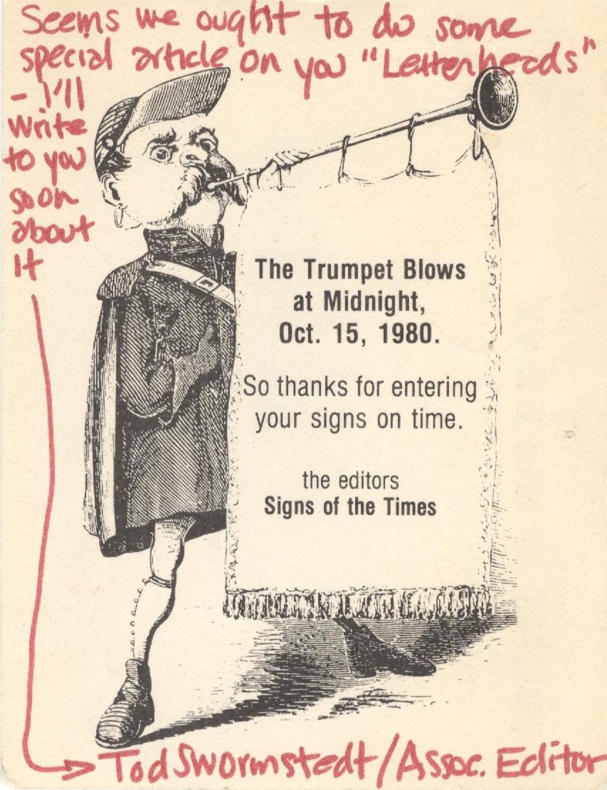
After the contest, Tod Swormstedt sent this note to Noel Weber. It eventually led to this Signs of the Times article.
Our selection was not entirely random. Arthur, too, had crossed paths with the association while revising Raymond LeBlanc’s well-known book — Gold Leaf Techniques. As it turns out, many of the photos Gwen chose were entries from our commercial contest — some of them the work of various members of the Letterheads.
When Arthur contacted the designers for permission to publish their work in a book which some of the Letterheads were literally weaned on, a bond was naturally established. And to capsulise an already too-long introduction, the upshot of this association is both this month’s cover story and what will begin a series of technical articles on gold leaf in the coming issues.
The following is the story of the Letterheads.
By Gwen Colborne Arthur
Every industry has its organisations, its associations. Some national — some regional. And Denver is no exception — except that Denver has a plus. One that has upgraded the quality of the speciality signs found there. This little bit extra is the Letterheads ‘club’.
The Letterheads are a group of sign painters who share a common interest in antique work. They have dedicated themselves to learning the art and designs of the past. They all use modern methods and materials to fabricate their hand-lettered signs, because many of the old supplies are no longer available. Several of the members have learned the older techniques such as the glue-chip process, in-laid mother-of-pearl in gold leaf, and triple-split blended shades, etc.
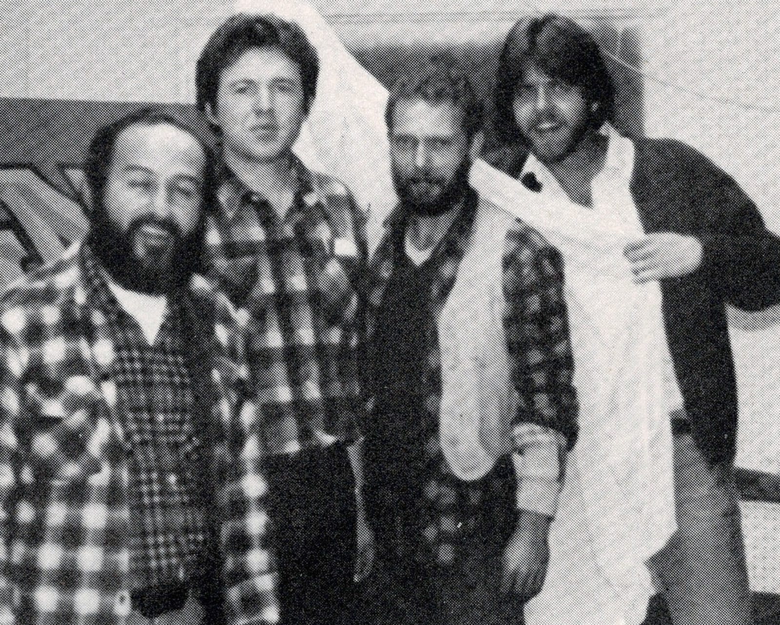
The group slowly began forming in late 1975 with Mark Oatis, Rick Flores, and Earl Vehill. Then came Mike Rielly, Noel Weber, Bob Mitchell, and John Frazier. These seven commercial sign painters comprise the nucleus of the group, although many others from Denver and across the country have come in contact with them since. Strangely enough, each member has a special interest in a different style ranging from Victorian to contemporary.
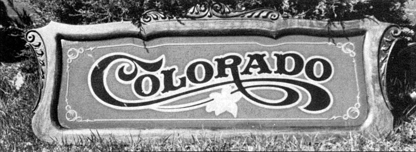
Rick Flores brought the first sandblasted wooden signs to Denver in 1974. He had come from California where he learned the technique from Walter Methner while working for him at Walter’s Sign Studio. Many credit Methner with the technique of sandblasting wooden signs. During the time he was learning sandblasting, Flores had taken over Rowland Signs where he learned the sign trade.
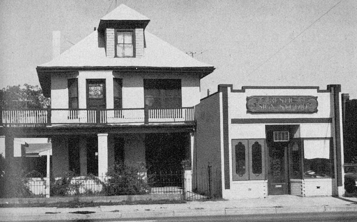
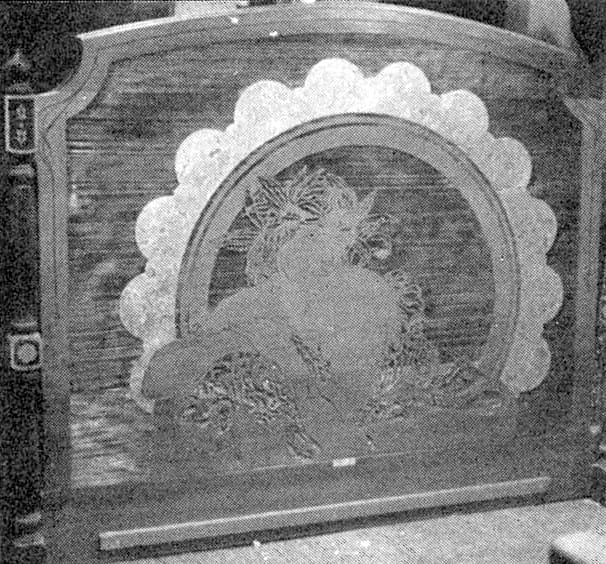
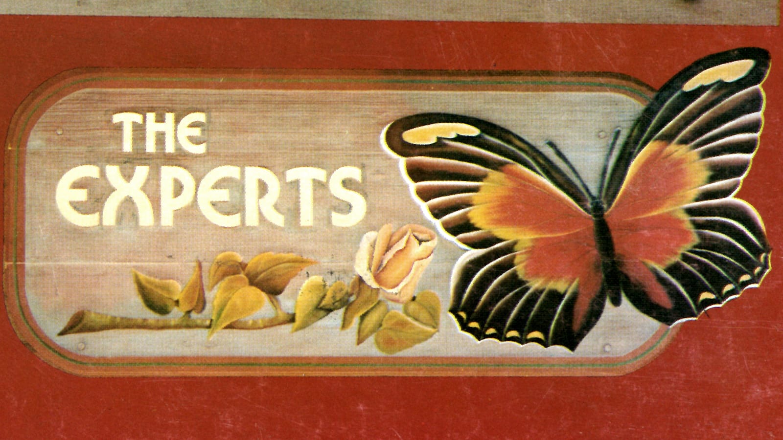
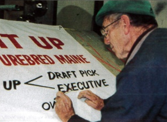
Home and shop for Cher and Rick Flores (left) and a headboard design for Odin Oldenberg, Gerald Ford’s former chief.
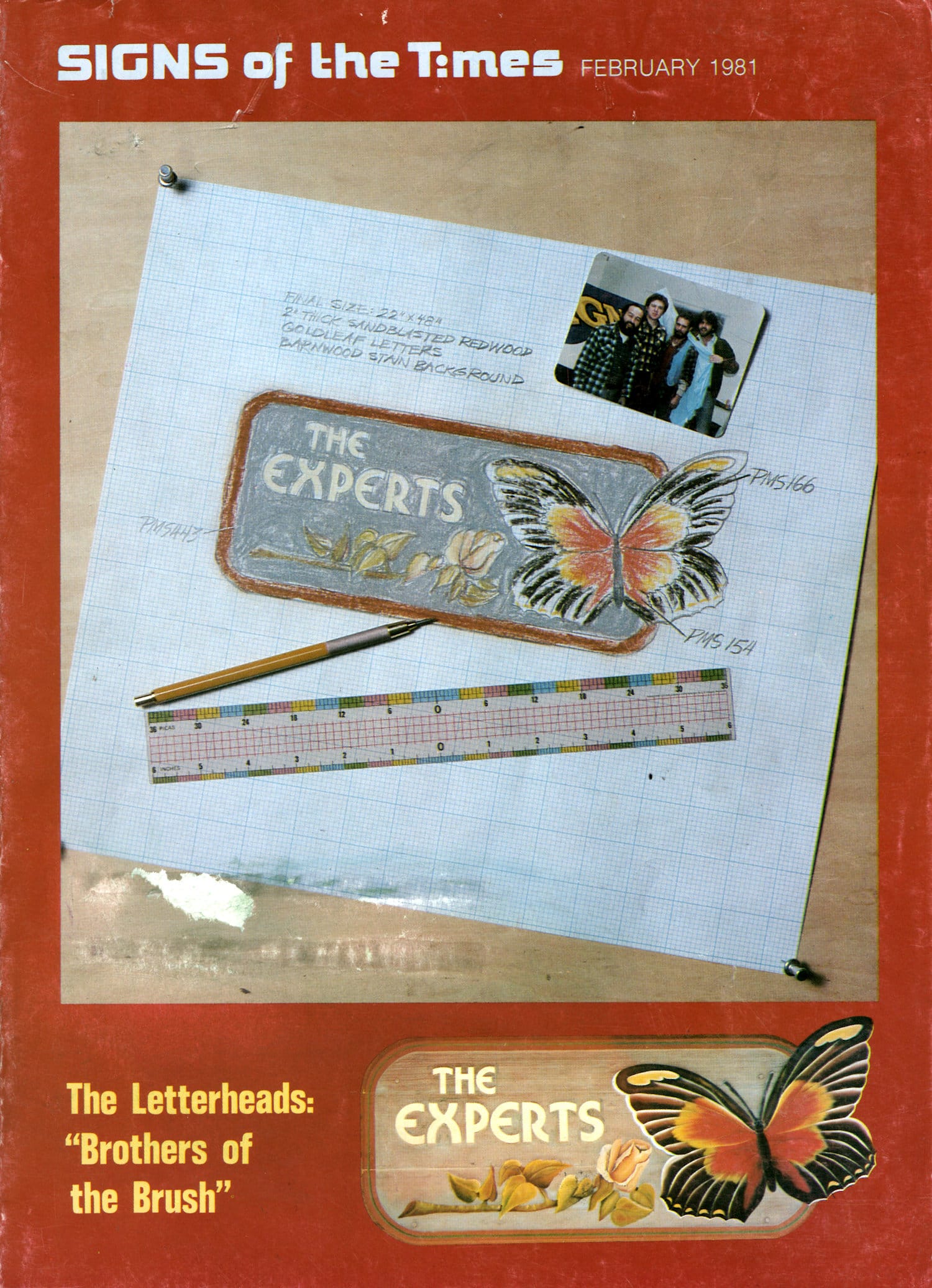
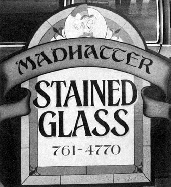
Flores now owns and operates his shop, Rustic Sign Studio, in Denver with his wife Cher, a ‘Tole’ painting expert, says Rick, a branch of Pennsylvania Dutch art. (You may remember Flores from past sign design contests. If not, witness this month’s cover sign, designed by Cher Flores.)
Much of Flores’ Inspiration came from his father (Paul Flores) and his love of antique work. Rick uses most of the antique work as ornamentation and embellishment on his distinctive signs. Sandblasting signs remains his speciality, though Flores admits he has recently branched into other decor related areas — sandblasted mirrors and bedposts, for instance.
Mike Rielly Is originally from Amarillo, Texas. He attended art school In California and then came to Denver. He took his five-year apprenticeship in Denver through the Sign Painter Local 1045 Joint Apprenticeship Training Program with Mark Oatis. Subsequently, he worked as a journeyman sign painter under Joe Ferry at Brisson Signs in addition to a two-year stint at Eller Outdoor Adv.
A sampling of Michael Rielly’s photo realism; the artist himself.
Rielly returned to Amarillo in mid 1978. There he runs his own shop, Tanglewood Graphics, and subcontracts to Pro Sign where he also works full-time.
Though Rielly credits Charles Strong’s book on the old Detroit School of Lettering as his inspiration, Rielly has perhaps the most contemporary design flair in the group. He is the pictorial man of the Letterheads, and his speciality is photorealism, perhaps a throwback to the days when he studied Process Photography at the Metro in Denver.
Mark Oatis, a native of Denver, was formerly self-employed (The Sign Studio) and now works for Cliff Singer at Cliff Singer Signs. Oatis was inspired by the work of Jerry Albright, a local sign painter, “the best all around man in town”, as Oatis puts it. Albright did all the antique-type work in the old part of Denver.
There is a profile of Jerry Albright, ‘father of the Letterheads’, in BLAG 07.
Oatis’ interest lies in the Victorian period with a touch of Art Deco showing up now and then. Oatis’ main goal is authenticity. He specialises in lettering effects — mainly shades (which includes a triple-split blended shade). He also does fine gold leaf work.
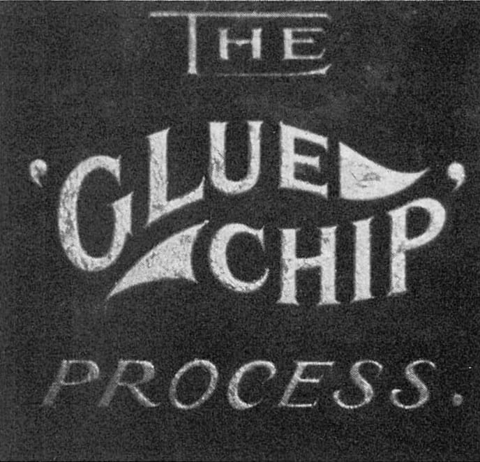
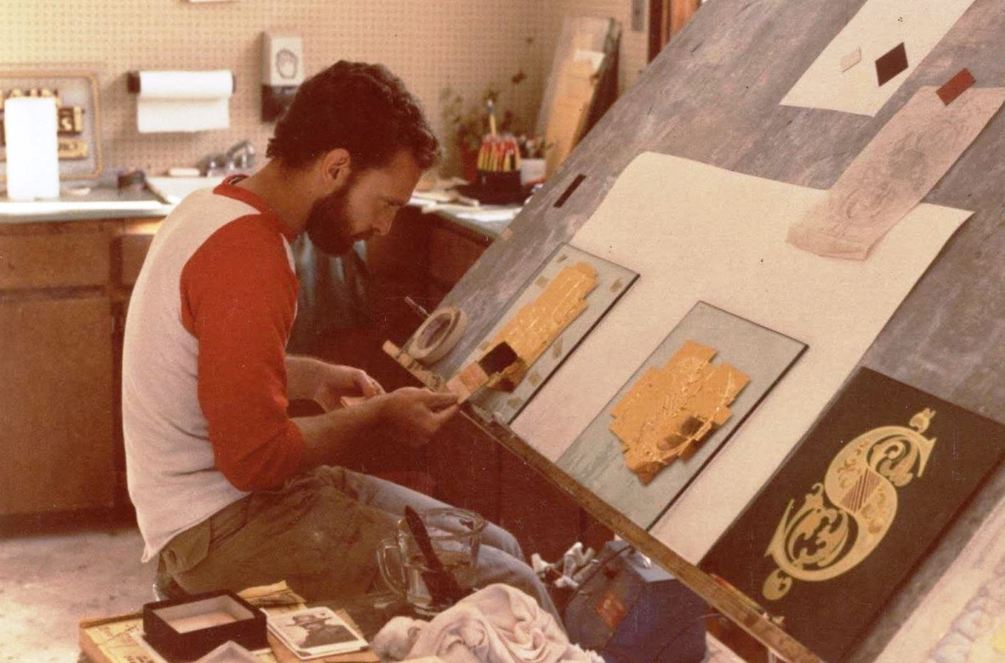
The work of Oatis: a demonstration of the glue-chip process revived (left) and gold leaf in an Art Deco vein.
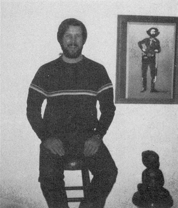
Bob Mitchell came to Denver from Wyoming. He received formal art training in Denver and then went through the sign apprenticeship program there. He worked for several sign companies including American Standard, Colorado Sign, and Cherokee Signs, which is no longer in existence. Working for Sign Associates (an architectural shop) “really influenced me”, because “everything (was) neat and clean”. Mitchell tends more towards the contemporary and is the ace screenprinter of the bunch. To “pay some dues” he credits a whole slew of sign painters — Mark Oatis, Monty Jumper. Gene Niblo, Tom Eardly, and Richard Anderson — with preparing him for the sign trade.
In early 1979, Mitchell went to Aspen, Colorado, to work at Gaard’s Graphics and later took over the business that Mitchell still owns and operates. Gaard has been interested in the group and has helped to find resource material and offers input from time to time.
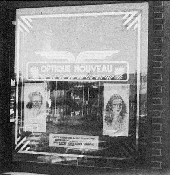
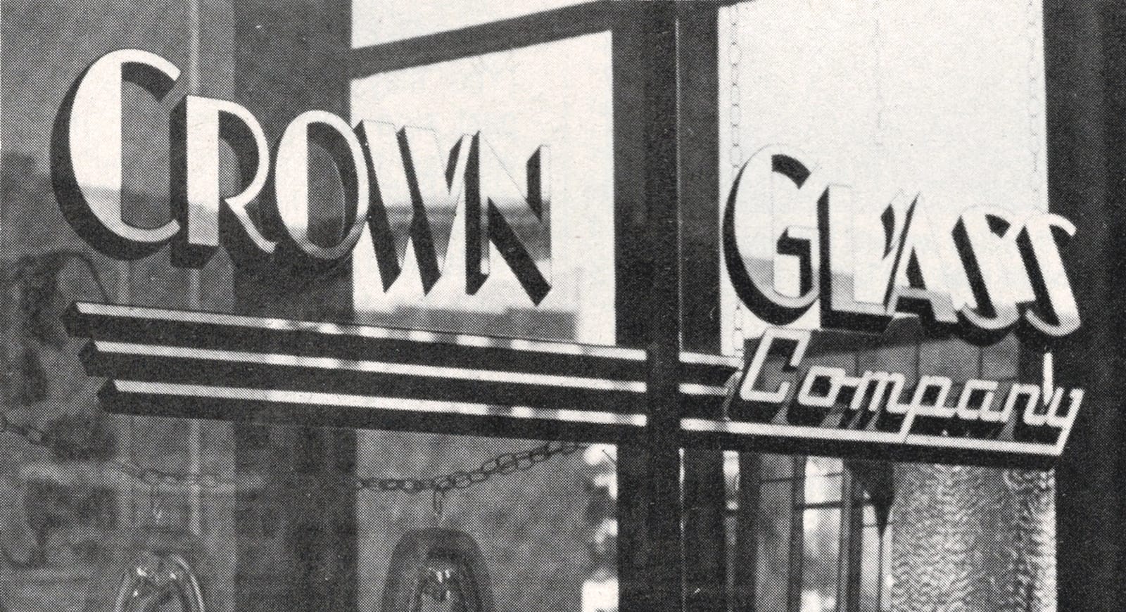
Two samplings of Mitchell’s gold leafed window art: ‘Optique’ (right) uses rolled-on black with burnished/matter gold.
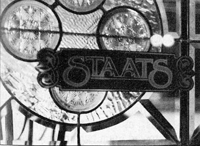
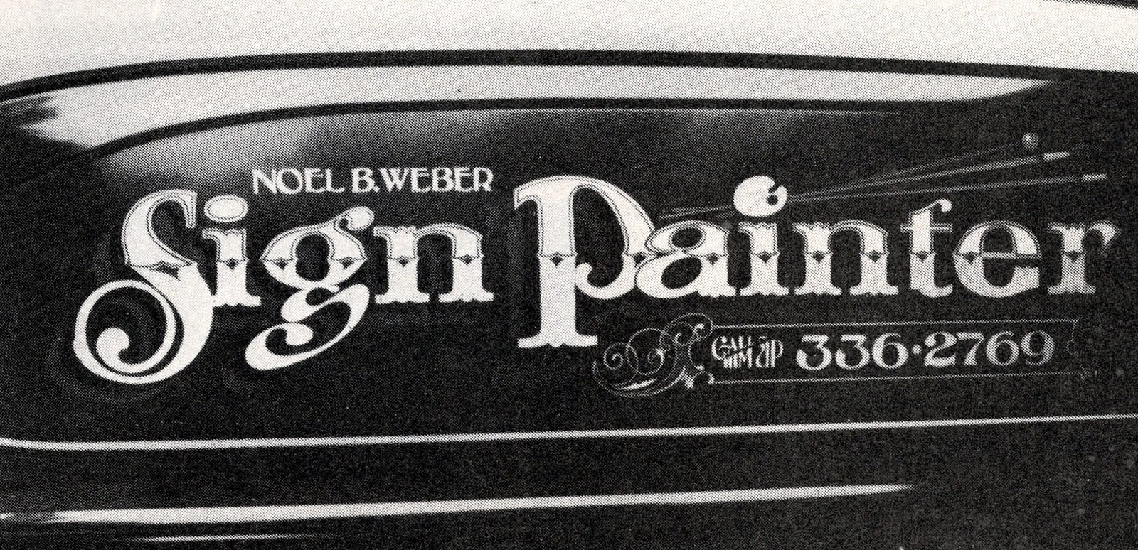
Noel Weber left Chicago for Denver in 1972. While in Chicago, he attended the Institute of Lettering and Design and took a course from the well-known Sid Borden. He also attended the union apprenticeship program in Chicago. For a while, Weber co-owned and co-operated the shop Signcraft in Denver with his brothers Nick and Ben. Then he decided to freelance and went to work for Larry Alba at Lakewood Sign Studio. Alba, who has been in the sign business since the age of 15 and learned the art of gold leaf from Raymond LeBlanc while in California, became a sort of mentor to the Letterheads.
Detail on Weber’s 1946 Chevrolet panel truck (left) features deep and lemon gold, and a Weber entry in Contest III. (There are some colour before and after photos of the truck in the ‘What a Ride’ photo feature.)
Weber’s main interests are the Victorian era and the alphabets of Charles Strong. His best work is on glass, but he also creates excellent flat commercial painted signs.
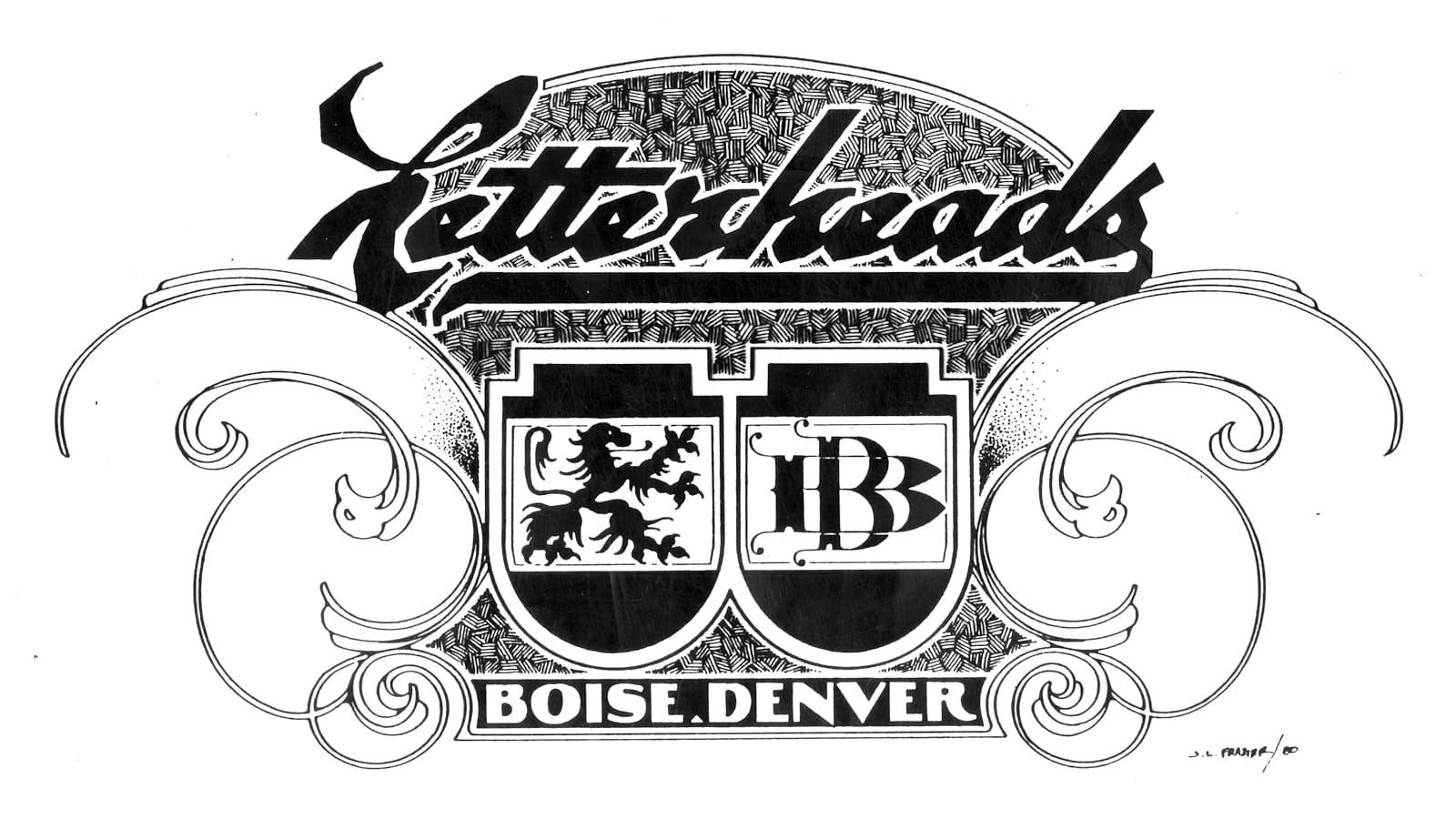
John Frazier, the only member of the group who has no union training, is a natural illustrator turned sign painter who didn’t enter the sign field until 1976. Prior to that, he had spent much time with Earl Vehill and received inspiration from him. Frazier was impressed with the heavy, masculine style of John Ohnimus (mentioned by Atkinson and Matthews). This is quite apparent from the Letterheads’ logo which is his creation. Frazier specialises in pen renderings.
For more of John Frazier’s work, and story, see ‘Meet the Letterheads’ in BLAG 03 and ‘That Saturday Afternoon Jaunt with John Frazier, Original Letterhead’ by Mark Oatis.
Earl Vehill, through his working experiences, touched base with almost all of the group. He worked part-time for Flores (with Oatis) at Rustic, part-time for Alba (with Weber) at Lakewood, and part-time at Associated Grocers with Mike Author, who frequented the meetings. Vehill graduated from the union apprenticeship program in Denver, although he entered the sign field in the San Francisco Bay area. He now operates his own AV Sign Studio in Denver. Vehill studies the Art Nouveau period and, in addition, has resources on old advertising art and design. He does excellent fancy etched glass work and fine showcard work as well.
The Vehill look: from airbrush to hand-carved.
All seven men were interested in the older styles and techniques but had limited resources consisting only of Oatis’ Atkinson Sign Painting and some photocopies of Charles Strong’s book from the old Detroit School of Lettering that Oatis found in the library. The resources have grown and now include many lettering books, old advertising art and design collections, odd showcard material, books of Matthews, Martin, Ohnimus, Strong, and even Callingham’s Sign Writer (dated 1883). These are all freely exchanged between the men.
At its conception, at least half of the group consisted of apprentices or newly turned-out journeymen. And the ‘club’ was really a result of their enthusiasm to learn and to succeed. There was almost a magic to each new discovery of the old material made by each of the members. Oatis tells us, “There was a period of doing ’em for the glory as much as the money we all went through”.
In the first half of 1976, the Letterheads were meeting weekly to exchange new ideas, materials. troubles, inspirations, and photos which they continually take as they travel across the country so that they can keep themselves aware of what is going on in other places. Each meeting had a special topic of discussion and study. One of the meetings was for learning the art of the airbrush, one for stippling on glass. Several meetings were devoted to the art of gold leaf. They also undertook several group projects or add-on signs where each one would add one element to the sign and that would be his contribution to the finished product. Many of the meetings were spent comparing resources against each other for similarities and differences in style and technique.
As they all began to establish themselves as commercial signmen, the meetings went from weekly to bi-weekly to at least once a month, Not due to lack of enthusiasm, but more that they were becoming comfortable with their levels of achievement. Several of them have since left Denver — Weber and Frazier to Boise, Idaho, to work in a shop owned by Weber; Rielly to Amarillo, Texas; and Mitchell to Aspen, Colorado. Their most recent meeting was this past December.
The distance has not kept them apart. They still confer continually over the telephone and are all still in close contact with each other. They are hoping that anyone interested in their work and/or resources who is in the area or passing through will contact any or all of them. They always want to share their knowledge with others and want to learn from them as well.
For a contemporary take on the movement, get BLAG 07, the Letterheads special, available for individual purchase in the BLAG shop.
More Letterheads