Pieces from the extensive collection of drawings and designs left by John Frazier, and now scanned by fellow original Letterhead Mark Oatis.
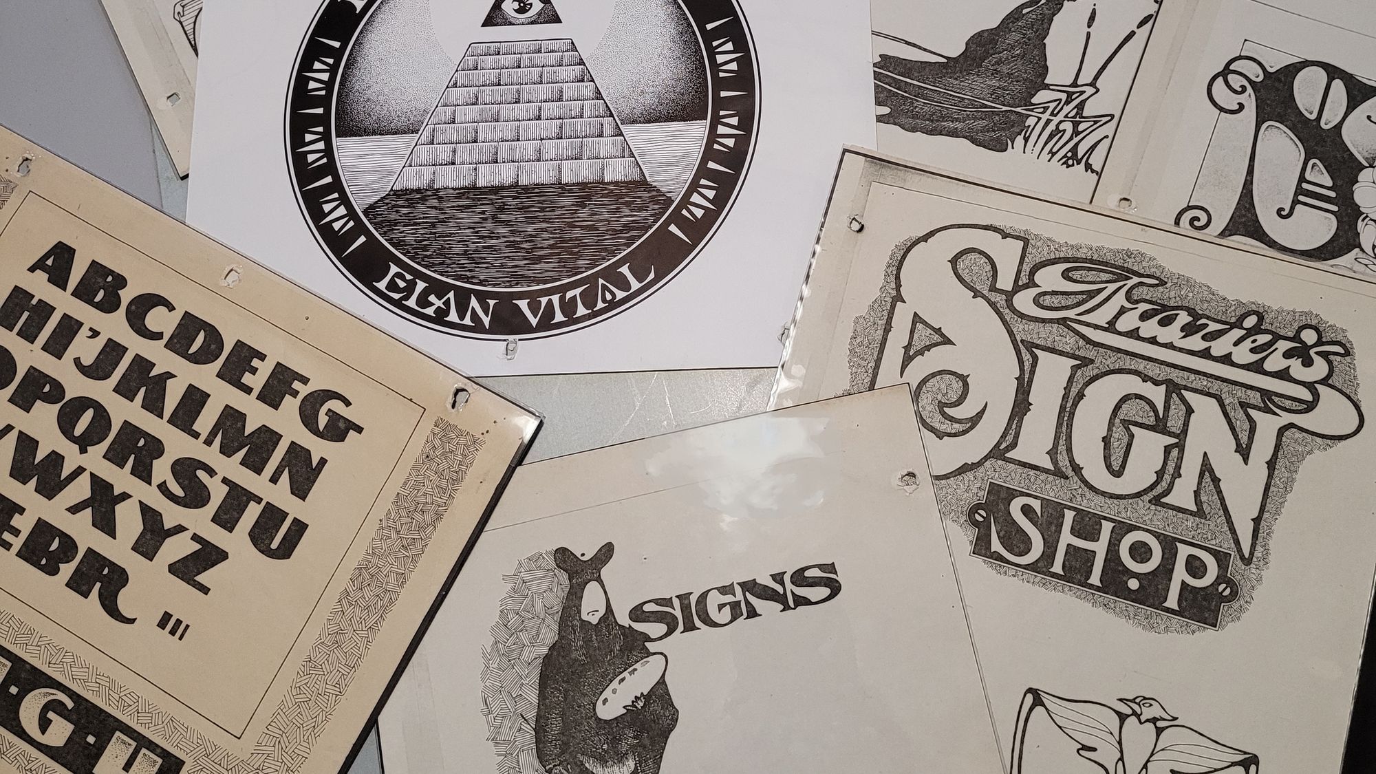
Issue 03 of BLAG (Better Letters Magazine) contains an article about John Frazier, one of the seven original Letterheads. His friend, and fellow Letterhead, Mark Oatis has been working with John's surviving family to scan a vast collection of material that he left behind. In that article, and below, he shares a small sample of this, alongside reflections on the influences, and influence, of this remarkable designer, letterer, sign painter, and artist.
That Saturday Afternoon Jaunt
By Mark Oatis
That Saturday afternoon jaunt began with lunch and a beer at Mexico City Café on Larimer Street, the better to fuel up for a mission of discovery through the alleys and side streets of Lower Downtown. Urban gentrification was still decades in the future and amid the wino bars and pawn shops lay our treasure—the old ghosts, painted advertisements and on-premise signs, waiting to be deciphered.
Top: Layers of fading painted signage on a wall in Denver, including one for M&O Cigars. The panel is one of three that fill the entire length of this industrial building. Photo: Outspoken1 on Waymarking. And, bottom: The same sign photographed by Alan Miller in 1975, around the time of the Saturday afternoon jaunt.
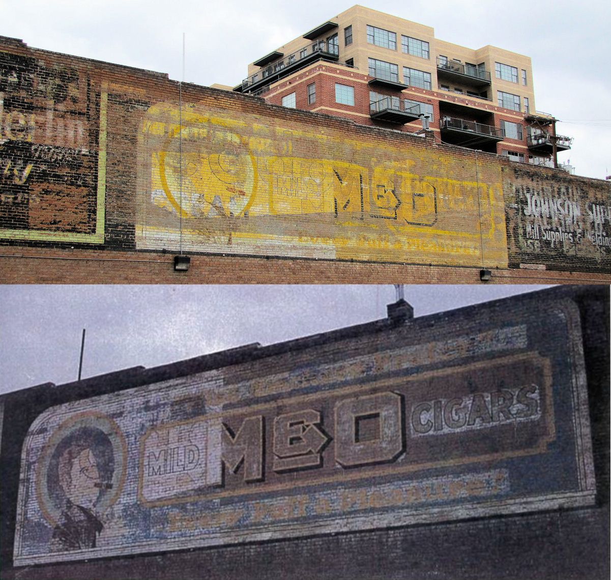
On this day, we returned to favourites: a decrepit smalt hardware panel, the King Cobra Corduroys wall with the pictorial of a bi-plane flying straight up, the barely-legible M&O Cigars advertisement with its inviting tag line, “Every Puff a Pleasure".
Then a southward turn, and our high-powered trek took us through the financial district, where forged iron gates, cast manhole covers and carved granite column capitals beckoned—each one unique and each one examined, analysed and remarked upon, the lost identity and skill of long-ago craftsmen a source of sheer admiration.
Then a detour past the old Navarre Building and the Brown Palace Hotel, to study the split-shaded, two-toned gilt work on the tavern windows. Another block, and the Public Library loomed into view, where Strong’s Book of Designs, the original Coast Manual of Lettering and Designs, and a mint-condition collection of old telephone books (filled with hundreds of hand-rendered Yellow Pages ads) rested upon the shelves.
One of John Frazier's favourite plates from Strong's Book of Designs, for Moyers Band Instruments on page 97.
Our pockets bulged with dimes; we built our resource notebooks at the photocopier, at ten cents per sheet.
“Hey,” John said, “it’s only three o’clock. We can still go to the art museum.”
If memory serves, that night in Denver in 1975 ended like so many before it, at the bench in Earl Vehill’s shop, with more beer to wash down a take-out pizza and more discussion, this time over new discoveries from Earl’s personal library.
And that fervid discourse (as it had been all day) was led—and fed—by the infectious enthusiasm of John L. Frazier, not 21 years of age, but a mile out ahead.
The great, and undoubtedly grimy, birth of Letterheads was an uneven affair, more hiccup than heroic—things are better now! But the nascent contribution of the movement’s first members deserves, now and then, to be told.
Here is your introduction to the virtuosic John Loren Frazier, explained by this glimpse of his unique compositions. John’s transcendent facility with the brush was matched only by his musical mastery of the pen. The work makes his exuberance obvious.
“It is [as he often said] the whole thing behind the whole thing.”
Or maybe Earl said that...
John's 'Plugh' alphabet was directly influenced by the work of John G. Ohnimus.A contemporary of Atkinson and Strong, and an artist of international reputation, Ohnimus took Victorian sign painting traditions to eccentric extremes. This is one of his designs from the book Henderson's Sign Painter.Although they are now scarce, copies of Henderson's Sign Painter can still be found. It is a 'must' for every collector's library.
John Frazier gilding decorative glass samples at Classic Design Studio, Boise, Idaho 1981.This reverse glass sign was made by John for Mark Oatis in 1986. It was mounted next to the front door of Mark's shop on Acoma Street in Denver, Colorado, and now hangs at Mark's home in Las Vegas. The embossed damar centres are still bright, and the silver-to-gold burnish blend on "Anything" is a joy to behold.
John Frazier working on the gilt windows produced for the Main Street development in Boise, Idaho, and a detail of the finished fine line rendering. This 1980 project in Boise's Lower Main Street commercial historic district was a landmark accomplishment for Noel Weber's newly-established Classic Design Studio.Gilt windows produced for the Main Street development in Boise, Idaho. Fine line rendering by John Frazier. This 1981 project in Boise's Lower Main Street commercial historic district was a landmark accomplishment for Noel Weber's newly-established Classic Design Studio.Between 1976 and 1984, John designed about a dozen Letterheads logos, each quite distinct from the rest. The image within the circle may represent a stylized map of Earth, but it is hard to know for certain.
Left: When John designed the artwork for the shirts worn at Noel Weber's 'Barbeque' meeting in June, 1982, there were just two informal 'chapters' of Letterheads. The positive response to the three-day Boise, Idaho, weekend gave rise to the larger gatherings which followed. Right: In addition to gift signage, John constantly made personalized Ex Libris bookplates and other items for friends.The illustrations often had spaces left open in anticipation of typesetting, or some personalized notation; a comical strain is ever present.This caricature of British Prime Minister Margaret Thatcher is a testament to John's facility in the art of cartooning. His ubiquitous patterned cross-hatch could be mannered and precise... or relaxed and casual.This U.S. One Dollar bill serves to give scale to many of the small drawings discovered in John Frazier's remarkable portfolio. This study appears to have been an experiment in textural effects.
Among his creative themes were a series of 'reflections'; letters which would take on unique characteristics, depending on their position.An alphabetic reflection, given to Lee Littlewood (Portland, Oregon) by John at the Letterheads Denver Exchange in 1985.The reflected alphabet piece above, rotated and cropped.A personalised envelope was a special treat, indeed.This plate by the renowned calligrapher Carl Rohrs is representative of the artistry and inventiveness that so inspired John. He held Carl in great esteem. He studied and practiced calligraphy throughout his career, sometimes carefully drawing the written forms for accuracy.Among the many rondels designed by Frazier, this enigmatic and personal piece shows his appreciation for Carl Rohrs' capital Romans.John filled notebooks with brush-written monogram caps. This was taken from a sheet composed entirely of exuberant R's.A drawn and filled italic, replete with character and rhythm.
Repetitive quotations (left) comprised a binder from the late-2000s, a period devoted entirely to the pursuit of beautiful writing. During this period, writing often evoked dancing, as in this lovely 'tornado-esque' composition (right). Quick self-portrait, c.1990.
Written by Mark Oatis
Thank you to Mark Oatis and John's family for taking the time to scan, collate, and narrate this sampling of John's work. More can be found in the corresponding article in Issue 03 of BLAG (Better Letters Magazine).