What’s Inside Issue 09 of BLAG (Better Letters Magazine)?
Between the covers of the worldwide adventures in sign painting from Issue 09 of BLAG.
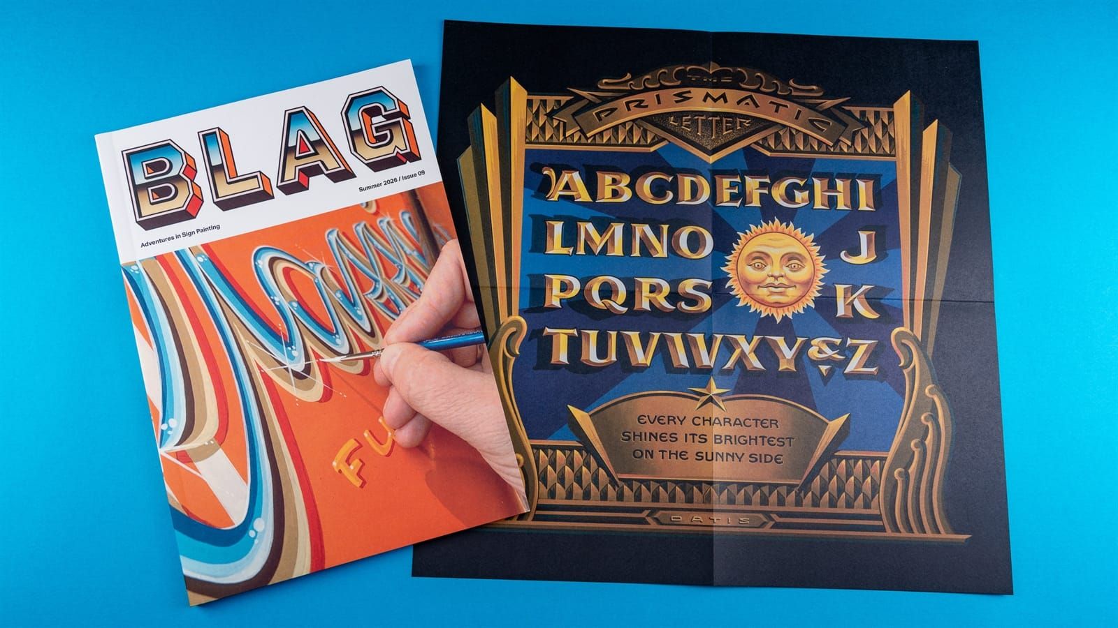
BLAG 09 is now landing with members around the world, so it’s time to take a look inside the latest instalment of our adventures in sign painting.
Before we dive in, I want to say thank you to the entire BLAG membership who, via the magazine’s paid plans, make it all possible, and keep it free of advertising. Your continued support of me and my work is much appreciated 😃.
On the Cover
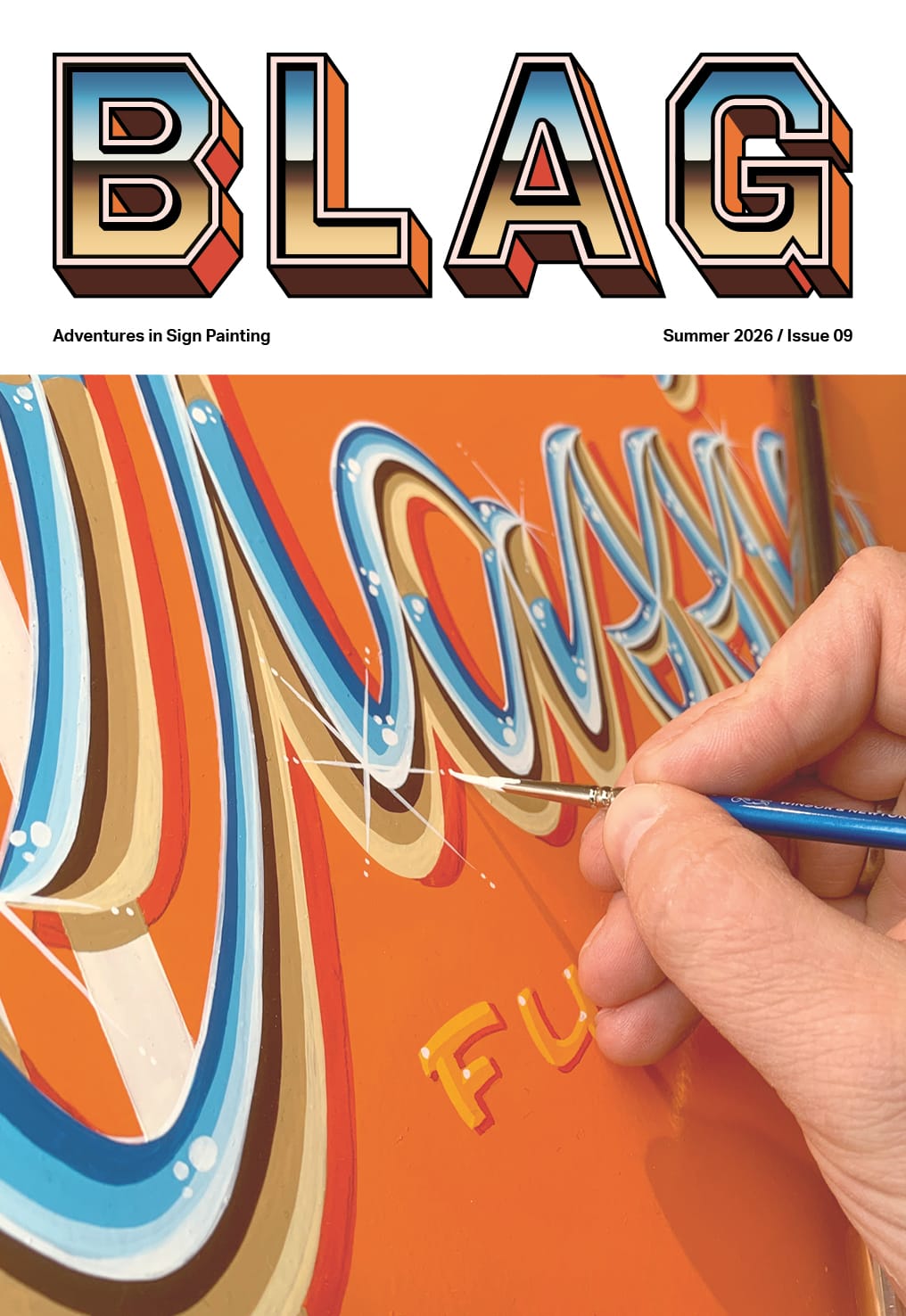
The sparkling chromatic letters on the cover are from the hand of Pieter Snijders. Inside you’ll find his step-by-step guide to creating the lettering effect, which was developed by studying the work of James Cooper, aka Dapper Signs (RIP). It also takes inspiration from the script logotypes of classic cars. The chrome theme is then reflected in this issue’s masthead.
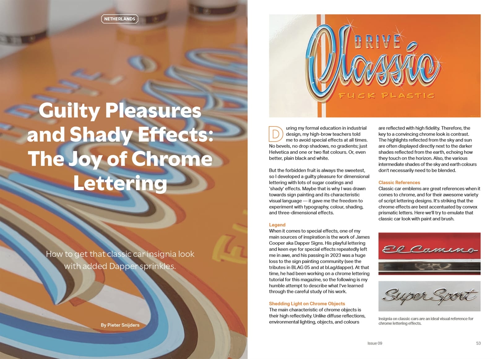
‘Guilty Pleasures and Shady Effects’ is Pieter’s instructional for creating that classic chrome look.
Contents
No advertising means that all 80 internal pages are given over to what we’re all here for: the sign painting. This ranges from the bitesize content in the ‘Sundries’ section to longer in-depth features, and everything in between.
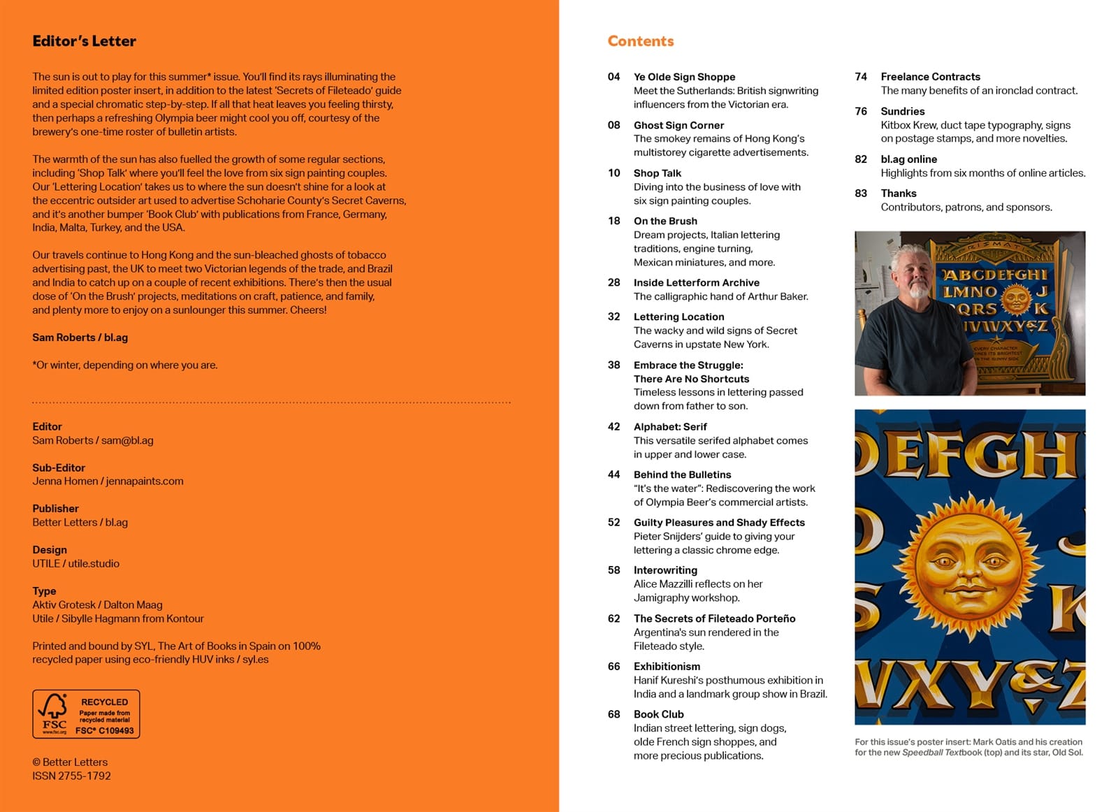
My editor’s letter has a sun/summer theme, which is echoed by the two images on the contents page opposite. These are from this issue’s poster insert, which is a reproduction of Mark Oatis’ ‘Prismatic Letters’ panel from the forthcoming 26th edition of the Speedball Textbook. The video below shows the poster, alongside everything else from inside the issue.
The Regulars
Drawing and painting the Argentinian sun is the focus of Gustavo Ferrari’s latest ‘Secrets of Fileteado Porteño’ column, while ‘Ye Olde Sign Shoppe’ takes us back to Victorian England to meet the legendary Sutherland signwriting dynasty.
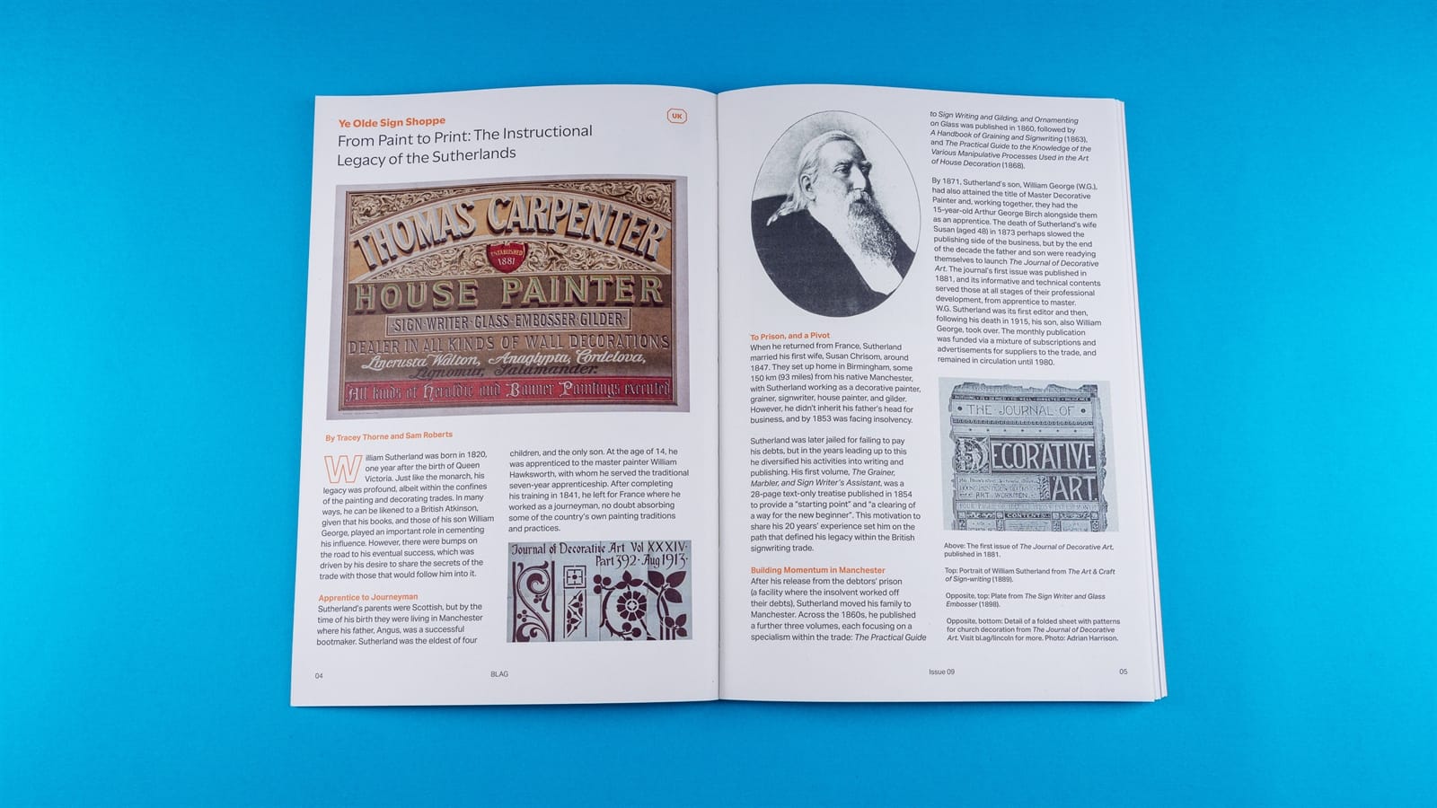
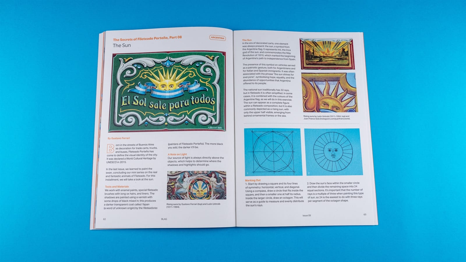
‘Ye Olde Sign Shoppe’ and ‘The Secrets of Fileteado Porteño’
Other regular columns feature a taste of Hong Kong’s tobacco ghost signs, a tour of the wild and wacky Secret Caverns bulletins in upstate New York, and reflections from Alice Mazzilli on her recent ‘Jamigraphy’ workshop in Cambridge.
There’s also an introduction to the calligraphic hand of Arthur Baker for ‘Inside Letterform Archive’, and Rob Cooper’s latest alphabet is simply called ‘Serif’, with the usual presentation of uppercase, lowercase, numerals, and a selection of special characters.
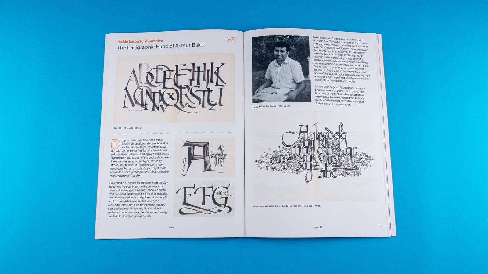
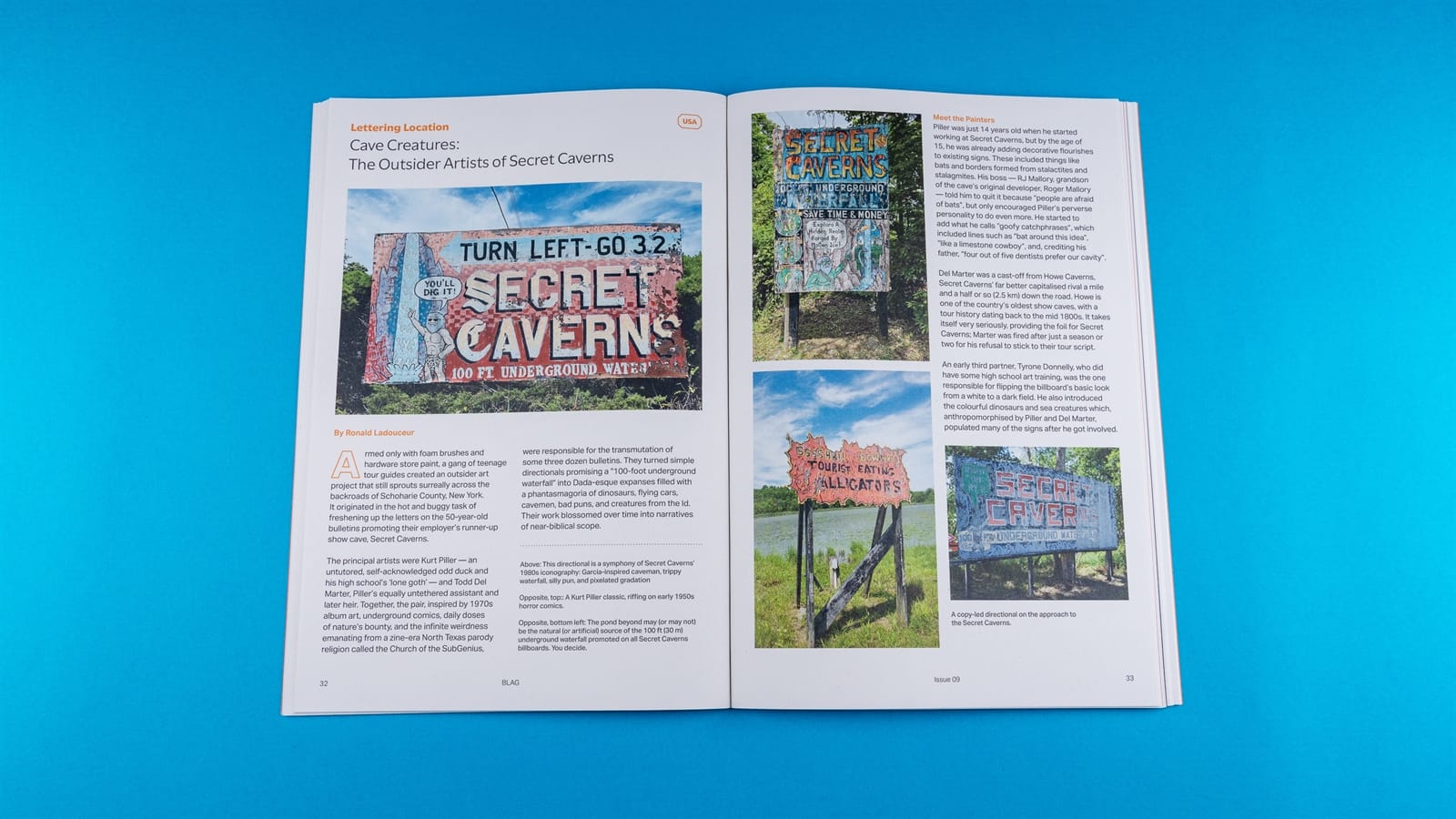
Arthur Baker for ‘Inside Letterform Archive’ and Secret Caverns for ‘Lettering Location’.
Feature Length
In addition to Pieter’s chromatic lettering guide, there’s an extended feature on a remarkable collection of Olympia Beer bulletin artworks created between the 1930s–1950s by a talented cast of West Coast artists and illustrators. Jenna Homen’s ‘Shop Talk’ has then gone feature-length for this issue as we meet half a dozen sign painting couples sharing their lives on, and off, the brush.
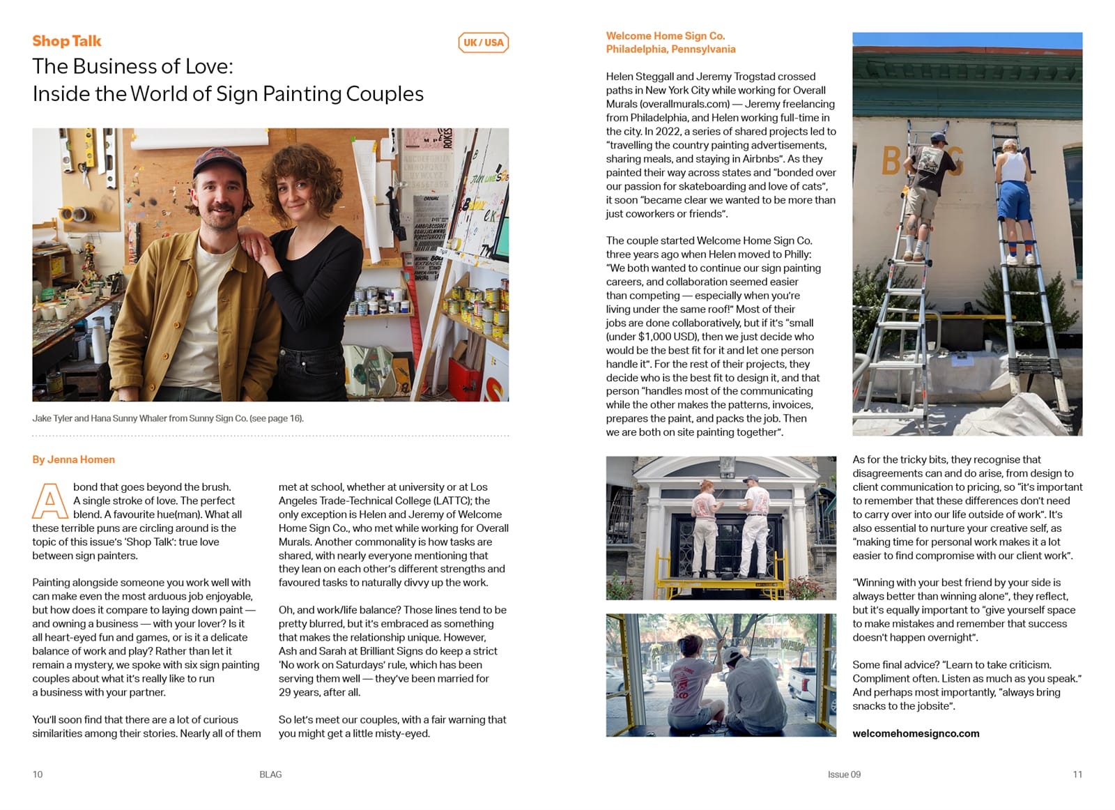
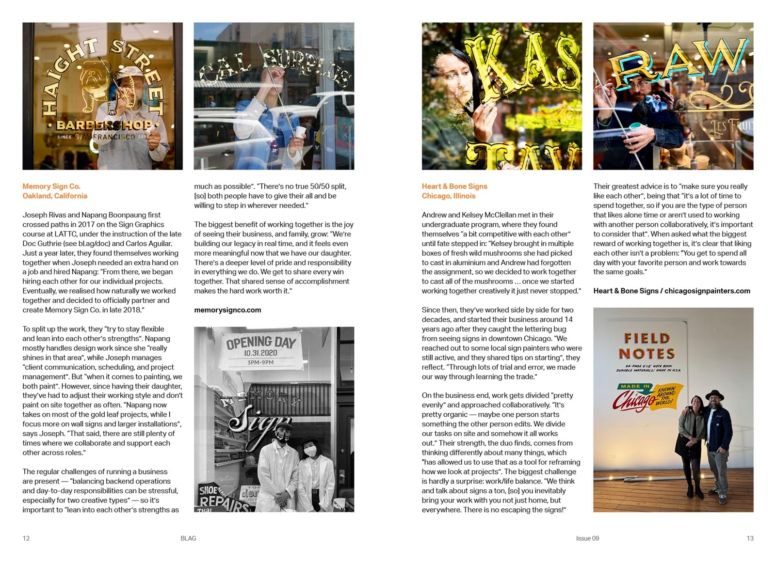
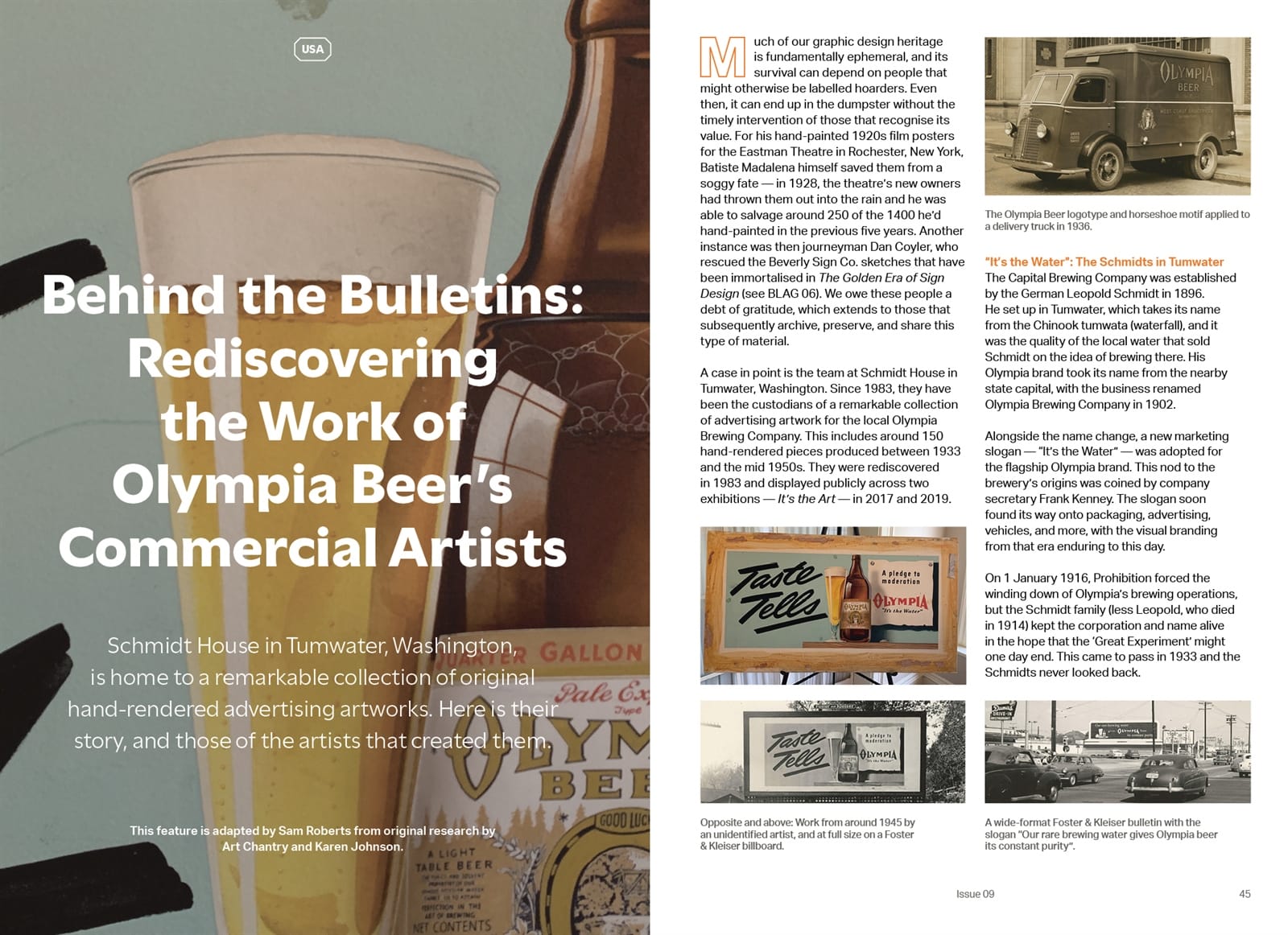
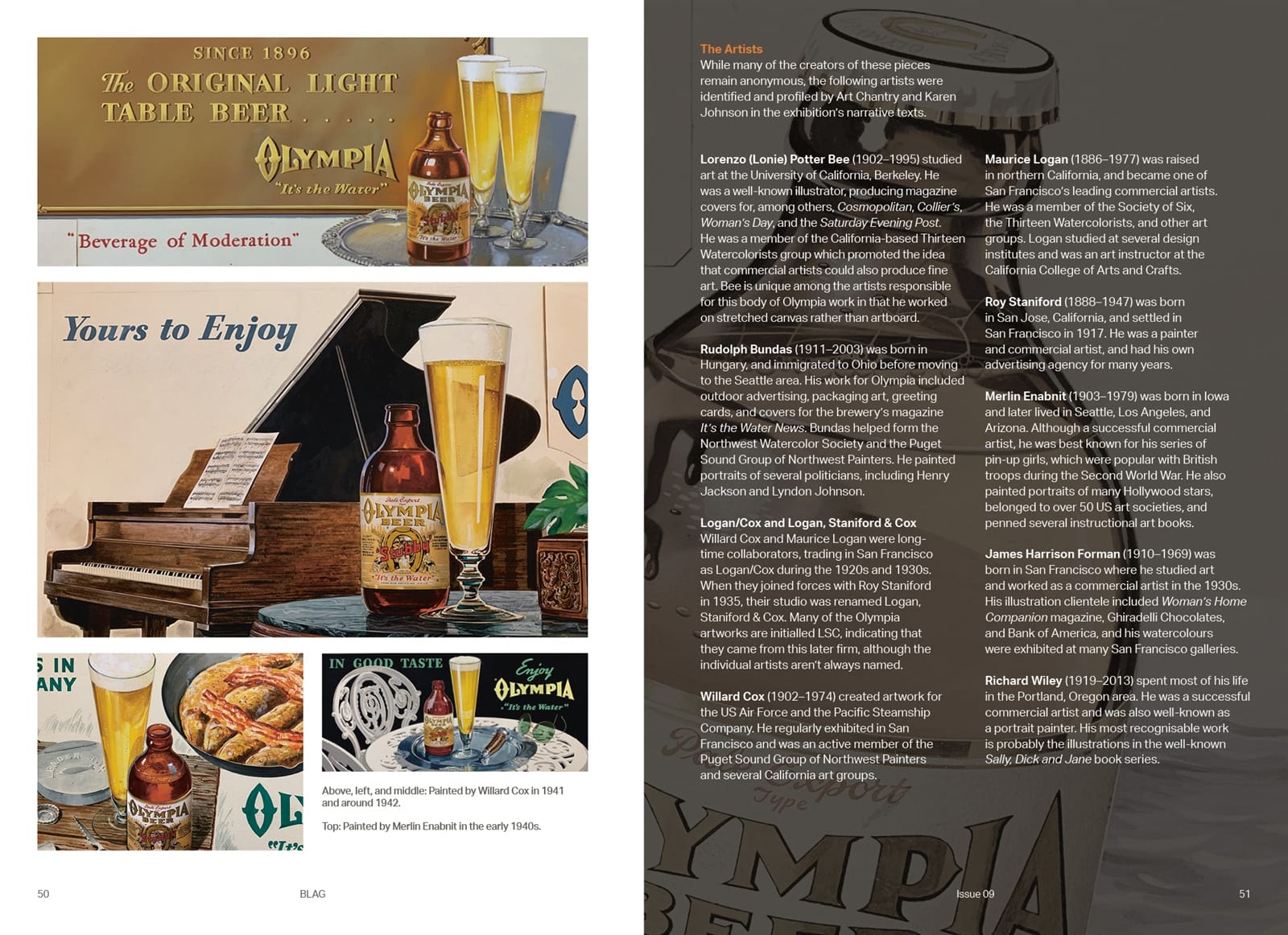
Sign painting couples and the bulletin boards of the Olympia Brewing Company are two of this issue’s main features.
Projects & Publications
‘On the Brush’ profiles a series of projects from Australia, France, Italy, Mexico, Thailand, the UK, and the USA. These range from branding a local bakery to creating a series of miniature food carts, plus one from Massachusetts inspired by Veronika Skilte’s ‘Pillow Gild’ from BLAG 06.
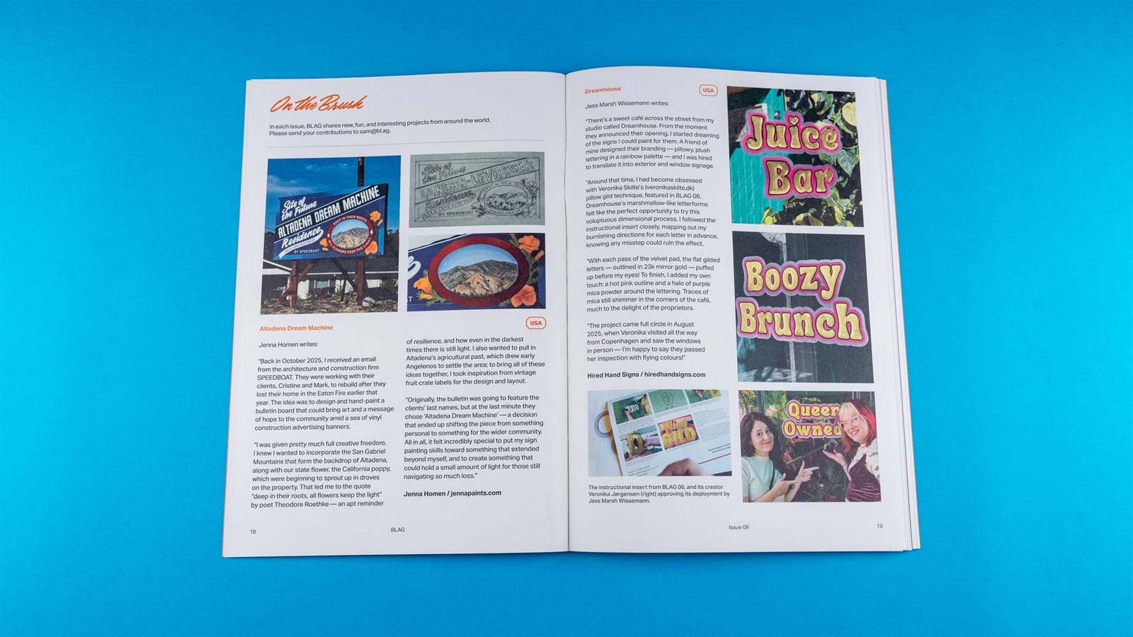
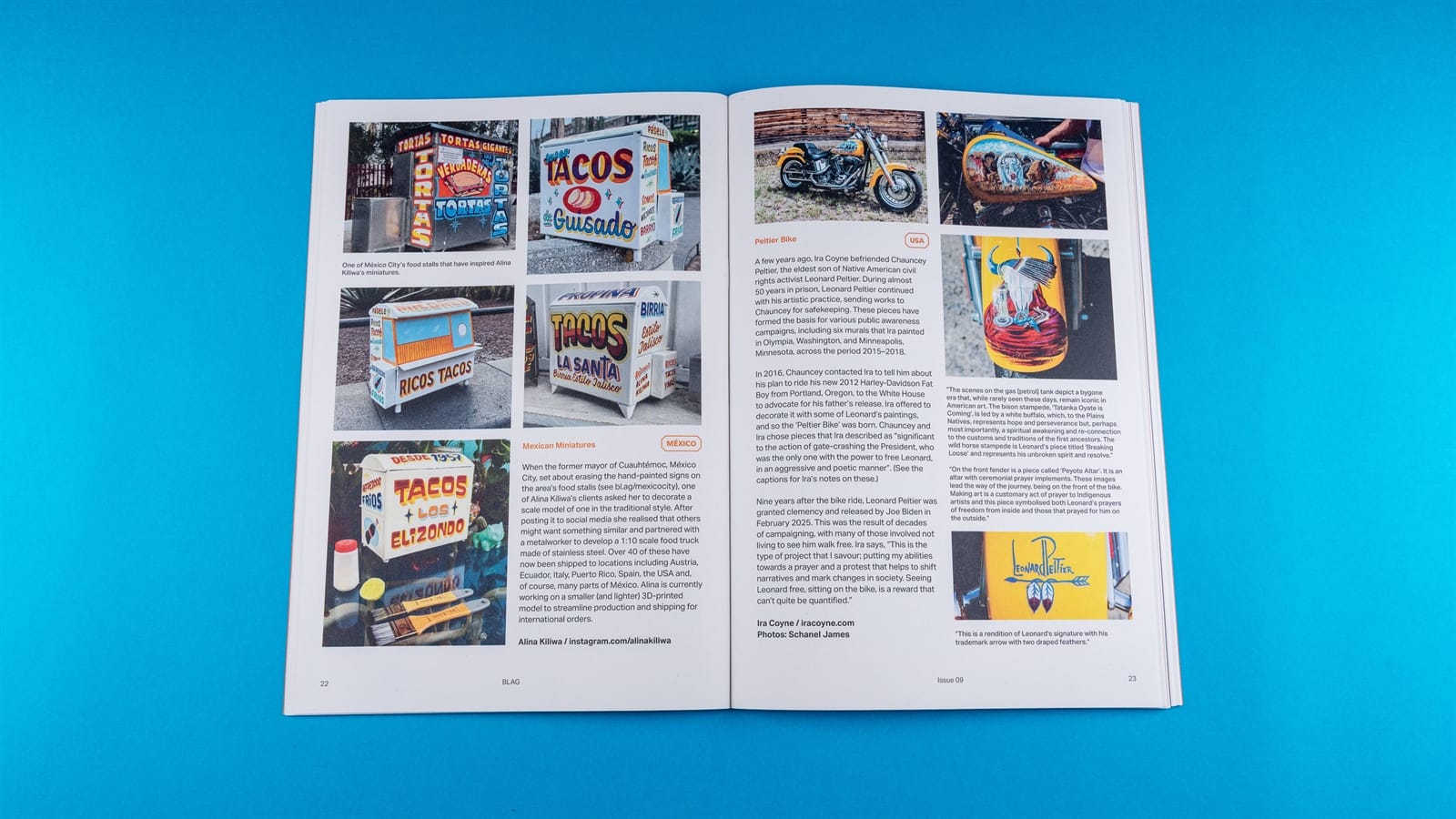
‘On the Brush’ project profiles.
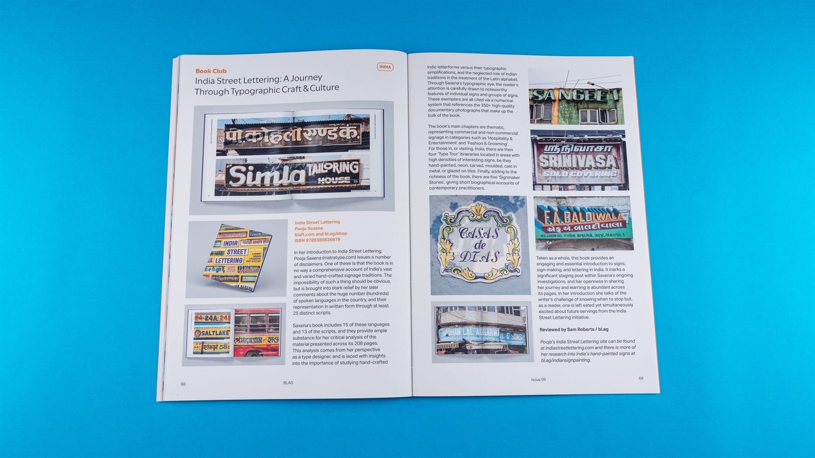
There’s then the latest 'Exhibitionism’ column with details of recent shows held in Brazil and India. The global reach of the issue also extends to the ‘Book Club’ with featured publications from France, Germany, India, Malta, Turkey, and the USA.
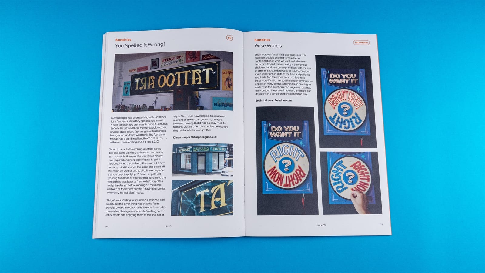
Wise Words
In addition to this issue’s ‘Wise Words’ creation by Erwin Indrawan, there are also lessons in lettering and business from Dan Forster and Darren Di Lieto. Dan tells the story of a formative experience under the guidance of his father, Tony Forster, while Darren sets out the principles of a good client contract.
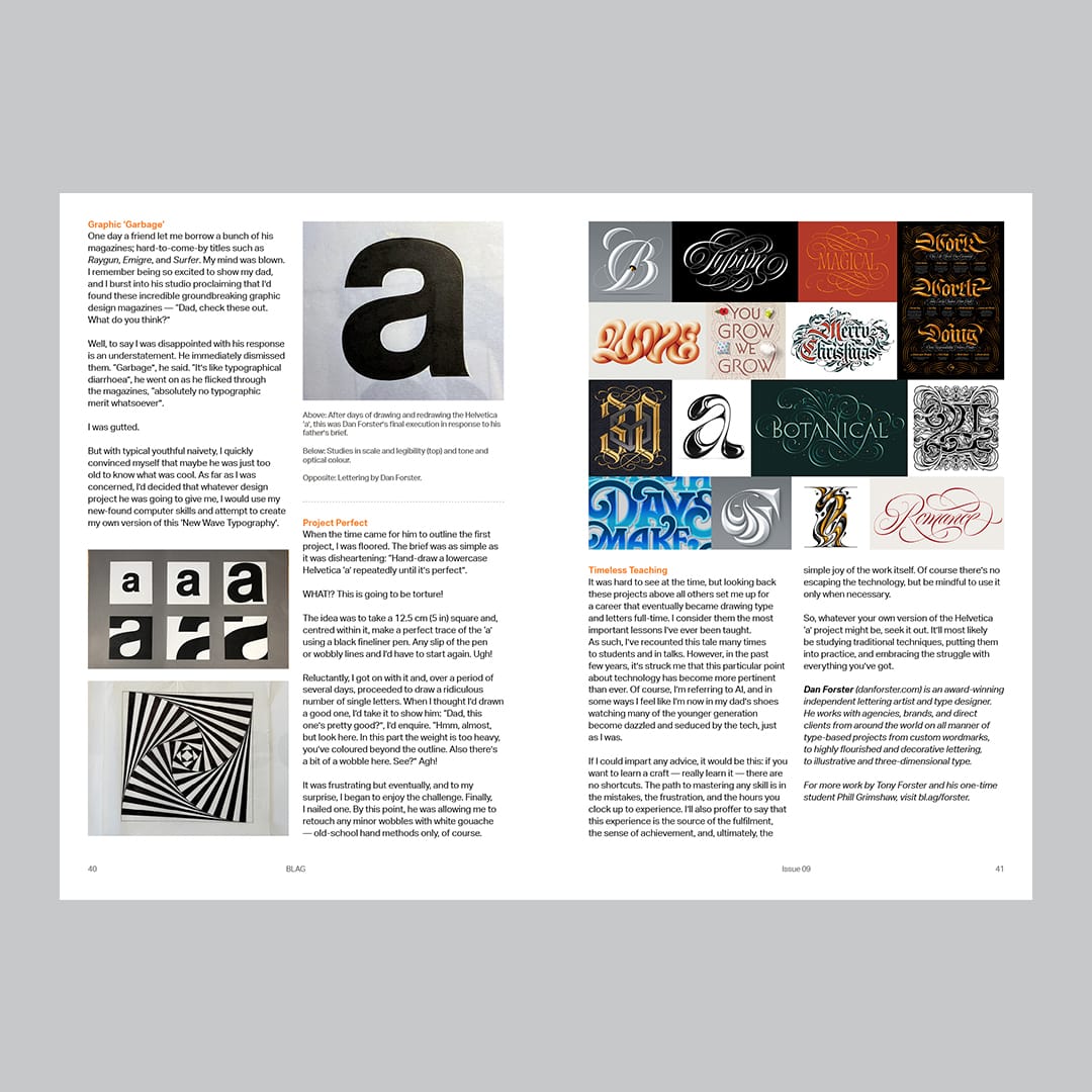
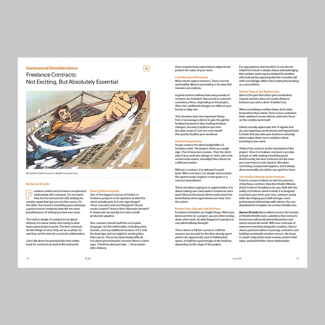
Dan Forster on lettering lessons from his father and Darren Di Lieto on freelance contracts.
Sundries
As always, the magazine’s last few pages are given over to a menagerie of shorter snippets, including duct tape lettering from Japan, walldogging with the Kitbox Krew, signs on stamps, and more.
Thanks
Well over 50 contributors from around the world made BLAG 09 possible, and I truly value and enjoy the process of collaborating with so many brilliant people. Thank you all.
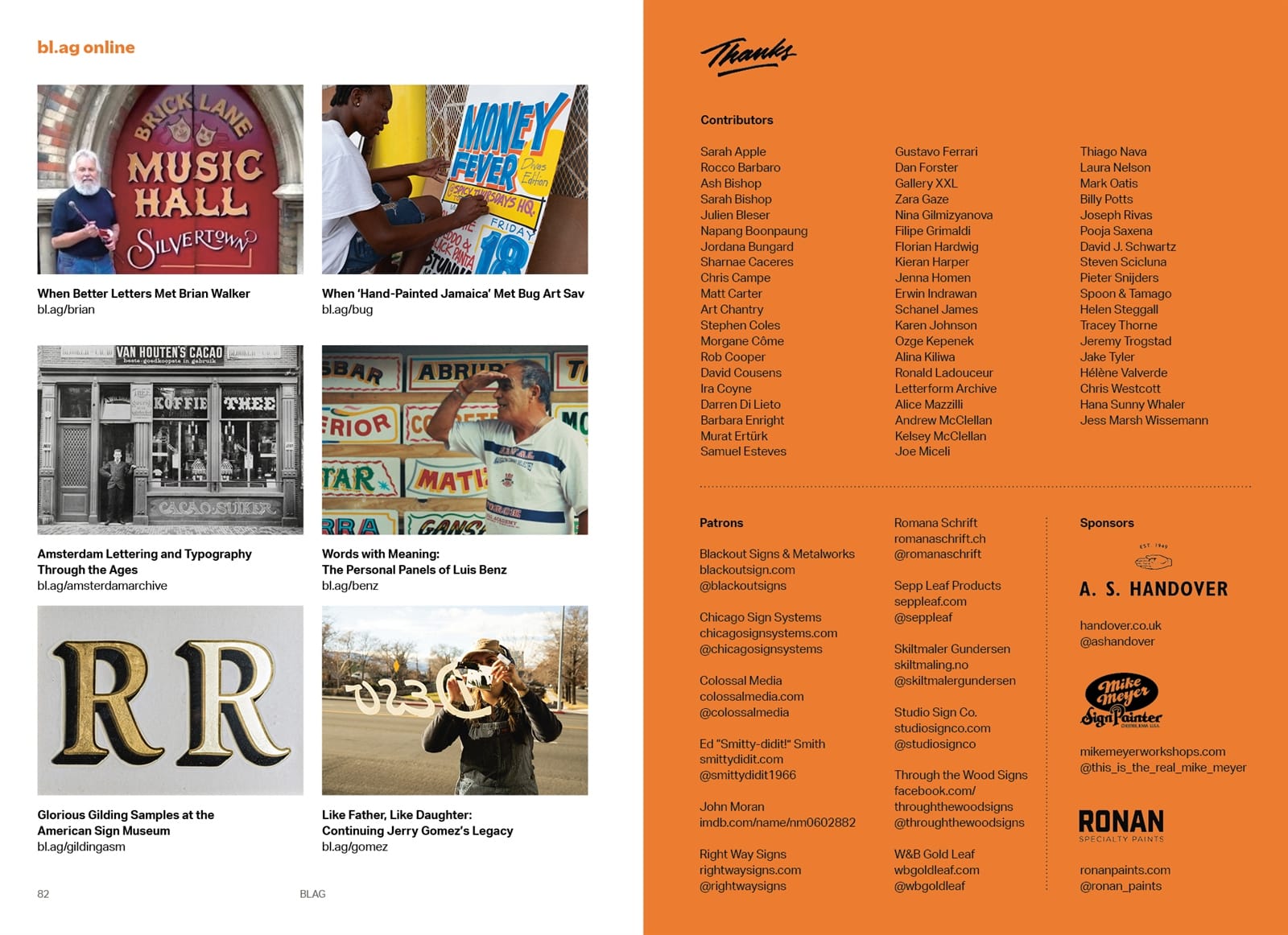
Also on the inside back cover you’ll find the logos and website of our wonderful sponsors, so be sure to visit them all:
Thank you also to our patrons: Blackout Signs & Metalworks; Chicago Sign Systems; Colossal Media; Ed “Smitty-didit!” Smith; John Moran; Mandinos; Right Way Signs; Romana Schrift; Sepp Leaf Products; Skiltmaler Gundersen; Studio Sign Co.; Through the Wood Signs; and W&B Gold Leaf.
And nothing happens without the paid members around the world that fund all the work that goes into the magazine. Thank you! If you’re not one already, then join today to get the latest issue delivered directly to your mail/post box.
And, last but not least, thank you to the wonderful team that brings the final print magazine to fruition: Jenna Homen on sub-editing; UTILE on design; SYL, The Art of Books on print; and Ra & Olly on distribution.
Fonts in Use are Aktiv Grotesk by Dalton Maag and Utile by Sibylle Hagmann from Kontour. Photography of the magazine is by Edgar Gonzalez.
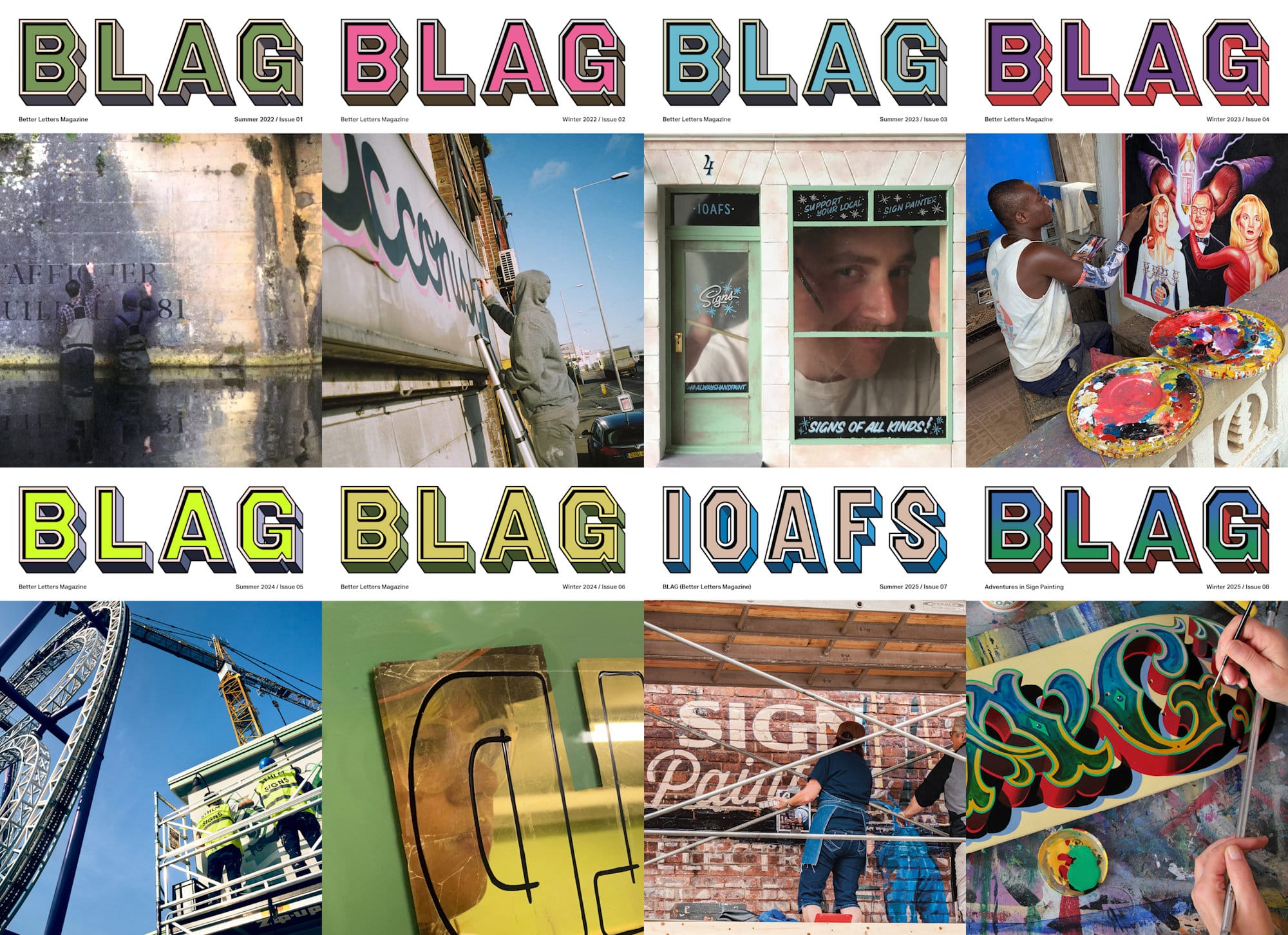
To see what’s inside previous issues of BLAG, visit the back issues page where you’ll find digital copies to read in full, links to bonus content, and recordings from BLAG Meet events.
Some back issues are also available to buy individually from the BLAG Shop.