The Vernacular Returns: on Alastair Johnston’s Book the Trip
Daniel Elkind jumps aboard for a lettering world tour led by typographer Alastair Johnston.

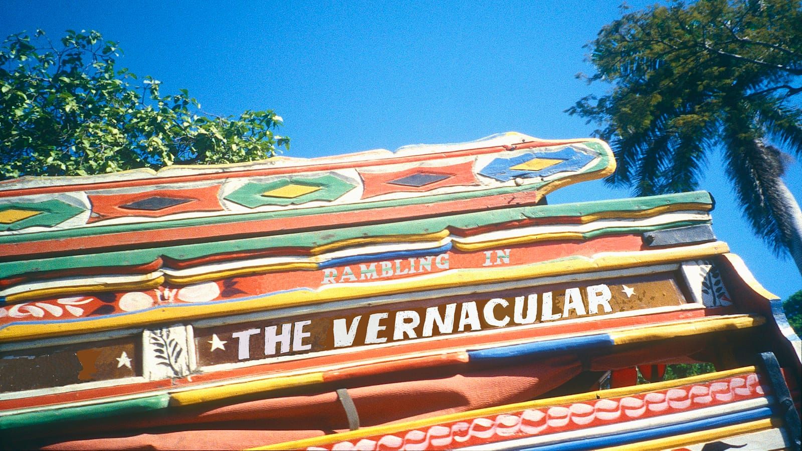
For this post in the current series on books, Daniel Elkind reviews Alastair Johnston’s Book the Trip. Daniel’s thoughts are accompanied by some of Alastair’s favourites from the 700 photos that straddle the globe and proliferate across the publication’s 236 pages. Their captions are taken from the book itself.
The Vernacular Returns: on Alastair Johnston’s Book the Trip
By Daniel Elkind
The work of publisher, photographer, designer, and all-around polymath Alastair Johnston has never been centred merely on the typographic. Spanning semiotics, anthropology, nostalgia, and the myriad variety of manifestations that comprise the cultural Vernacular, Johnston’s projects always amount to a personal exploration of what the ancient Greeks meant by technology: craft, skill, applied artistic expression, the artefactual. His latest, Book the Trip: A Tour of Folk Lettering Worldwide, is no exception. The culmination of more than four decades of travel and patient collecting, this ramble through the global vernacular, as Johnston humbly puts it, “combines three of my interests: travel, photography, and typography”.
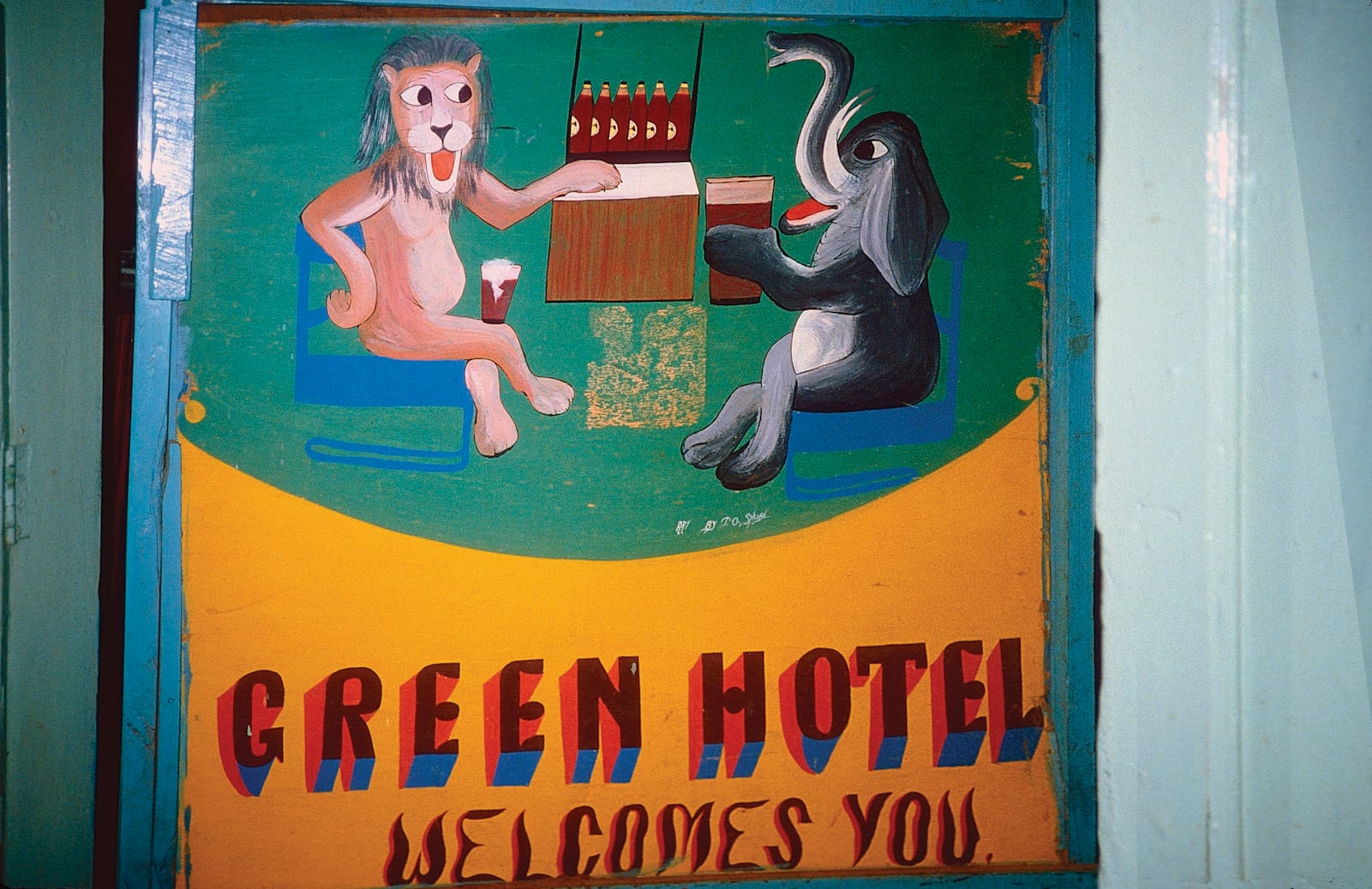
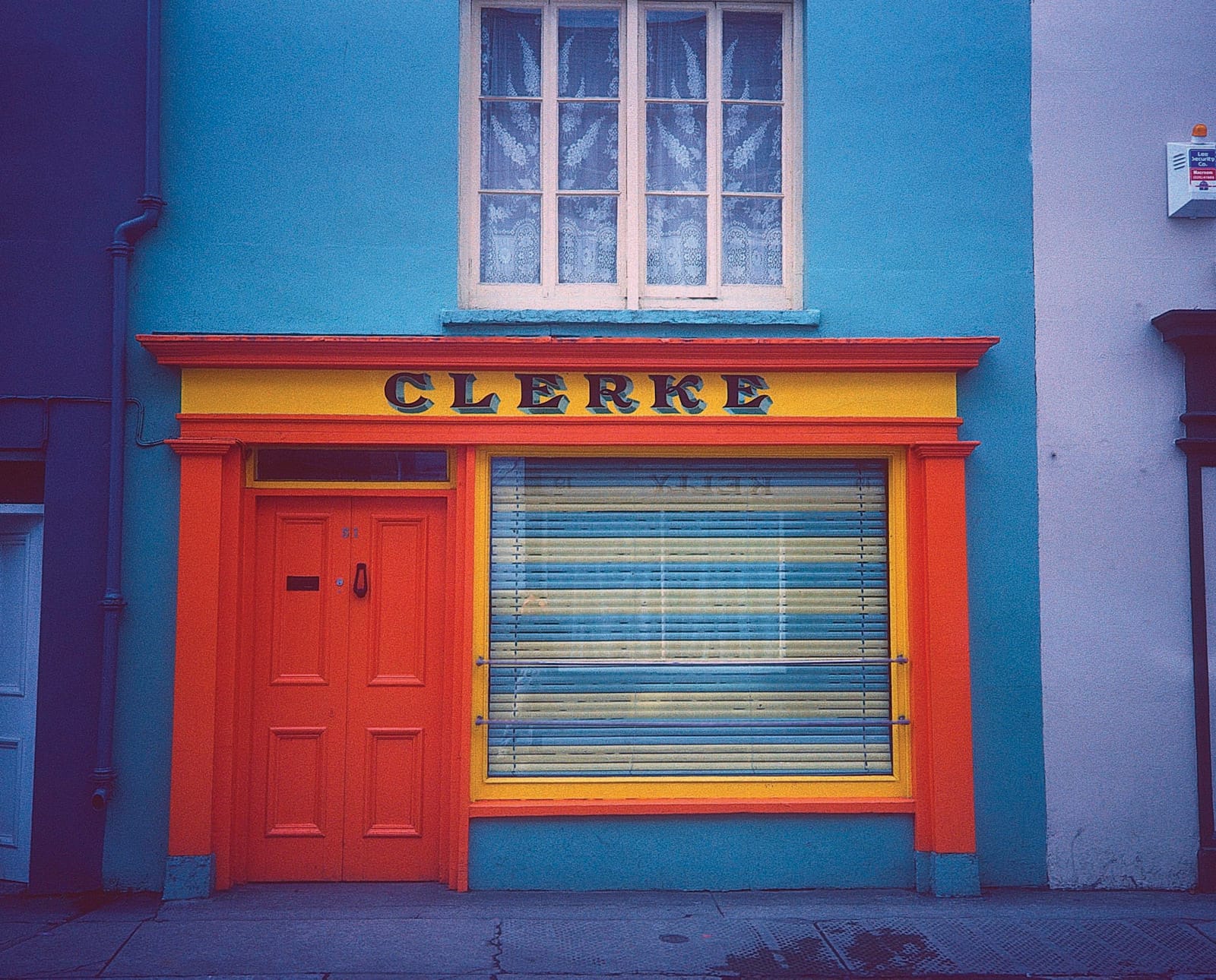
The vernacular dimension is what defines this predominantly twentieth century era — now firmly in the rear view and therefore resurrected as a species of nostalgia — in which some essential residue of individuality, a touch of the artificer, remains to prevent the complete homogenisation of signage rampant in our present time. (Perhaps the best example I can think of is poslikane panjske končnice: the now-defunct Slovenian custom, both practical and symbolic, of painting beehive panels with scenes from the country’s historical, religious, and folkloric life.)
Interspersed with quotes from sources as far afield as Plotinus, Louis Zukofsky, Xavier de Maistre, and the Book of Job, Johnston’s ambitions in this book are immediately evident. Addressed as much to the professional graphic designer who may think their work transcends the vernacular’s essential amateurishness, this magnum opus connects disparate manifestations of visual literacy, drawing connections between subtle national differences in children crossing signs from Holland to Haiti, graffiti in New Delhi and Mexico City, gravestones from Belfast and San Francisco, Afghan market trucks, and Parisian shop signs.
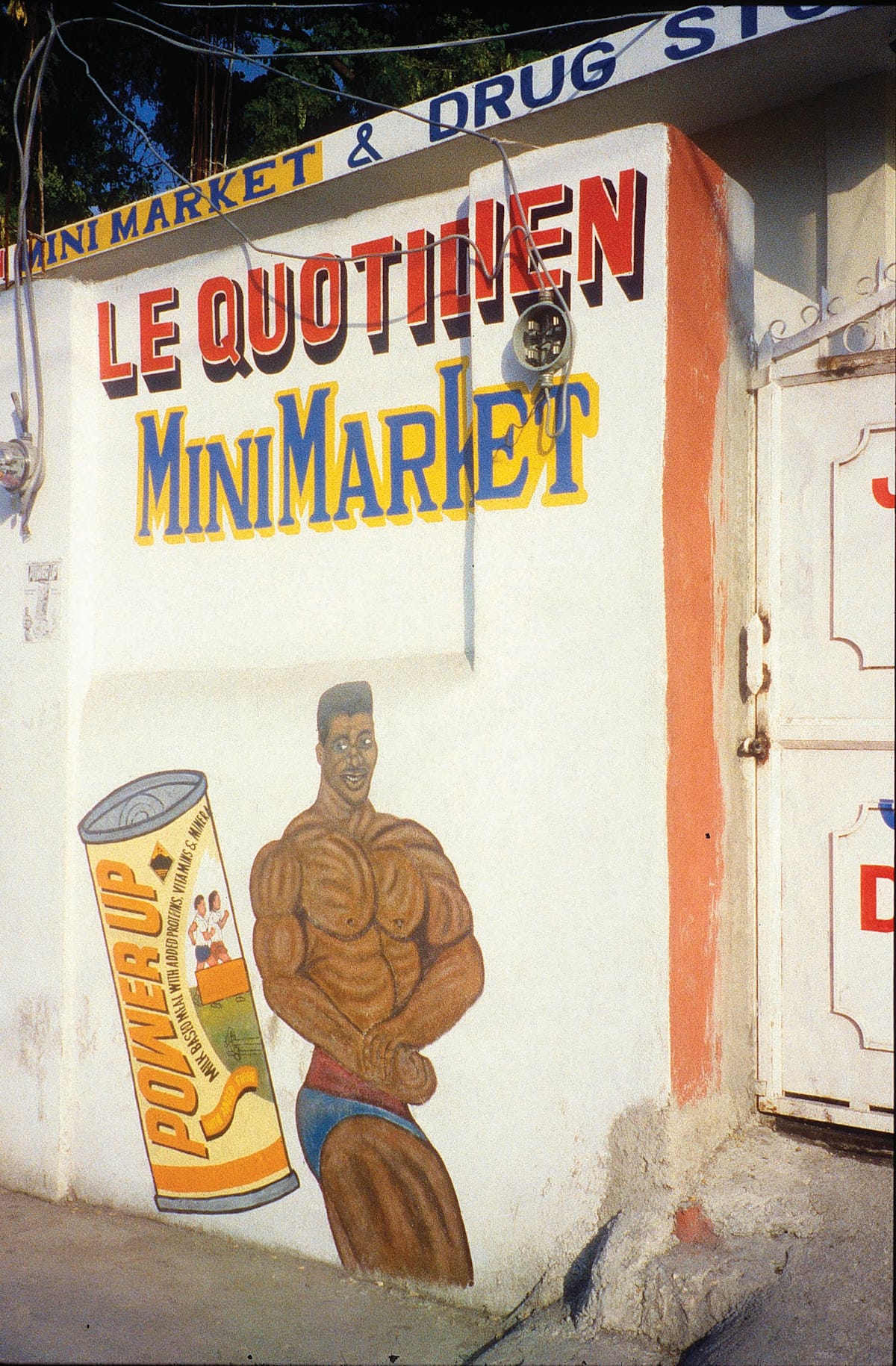
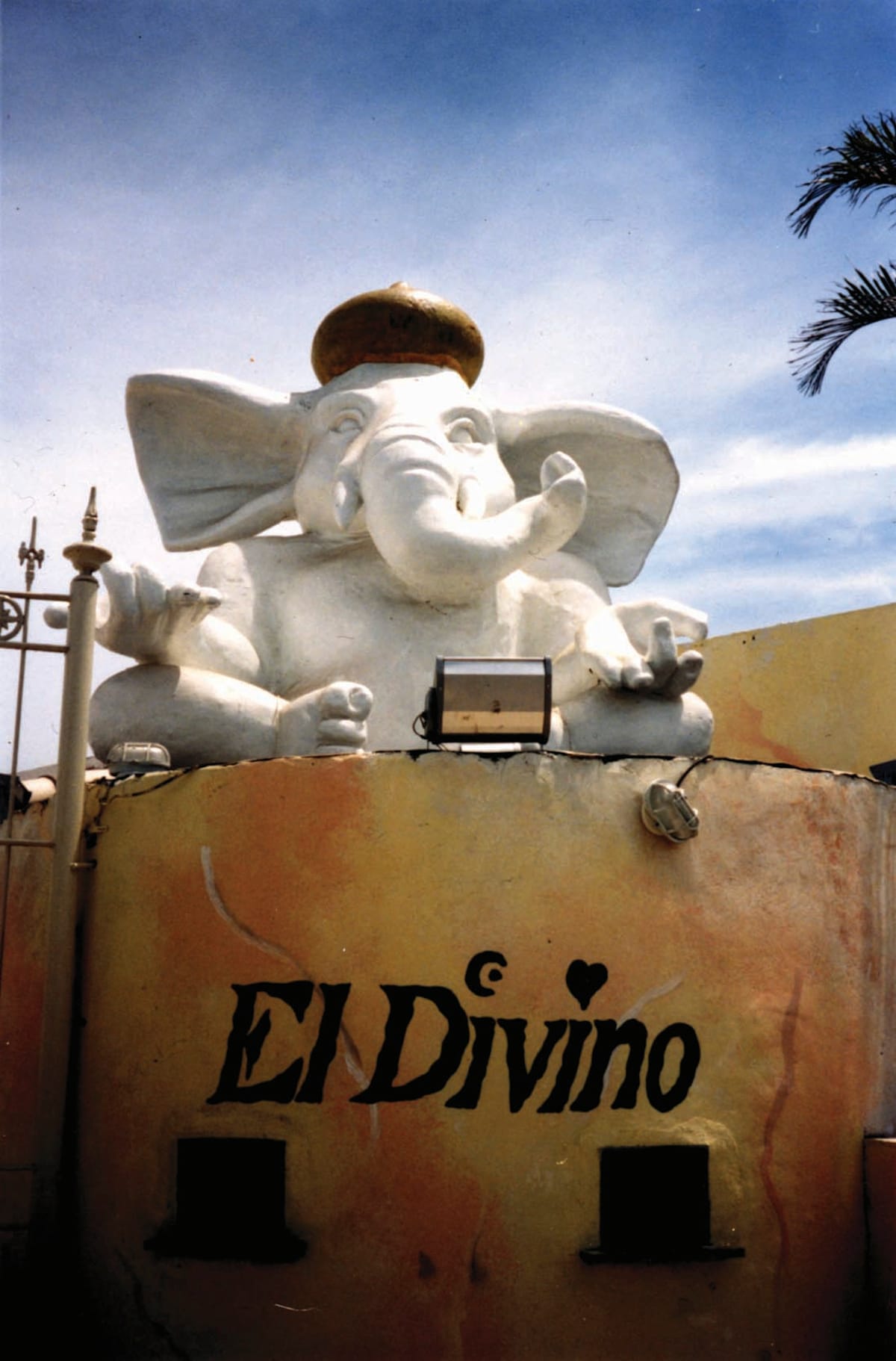
“Gay French Clarendon and sans serifs on a pharmacy” in Port-au-Prince, Haiti, and “Ganesha sits atop a night club box office, painted in a tremulous Runic” in Armação dos Búzios, Rio de Janeiro state, Brazil.
Johnston is a fascinating observer and his eye is both subtle and allusive in its capacity to draw connections to a scribble seen decades ago near a distant church or dusty alleyway. He notices minor irregularities in the use of fonts, errant serifs, contrasts between lower and uppercase, variations in a letter’s weight. He draws a distinction between the glyphic and the calligraphic. Johnston’s comments on letterforms and motifs glow with his unique blend of wit and metaphor: an incomplete ‘s’ “looks malnourished”, while a sign featuring a schoolgirl’s pigtail rhymes visually with the crucifix of a church in the photo’s background. He is at once capable of distinguishing an attempt at Lubalin Graph typeface in a restaurant sign in California, the tight kerning of Century Schoolbook in London, and the terminal periods (full stops) of British grammar.
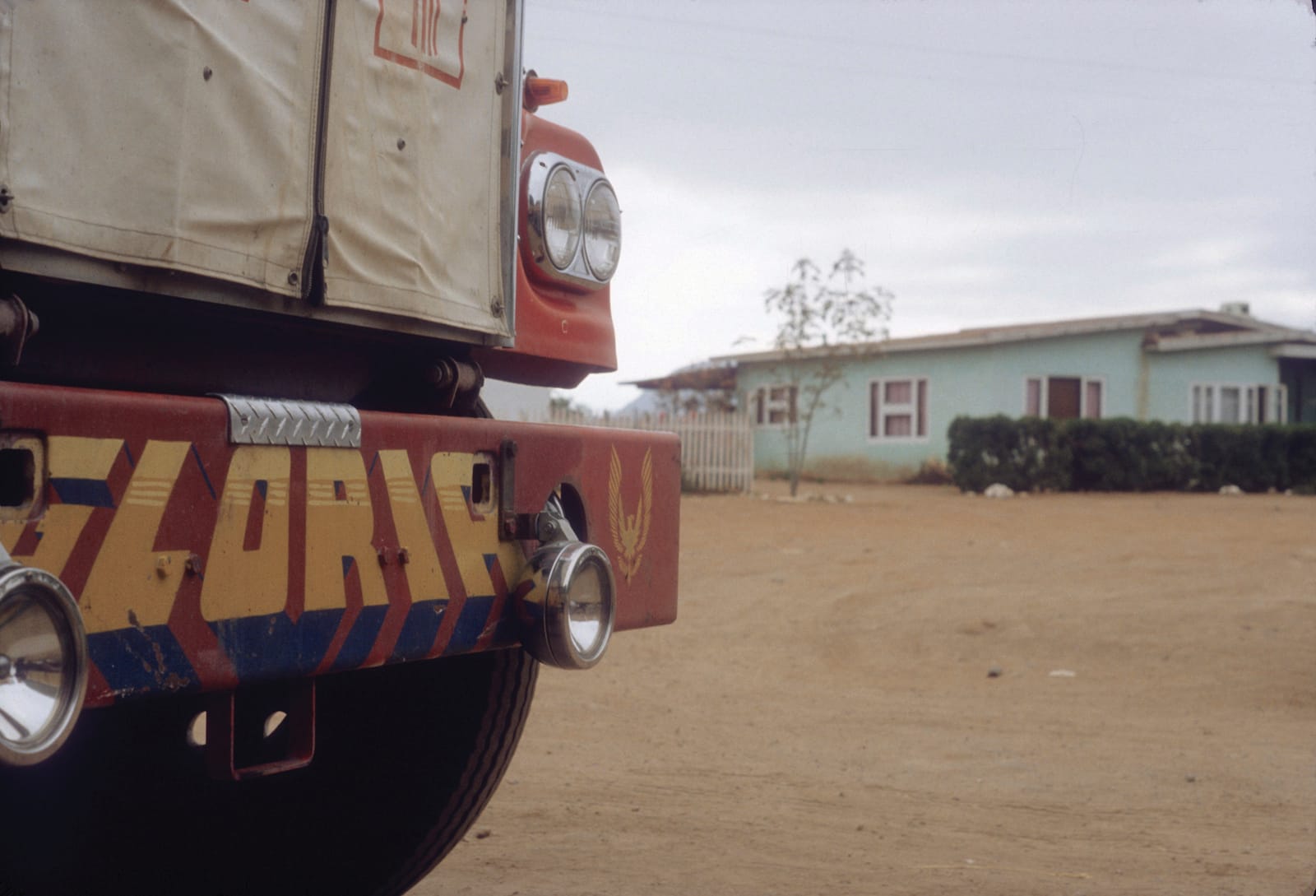
Like something out of a Johnston photograph and its spirit of serendipity, I first discovered his work through an earlier iteration of this project, Musings on the Vernacular, when I stumbled upon it completely by chance on a dusty bookshelf in a used ephemera shop in Berkeley, California. Since then, I have not been able to pass a quixotic sign or a particularly poignant palimpsest of font and paper without muttering to myself, “Alastair would love this”.
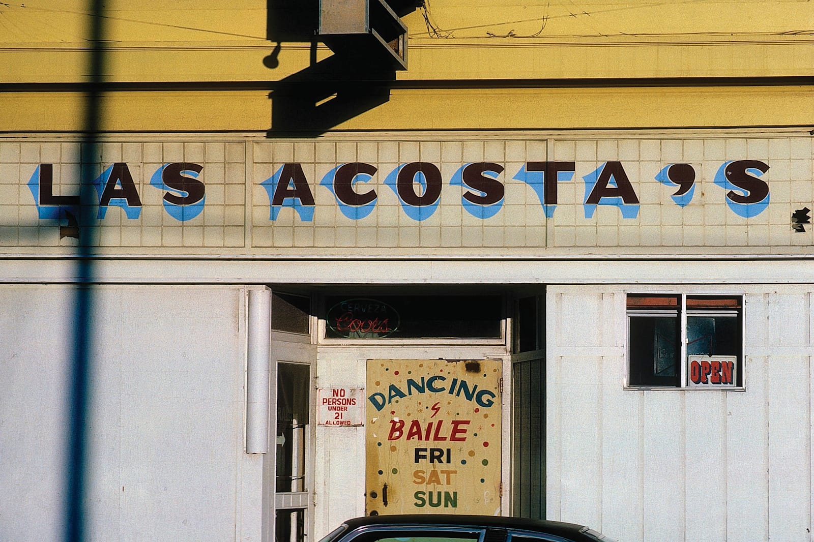
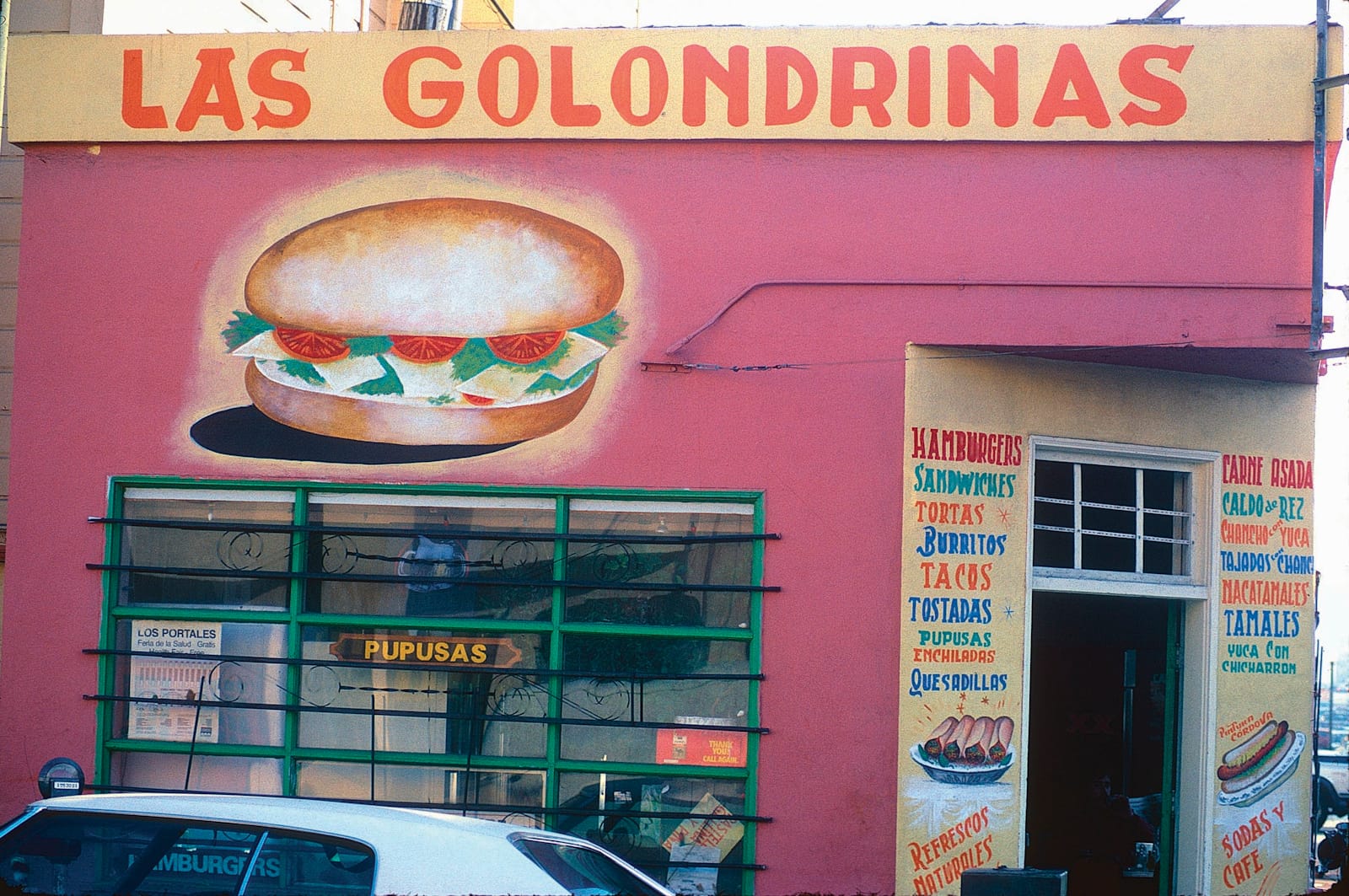
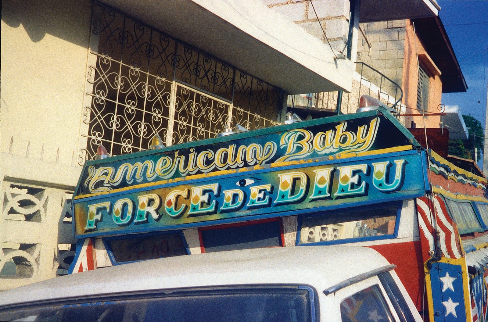
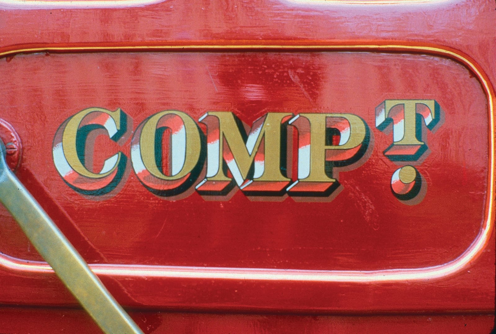
“Sans serif with very inventive shading, large apostrophe” in Oxnard, California, and, in San Francisco, 1985, “Las Golondrinas. Note ‘Detroit’ slab on first ‘A’ and different treatments of ‘S’ terminals, glowing torta.”
The manifold appearances and functions of signage is a fascinating study in itself. A stencilled sign in Rajasthan, for example, warns non-readers to beware of leopards, a painted one in Portugal reminds visitors that it is “forbidden to disturb the birds or plants, to use firearms, or to have any kind of fire”, while a placard in Point Reyes alerts park attendees that it is prohibited to collect elk antlers. The sublime and ridiculous, Johnston reminds us, are conjoined twins. The work partakes of semiology, the interpretation of signs being entirely cultural: a warning of double bumps in the road ahead, he points out, can be (mis)read as a ban on brassieres. But commonalities emerge from the evidence gathered here, too, in the talismata adorning modes of transportation from Indian commuter buses to the mudflaps of trucks in Sudan and Peru, the Haitian tap-tap, or well-used wooden fishing boats of the Congo.
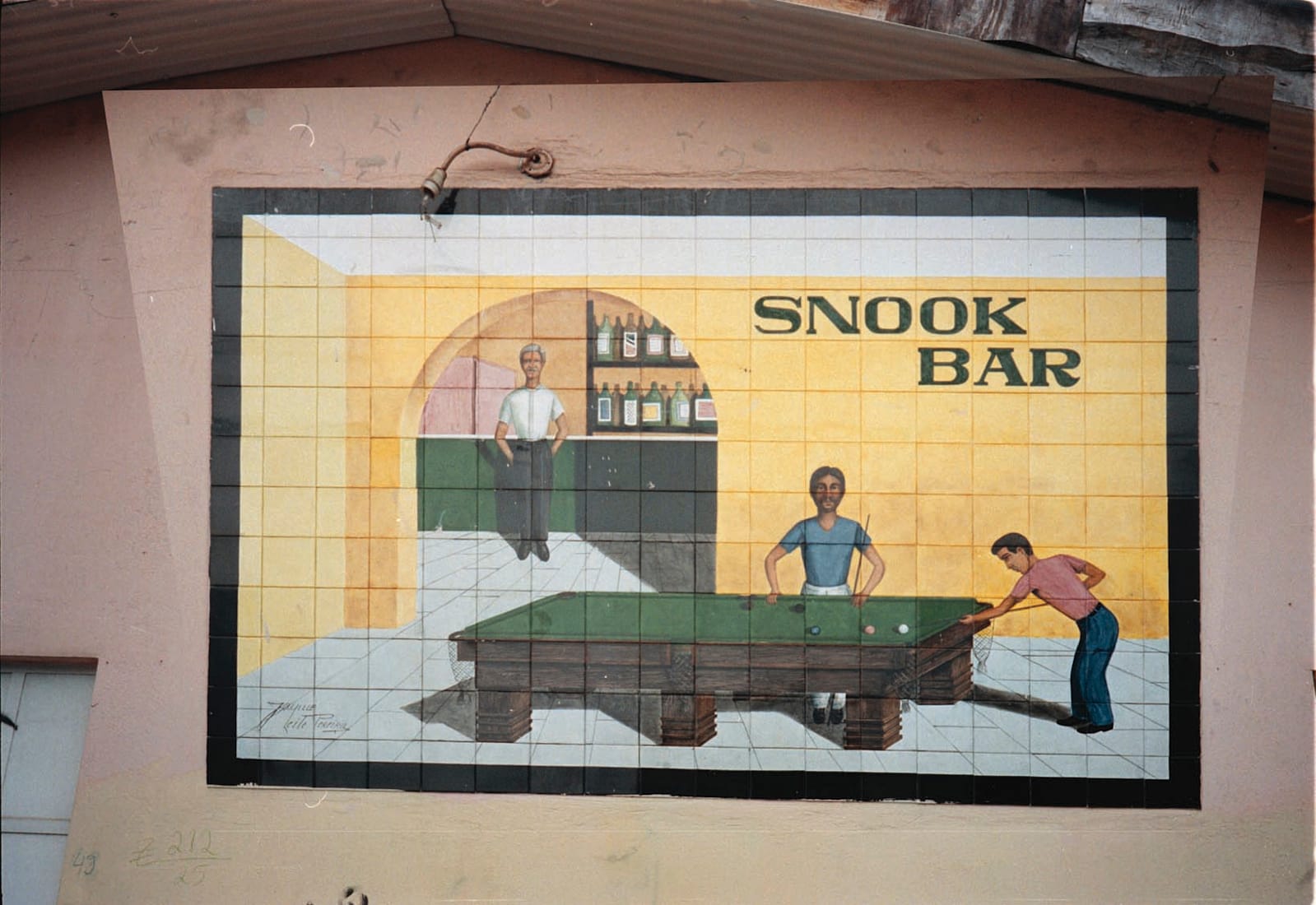
To quote Johnston, in turn quoting Zukofsky:
“In objects which men [sic] made and used, people live again. The touch of carving to the hand revivifies the hand that made it.”
Reviewed by Daniel Elkind
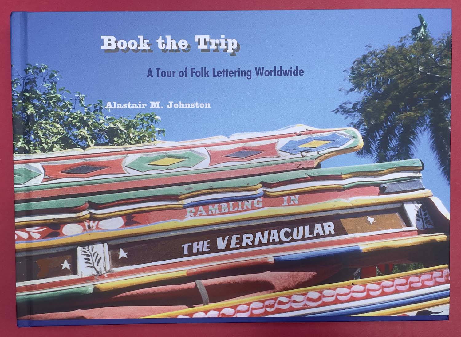
Book the Trip: A Tour of Folk Lettering Worldwide by Alastair M. Johnston is available exclusively via the Poltroon Press shop.
More Books
 Better Letters