Fascia Signs, Human-Made, at the Central Lettering Record
Alan Bartram’s words and photos extoll the importance of human connection in signs and lettering.

Fascia Lettering in the British Isles (1978) by Alan Bartram is one of a ‘trilogy’ of books, with the other two focused on street name lettering and tombstone lettering. It is presented as an extended essay, complemented by over 160 of Bartram’s photographs and his insightful commentary on the fascia signs they depict.
I frequently refer to the book, and the last time I pulled it from the shelf I was struck by a paragraph with a prescient message for our times. It accompanies the final featured sign which Bartram describes as “an amateurish effort” that is “wrong in the right way”. His remarks conclude with this expression of a central thesis within the book:
“We respond to it because it was so obviously done by a human being, with human weaknesses. The street feels a human place because of it. Lettering which is smoothly anonymous, without wit, imagination, personality or sensitivity, gives the impression of having been designed as well as made by machines. A street of such lettering is a hostile place.”
(Harry Leeson echoes that last sentence in his ‘Classifying Signs’ article.)
Bartram’s book can usually be found for sale on secondhand marketplaces and I highly recommend seeking it out. In the meantime, you can enjoy the following hand-painted and gilded fascia signs from inside, presented alongside Bartram’s comments.
L. Phipps
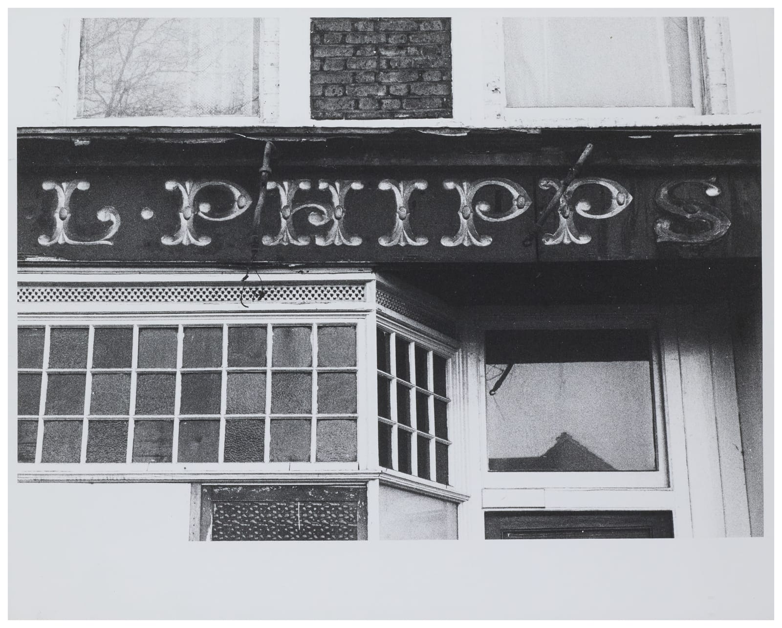
“[This example] of the gilded, V-cut, Victorian letter from Clissold Park, London, is a characteristically Victorian letter on a derelict shop; the original glass covering has been removed.”
In the book, the original photo is cropped to show just the part of the fascia sign that says L. Phipp, with the S dropped.
Gow’s Oyster Bar
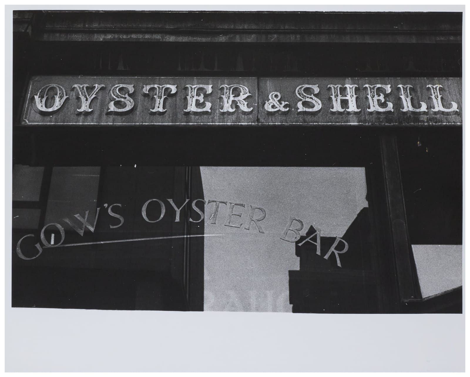
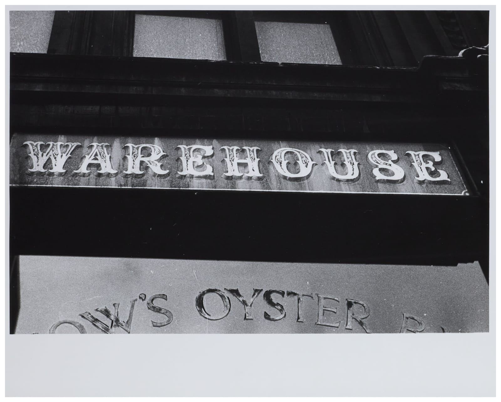
Photos: Alan Bartram / Central Lettering Record CLR.2023.150.M.1-3. Creative Commons License: Attribution-NonCommercial-NoDerivatives
“Characteristic Victorian work is shown [on these pictures] from Liverpool Street, London.”
Gow’s closed in 2019 and there is new signage for Honest Burger at the location. It appears that the gilded glass panels for Gow’s survive underneath this.
Hand-Painted Lettering
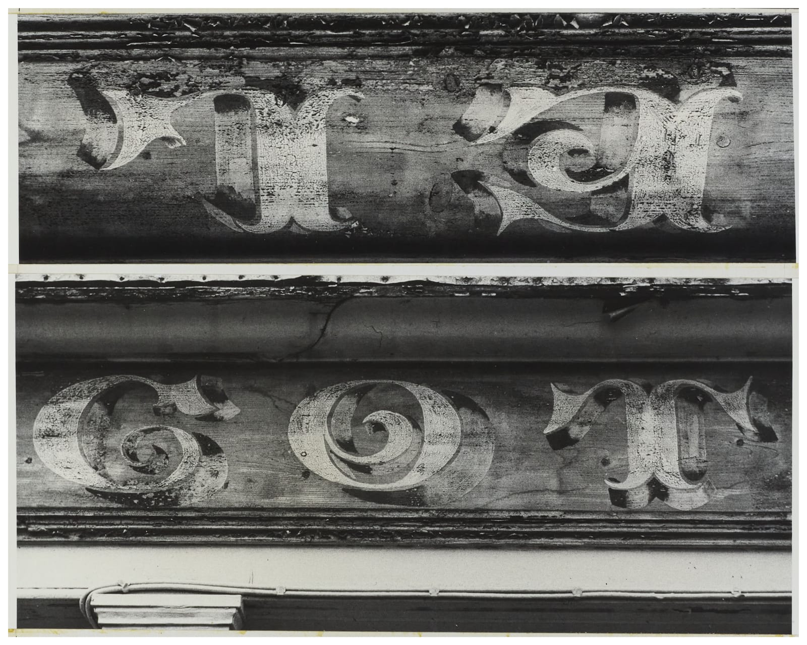
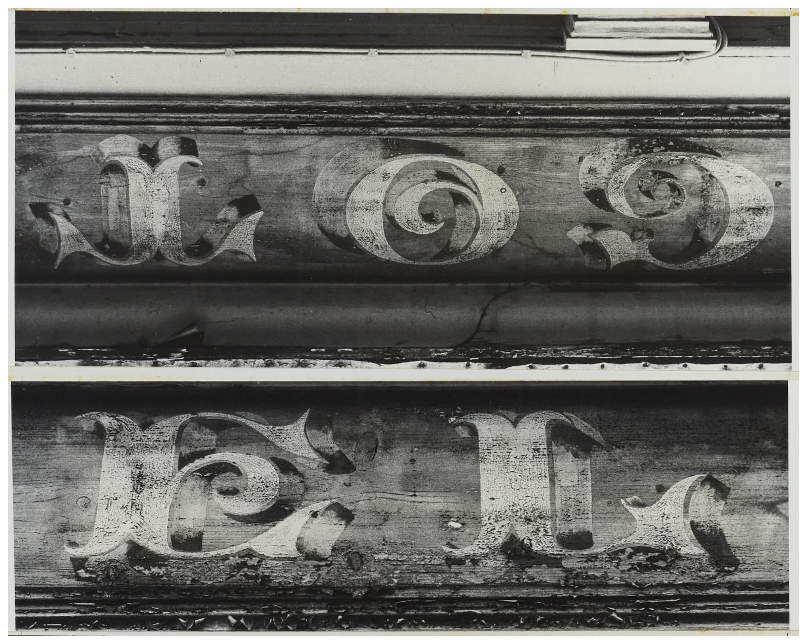
Photos: Alan Bartram / Central Lettering Record CLR.2023.842.M. Creative Commons License: Attribution-NonCommercial-NoDerivatives
“A superb decorative letter, on a wood fascia, could just be made out in 1976 at Westport, Co. Mayo, and it is probably clearer in the photographs than in reality.”
Volunteer Arms
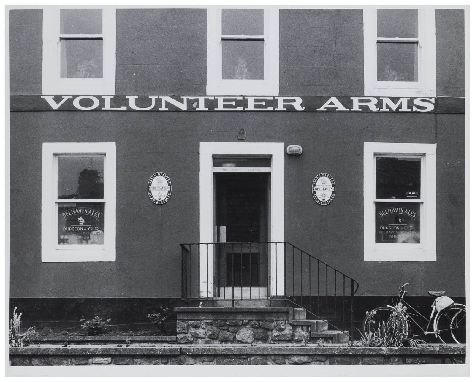
“A good expanded egyptian at Dunbar, East Lothian, is wittily used to fill the length of the narrow string course.”
West Country Shooting Ground
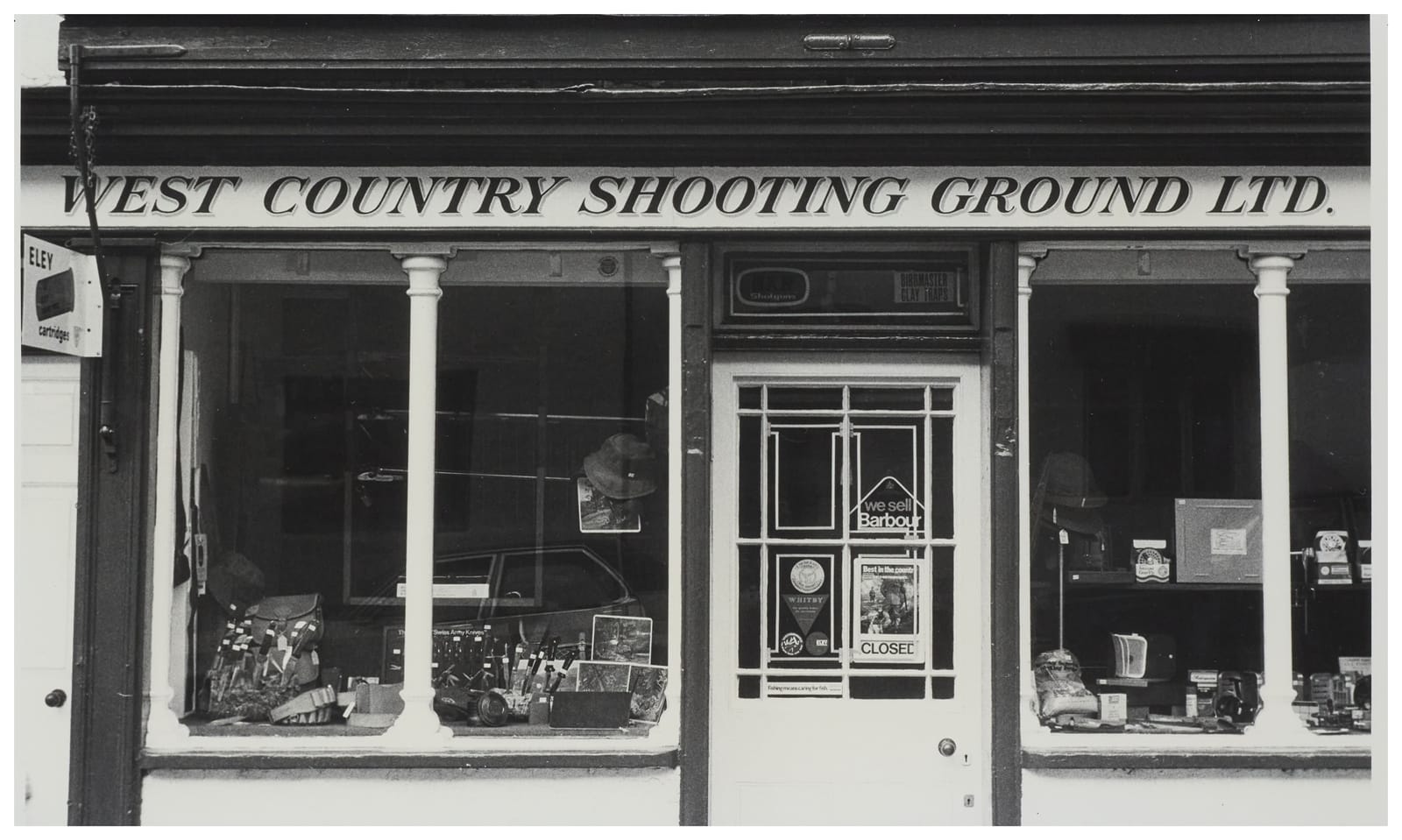
“The English vernacular letter, of which we saw an early example in [cross reference], is still much used. This italic version is at Dunster, Somerset. An unpretentious fascia in an Exmoor village, it is as good as anything of its kind.”
This is one of the signs that also appears in Bartram’s larger volume, The English Lettering Tradition from 1700 to the present day (1986), with its exposition of the “English vernacular” mentioned here.
The Crush Bar
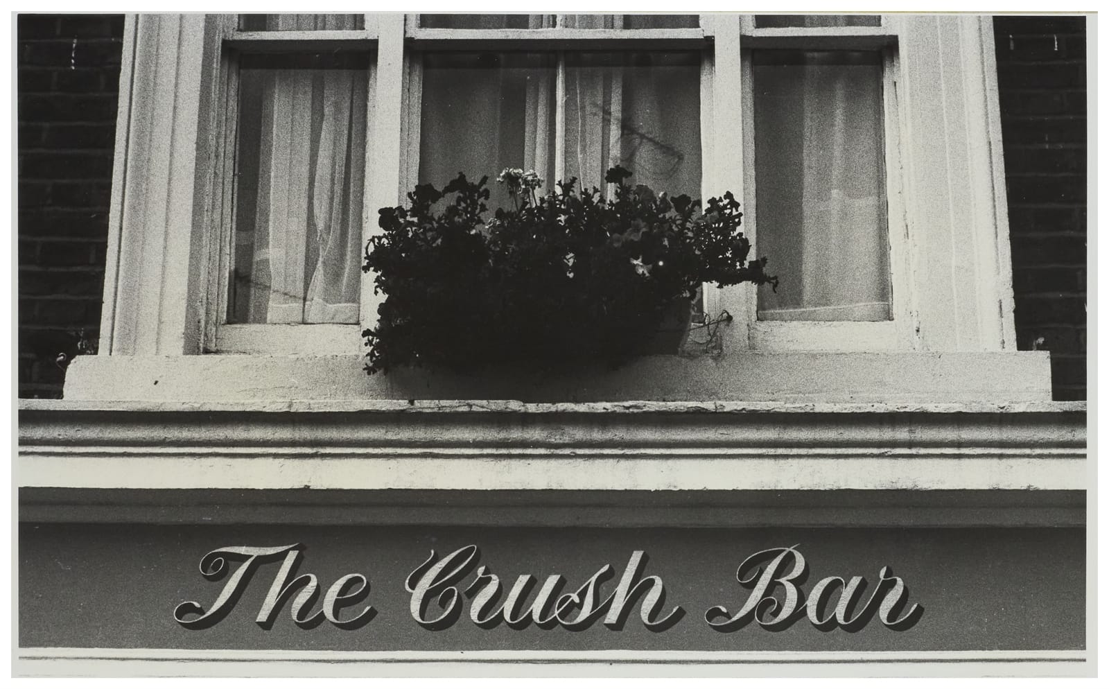
“The example at Notting Hill Gate, London, is an expertly executed form; and so it should be, since it is on a pub owned by a large brewery. But that, alas, is no longer a guarantee of quality.”
Railway Hotel
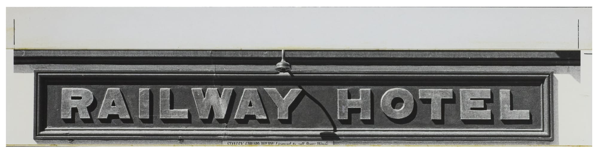
“A richly gilded, bold grotesque on a green background is used for a small pub at Liskeard, Cornwall.”
The Swan Inn
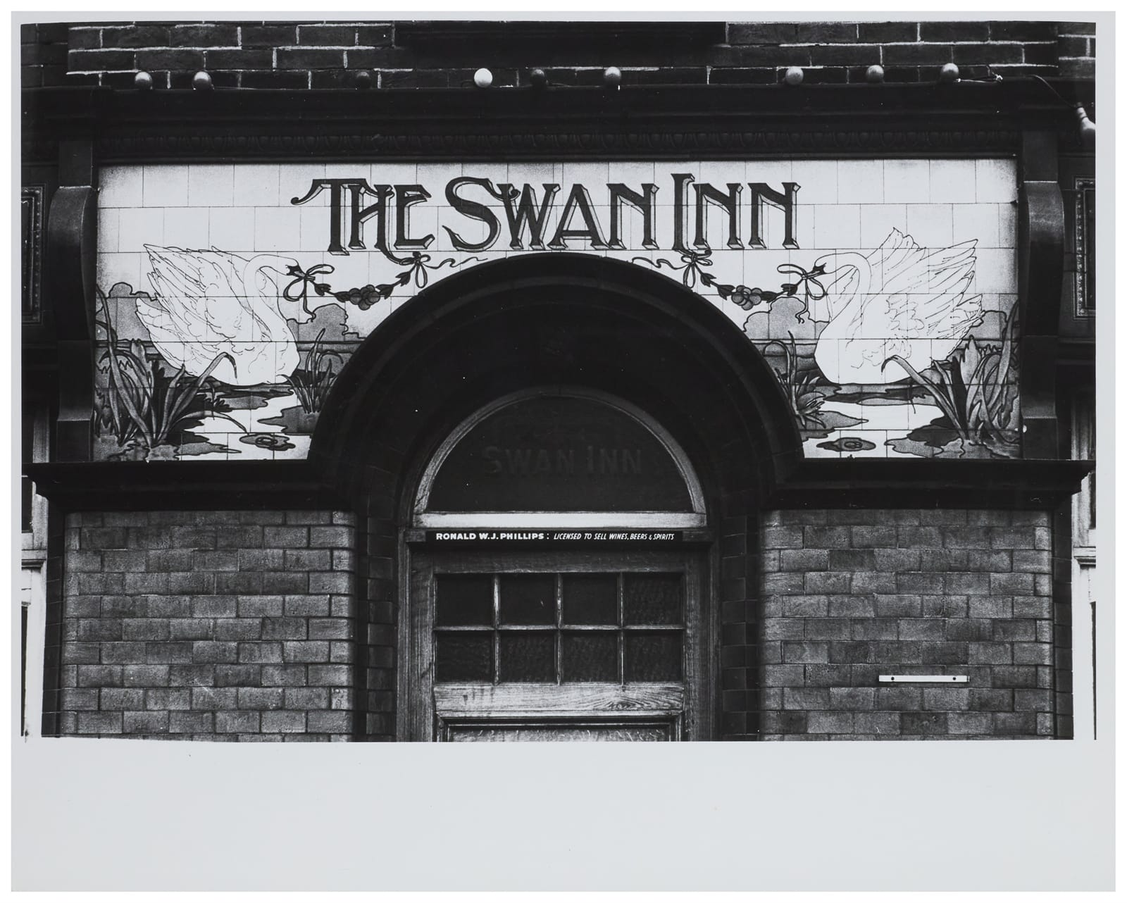
“Ceramics have been under-used for fascias. At Poole, Dorset, coloured tiles form name and traditional inn-sign in one panel.”
This sign is still in-situ, and the colours can be seen here on streetview.
W.J. Townsend and Sowerbutts
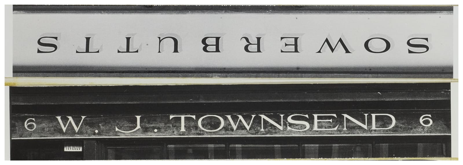
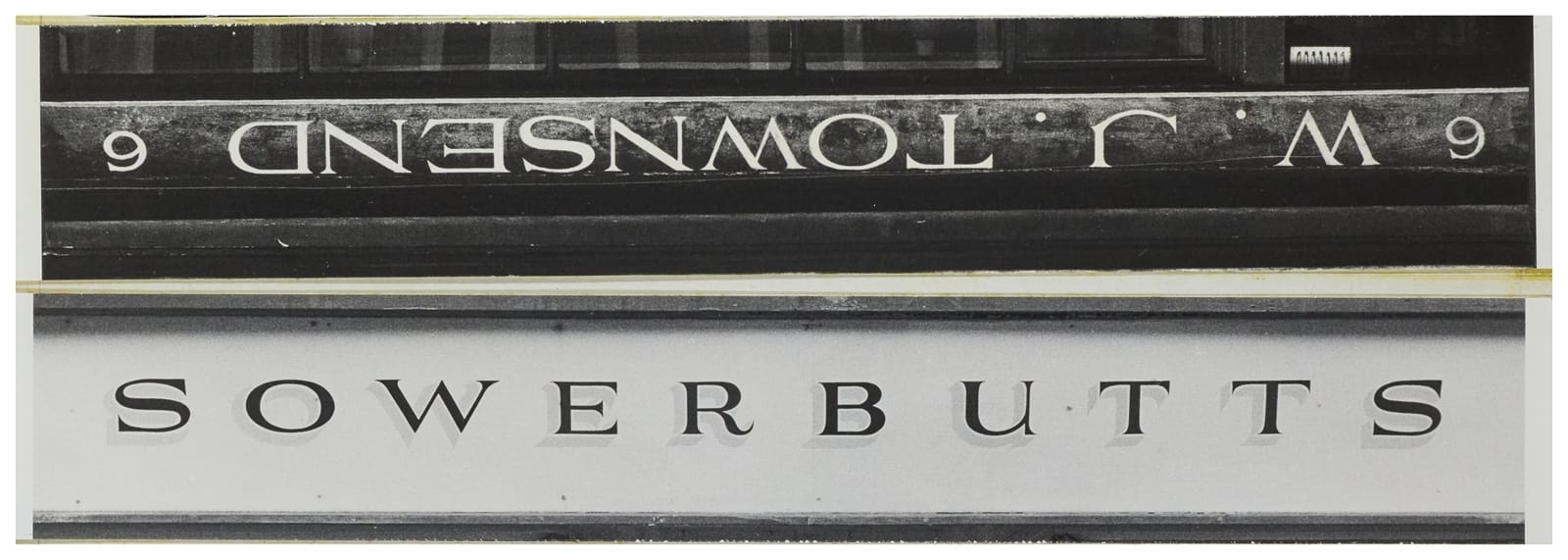
Photos: Alan Bartram / Central Lettering Record CLR.2023.187.M. Creative Commons License: Attribution-NonCommercial-NoDerivatives
“Another antique dealer [W.J. Townsend] at Knightsbridge, London, has a more assured and nearly as sensitive a letter; a shadowed variant can be seen over a shoe shop [Sowerbutts] at Clitheroe, Lancashire.”
These two fascias are at the beginning of the section dedicated to signwritten lettering. Here, Bartram talks again about human- versus machine-made in the following terms:
“Everyday jokes about computers taking over, ha, ha, reveal a deep-rooted uneasiness. Any evidence that man [sic] is still around, a man, using his own hands, employing his own skills on materials provided by nature, is greeted — probably often unconsciously — with relief. Without machines, we would be in a pretty pickle. But human nature, like nature itself, has its own needs, which cannot be tampered with or trampled upon with impunity.”
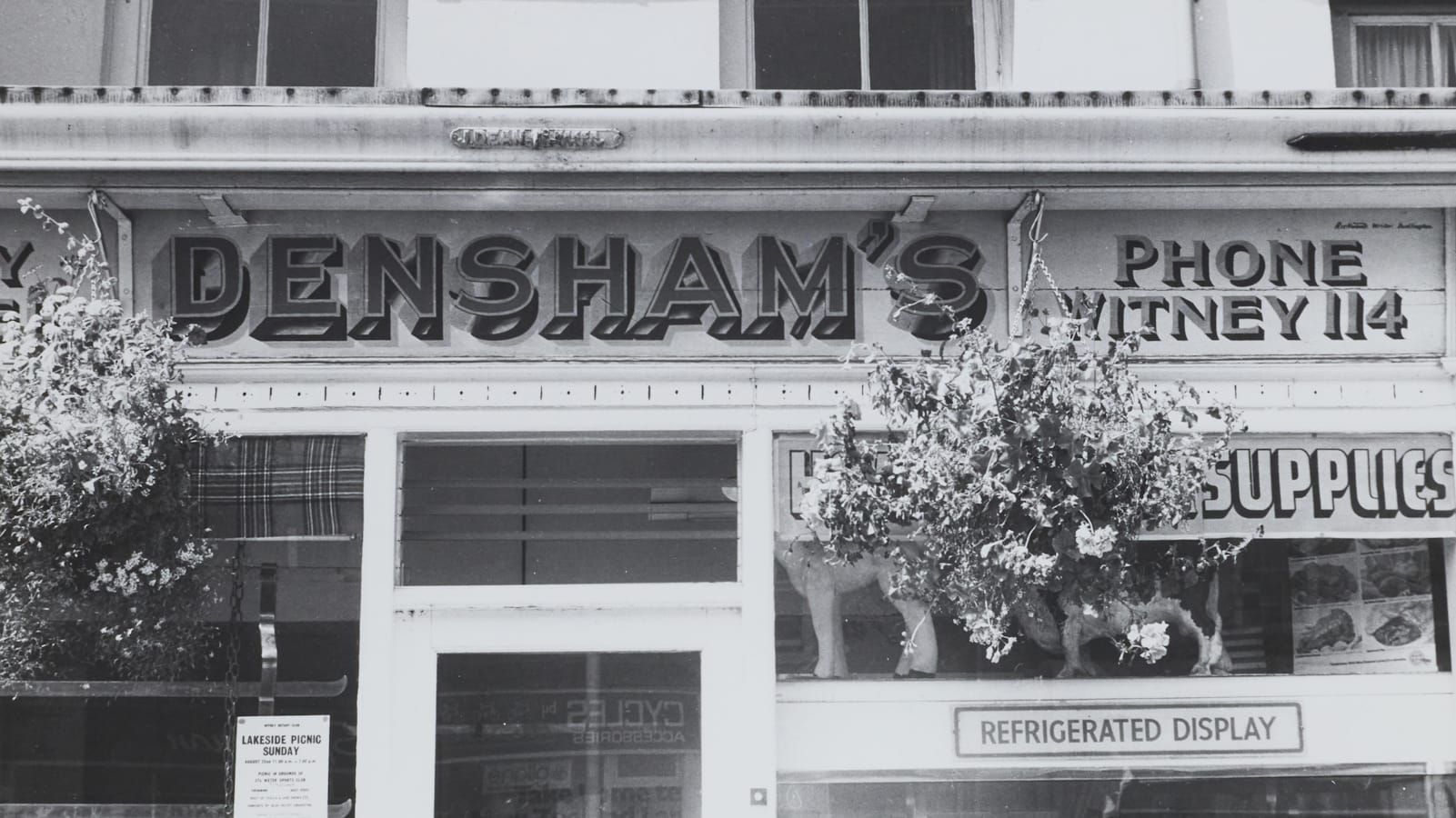
Densham’s
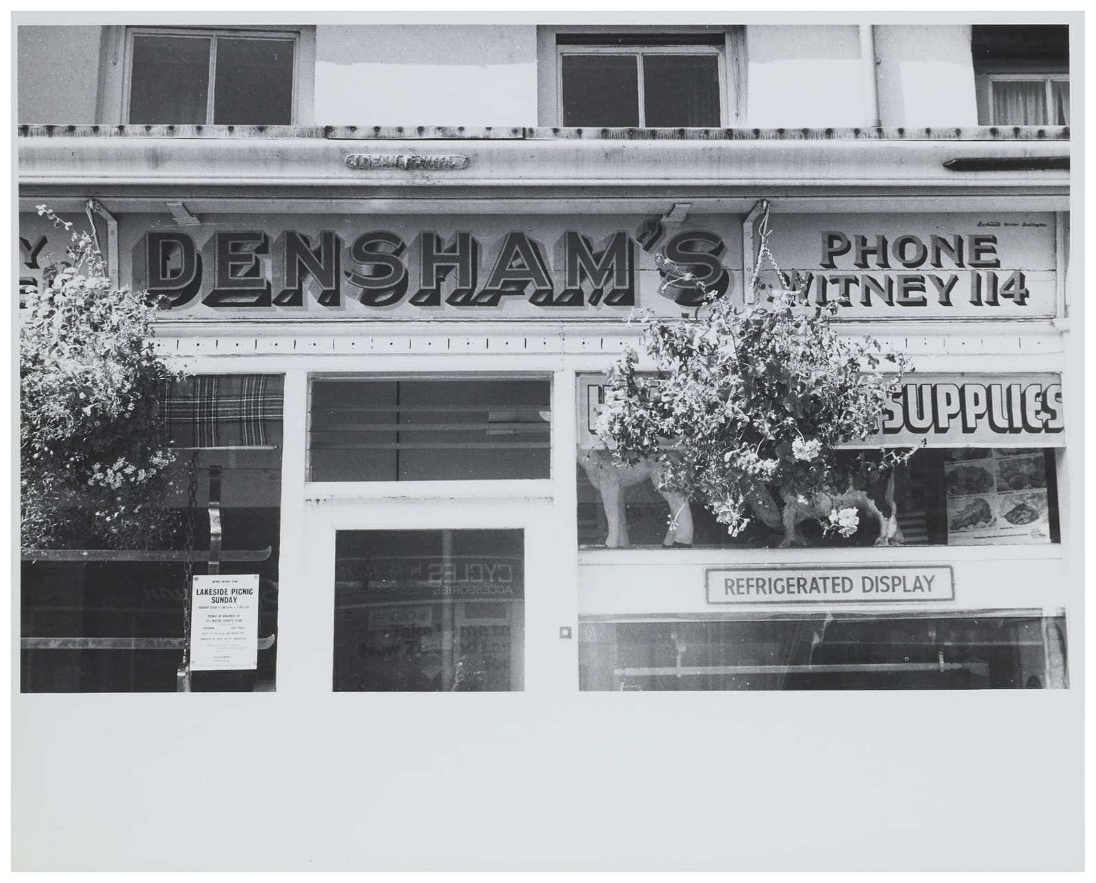
“A prettily painted butcher’s shop at Witney, Oxfordshire, is given additional attraction by hanging bunches of plants; the letters have two ‘cast’ shadows each, as well as lots of reflected light in the painted returns.”
Penicuik Cooperative Association
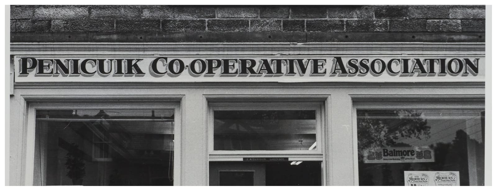
“Another shadowed letter with carefully painted returns can be seen at West Linton, Peebleshire — a small village with many good fascias. Glossily-painted wood against a hard rough stone.”
This commentary also refers to a second sign (for a drapery) that’s in the book but isn’t currently documented in the online archive.
Ayton Post Office
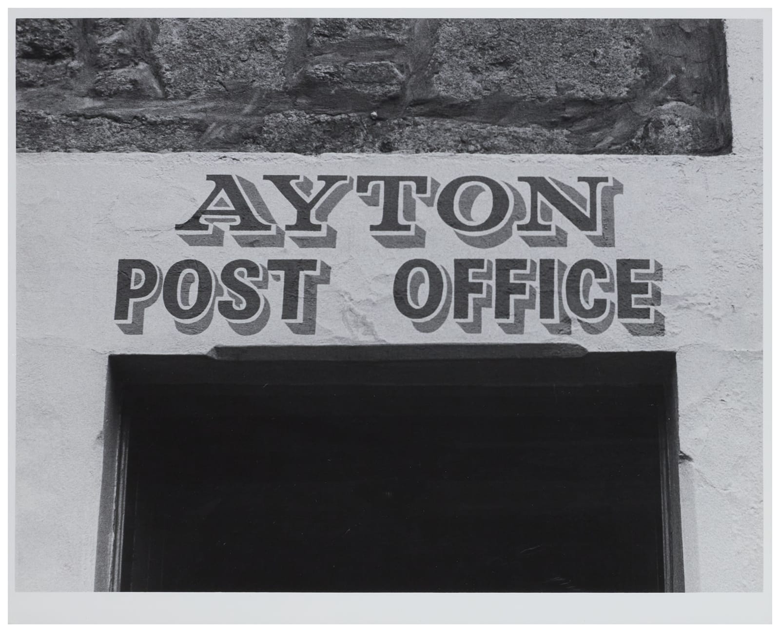
“Post offices in cities should look briskly efficient and anonymous; but this one at Ayton, Berwickshire, exactly captures the correct mood for a village post office. Well maintained, well painted directly onto the stone, a pleasing choice of letterforms showing evidence of a freely-used skill; this is where you keep up with all the village gossip.”
Margaret Walsh
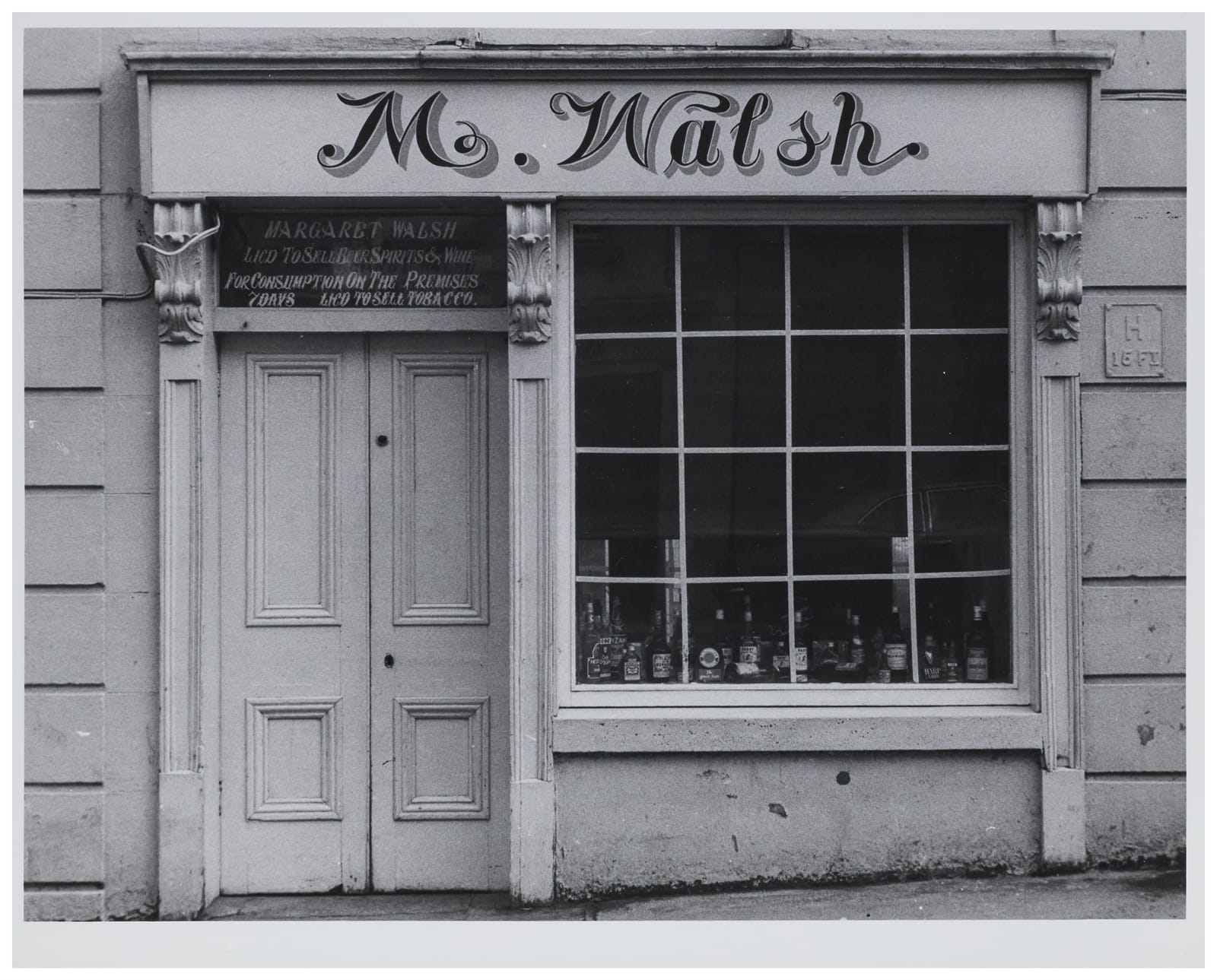
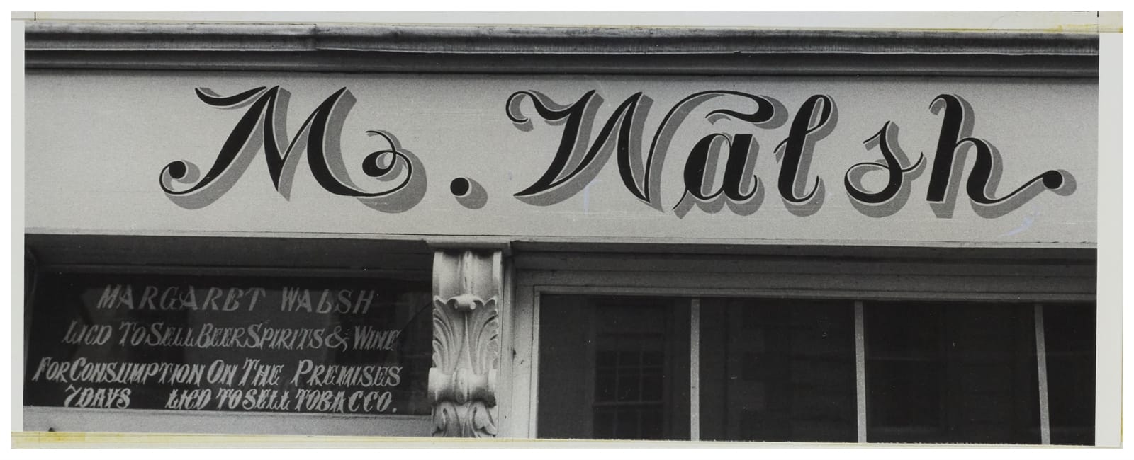
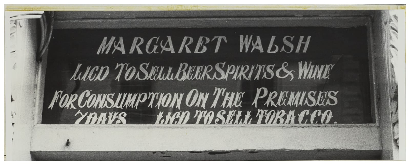
Photos: Alan Bartram / Central Lettering Record CLR.2023.851.M.1-3. Creative Commons License: Attribution-NonCommercial-NoDerivatives
“Some distraught letters at Westport, Co. Mayo, have been done with great abandon; and the bar’s licensing notice is a freely-drawn italic whose serifs and forms derive directly from the way the letters are quickly brushed in.”
The Jackdaw
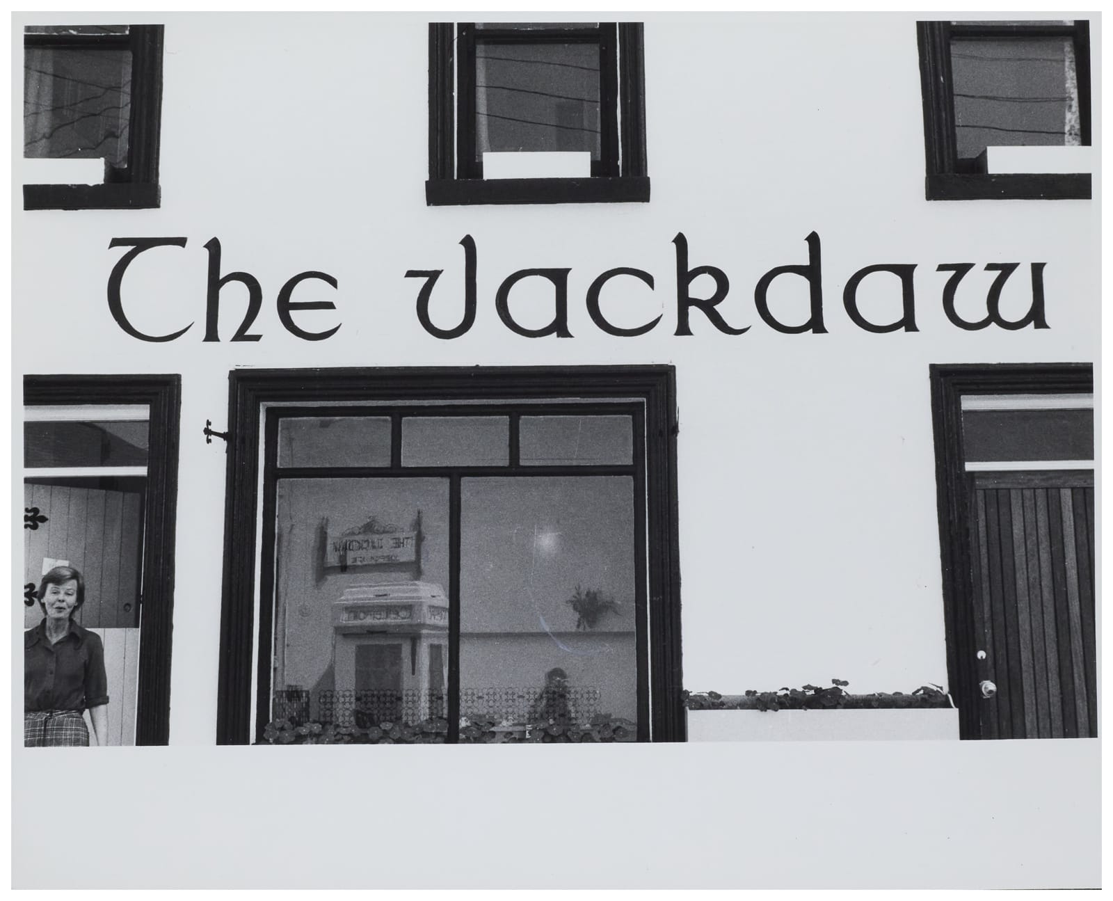
“‘Why are you photographing my house?’ she is asking. Because of the nice lettering. Irish half-uncials, more or less, at Cong, Co. Mayo.”
There’s also a glimpse of Bartram taking the photo.
Miley
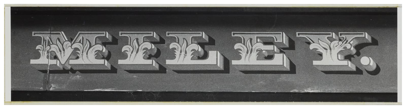
In the book, this one is presented alongside another part of the name (James) from the same bar. Similarities in the letterforms and decorative details are used to conclude that the work is by the same sign painter as another fascia on the same page. The other two images are not currently in the online archive.
Signs and Humanity
On the last page of the book, Bartram talks about the warmth of hand-made signage, its innate humanity, and its links to nature. From this, he concludes that:
“The more inhuman (or should I say unnatural?) we make our surroundings, the more inhuman (or unnatural) we become. Caring about such trivialities as the character of lettering on shopfronts would mean we care about bigger and more momentous things too. Or so I believe.”
Hear hear.
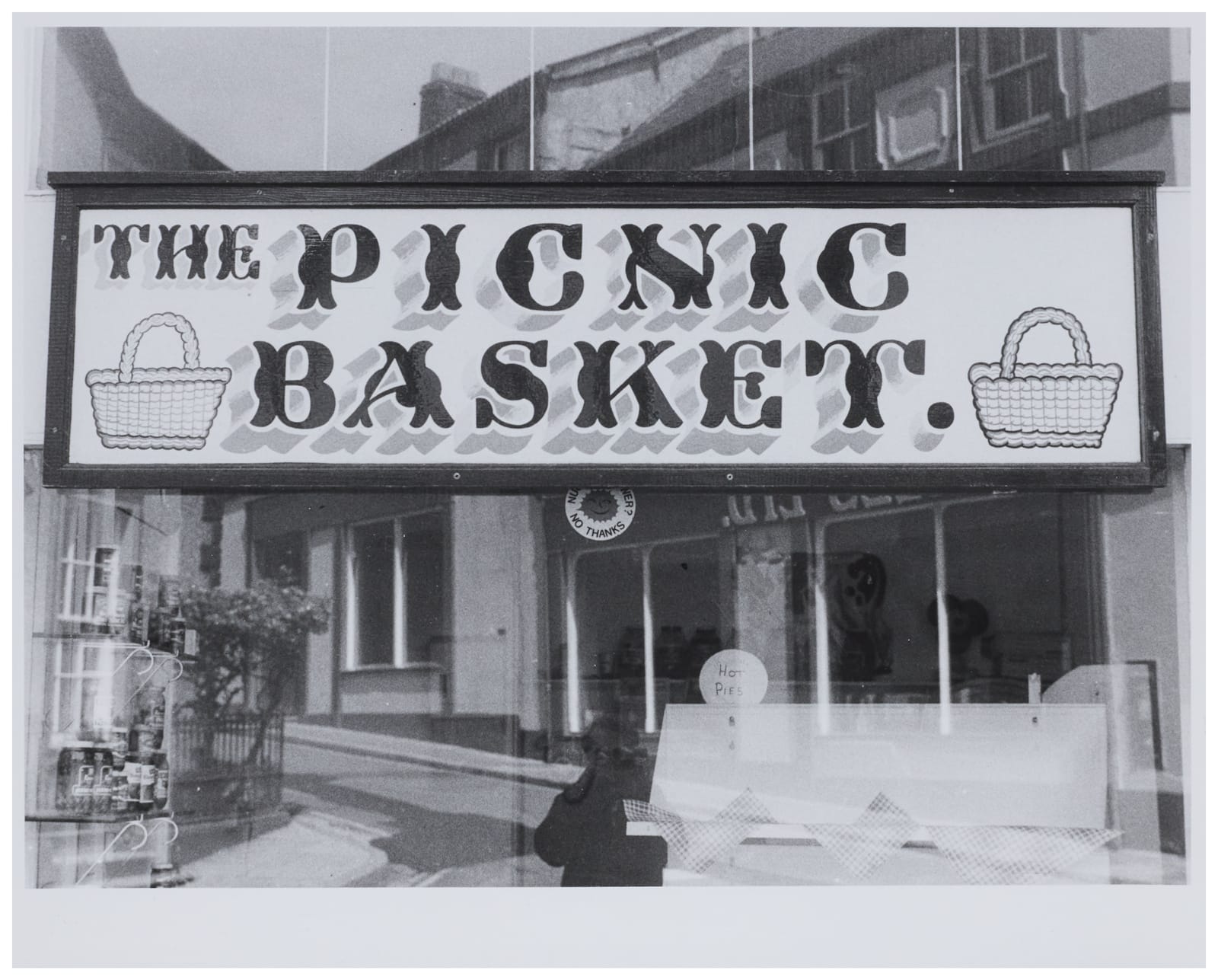
All of these images are taken from the collection of Alan Bartram’s photography in the online archive at Central Saint Martins. There is an extended introduction to the collection here.
Pictured is a sign in a window in Ulverston, Cumbria, for The Picnic Basket. It is unmistakably the work of William Gilpin but doesn’t feature in the Fascia Lettering in the British Isles book.