What's Inside Issue 05 of BLAG (Better Letters Magazine)?
Between the covers of the adventures in sign painting from Issue 05 of BLAG (Better Letters Magazine)
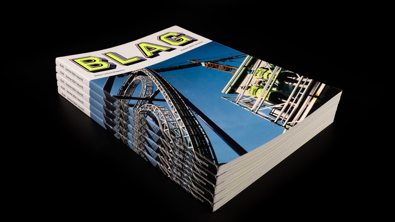
The fifth installment of our adventures in sign painting craft, community, and culture is out now. Inside you'll find work and contributions from 19 countries spanning five continents. Read on for an appetiser...
BLAG 05 is sold out in hard copy but members can read it online via the back issues page. Check the BLAG shop for other back issues.
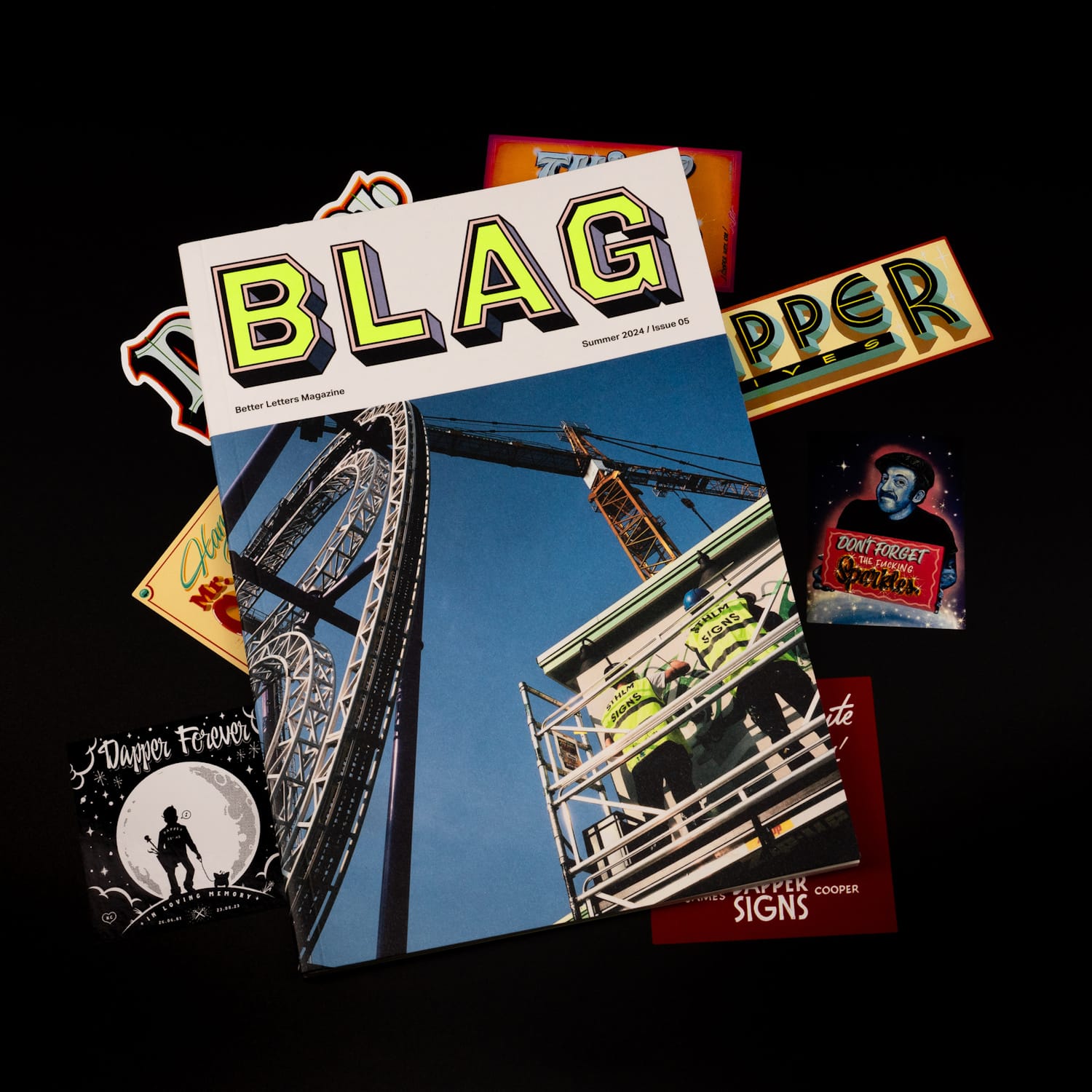
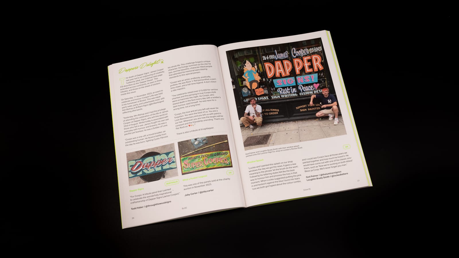
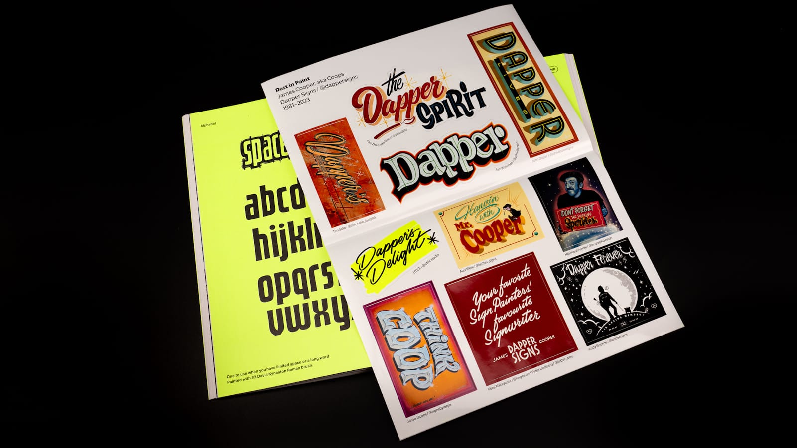
The magazine's 80 pages are once again completely free of advertising, thanks to members around the world 😃. Then, sandwiched in the alphabetic centre spread, is our first ever BLAG sticker sheet. This is an extension of the 'On the Brush' section, which is given over to work produced in honour of Dapper Signs' James Cooper.
BLAG in print ships exclusively to members worldwide twice each year. Join today to get your first copy sent straight away.
BLAG Meet: Inside Issue 05
BLAG Meet is a free, online event that provides an opportunity to meet contributors to each issue. Here are the recordings from BLAG Meet: Inside Issue 05.
BLAG 05 Digital Companion
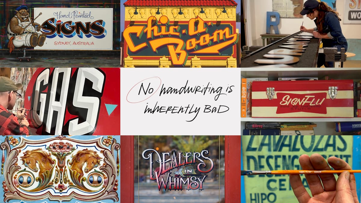
Members can also access dozens of extra pictures, videos, hot links, and PDFs in the BLAG 05 digital companion.
On the Cover
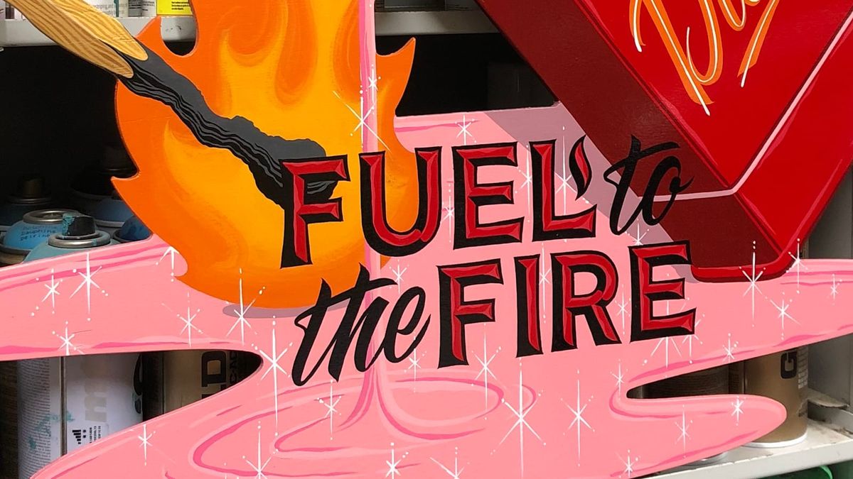
The cover photo comes from the feature on Sthlm Signs' work for the Gröna Lund theme park in Stockholm, Sweden. In the picture they're wearing hi-viz jackets, which inspired the designers at UTILE to suggest a fluorescent spot colour for the BLAG logotype.
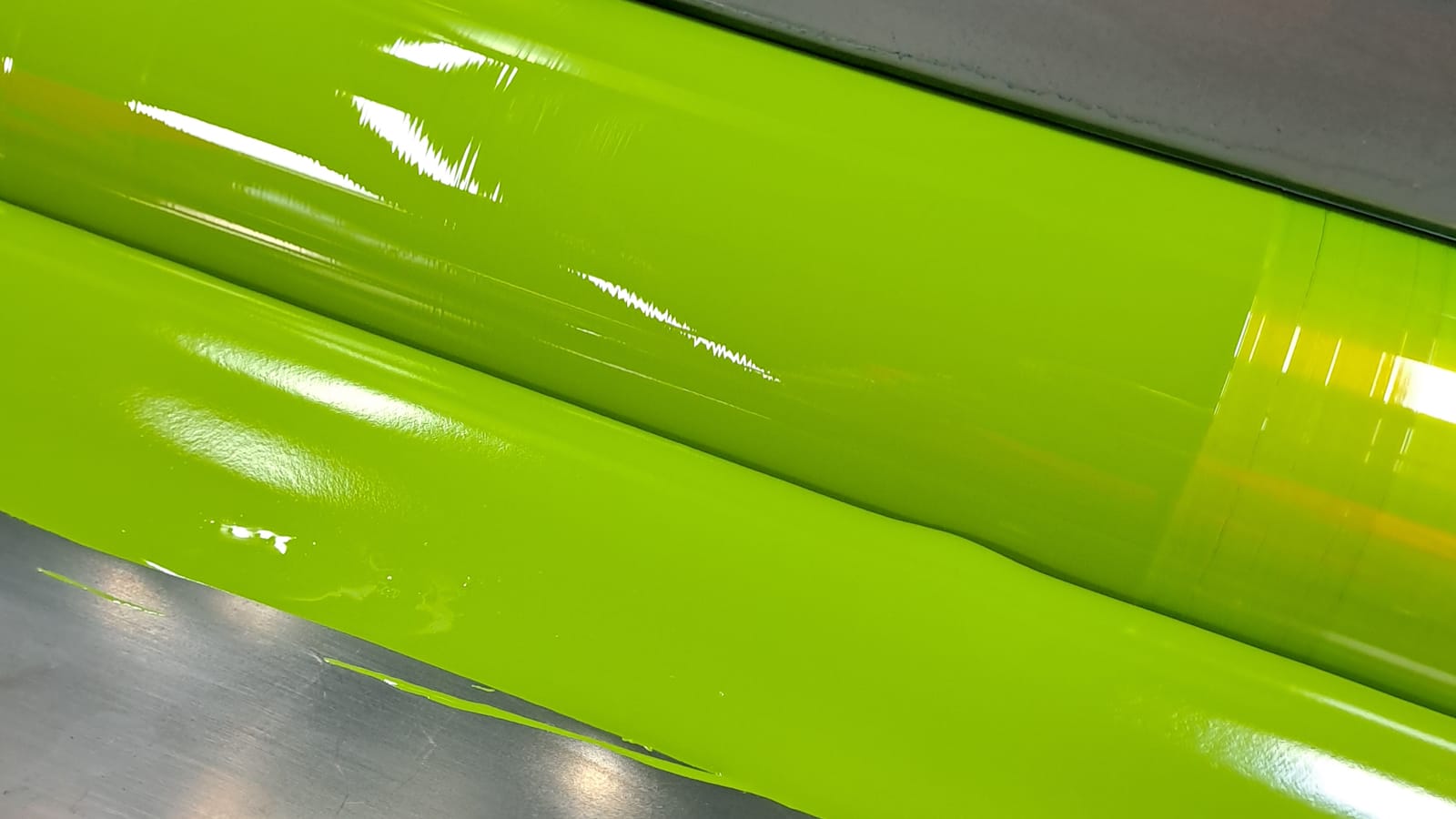
The magazine is printed with offset lithography in CMYK, so adding the fluorescent ink involved creating a fifth printing plate. The ink was also used for the inside covers, the alphabet pages in the centre, and, with a touch of blue added, the headers and location lozenges.
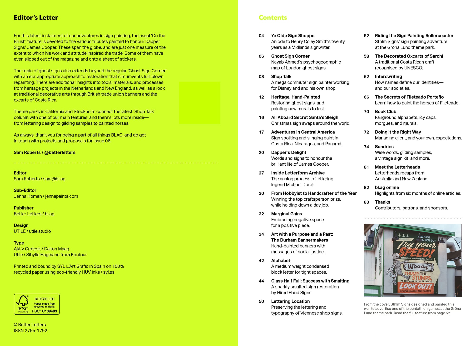
Contents
The absence of advertising inside the magazine means that all 80 pages are packed with what we're all here for: the sign painting. From the longer features, to the tidbits in the 'Sundries' section, this content is intended to inform and inspire in equal measure, with a few pleasant surprises along the way.
Before getting deeper into it, I'd like to thank our wonderful sponsors, whose support is a big part of making BLAG what it is:
And to give a big shout out to BLAG's patrons: Blackout Signs & Metalworks; Chicago Sign Systems; Colossal Media; Dragging the Line; John Moran; Right Way Signs; Romana Schrift; Sepp Leaf Products; Skiltmaler Gundersen; Through the Wood Signs; and W&B Gold Leaf.
Projects
There's a heritage thread running through some of the projects profiled in BLAG 05. These include a series of Jenever (Dutch gin) murals in the city of Schiedam, the process of creating a smalted sign in Greenfield, Massachusetts, and a sensitive ghost sign restoration in Gloucester.
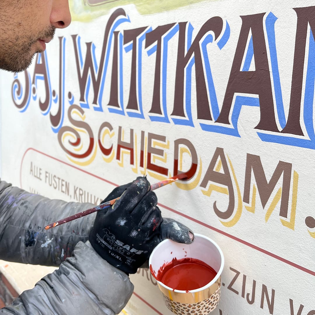
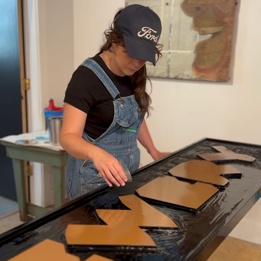
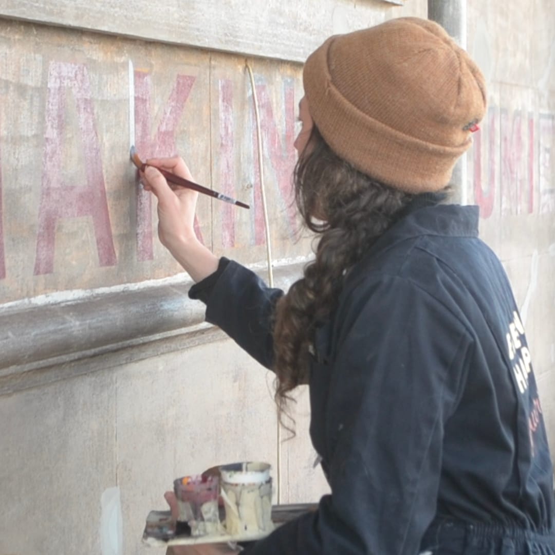
Heritage hand-painted, and smalted, in the Netherlands, USA, and UK.
In the piece about Sthlm Signs' work for the Gröna Lund, the duo running the shop share some of the individual projects they've delivered for this client over the years. And the issue's 'Shop Talk' with Derek McDonald similarly includes details of work that he's done in his vintage style. Derek also contrasts the experience of working for his own Golden West Signs shop with the day job at Disneyland.
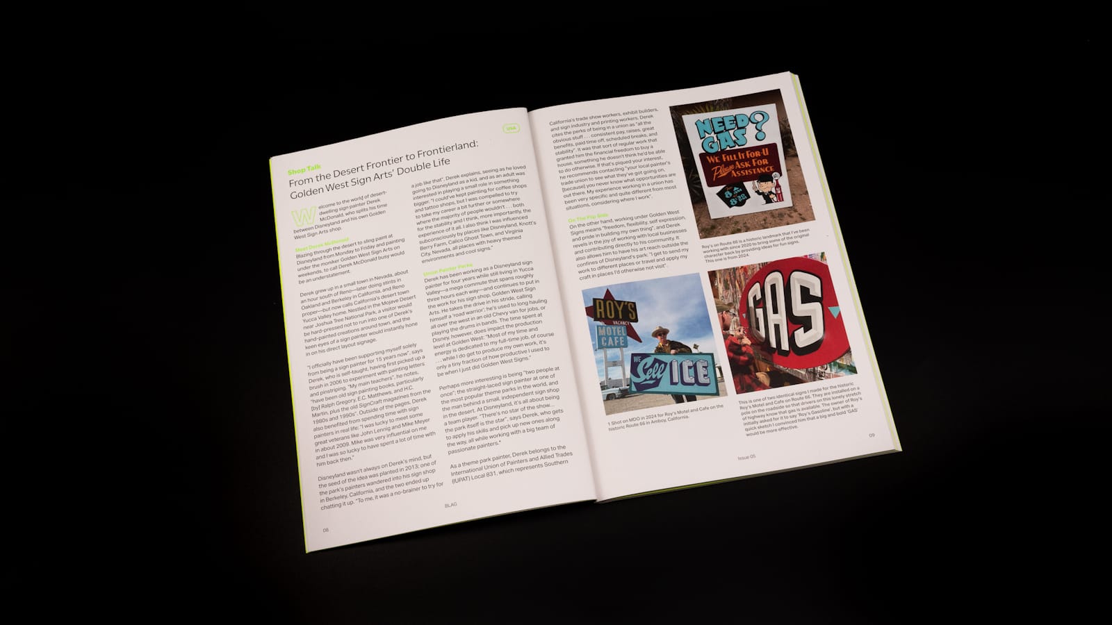
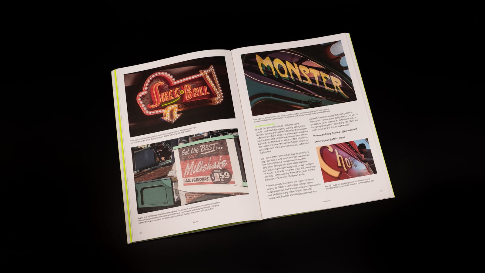
'Shop Talk' with Derek McDonald, and projects for Gröna Lund by Sthlm Signs.
Other projects include a sampling of work done for last year's Secret Santa (see Tozer Signs' BLAG Meet presentation), ghost signs in print for 'Ghost Sign Corner', and two huge pieces of lettering and typography best viewed from the air.
Learning Lessons
The three heritage projects above all have practical guidance within their stories, and BLAG 05 then contains lessons on margins, managing client expectations, and painting the horses of Fileteado. There are also wise words from the brush of Hélène Valverde, complemented by the latest BLAG cartoon.
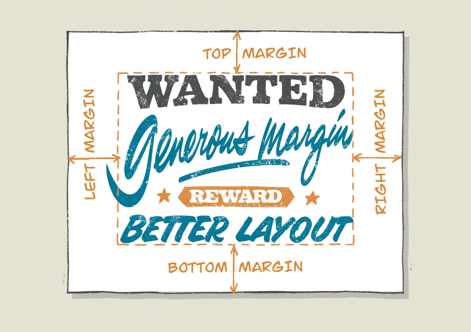
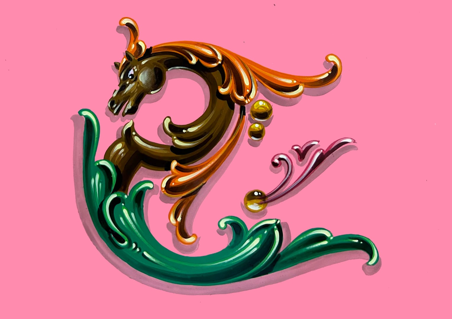
Erwin Indrawan shares his tips on using margins and Gustavo Ferrari introduces us to the horses of Fileteado Porteño.
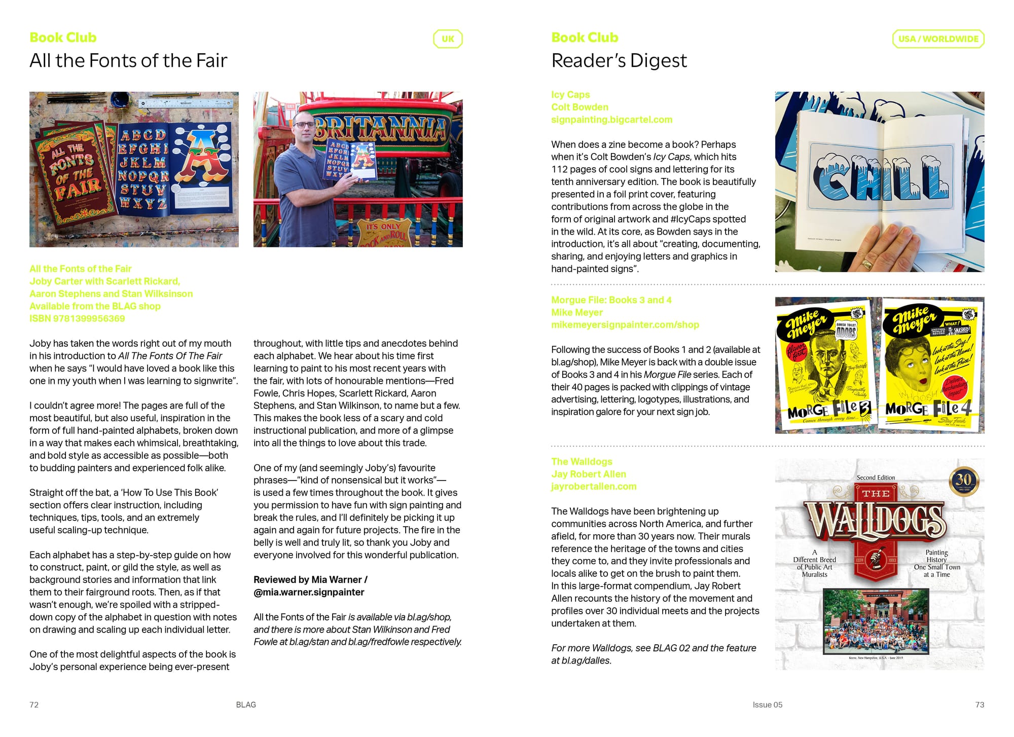
In the 'Book Club', Mia Warner reviews Joby Carter's latest offering, All the Fonts of the Fair, and there's plenty of 'Reader's Digest' inspiration in the form of Icy Caps, Morgue Files, and The Walldogs.
Living Traditions
One of things I love about working on BLAG is what people share in response to stuff that I've published. After reading the story of Costa Rica's Mr Masking, Juliana González-Bolaños got in touch from San Jose to tell me about the country's tradition of Carretas (decorated ox carts). Their story, and that of the practising decroative artist Don Luis, is told in BLAG 05.
Another tradition that continues to this day is the painting of trade union banners, and the Durham Bannermakers are at the forefront of this work. Emma Shankland leads the team there and shares the story of the firm, and its place within the wider heritage of this artform.
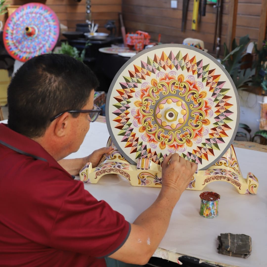
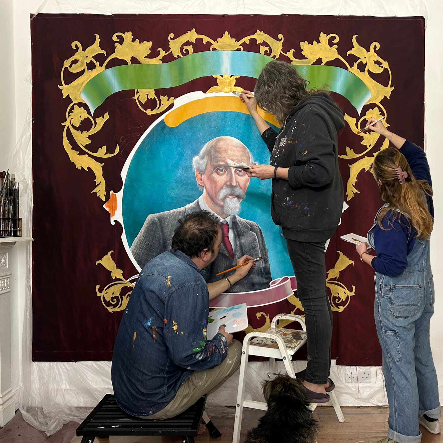
Don Luis working in the estilo Sarchí (Sarchí style), and team Durham Bannermakers in action in their studio.
The Place(s) to Be
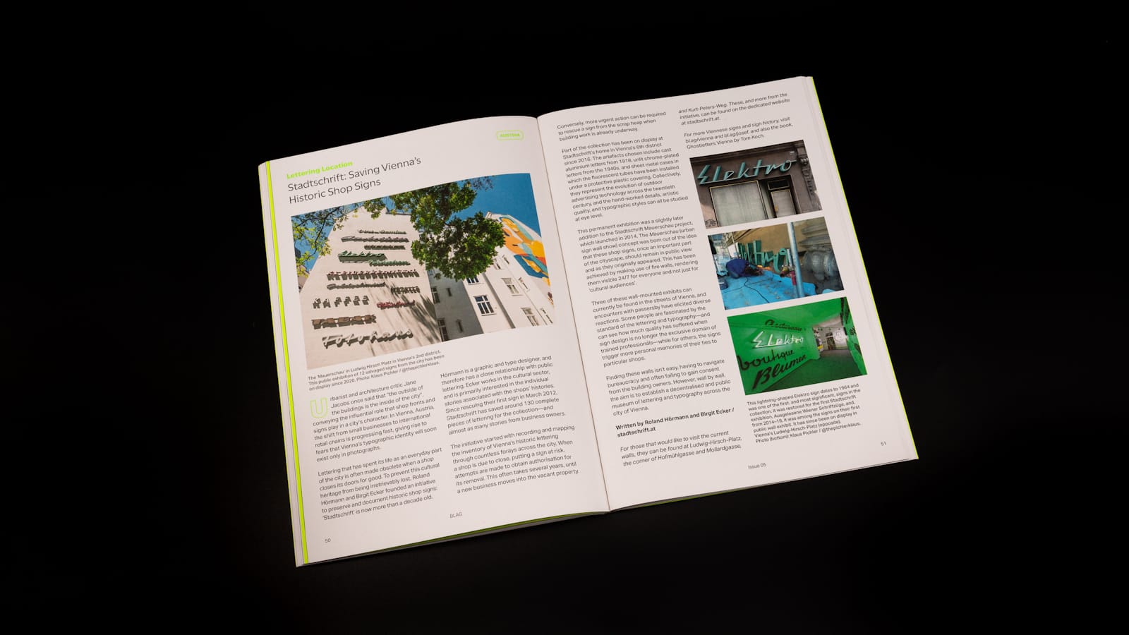
BLAG 05's 'Lettering Location' is Vienna, Austria, and Stadtschrift's public displays of rescued shop signs.
There's also a taste of the action from the latest Letterheads meets in Australia and New Zealand, and Daniel Esteve Carbonell is our guide as we pedal past some of the hand-painted signs of Costa Rica, Nicaragua, and Panamá.
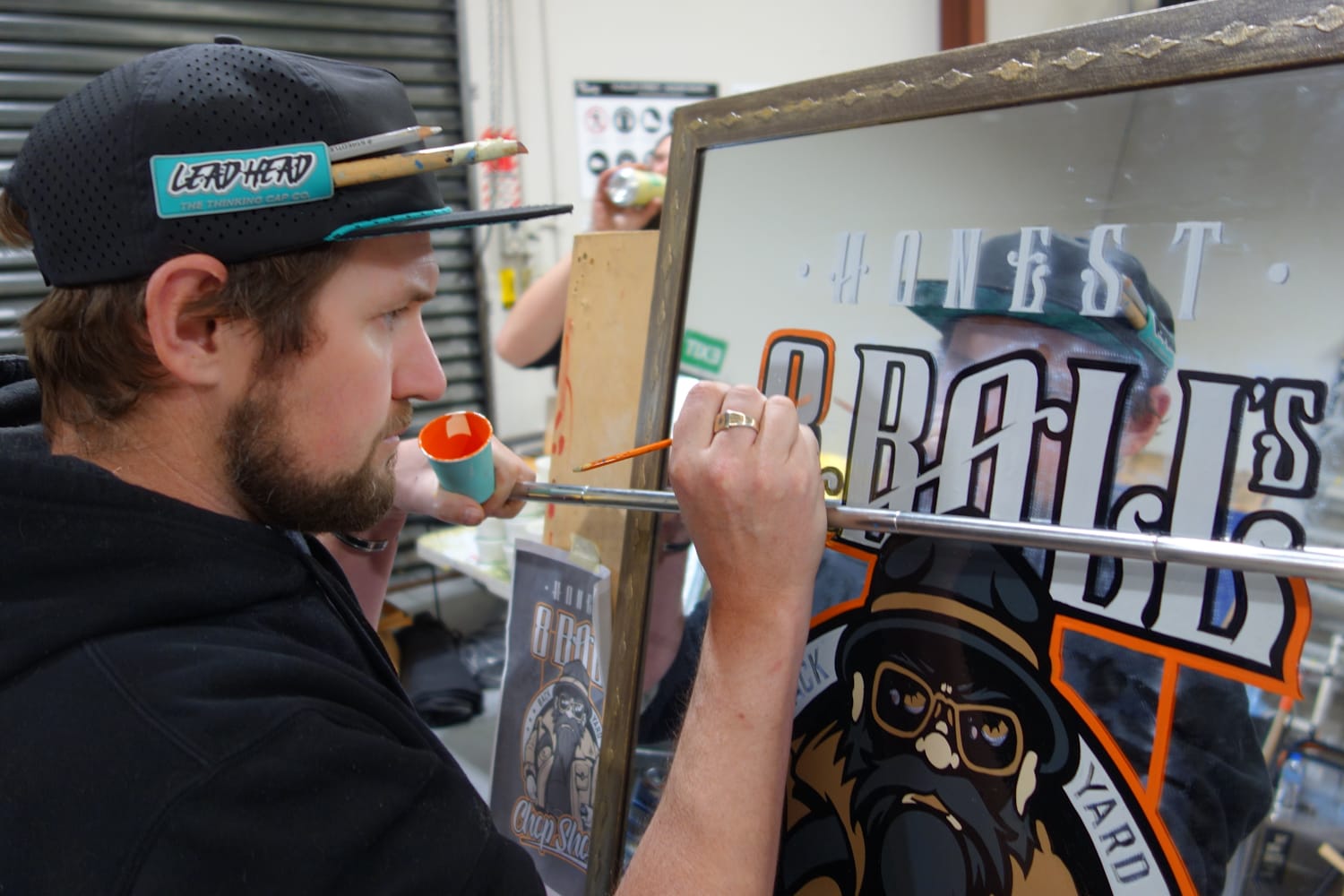
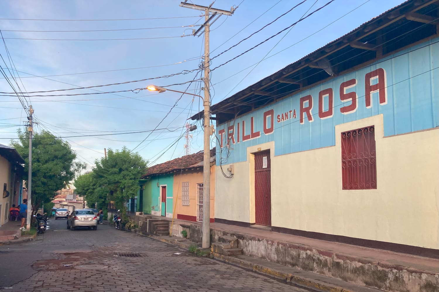
New Zealand Letterheads in full swing, and a taste of the sign scene in Granada, Nicaragua.
Letter Folk
For our regular 'Ye Olde Sign Shoppe' we hear the story of the Midlands sign painter Harry Coley-Smith, as told by his son Michael, while Alice Mazzilli's latest 'Interowriting' column looks at names, naming, and their written manifestations over time.
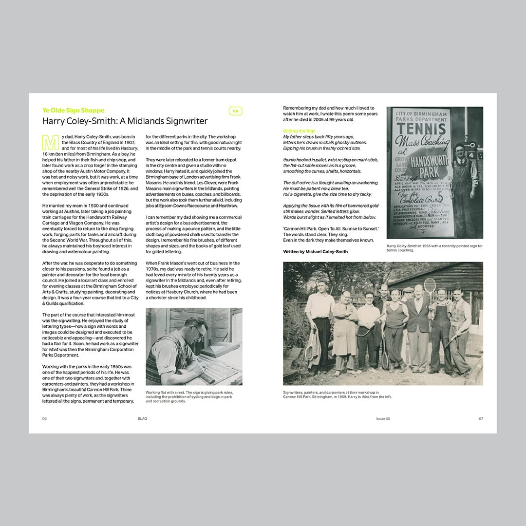
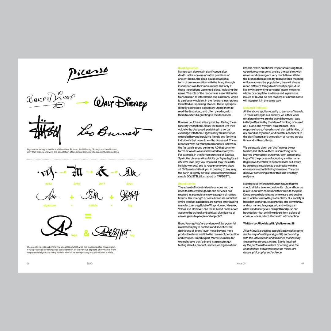
Harry Coley-Smith is the star of the latest 'Ye Olde Sign Shoppe', while Alice Mazzilli asks what's in a name?
There are contributions from two original Letterheads, with Noel B. Weber looking back at one of his first ever signs (without rose-tinted glasses), and Mark Oatis sharing a recent spelling mistake, in addition to his case of beautiful glass gilding samples.
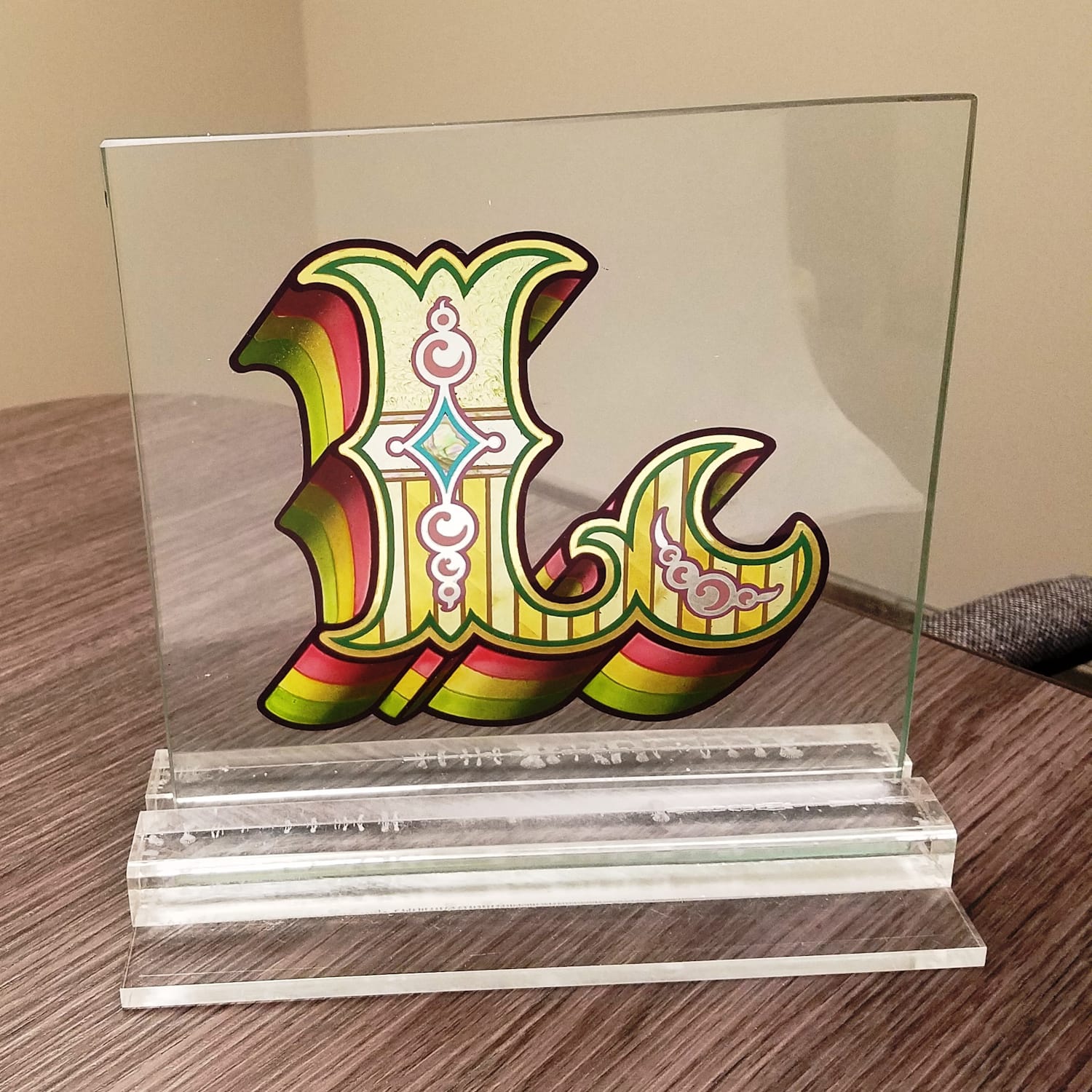
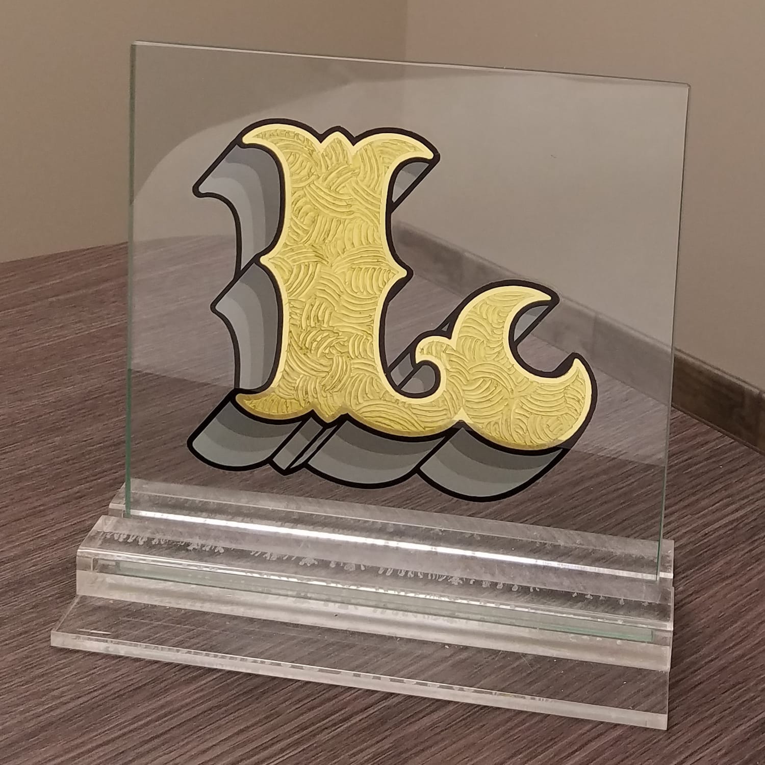
Two of Mark Oatis' gilding samples, used to talk to customers about different techniques and their final appearance.
Finally, BLAG 05 celebrates Marko Salminen's success in Finland's Handcrafter of the Year competition, and there's a look at the process behind Michael Doret's lettering work in the latest 'Inside Letterform Archive' piece.
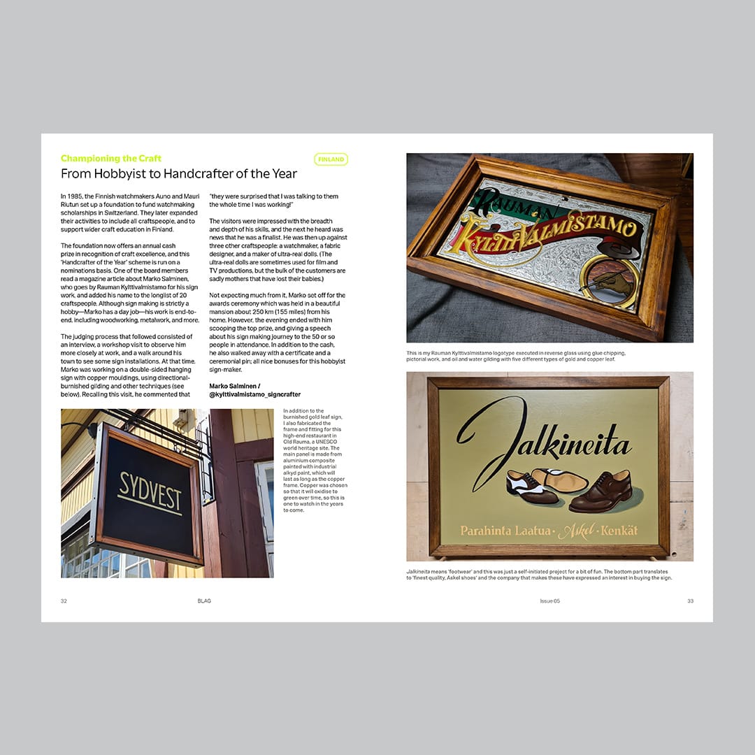
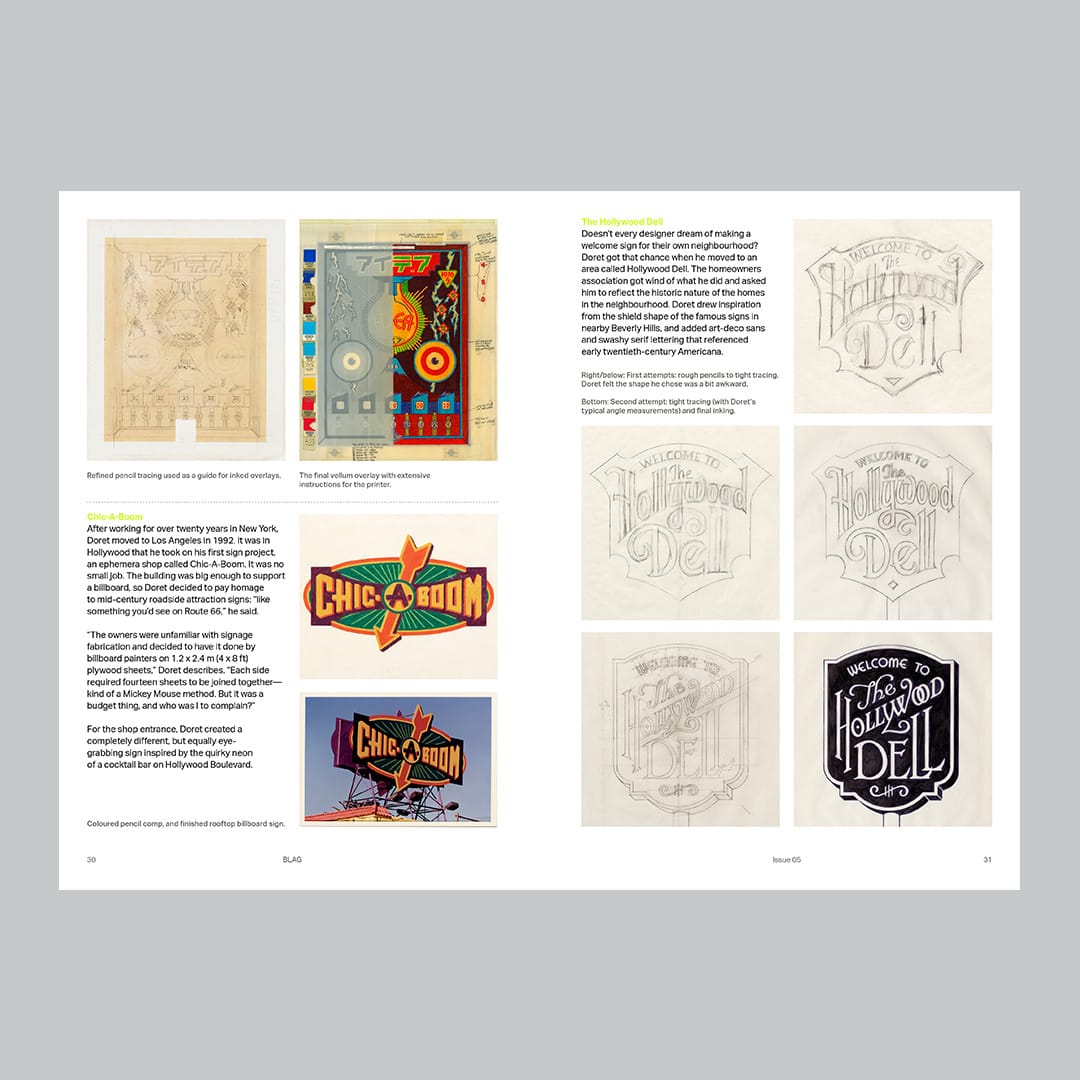
Handcrafter of the Year, the lettering work of Michael Doret, and the story of Harry Coley-Smith.
Thanks
More than 60 contributors from around the world made BLAG 05 possible, and it was once again a pleasure to collaborate with so many brilliant people. Thank you all.
Nothing happens without the members, patrons, and sponsors that fund all the work that goes into the magazine. Thank you! If you're not one already, then join today and receive everything above, and more, delivered directly to your mail/post box.
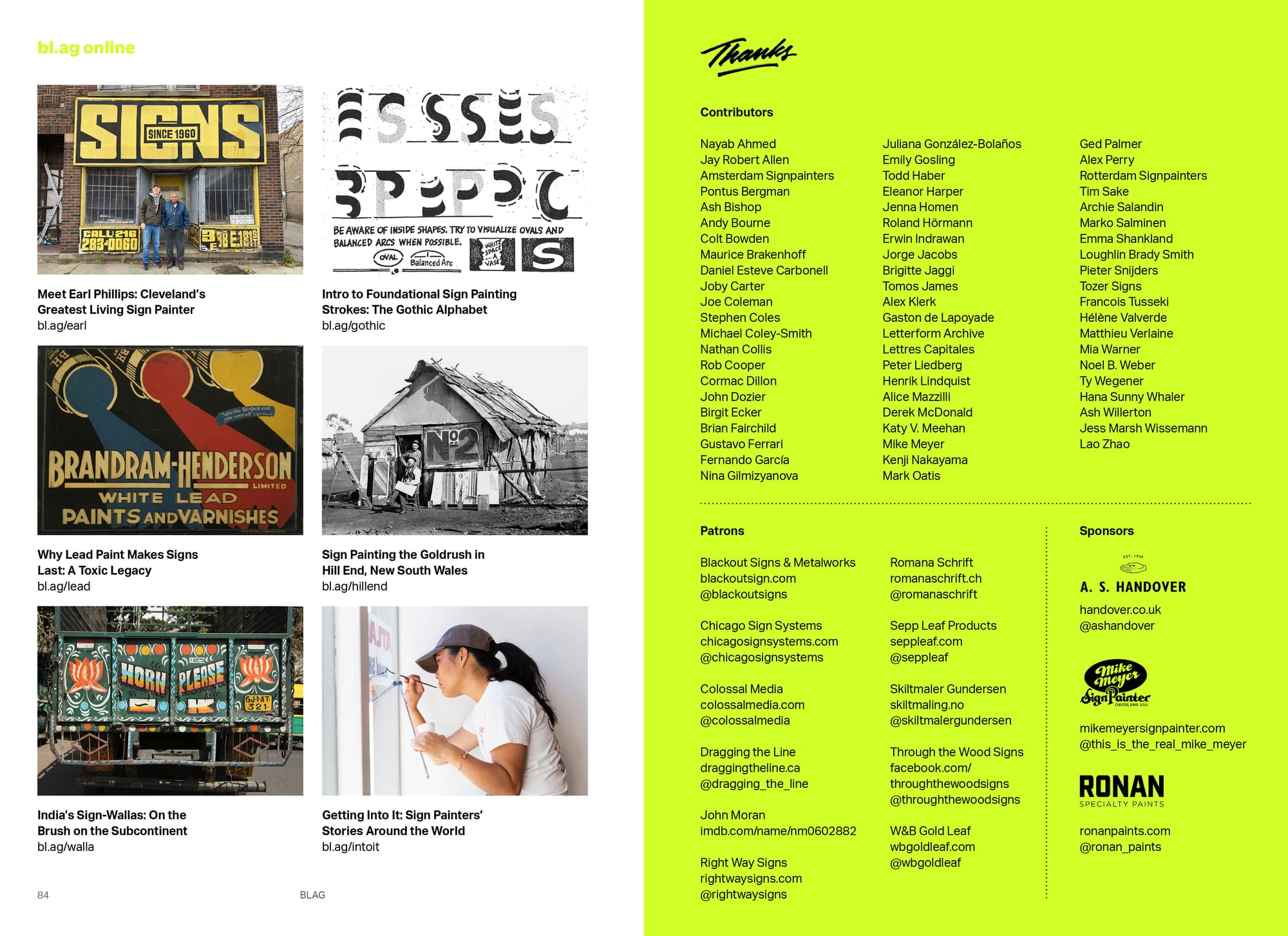
Thanks also to the wonderful team that brings the final print magazine to fruition: Jenna Homen on sub-editing; UTILE on design; SYL L'Art Gráfic on print; and Ra & Olly on distribution.
Fonts in Use are Aktiv Grotesk by Dalton Maag and Utile by Sibylle Hagmann from Kontour.
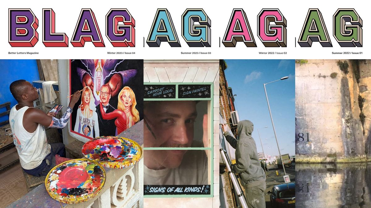
BLAG Back Issues
BLAG Meet
