The Basics of Letter Shades: Left, Right, Up and Down
An introduction to the placement of shades on different types of lettering used in sign painting.
Erwin Indrawan is a sign painter based in Indonesia, and he has been publishing some informative sign painting and lettering tutorials to his Instagram, @eindraw. He's kindly adapted one of these for publication here, looking at shade directions for different types of lettering.
Shade Types
Shades are used to give letterforms depth and emphasis. They obviously add time to a job, but the resulting impact is often worth it.
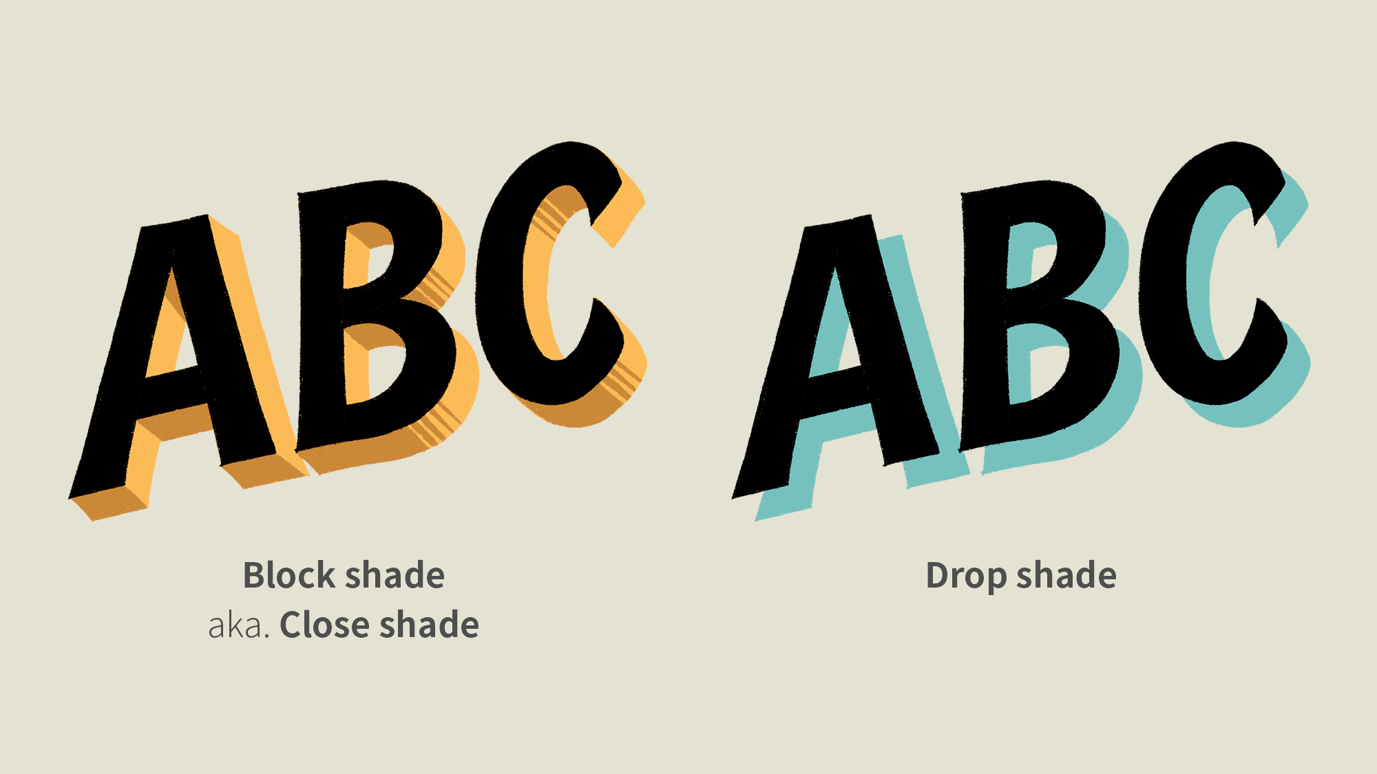
Two of the main types of shade used in sign painting are the block shade and the drop shade. The block (or close) shade gives the letterforms volume, making them appear to be three-dimensional objects. Drop shades make the letterforms appear to be floating above the surface they're painted on, casting a shadow onto it.
These are just two basic types of shade, and they can be adapted and combined in numerous ways. One of the most straightforward is offsetting them, so that they don't touch the letters themselves. This is beneficial in sign painting as it allows you to work on the shades before the letters have dried, or vice versa.
Shade Weight and Angle
In general we want a uniform weight to the shade, and this is most easily achieved by placing it at a 45 degree angle to the letterforms themselves.
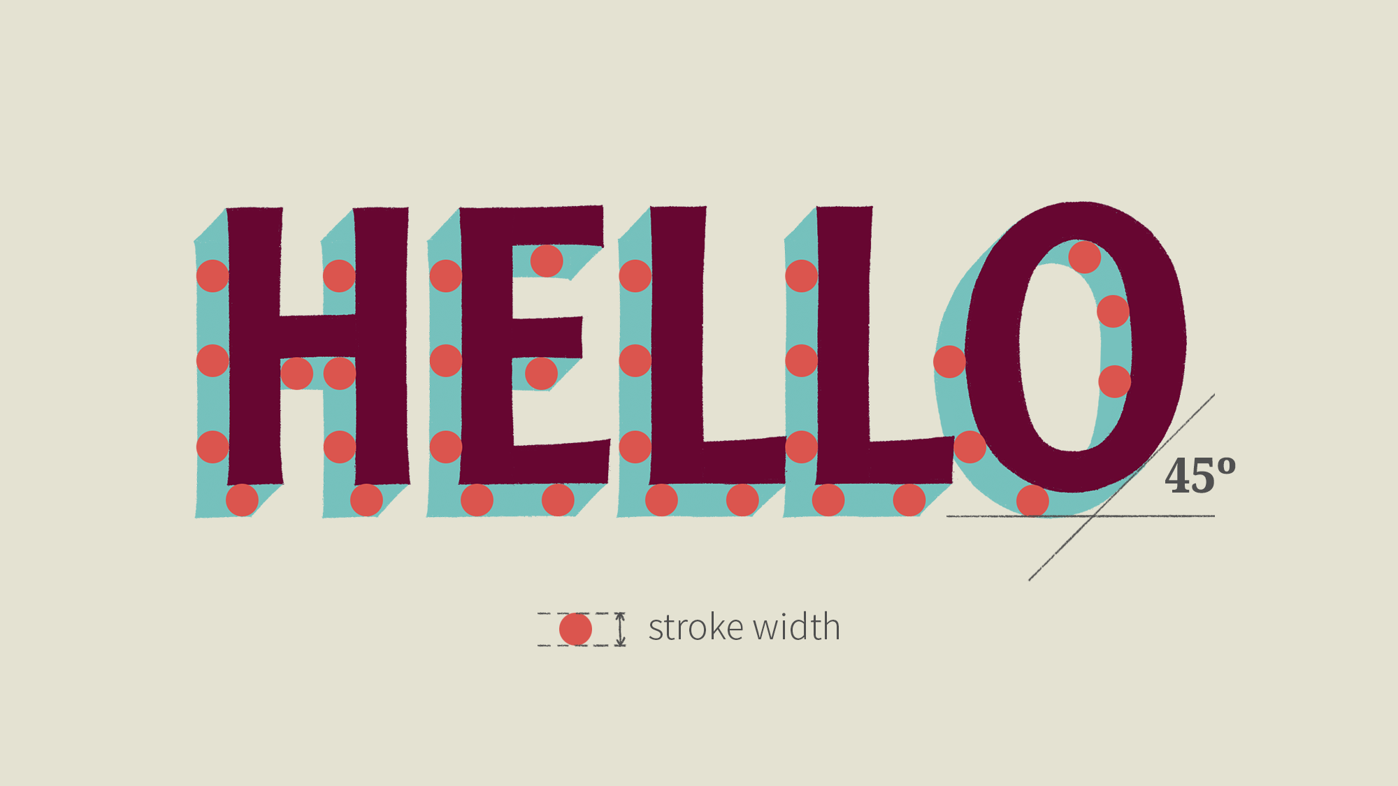
The stroke width can be varied to achieve different effects, while maintaining the consistent angle relative to the letterforms.
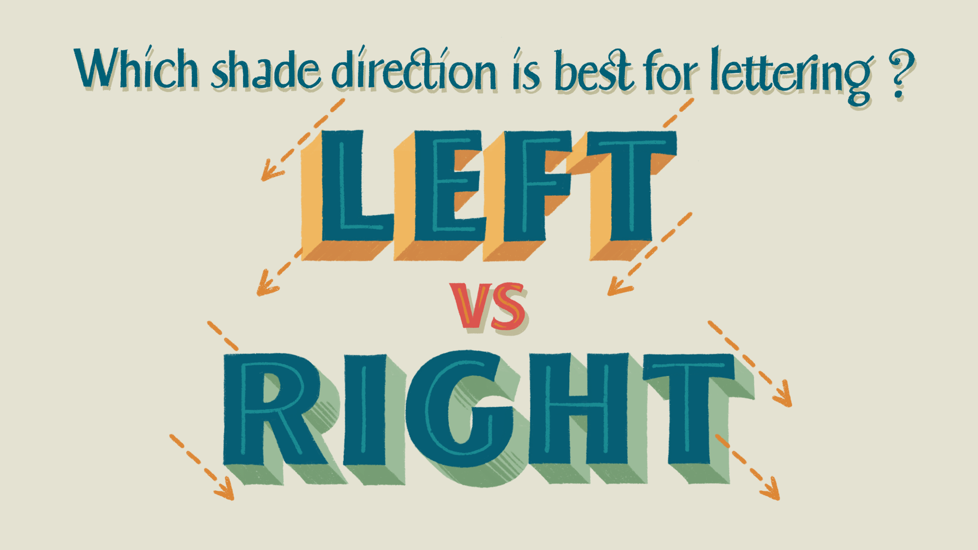
Shade Side, Left or Right?
For upright letterforms, the shade can be placed on either the left or the right side, but there are some visual and practical benefits to using the left side.