Glorious Gilding Samples at the American Sign Museum
A show of mastery on reverse glass gilded panels from the American Sign Museum’s collections.
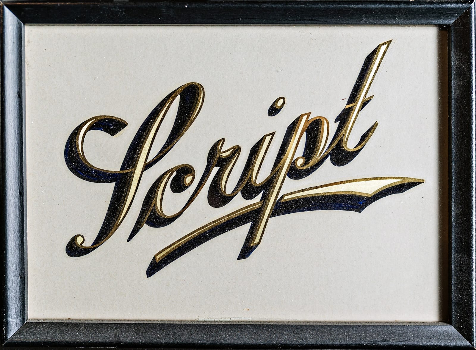
“Selling a gold leaf job is a whole lot easier if you can show, rather than tell, your customer what effects are possible.”
This was the opening line of the BLAG 05 piece featuring a case of gilding samples produced by Mark Oatis in 1990. He was following in a long tradition of sign folk creating samples, often single letter panels, to showcase the variety of effects and embellishments that can be achieved with the medium of gold (and paint) on glass.
Given their longstanding history, it’s no surprise that gilding samples are found in the displays at the American Sign Museum. They have also played an important role in the history of the institution itself, as outlined in the Museum’s new book. To celebrate the launch of this publication, here is a closer look at two sets of gilding samples taken from the dozens of ‘Sign Stories’ inside, plus one set that regrettably had to be left on the cutting room floor.
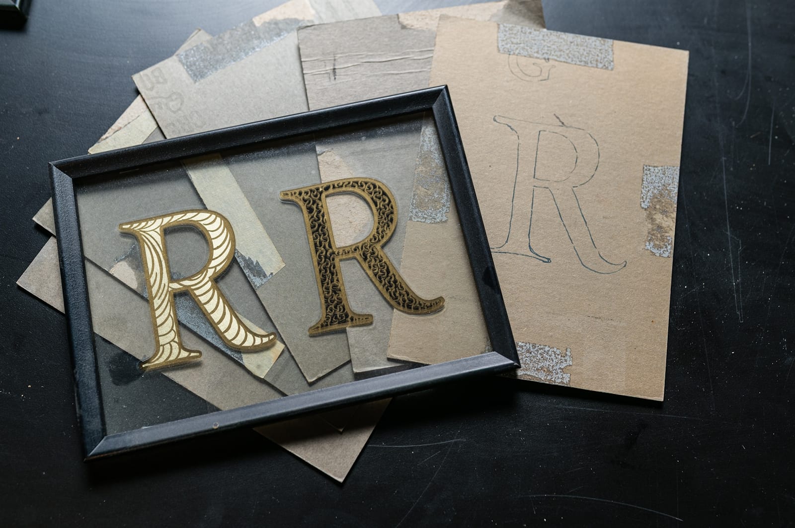
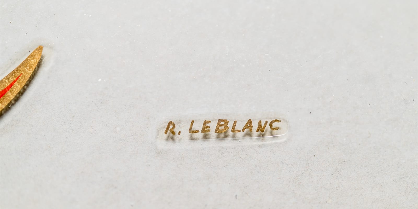
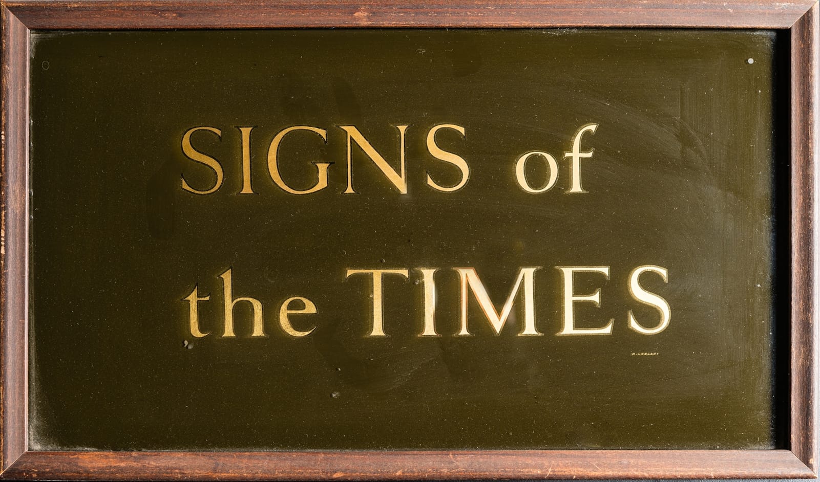
Raymond J. LeBlanc
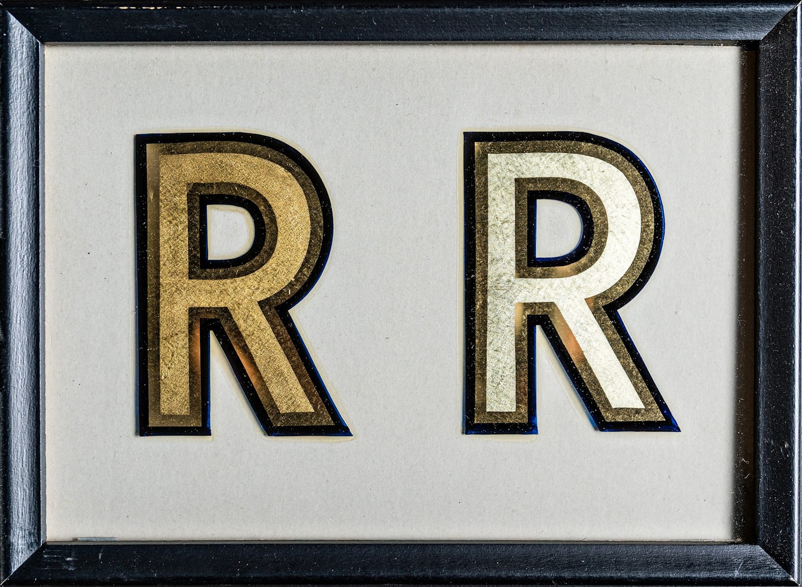
Raymond J. LeBlanc was a master of the craft, penning a long-running series of practical gilding articles for Signs of the Times magazine. These culminated in his book, Gold Leaf Techniques, which remains the definitive text for anyone learning to gild.
LeBlanc created this set of gilding samples in 1935 and they played a pivotal role in the genesis of American Sign Museum itself. This extract from the book explains:
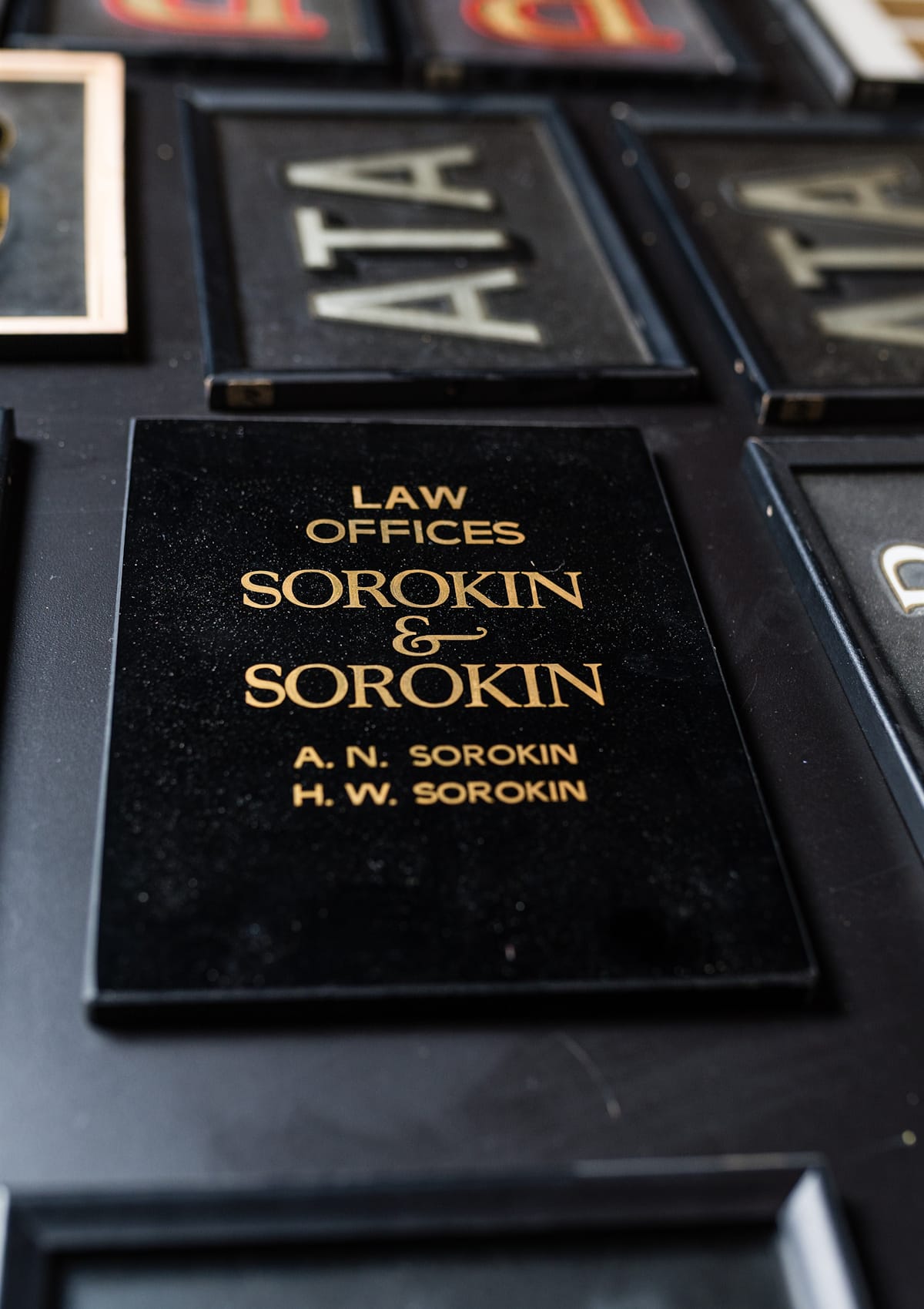
“The box, and the samples inside, found their way to Dave Swormstedt Sr., then publisher of Signs of the Times, following a letter sent to him by LeBlanc. This contained the line: ‘I’m getting up in years and none of my family wants to continue my sign business, so I’m sending this kit to you … because you’ll know what to do with it.’”
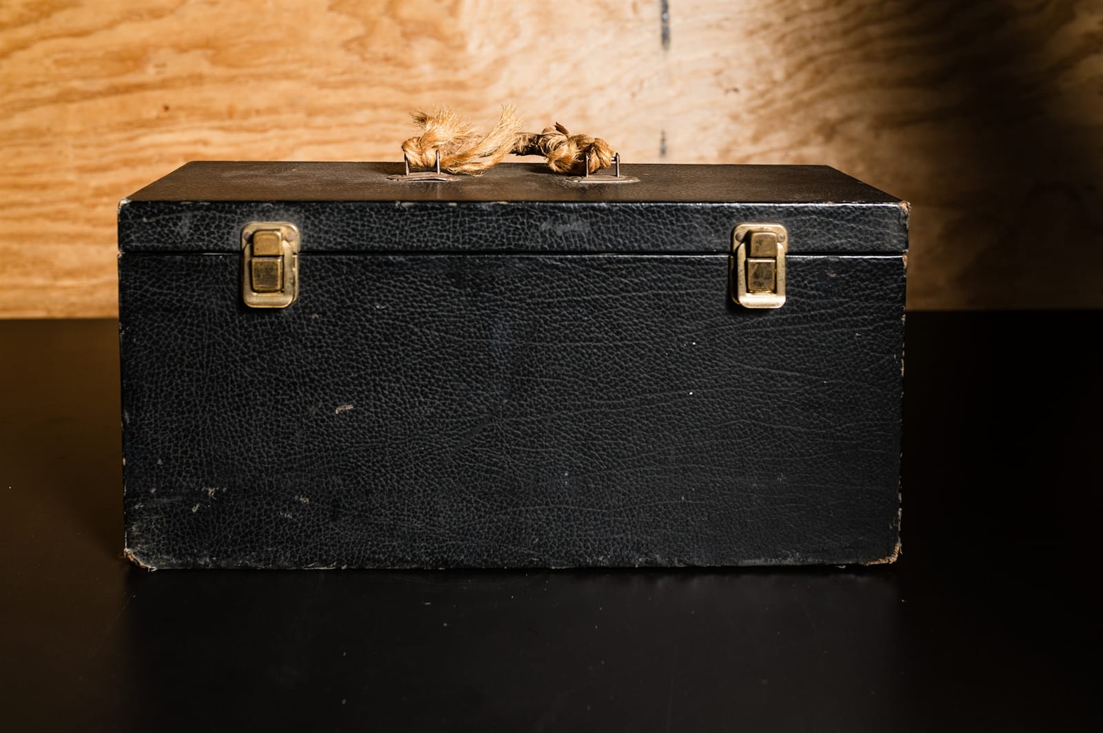
“After working out the logistics of getting it there, the kit’s new home was the Cincinnati office of Signs of the Times. There it remained stored in the company’s vault, until it was rediscovered by a member of staff during a clearout and brought to Dave’s grandson, Tod. Setting his eyes on it for the first time sowed the seed that eventually saw Tod forge ahead with realising the sign museum idea.”
It was Tod’s belief that the samples were deserving of a wider audience that catalysed the journey that followed, so we can be grateful for LeBlanc’s letter and foresight back in 1973.
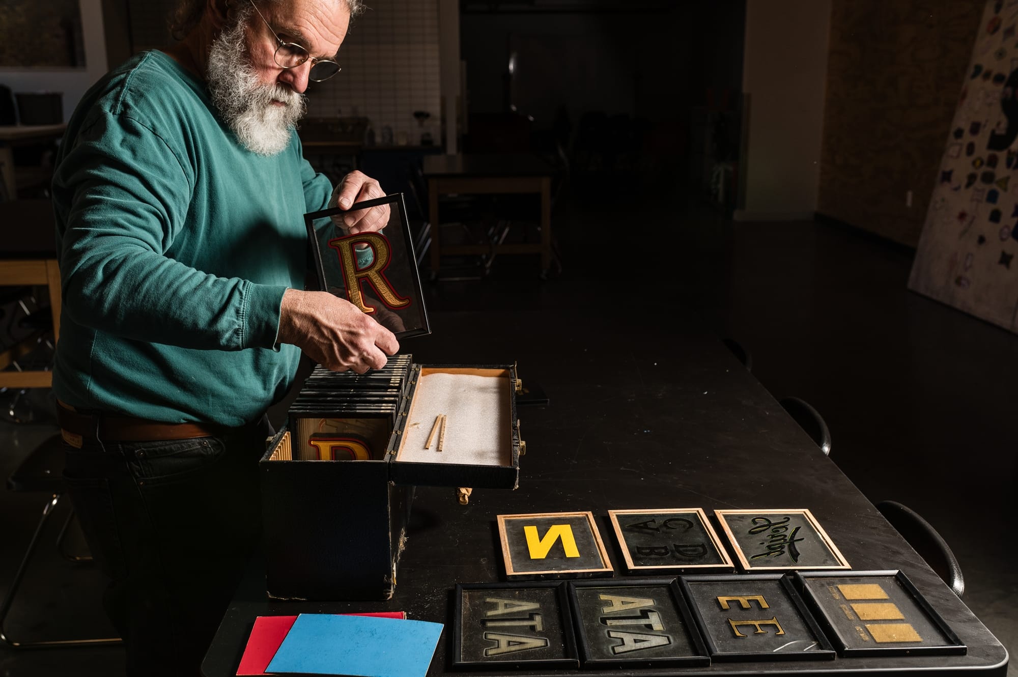
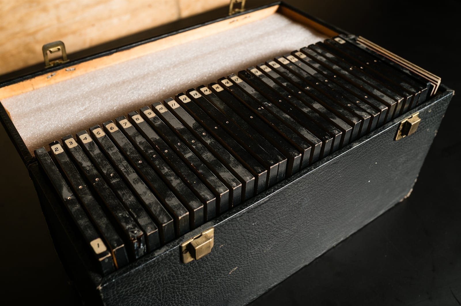
The box can be seen in the public displays at the Museum. It is located inside a cabinet on Main Street with a handful of the samples taken out for visitors to view. However, for the book, Tod removed it entirely from the cabinet, allowing Natalie Grilli to photograph each of the panels inside.
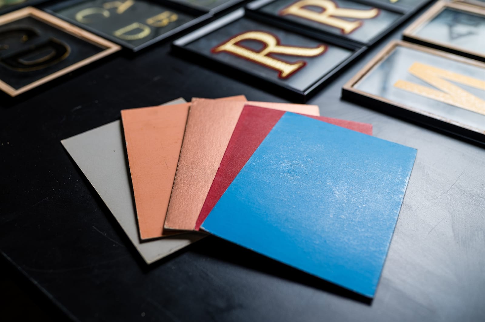
The samples come with coloured backing sheets that can be swapped in and out to demonstrate the effects on different backgrounds.
Natalie opted for neutral grey for her shoot.
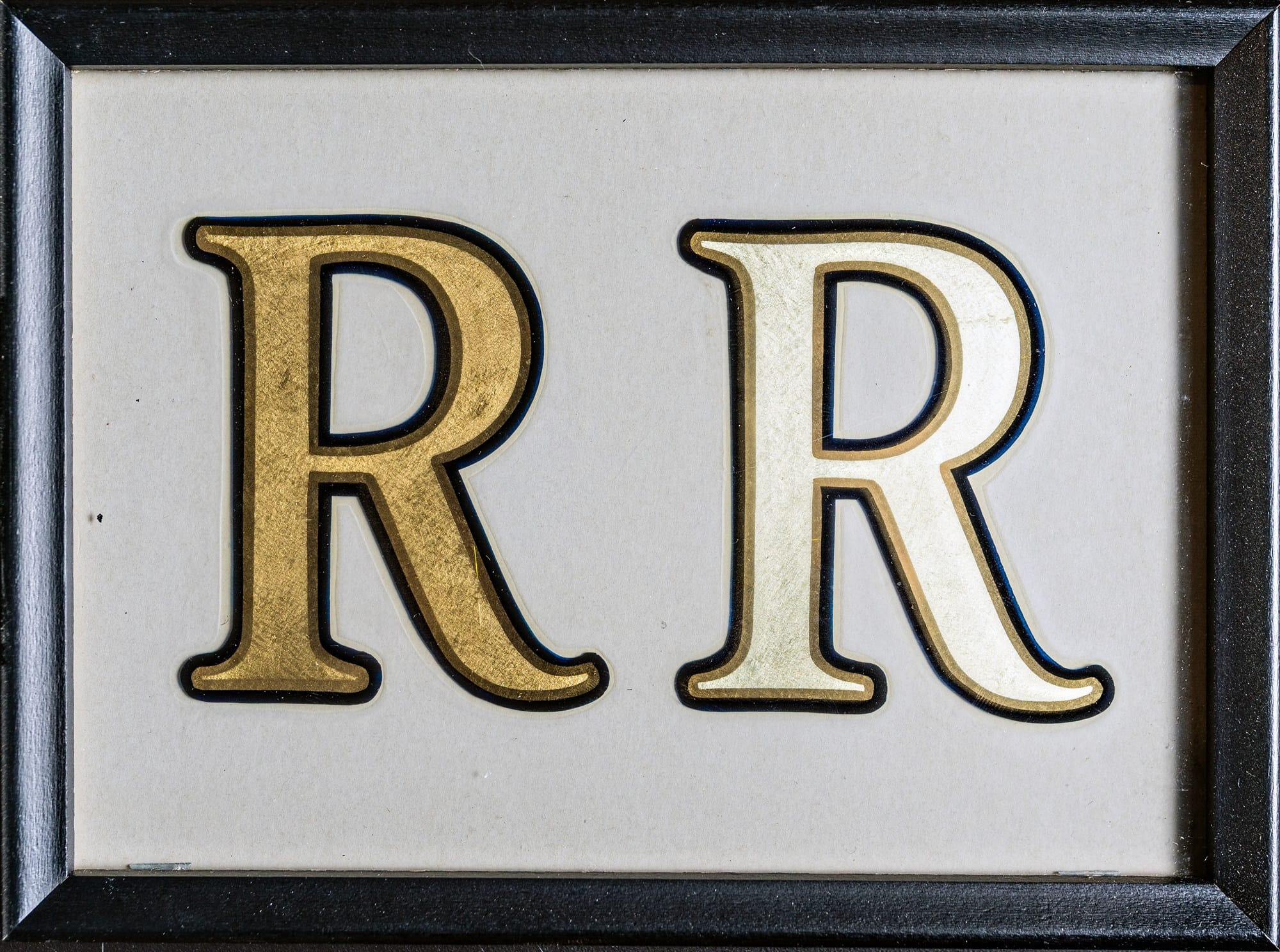
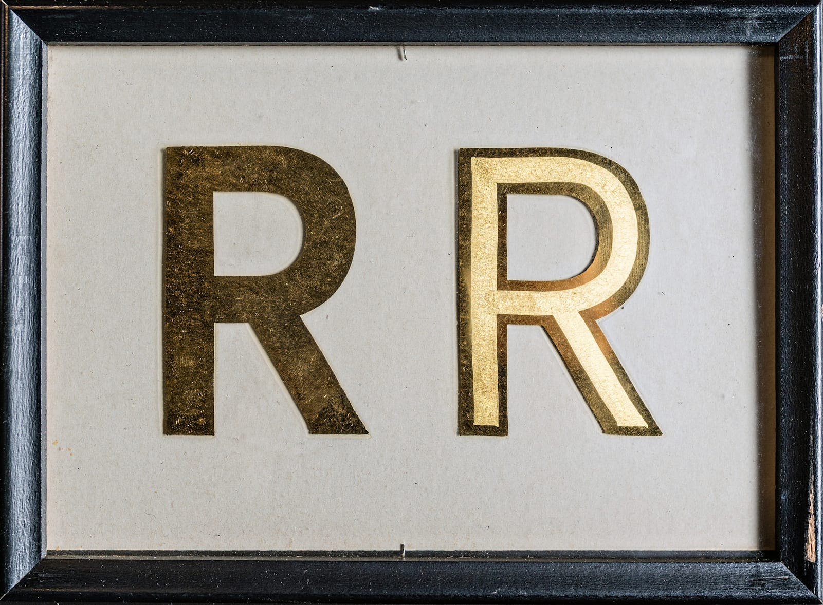
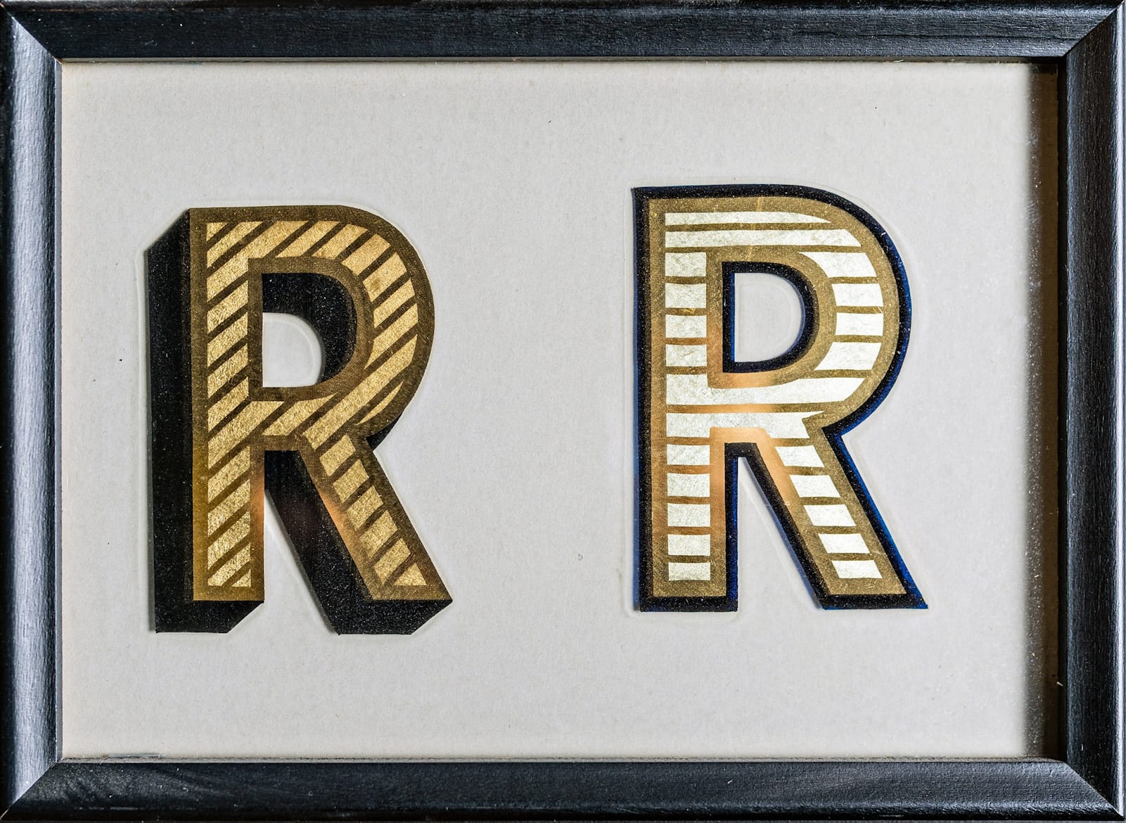
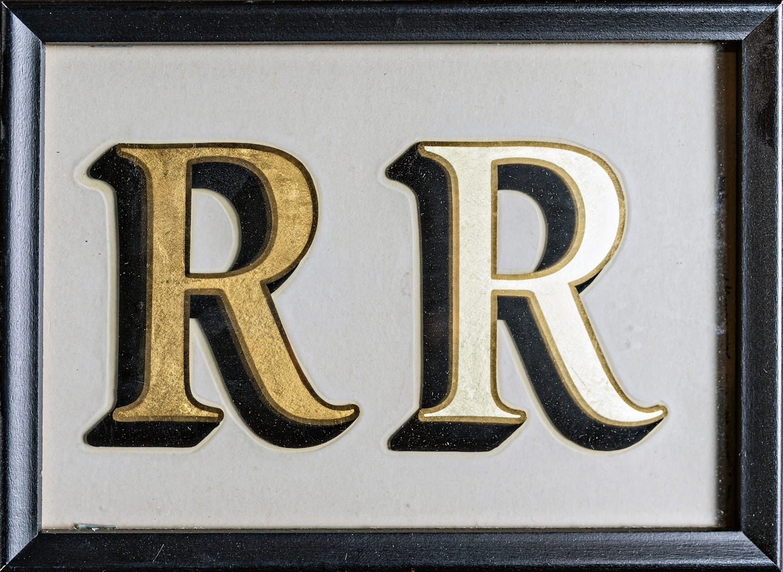
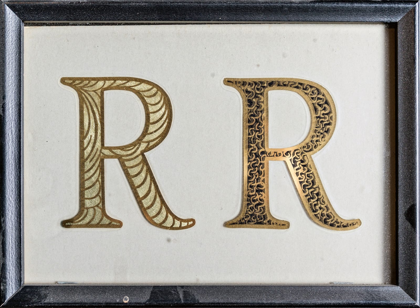
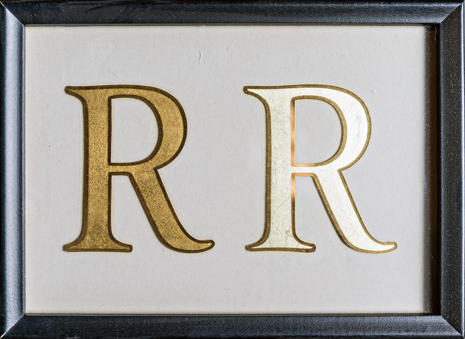
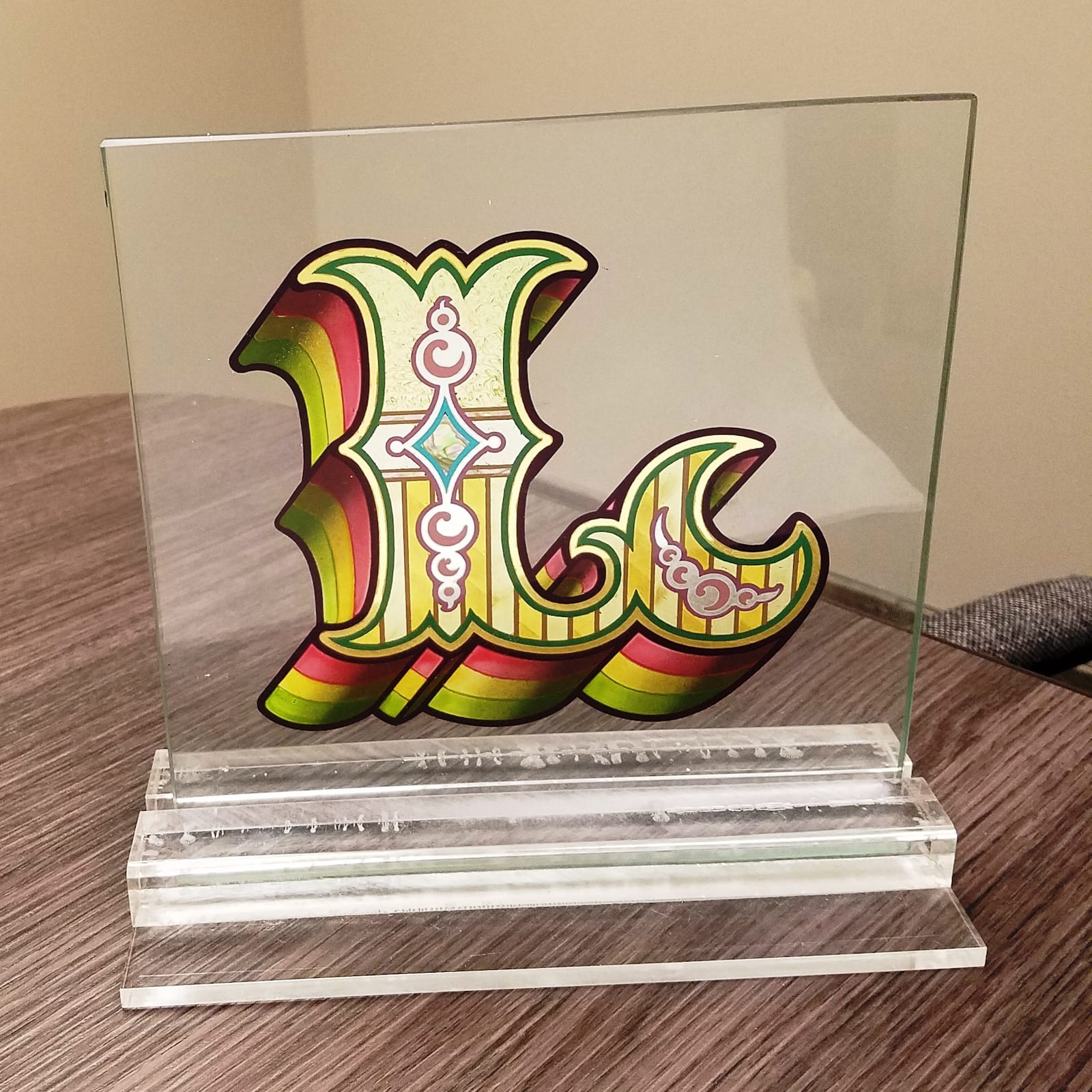
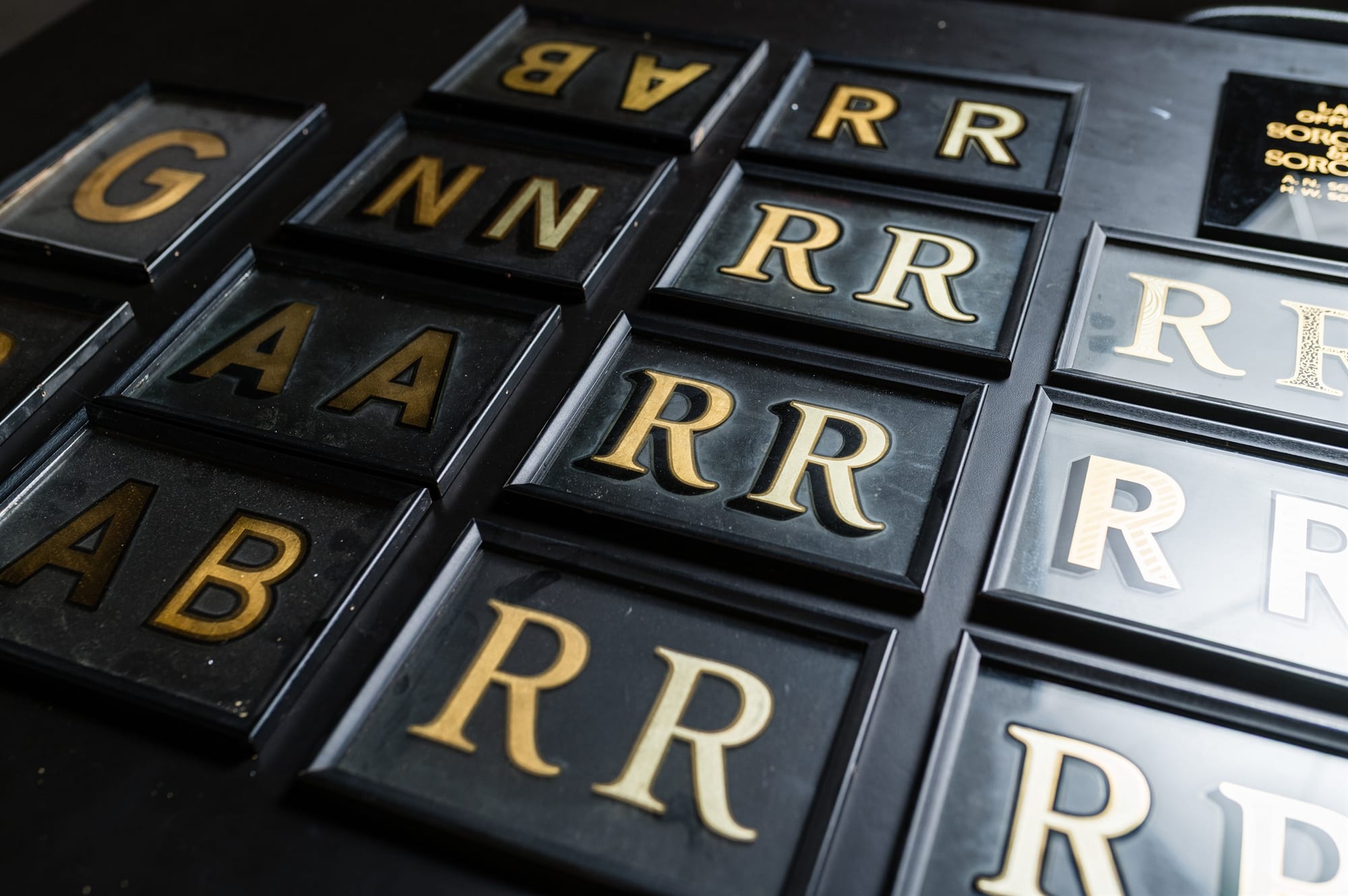
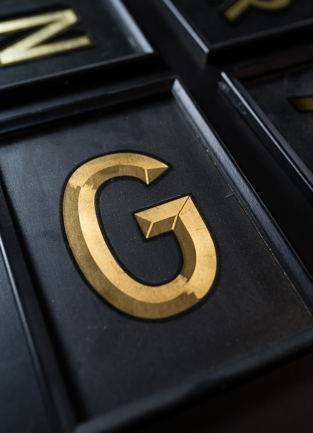
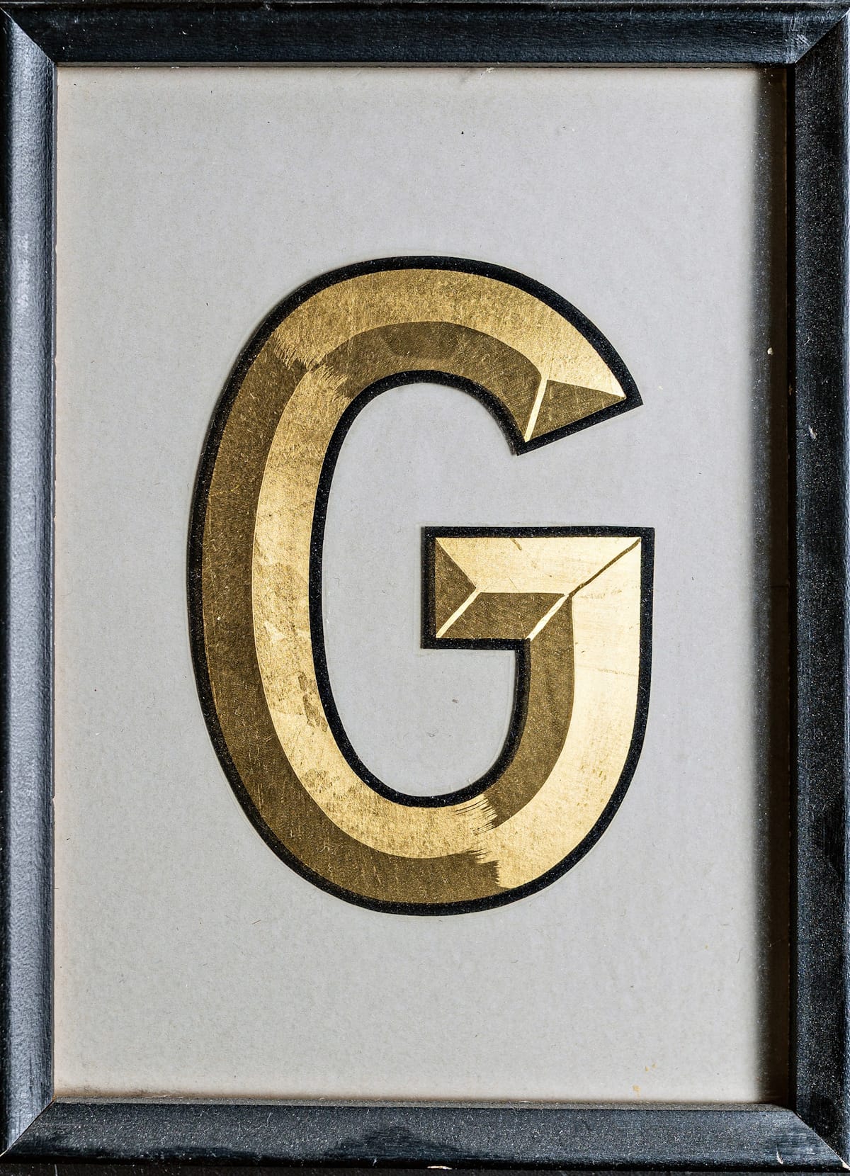
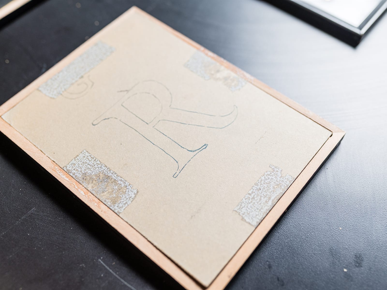
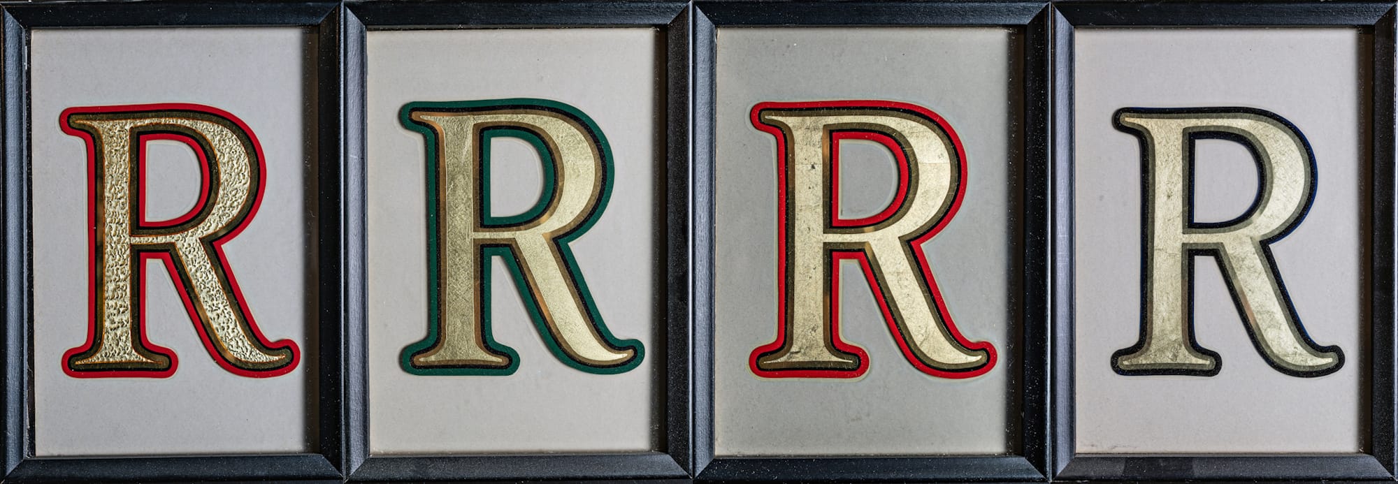
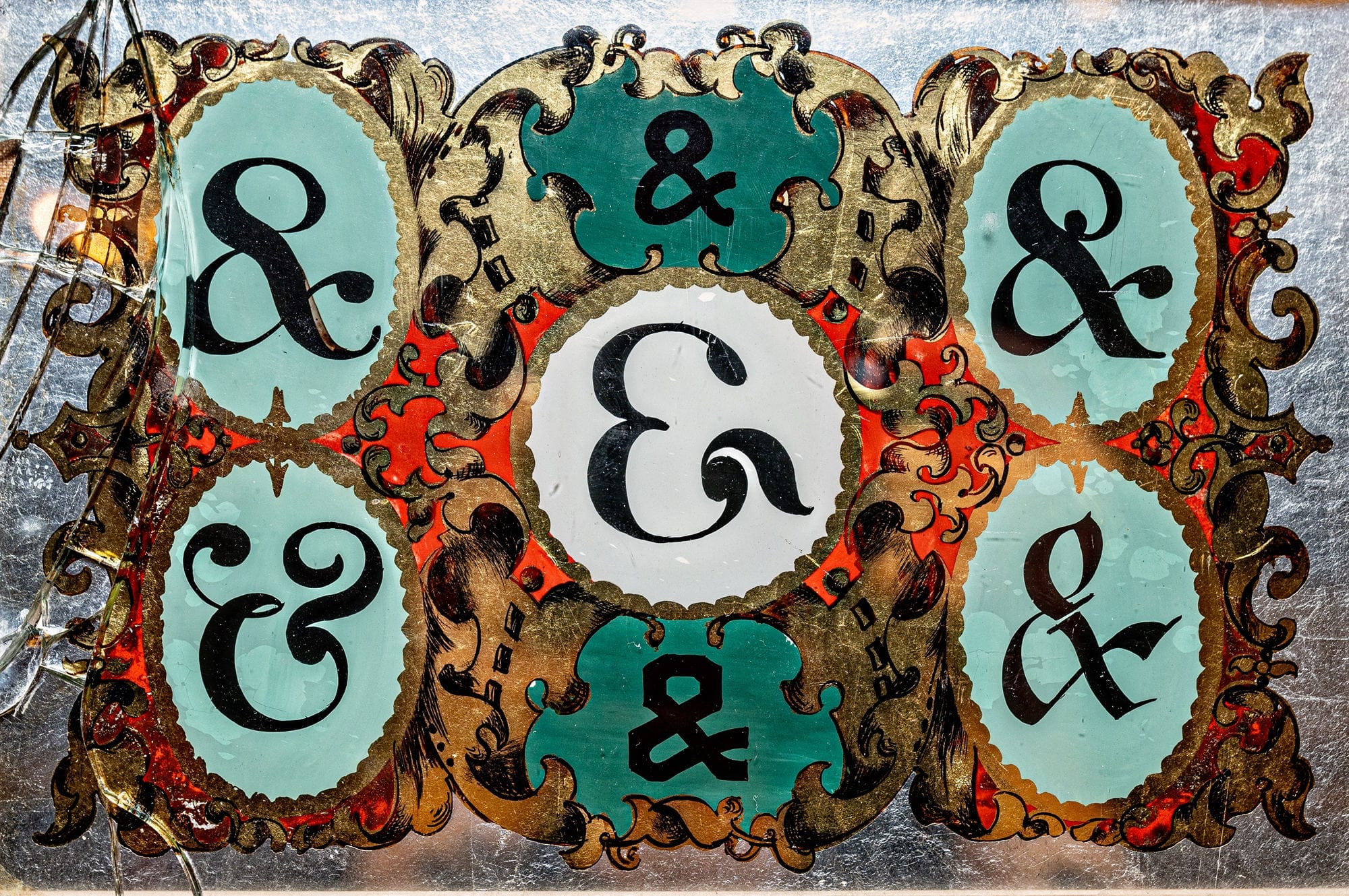
More Rs in different styles and with a variety of simple effects and embellishments to share with clients when discussing gilding projects.
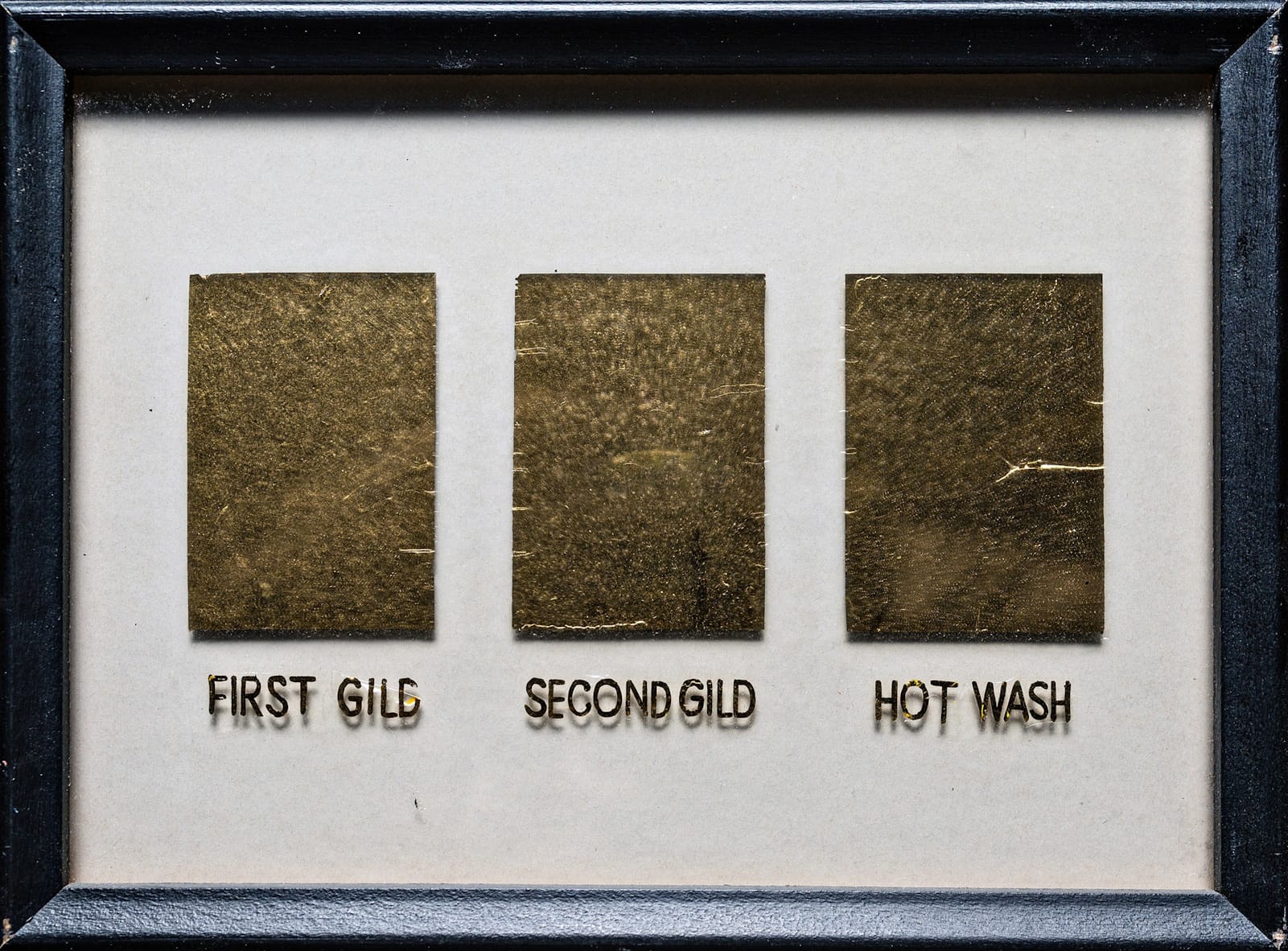
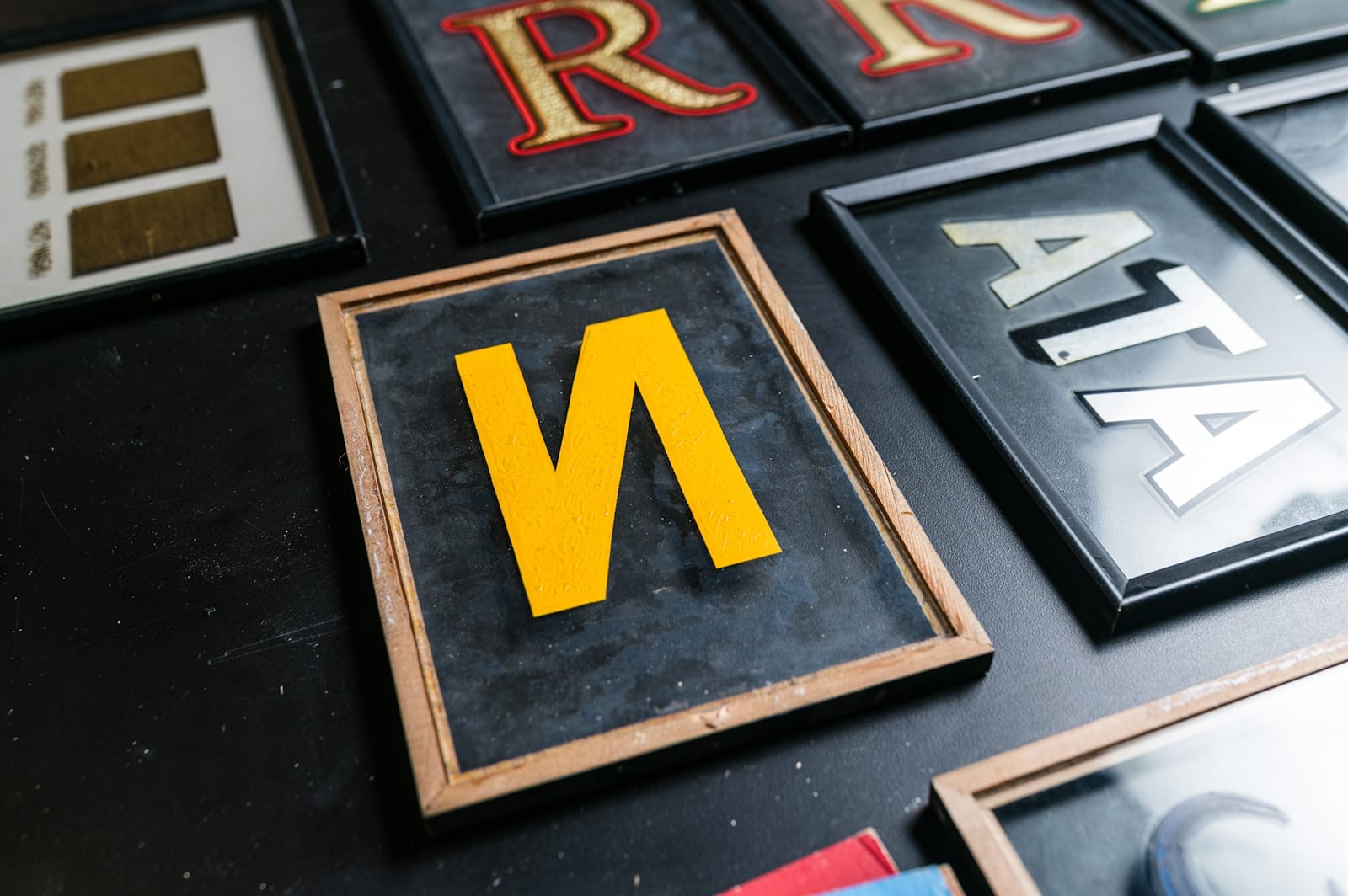
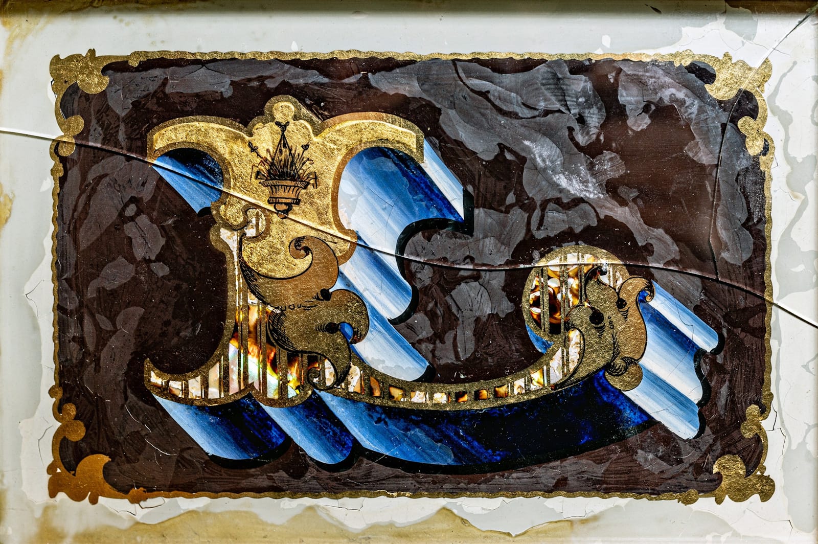
LeBlanc also prepared a panel to show the different stages in his reverse glass gilding process, including the final ‘hot wash’ in which the gelatine solution is applied over the second gild to increase the lustre of the gold and solidify the previous application of gelatine. LeBlanc discusses this process in his Gold Leaf Techniques book. For this N, he used yellow backup paint which further enhances the gilding on the front side.
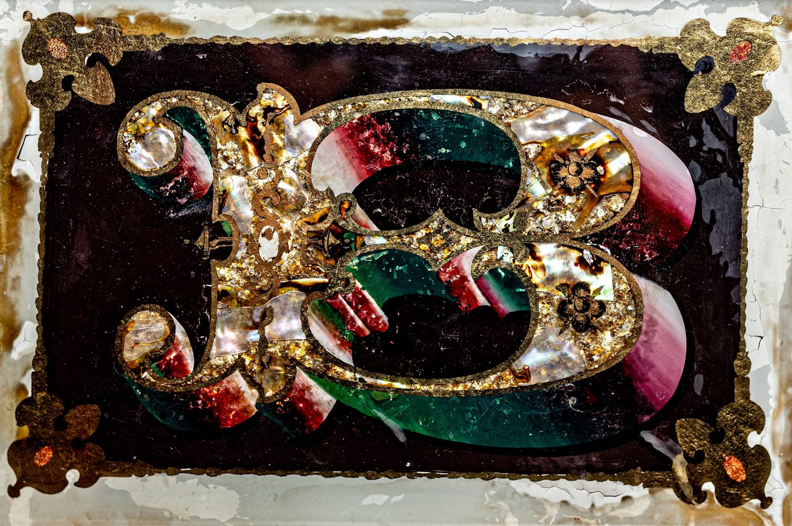
These two panels show some simple applications of different metals.
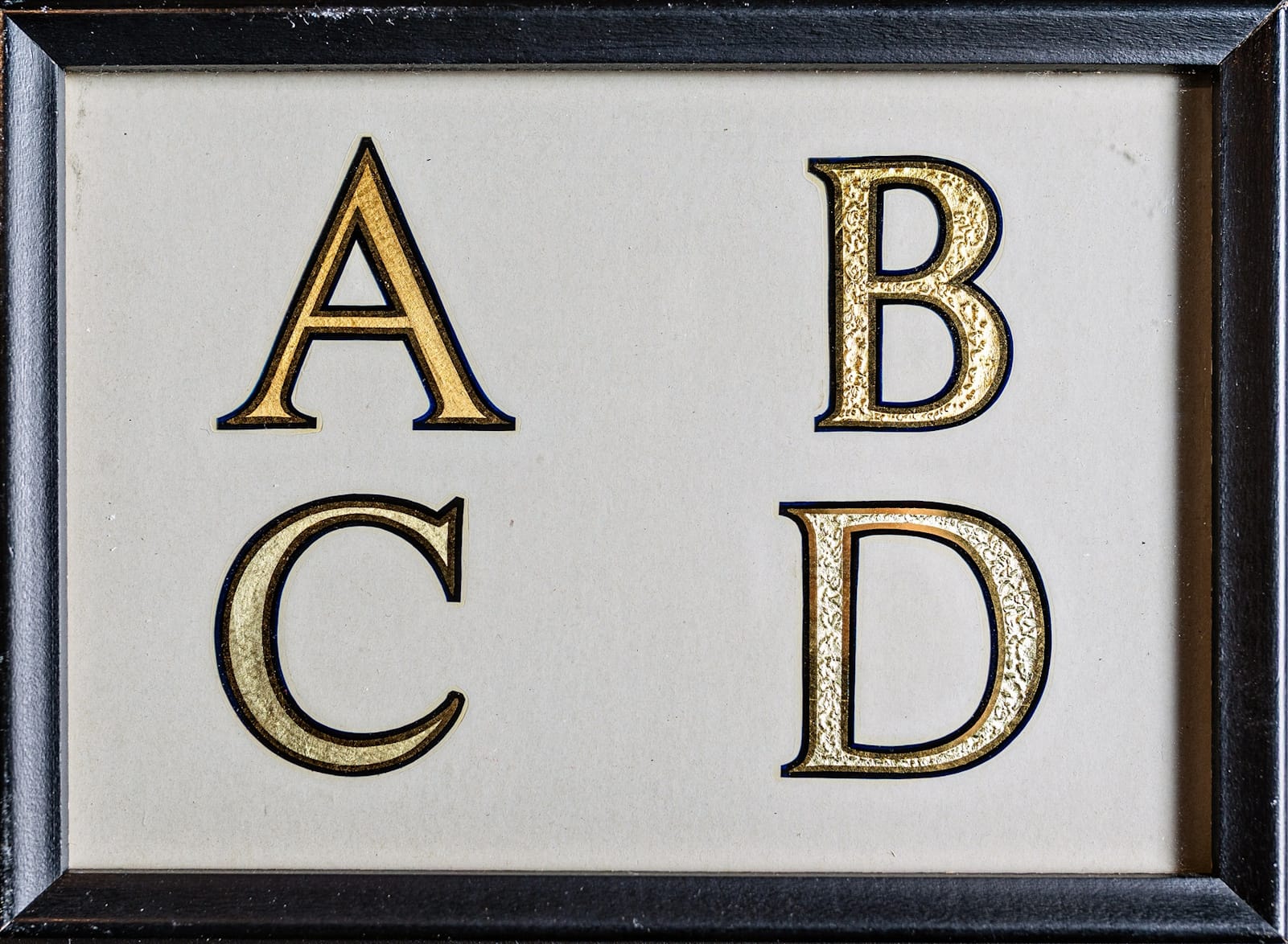
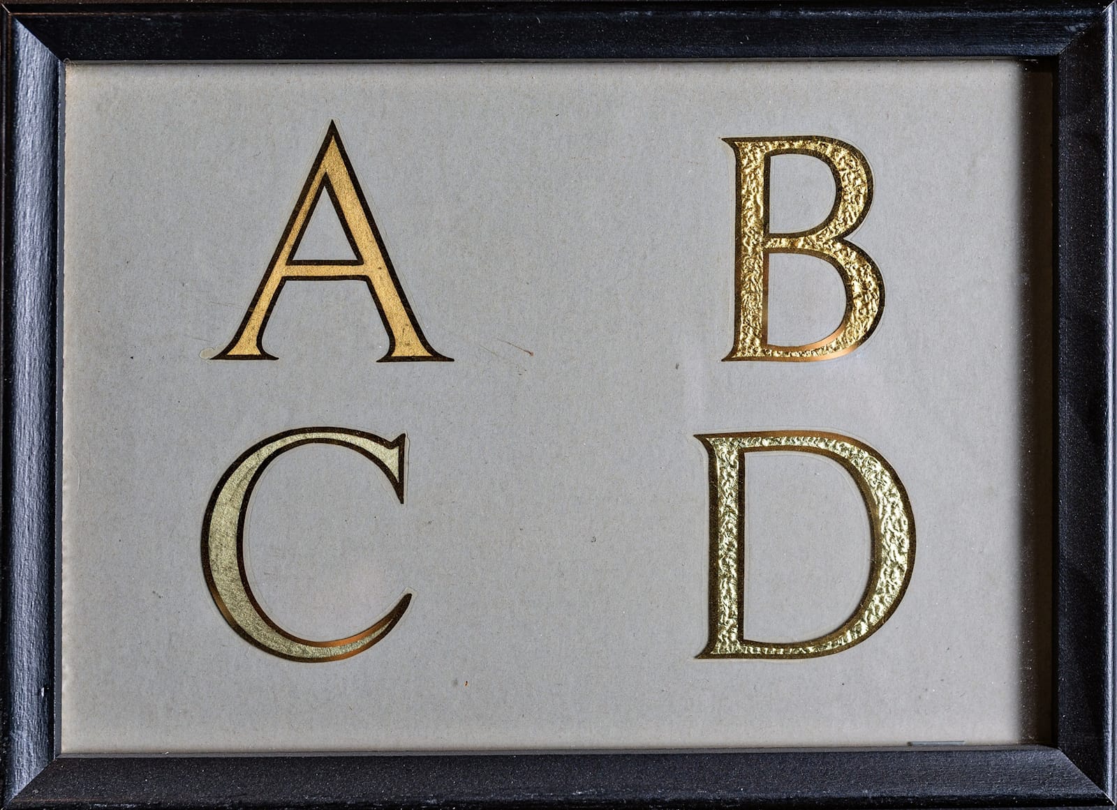
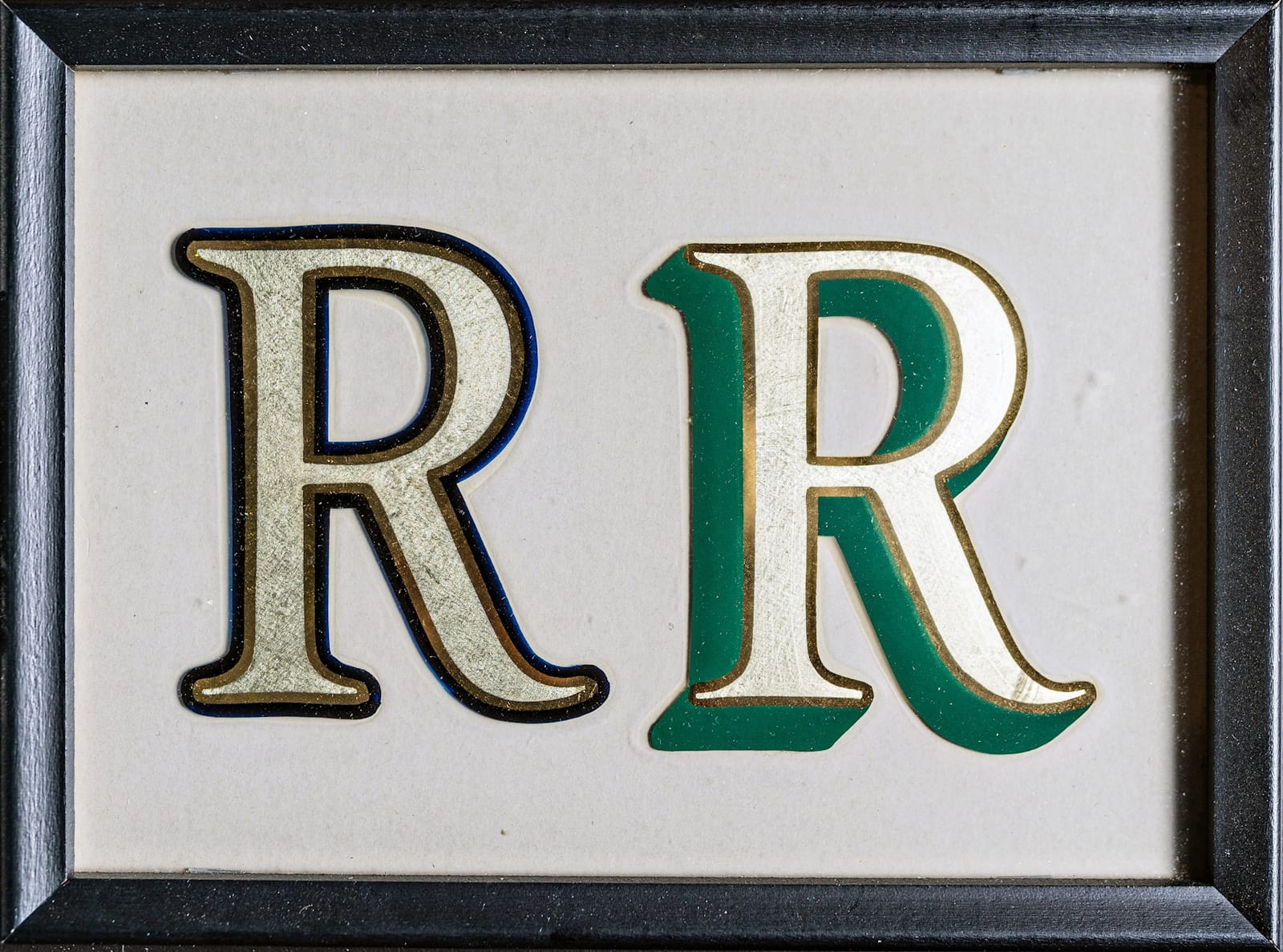
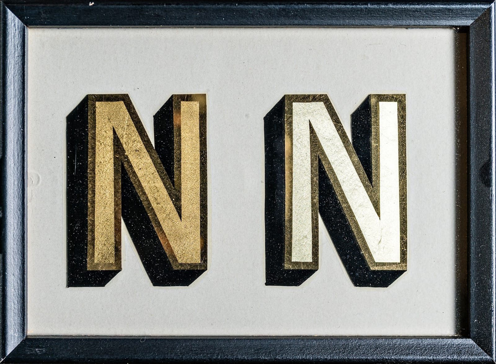
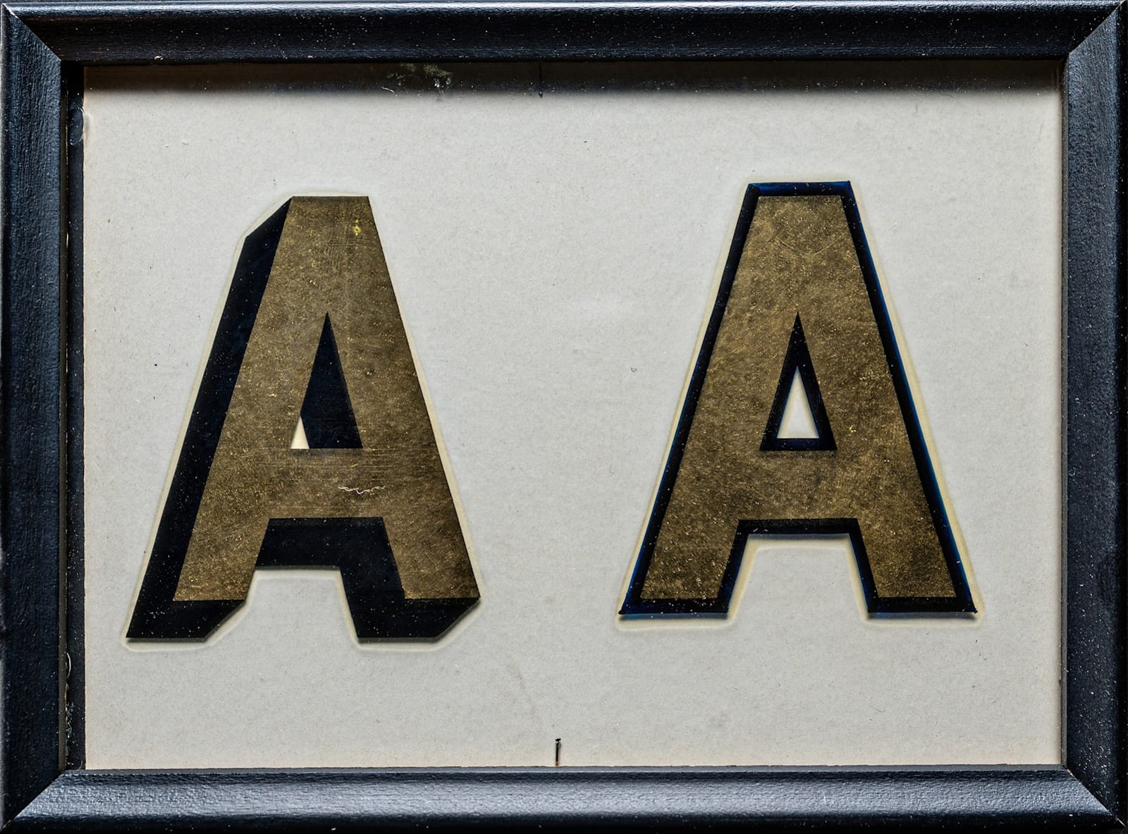
The variation in outline treatments across these two panels helps to demonstrate the difference to clients.
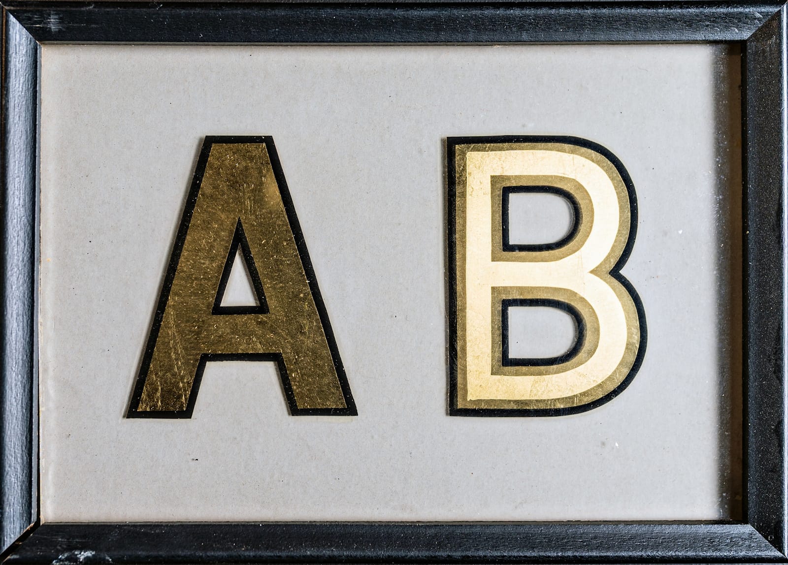
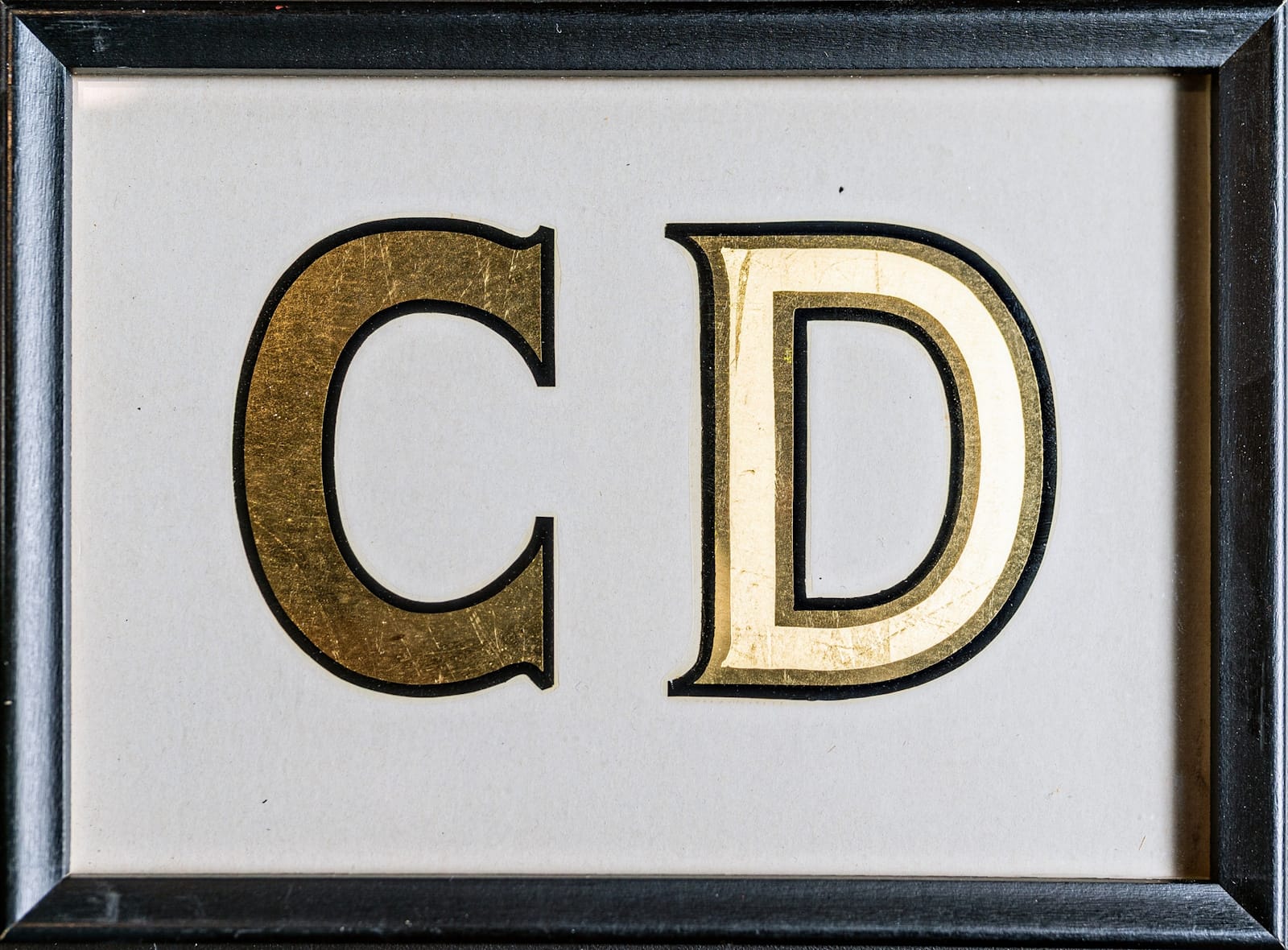
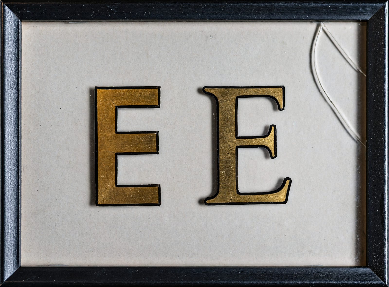
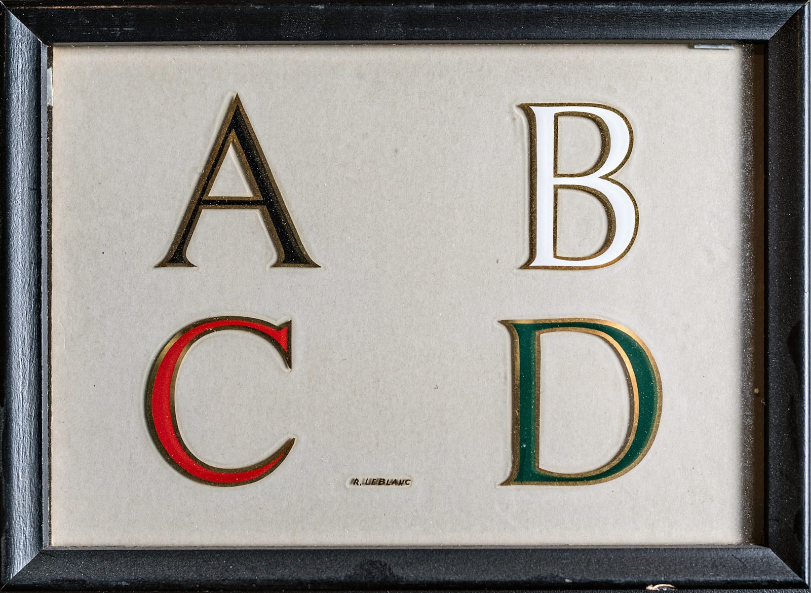
More ABC(DE)s from the hand of Raymond J. LeBlanc.
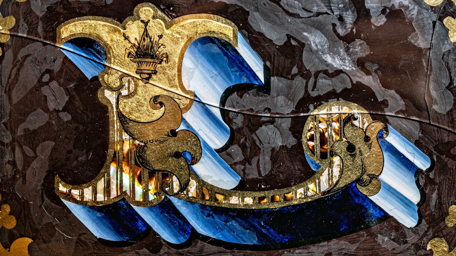
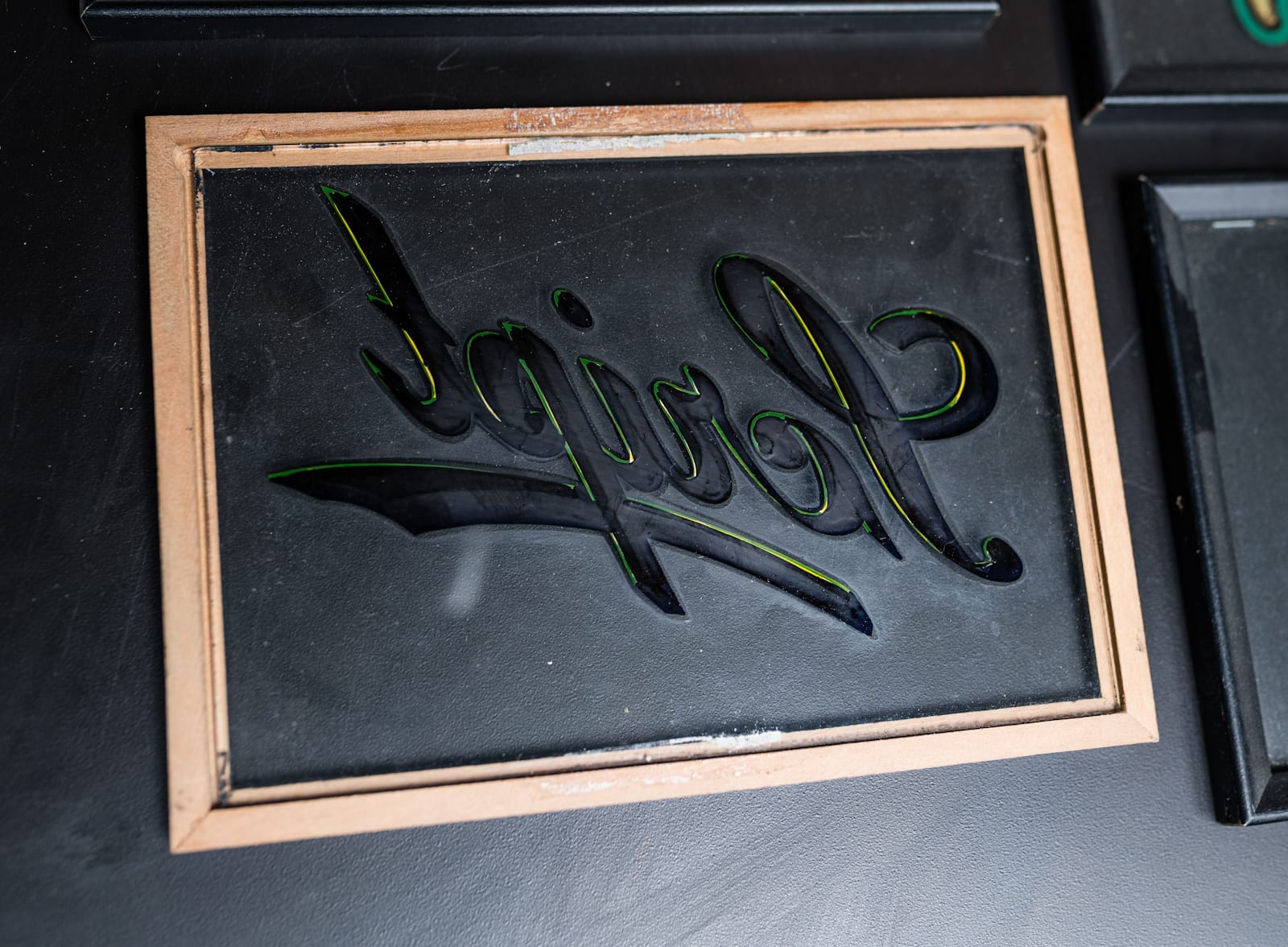
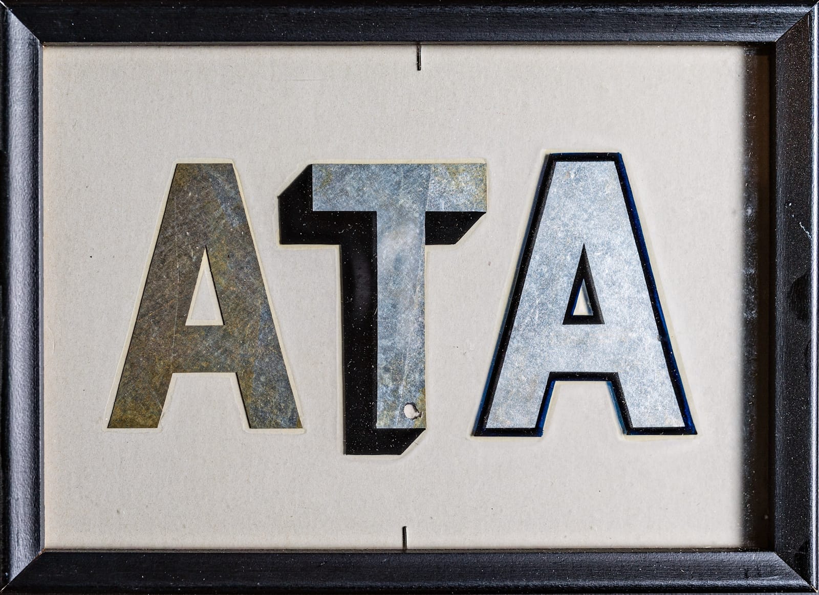
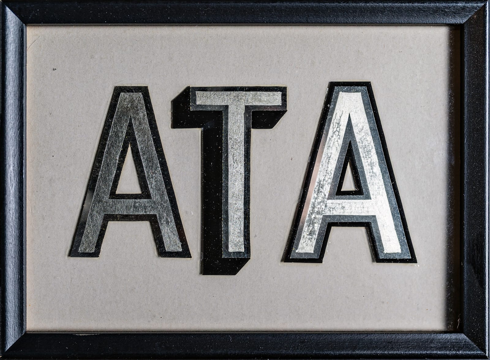
Also inside the box of samples is this piece, which is the only one that’s surface gilded and showing an actual layout.
George C. Brooke
On my first visit to the Museum for the 2015 Letterheads meet, the George C. Brooke display left a lasting impression on me. I was blown away by the intricate details achieved on the tiny panels, and the use of ‘sign writer’ on work from North America, where ‘sign painter’ is typically more prevalent.
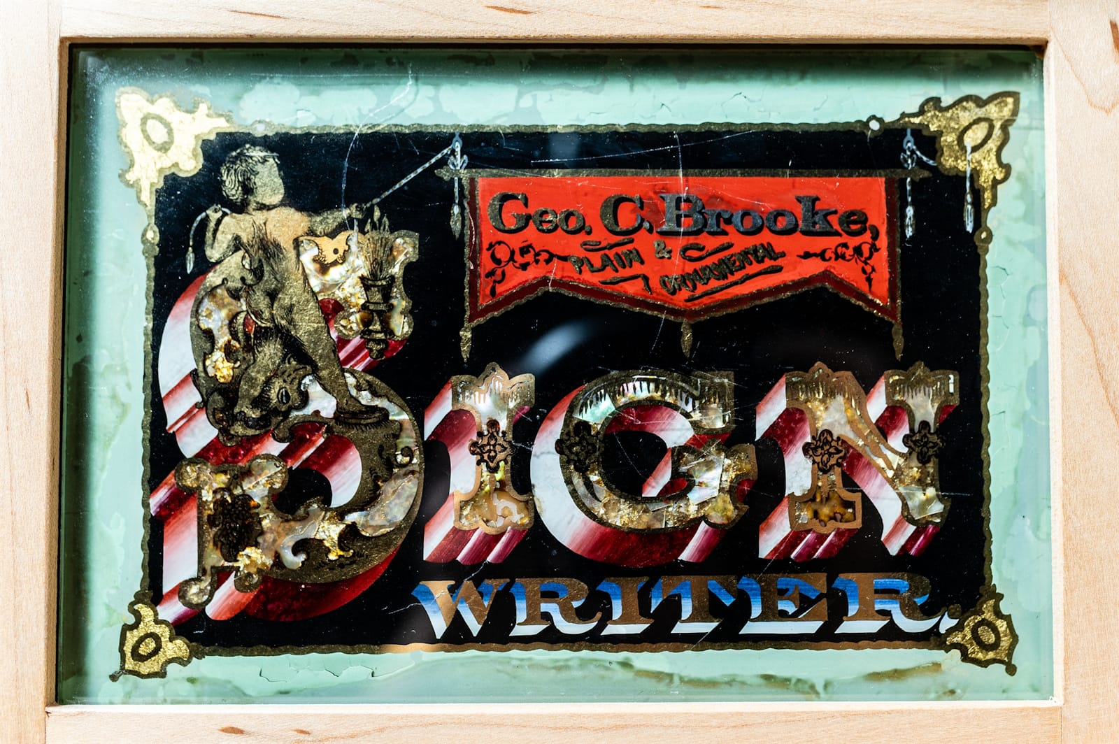
The samples date from 1870, making them the oldest items in the Museum’s collections. They were purchased from the estate of Rick Glawson (see profile in BLAG 07) in 2003 and are framed and mounted on spindles so that both sides can be seen.
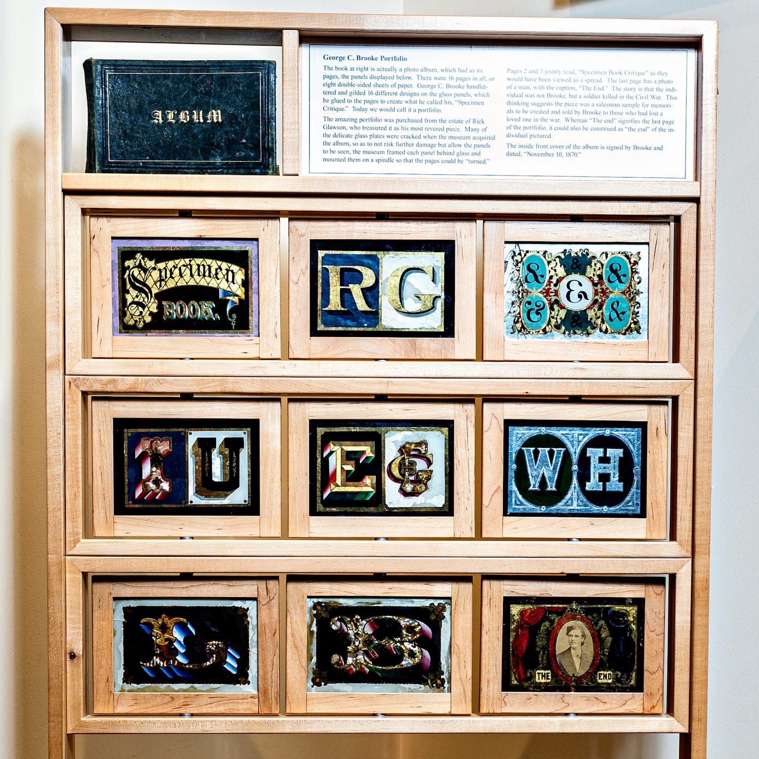
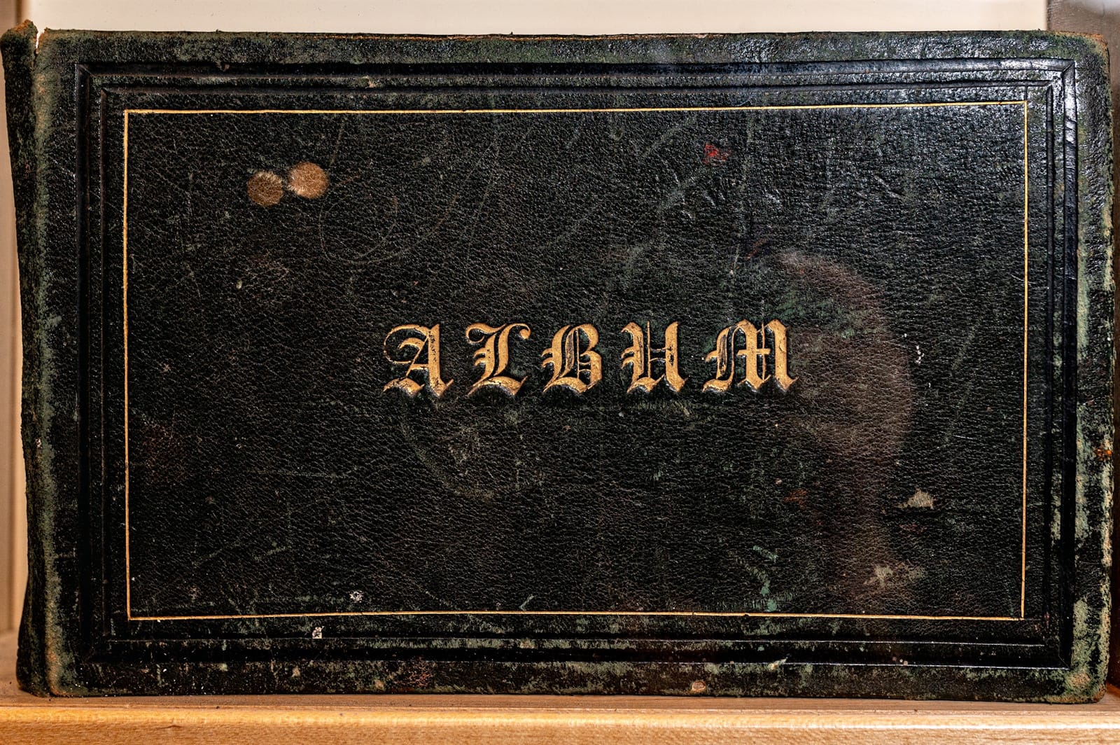
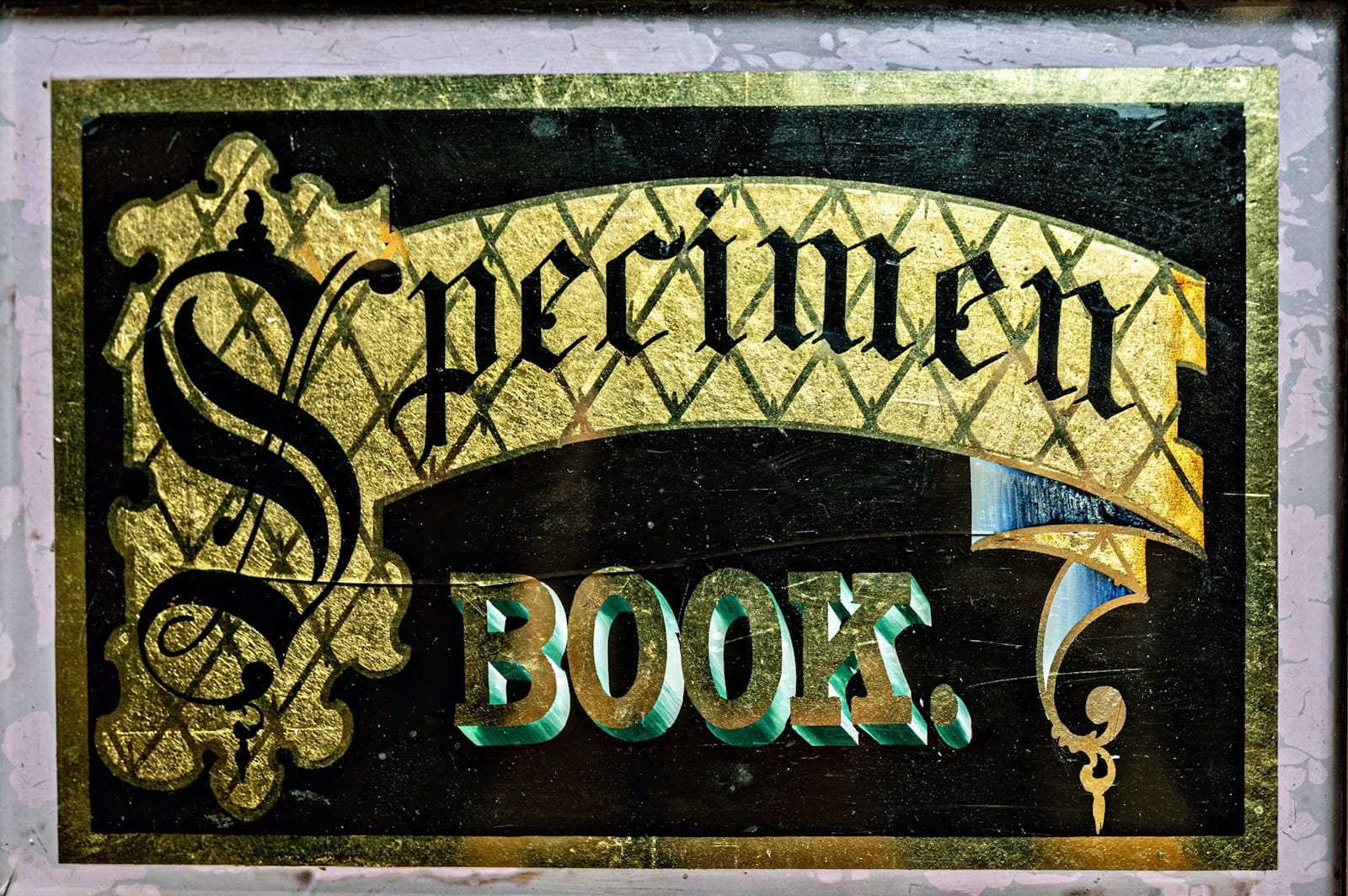
The cover of the photo album that Brooke used to present his set of gilding samples, and the ‘Specimen Book’ panel that named it.
The following is an extract from the American Sign Museum book.
“This series of gilded glass panels were originally glued to the blank pages of a photo album and used by George C. Brooke as a ‘Specimen Book Critique’, or what we’d call a portfolio today. The class of work in this case is at the very top end of what’s possible with the medium, showcasing myriad ornate effects that have been executed at a minute scale.”
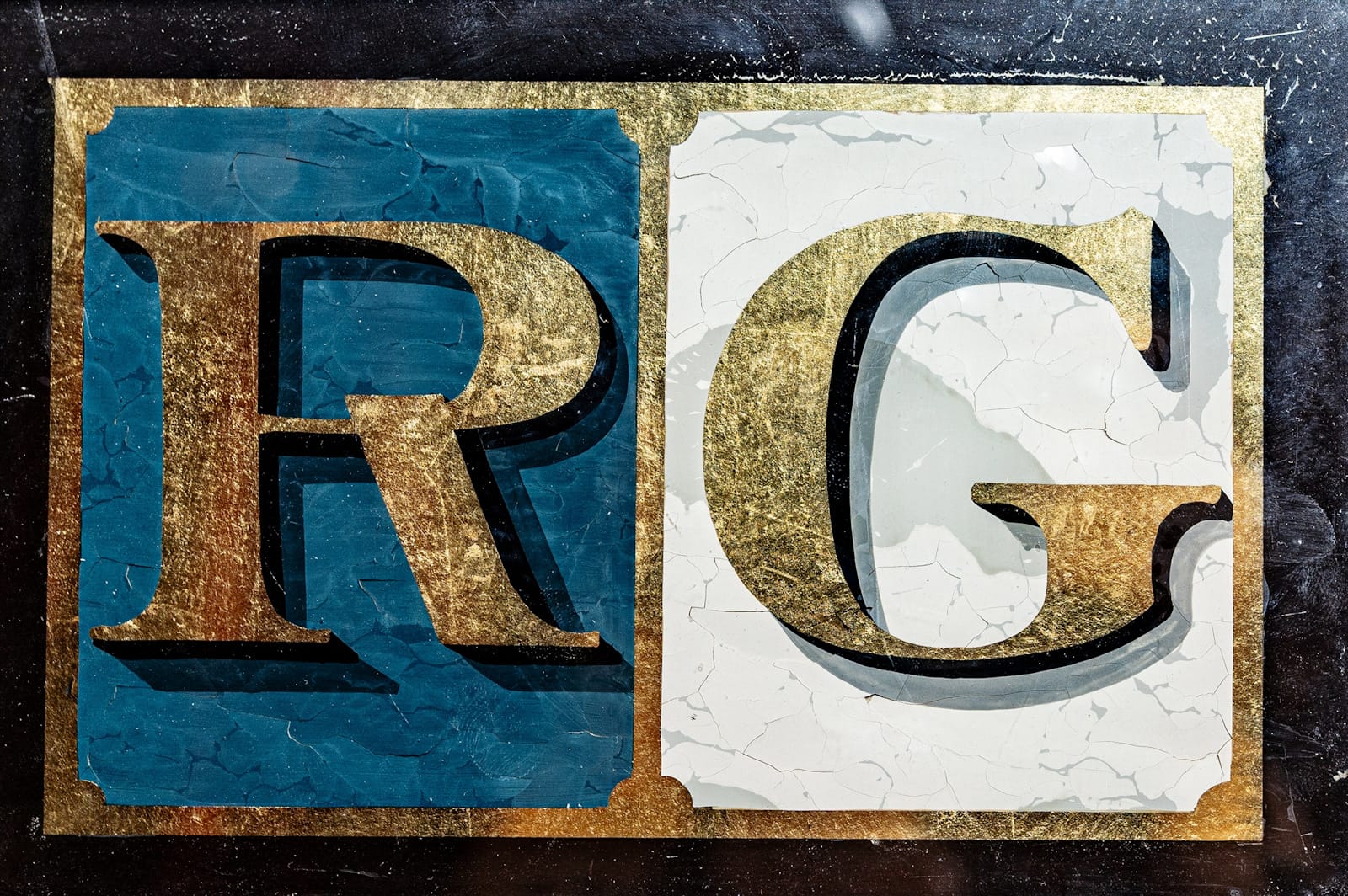
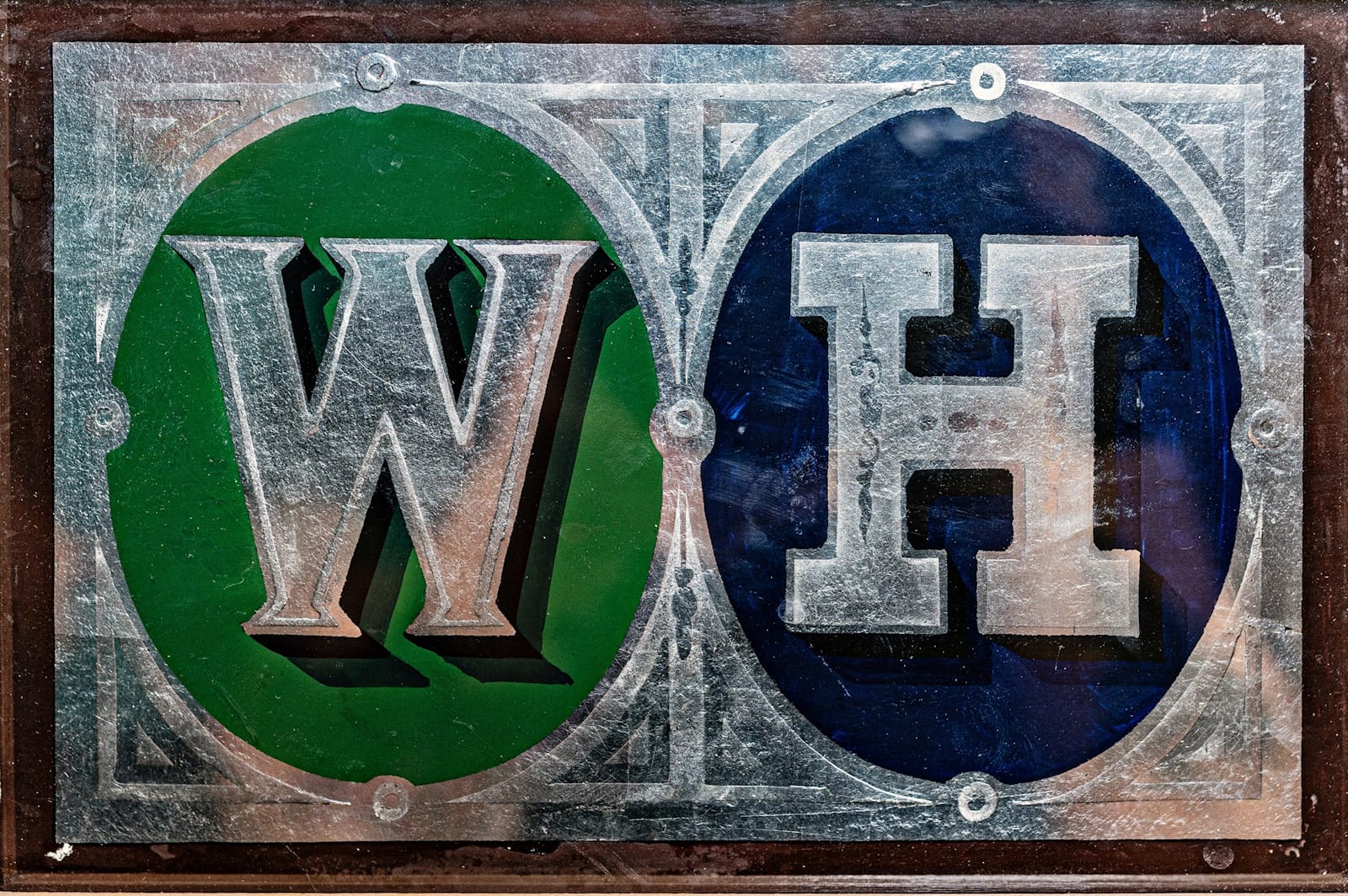
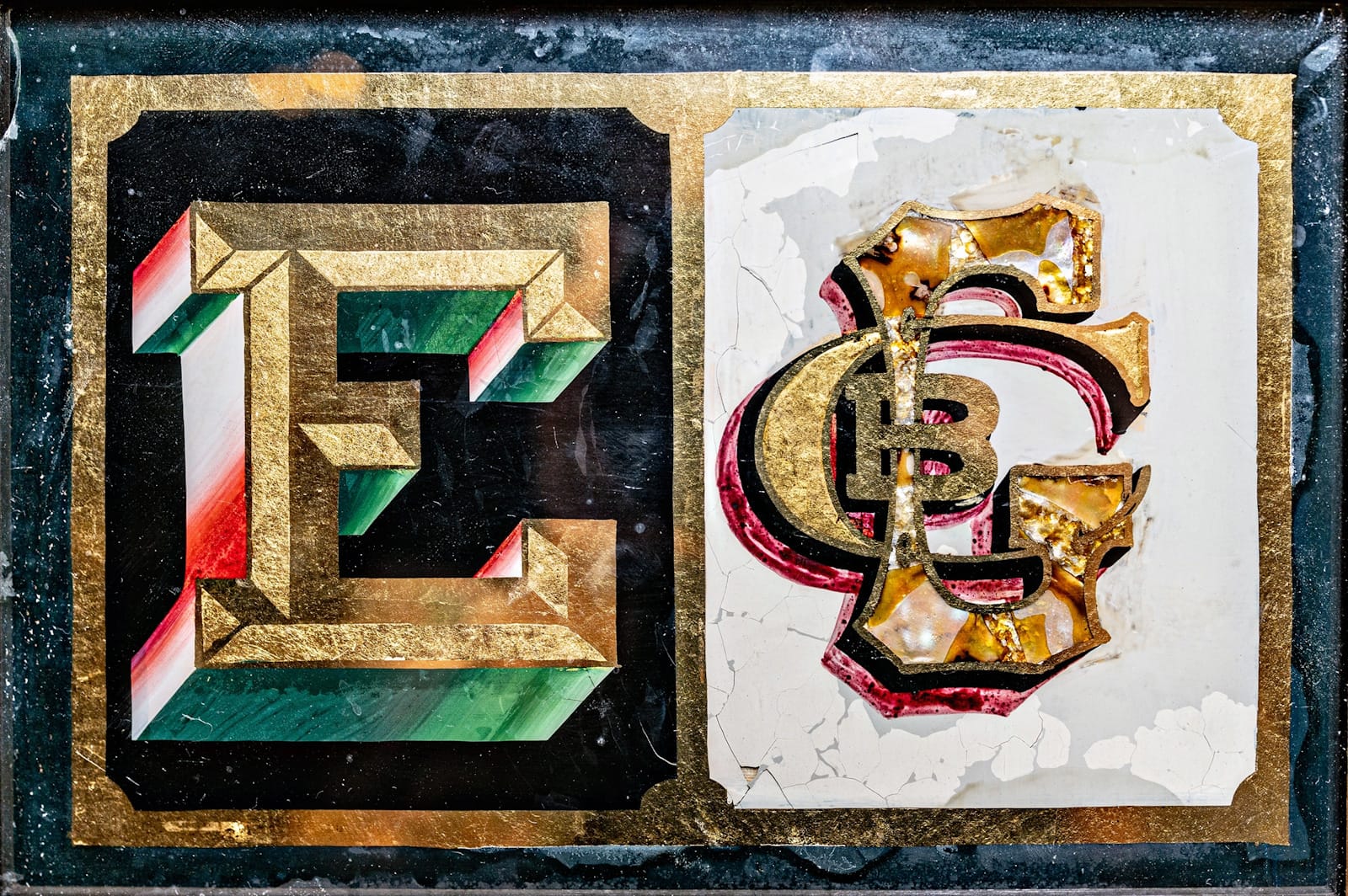
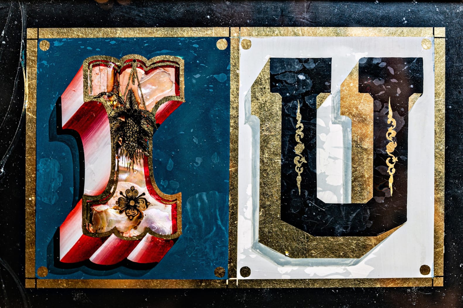
Most of Brooke’s panels are set up as ornately decorated pairs of letters.
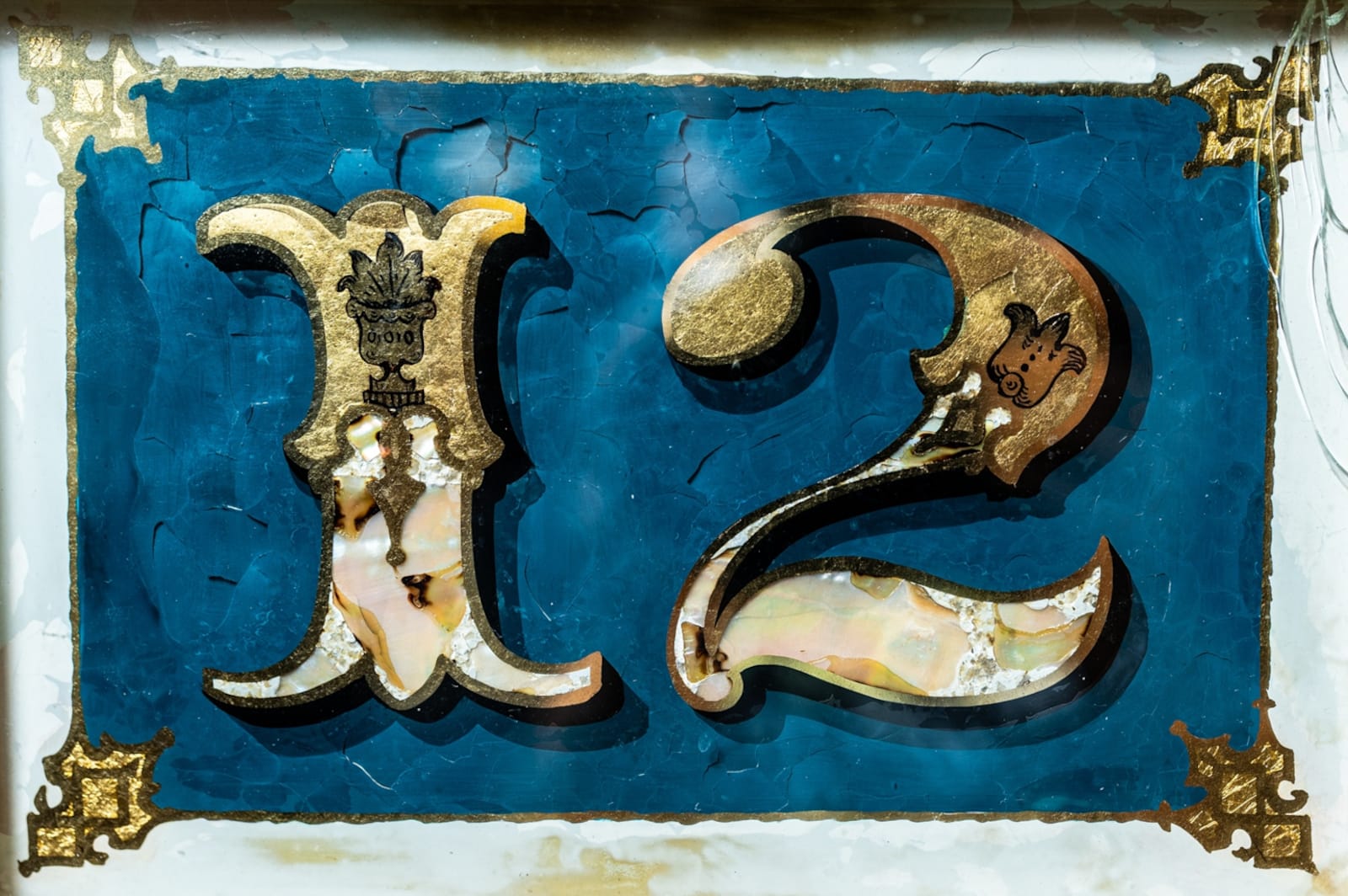
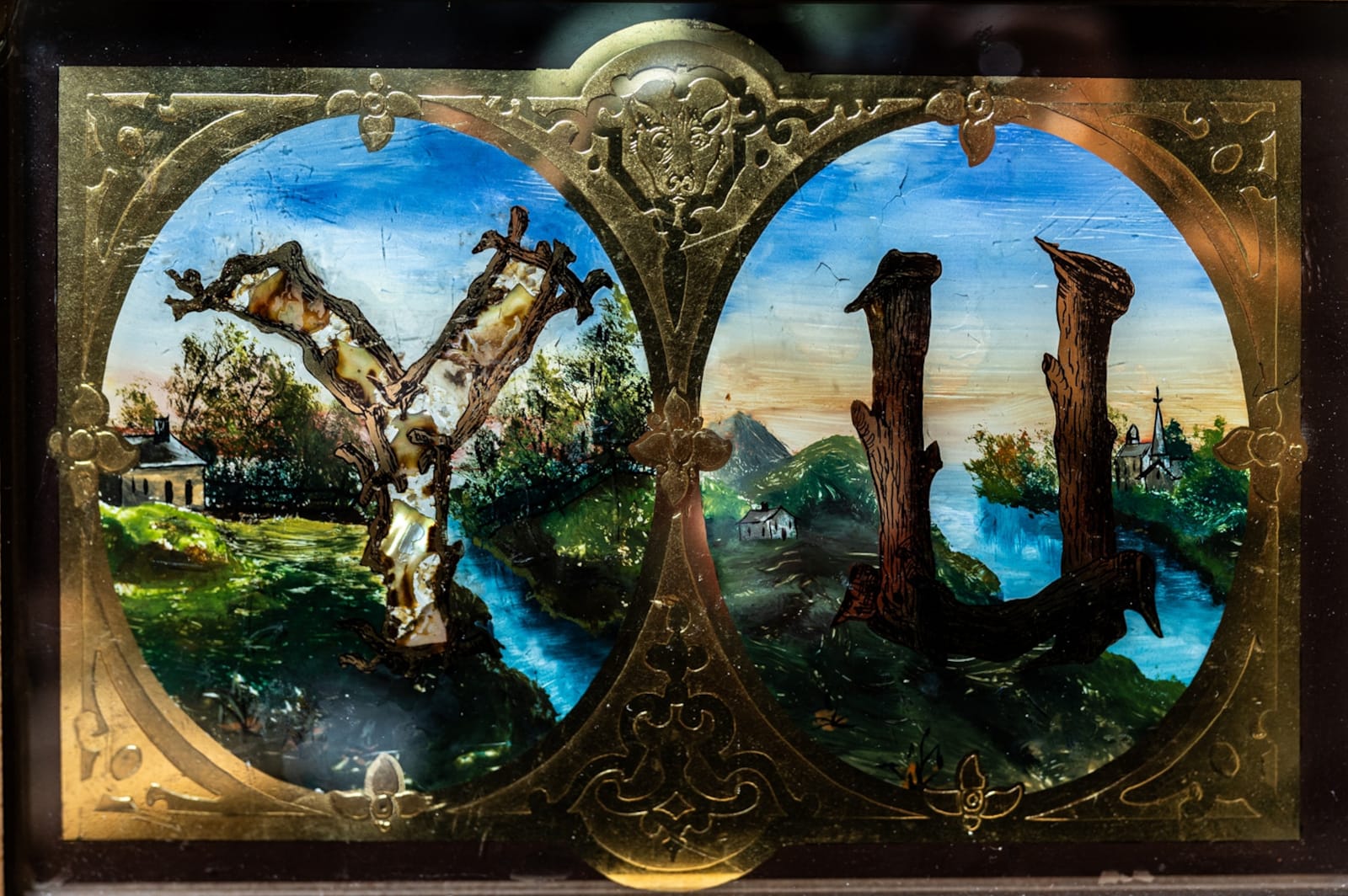
The level of detail is quite incredible for panels that measure a mere 22 × 17 cm (8.75 × 6.5 in).
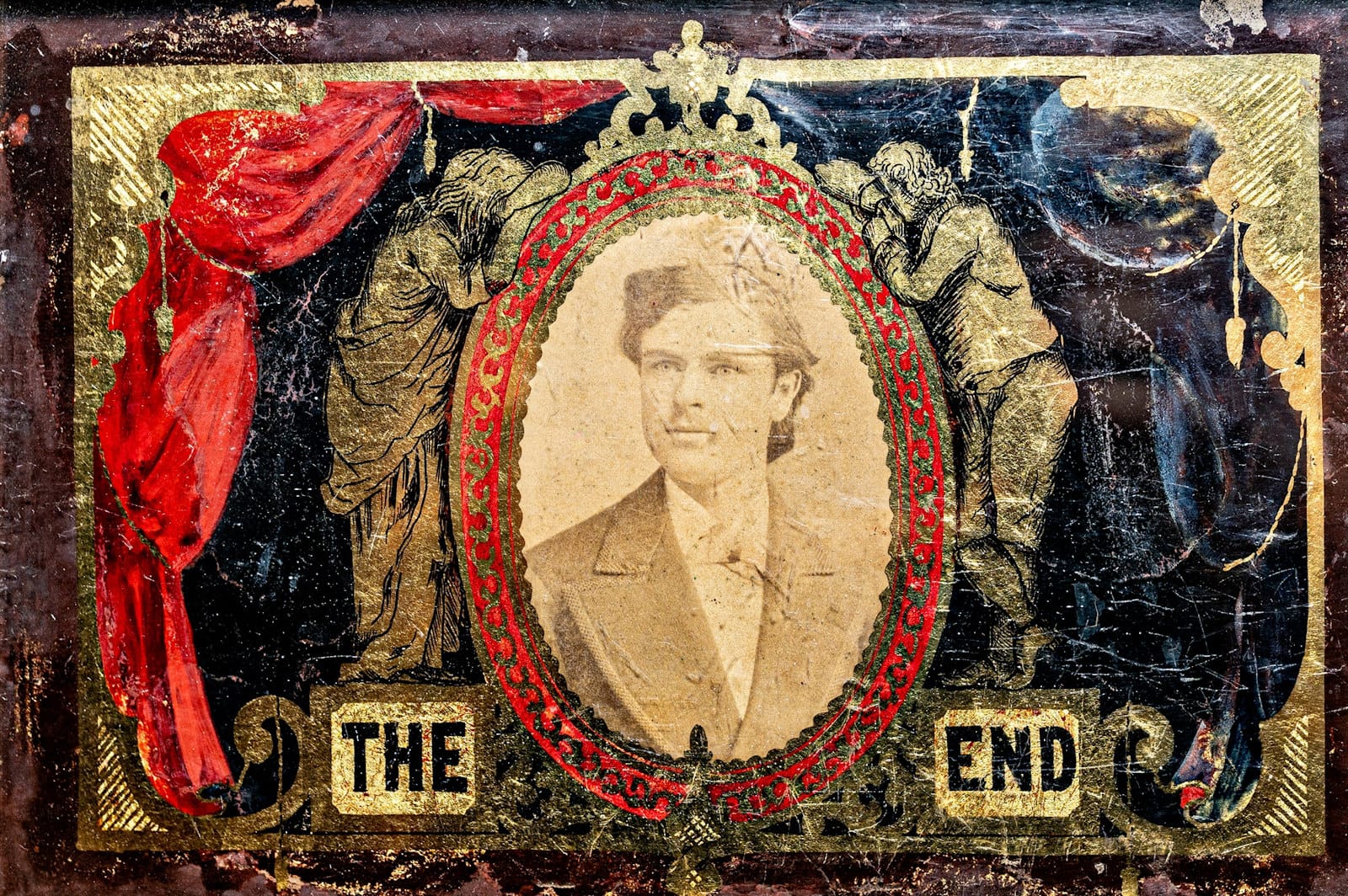
“One panel stands apart from the various letter samples: a photo of a man, framed with pictorial and other decorative elements, and captioned ‘The End’. This is not a portrait of Brooke, but rather a soldier that lost his life in the (then) relatively recent American Civil War. The intention was to sell similar memorials that families could hang or mount in a photo stand.”
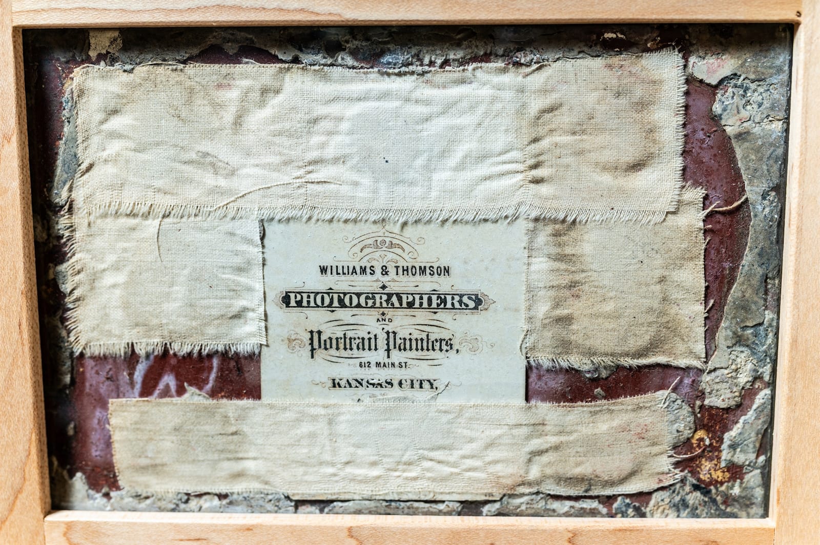
The reverse of the final panel shows the calling card for the photographers Williams & Thomson of 612 Main Street, Kansas City.
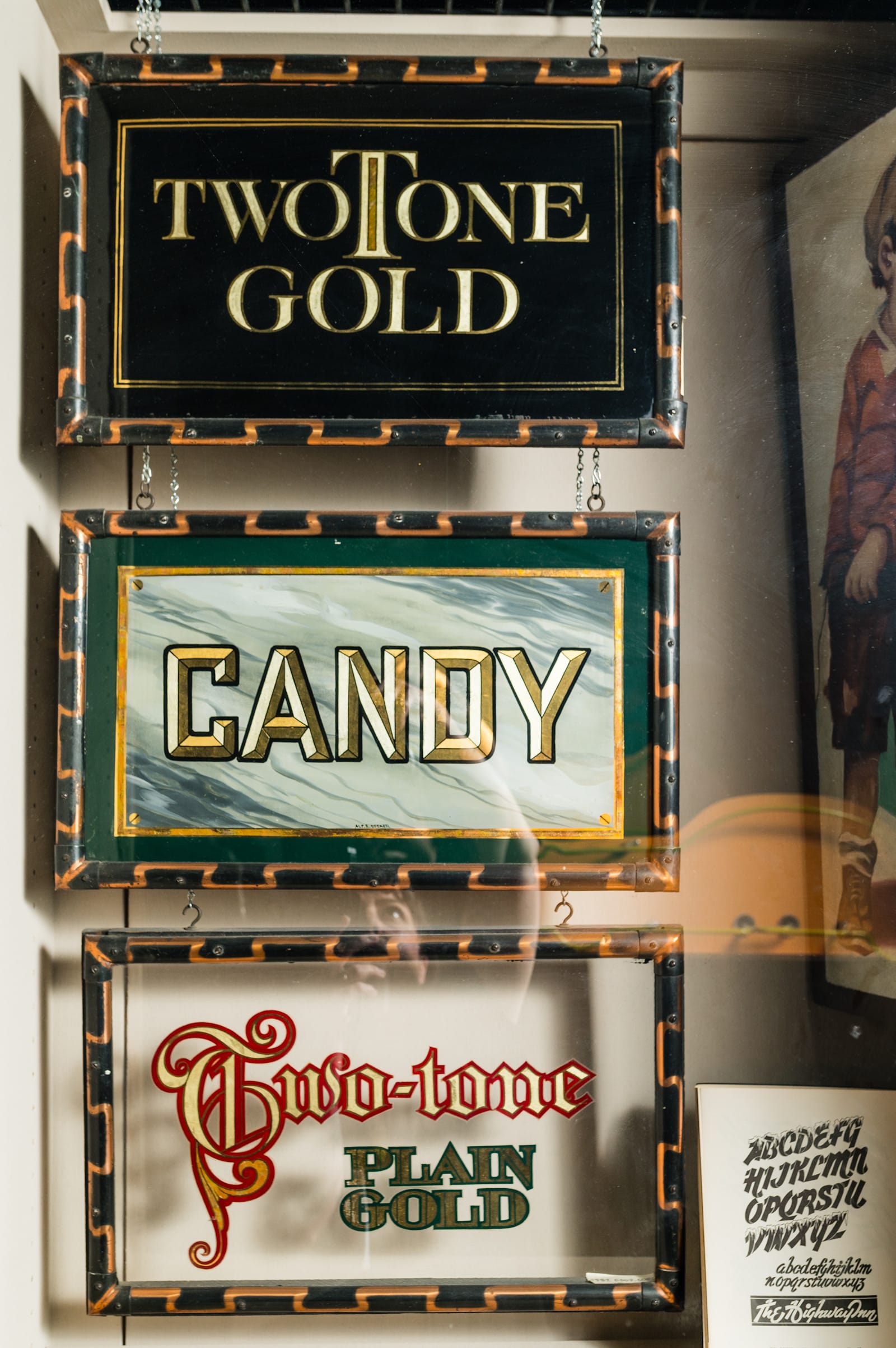
Bonus: Alf Becker
Like Raymond J. LeBlanc, Alf Becker was a distinguished Signs of the Times contributor, creating a total of 320 unique alphabets over a period of 27 years. (See one of them in this previous bl.ag online article.) In the 1930s, Becker worked for the G.A. Levy Co. sign firm, where he produced a set of gilded sales samples. These can be seen at the Museum, but don’t feature in the final selection of ‘Sign Stories’ in the book.
The American Sign Museum book is now available in the BLAG Shop and directly from the Museum. Please compare shipping costs to get the best value for wherever you are in the world.
More Books