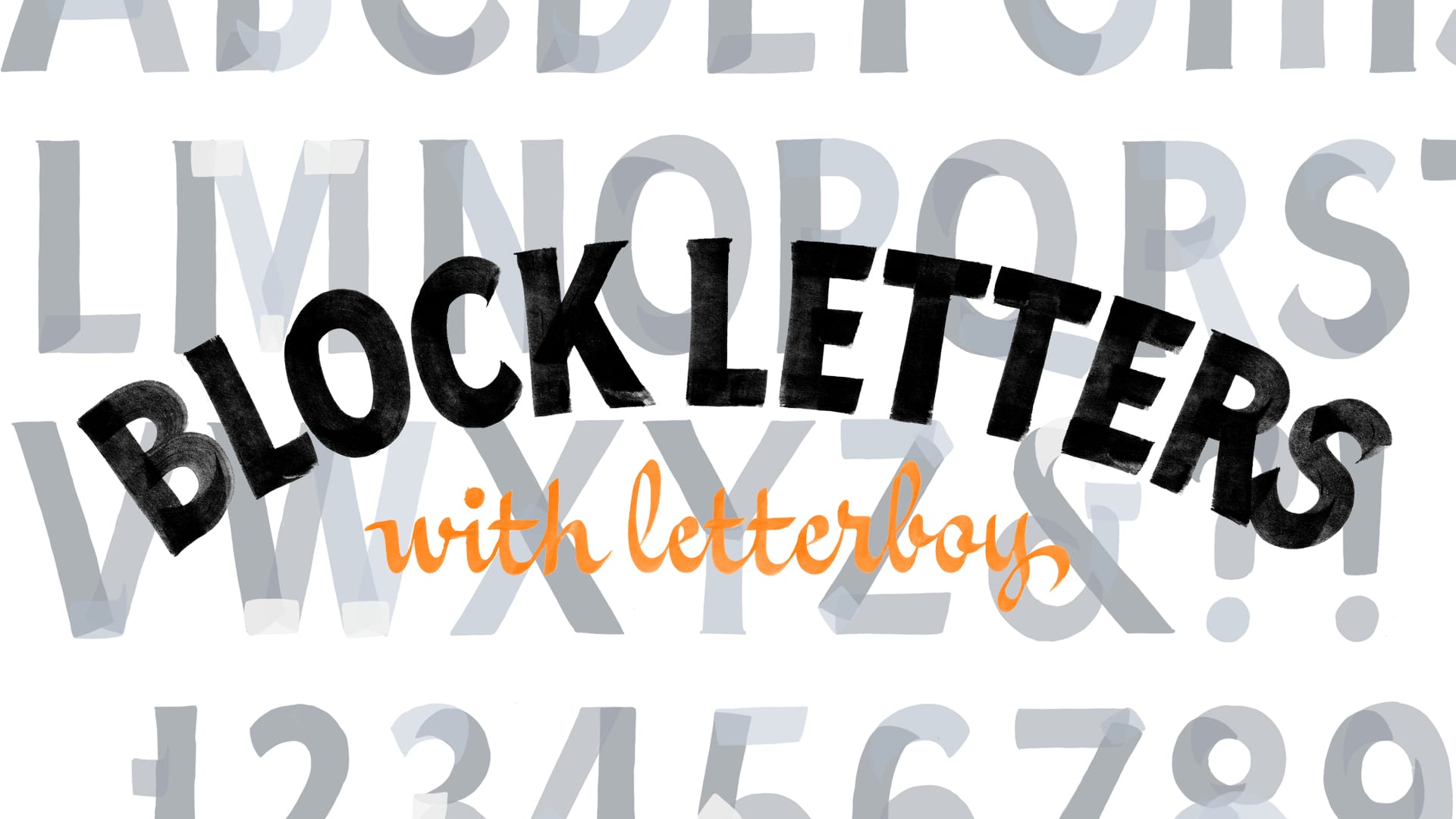
Brush Up Your Single-Stroke Skills at Letterboy's Block Party
Review and sample video from the new online course and community, Block Lettering with a Brush.

While a master of many styles, Peter Liedberg, aka Letterboy, is known for his bold and crisp block lettering. With over 12 years of practice under his belt, he recently rolled out an online course, Block Lettering with a Brush, to share his knowledge with a wider audience beyond his in-person workshops.
The course is marketed toward designers and hobbyists alike, noting that “if this is the first time you try this, it’s going to feel pretty difficult in the beginning, but don’t worry, it’s the same for everyone”. It’s broken up into 13 chapters, covering setup and materials, guidelines, basic strokes, individual letters, numbers, and punctuation, as well as spacing and contrast.
Peter walks you through the process of each step through video tutorials accompanied by helpful PDFs that summarise each lesson and expand upon them, making them valuable references to print and have by your side while practising.
The longest video is 13 minutes, but most hover between 5 to 10 minutes, which keeps them from feeling too long. This allows you to digest the lessons in bitesize pieces. A student who took the course, Sam Hollis, echoes this: “I only intended to watch the first video tonight and I ended up watching the whole course in one go and absorbed so much information!”
Course Overview
Setup and Materials
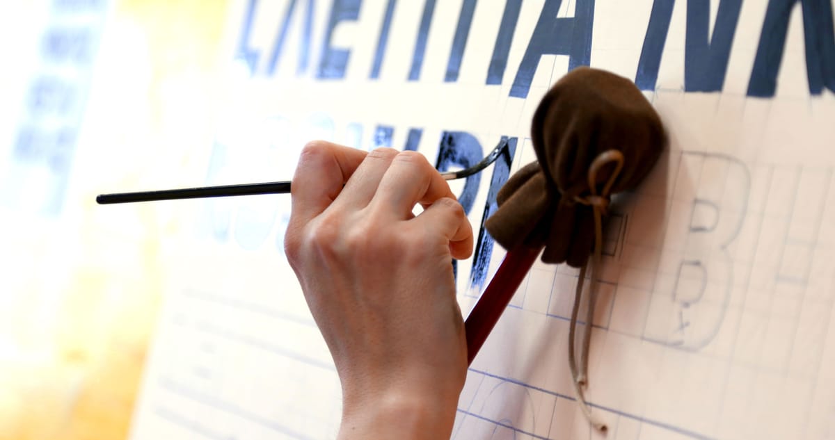
To get you started, Peter walks through how to set up your painting station with an angled easel, and explains the pros and cons of other ways of painting, ie flat and vertically. Recommendations for paper, paint, brushes, and other tools are covered as well.

Guidelines and Basic Strokes
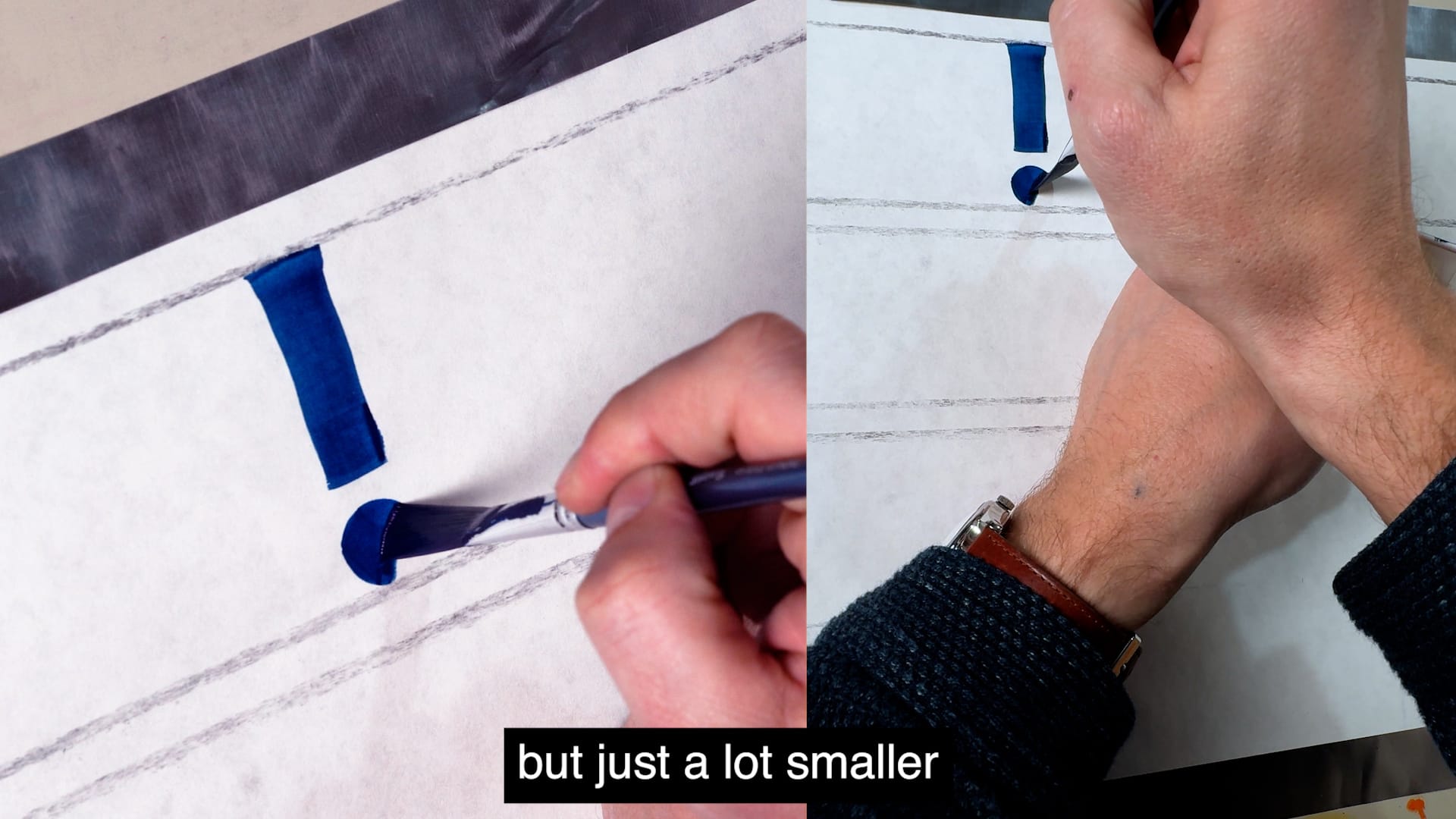
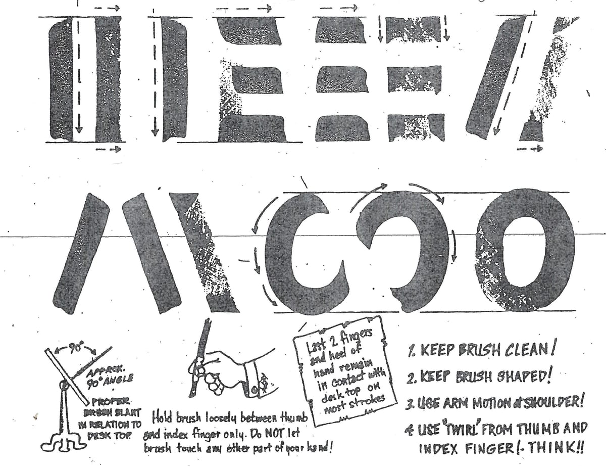
These two lessons discuss how to mark out your paper, as well as how to thin your paint and hold your brush, paint cup, and palette. Included is a simple way to determine your letter height in relation to your brush, as well as instructions on ‘scribing’ or pulling lines with a yardstick.
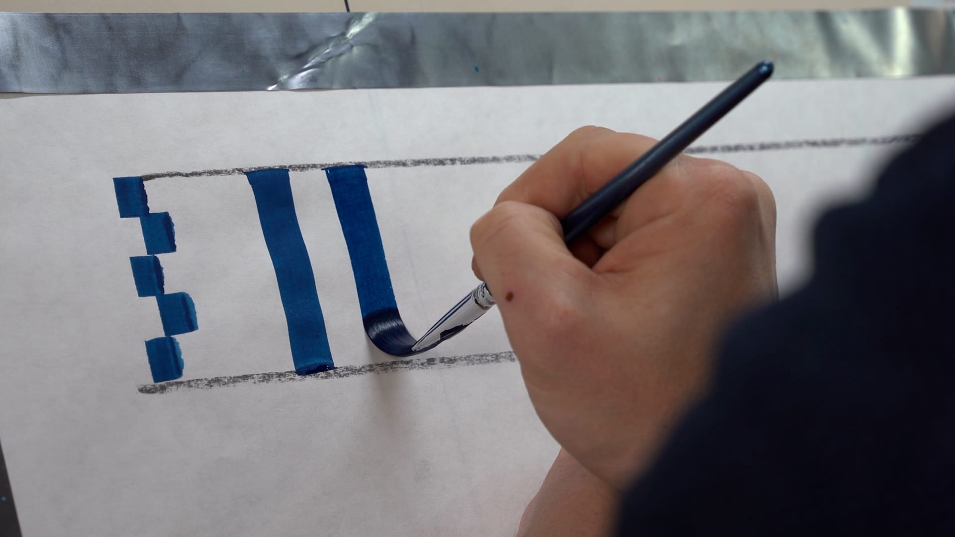
Vertical and horizontal strokes are demonstrated, but a small area of improvement here would be to include diagonal and curved strokes to practise, as they can be tricky; however, they are covered through practising complete letters in later lessons.
Letters and Numerals, Spacing and Contrast
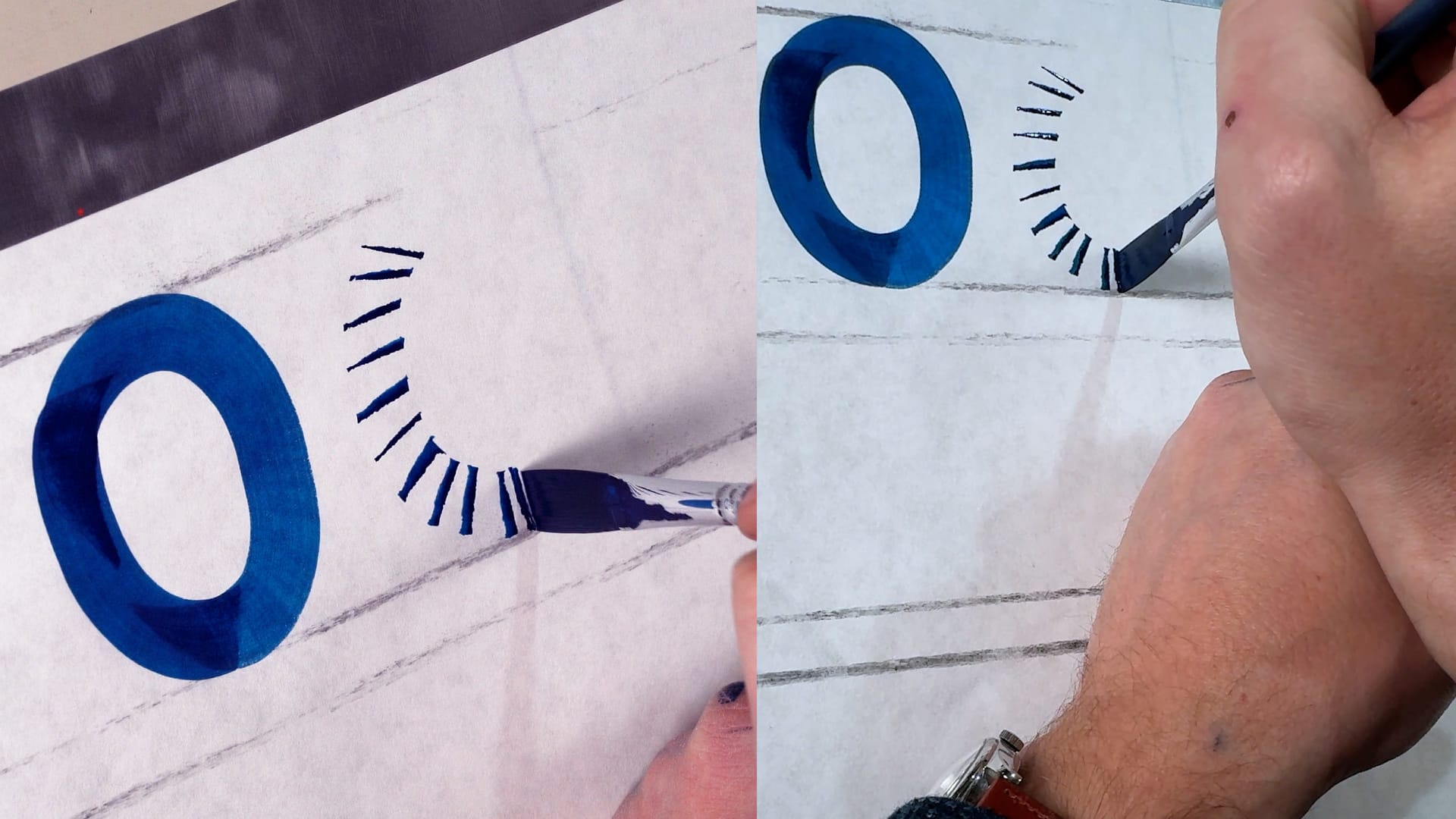
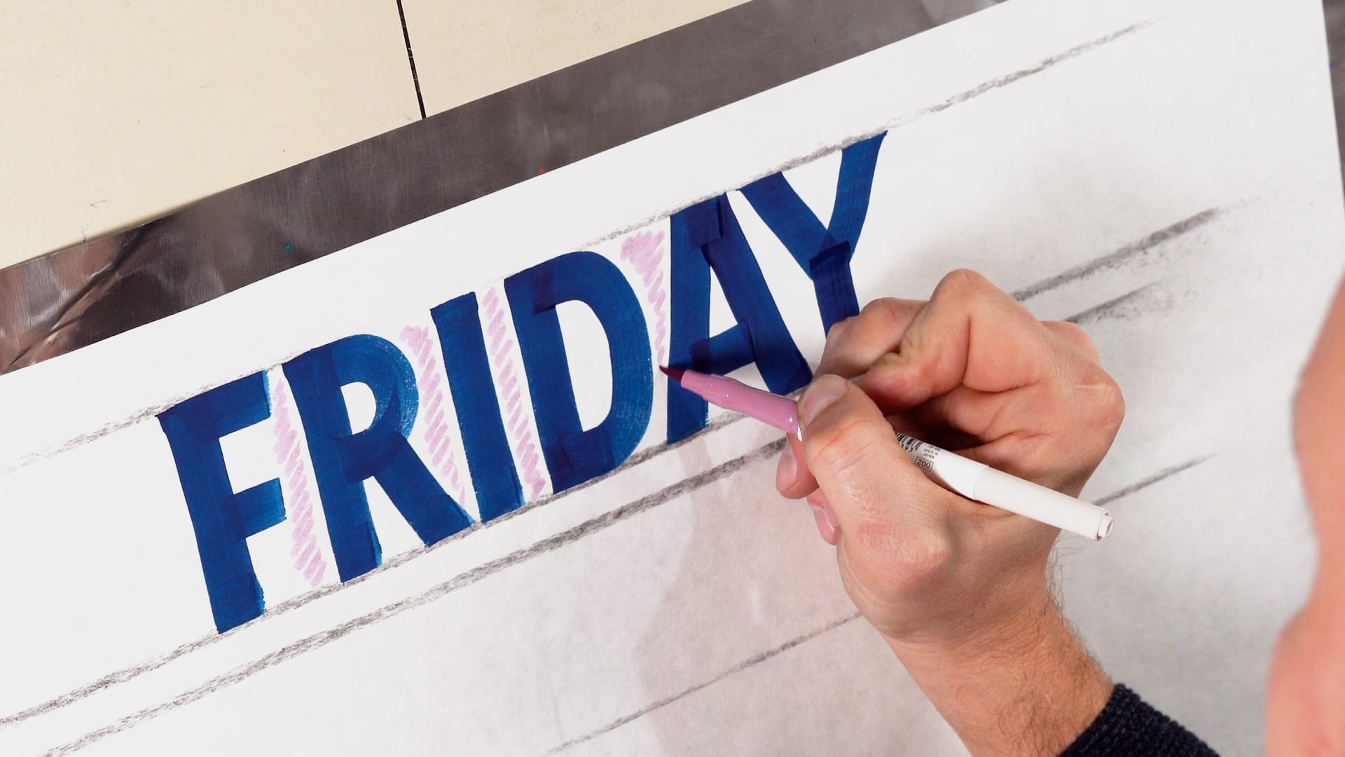
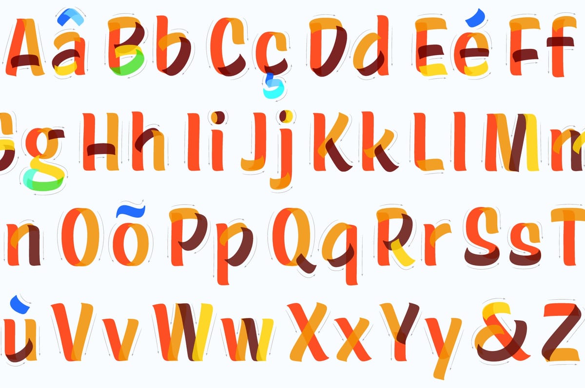
In the tradition of lettering instruction, Peter groups his individual letter lessons by similar strokes, so letters that feature vertical and horizontal strokes, like HEFLT, compose one lesson, and letters like AKMNVWXYZ that feature diagonal strokes are in another lesson.
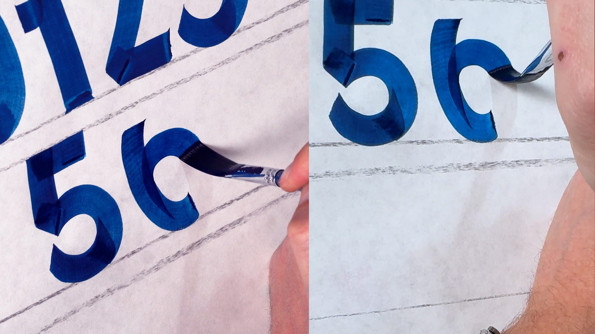
These videos are filmed with a split screen to show the brushwork from different angles. Peter offers tips on how to balance individual letters with stroke length and counterspace (negative space), and also demonstrates numerals and punctuation, a welcome lesson that isn’t always guaranteed in lettering instruction.
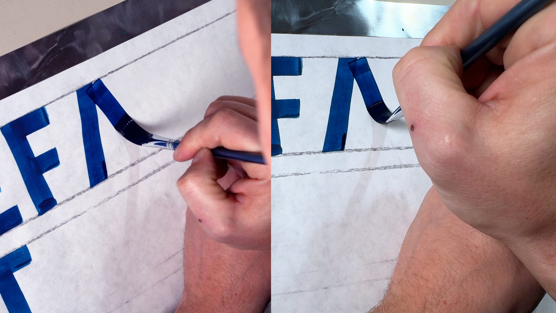
The split screen allows you to see how the brush is positiioned and to follow its movements as Peter paints. Subtitles are available in English and Japanese, with other languages available on request.
Peter then walks through the spacing between letters so that you can paint words with appropriate visual balance — BLAG members can watch this video at the end of this post. In the section on contrast, he shares a simple way to adjust the widths of your letters while maintaining proportions.
The Result? A Well-Paced Course for Flat Brush Lettering
As a whole, Block Lettering with a Brush is a thorough, easy-to-navigate, and well-paced introduction to block lettering with a flat brush. Gently and confidently, Peter guides you lesson by lesson with ease, sprinkling in helpful advice and tips along the way at the appropriate moments.
In the introduction, Peter notes that a lettering quill can also be used; however, the course and its corresponding advice are centered around using a flat brush. If you are just starting out with single stroke block lettering, or are a complete beginner, I recommend you follow the course with a flat. For those with previous experience working with quills, or that have made good progress working with a flat, feel free to follow it with a quill.
The $85 price is fair for the amount of information and guidance shared. You also gain access to a community board, where you can post questions or practice work so that Peter can help out further; previous enquiries include tailored advice based on a practice sheet and instruction on how to clean a brand new brush.
While the course is best suited for the beginner, more experienced painters will still pick up tips and tricks along the way — I know I did. Thank you, Peter, for bringing it to life and making lettering more accessible for all!
Block Lettering with a Brush is recommended for:
- Beginners interested in block lettering with a flat brush.
- Designers wanting to expand their hand-lettering toolkit.
- Seasoned sign painters looking to practise more.
More Resources
Spacing Video
Exclusively for BLAG members, Peter has shared this video on spacing from the course.