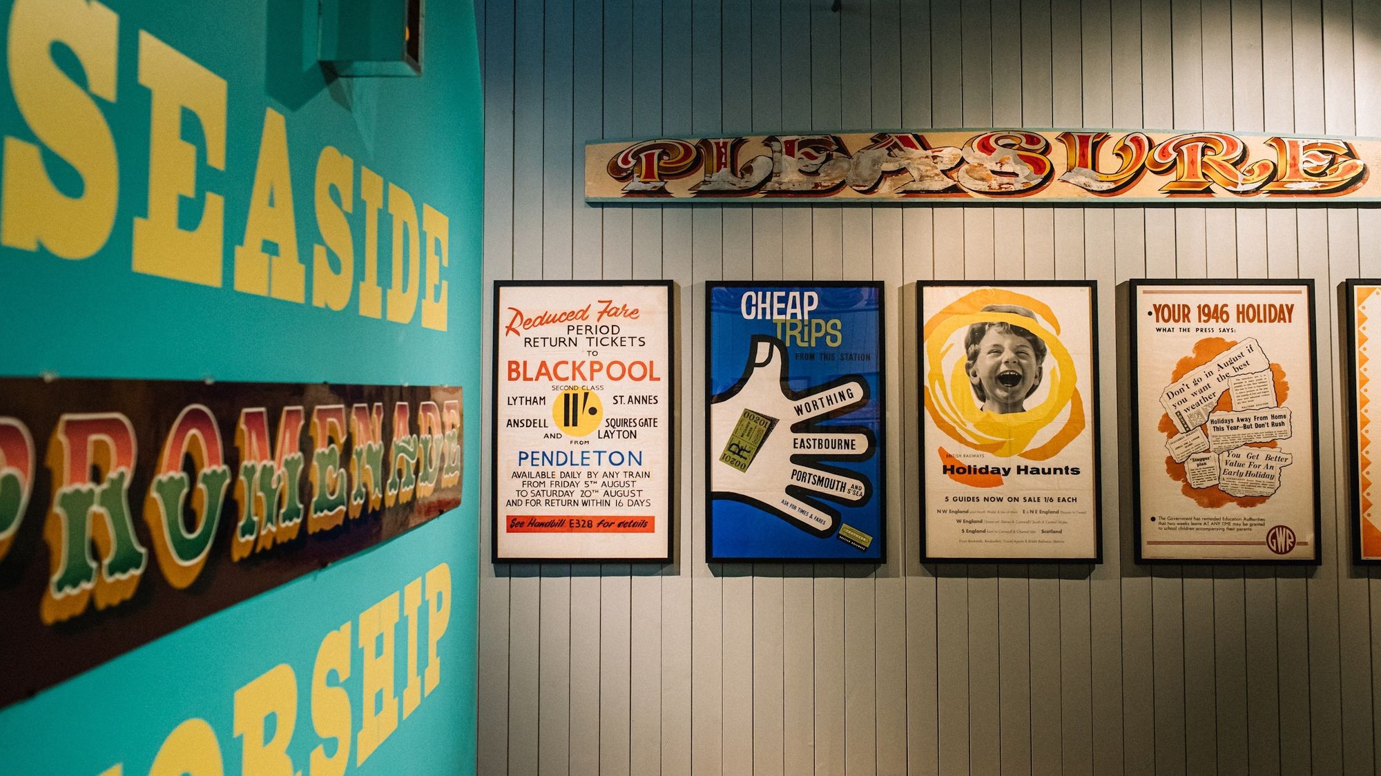
A hand-painted sign by Dr Amy Goodwin created for the Signs of the Seaside exhibition (left) alongside vintage travel posters and an original painted and gilded ‘pleasure’ panel.
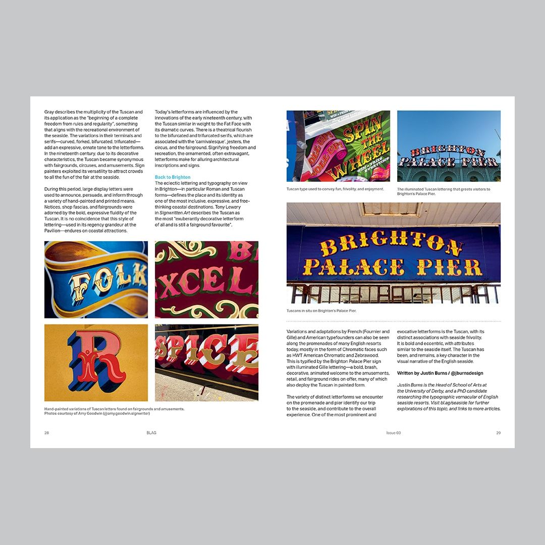
English seaside resorts have a rich and diverse heritage when it comes to lettering and typography. In Issue 03 of BLAG (Better Letters Magazine), designer and researcher Justin Burns (@jburnsdesign) explores one noteworthy aspect of this: the Tuscan letter.
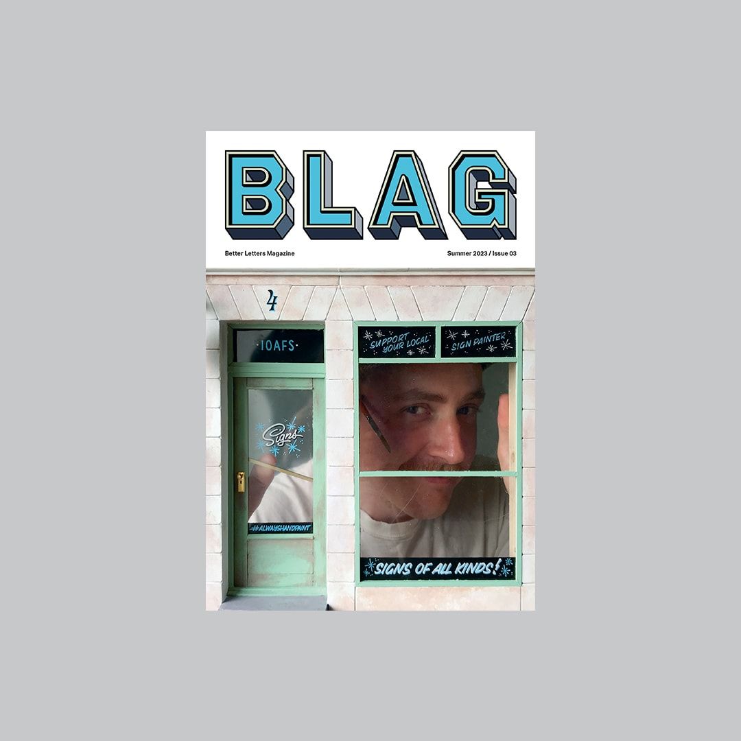
BLAG 03 and a spread from Justin Burns' article on Tuscan letters.
Justin has been researching the typographic vernacular of English seaside resorts for his PhD, and recently curated an exhibition, Signs of the Seaside, at the Ditchling Museum of Art + Craft in Sussex, UK.
For those unable to travel, here is a look at some of the work on show, which spans the disciplines of graphic design, typography, sign painting, illustration, and photography. These sit alongside a host of original artefacts, including hand-painted signs, bill posters, books, and type specimens.
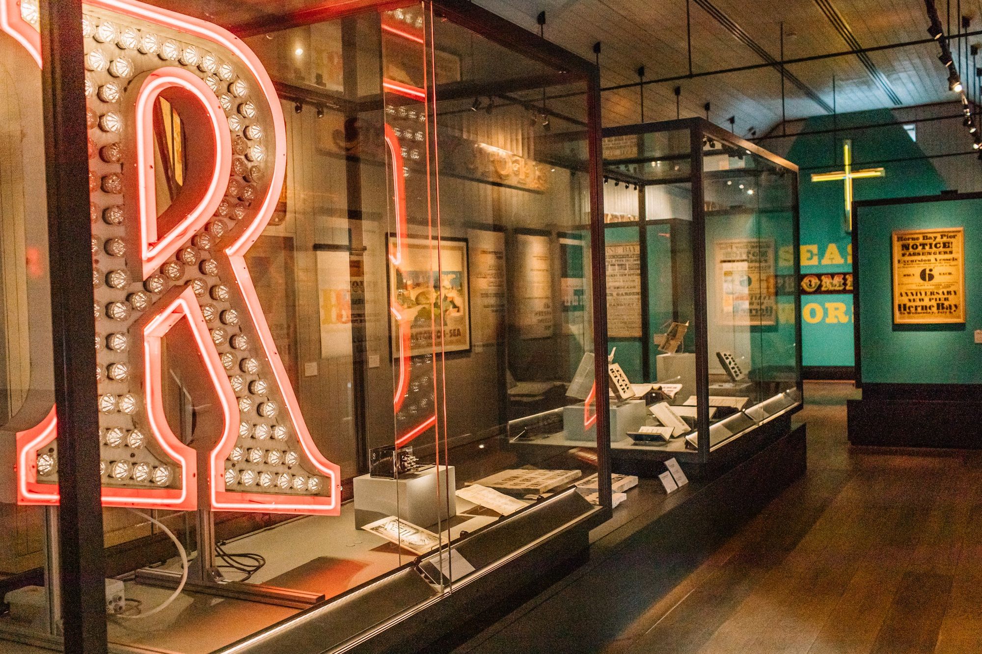
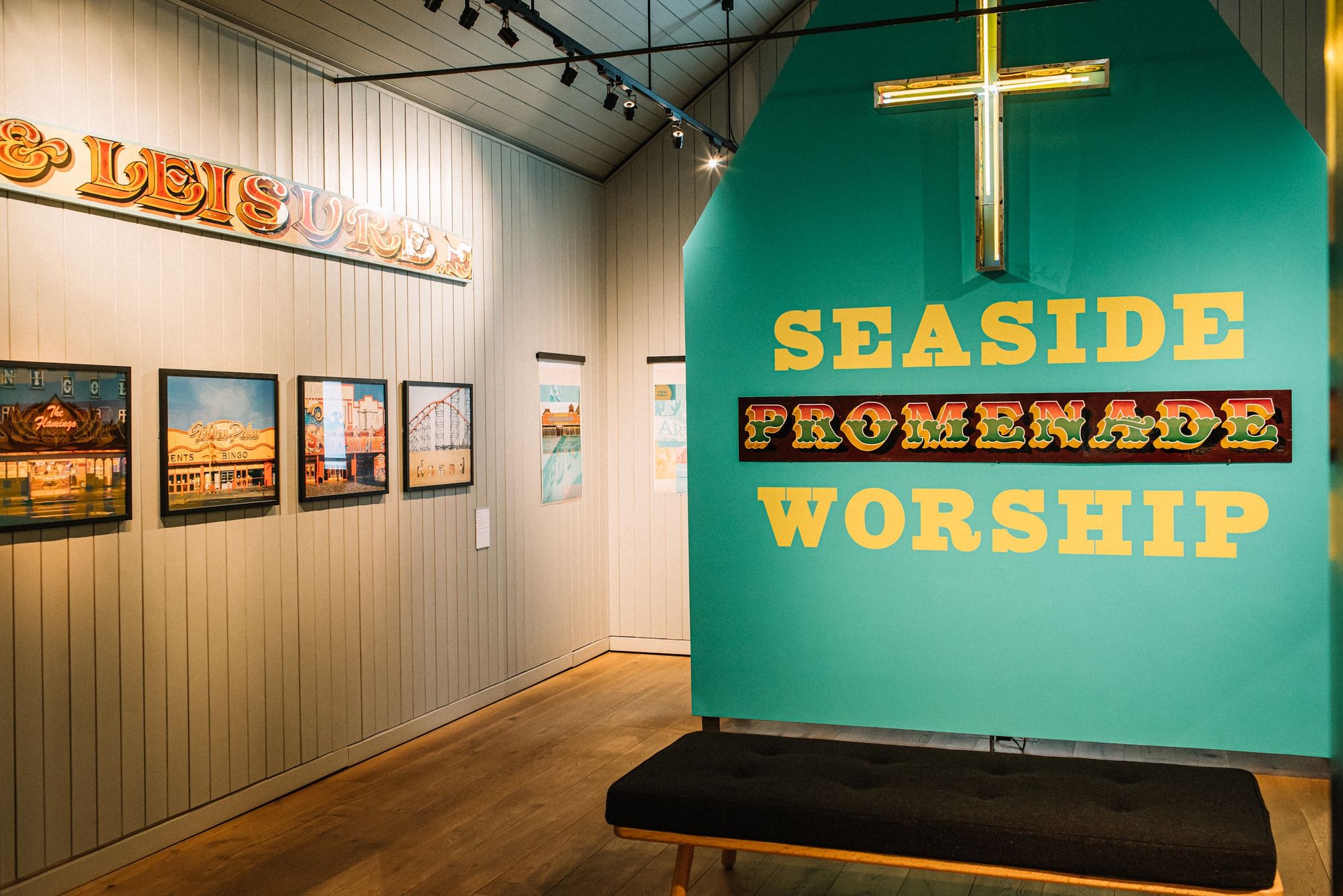
The exhibition space and, in the foreground, the 1.5 m (5 ft) letter ‘R’, which once graced the entrance to Brighton Pier, and has been renovated and reimagined for the exhibition by neon artist Andy Doig (@andydoigneon).One of the centrepieces of the exhibition is this 'Seaside Promenade Worship' commission painted by Dr Amy Goodwin (@amy.goodwin.signwriter). To the left is coastal photography by Rob Ball (@rob.ball).
The historical context of typography and lettering at English seaside resorts is explored through a range of original artefacts, including guidebooks, bill posters, and type specimens. These come from the collections of the museum itself, the St Bride Foundation, and the curator, who explains: "Typographic innovation was led by type founders Vincent Figgins and Robert Horne; new display typefaces such as Serifs (Roman), Fat Faces, Egyptian Slabs, Tuscans, and Antique typefaces were fundamental to the visual impact of posters and bills of the time. Type specimens show the influence of these early innovative typefaces on the promenade to this day."
Justin Burns' own work, Sea Facing, illustrates the transition and usage of some of the most familiar typefaces we observe along the promenade.Vintage travel posters straddled by an original painted and gilded ‘pleasure’ panel. Posters kindly loaned by Original Railway Posters.
New to BLAG (Better letters Magazine) and enjoying this article? Sign up now for a free subscription to unlock even more sign painting resources and the latest news.
In this collaboration with the poet Ian McMillan, Justin Burns responds to Ian’s literary wanderings along the promenade in typographic form.The S!O!S! piece by Anthony Burrill (@anthonyburrill) touches on a number of themes, as curator Justin Burns explains: "Burrill explores the impact of one of the most frequently used typefaces at the seaside: Playbill, designed by Robert Harling in 1938. Typefaces of this design and weight have been commonly used for ‘Wanted’ posters, Wild West themes and circuses. The prints are notice of the impact of typography at the seaside, and also a reference to a maritime call for action."
The Signs of the Seaside exhibition with visitors and curator Justin Burns (last picture) at the Ditchling Museum of Art + Craft.
Curator Justin Burns has written a piece about the history and role of Tuscan letters at English seaside resorts for Issue 03 of BLAG (Better Letters Magazine). The articles linked below will then get you even deeper into various aspects of his research.