Signage Rebirth: Reimagining Slovenia’s Lettering Heritage
Alja Herlah shares her work recreating and reinterpreting iconic Slovenian signs and logotypes.

At last month’s All You Can Type conference in Vienna, Alja Herlah shared her recent work documenting Slovenia’s sign painting heritage. The research emerged, and was funded, as a direct result of her self-initiated ‘Signage Rebirth’ project. While ‘Signage Rebirth’ has parallels to Juan Nava’s ‘Letras Recurperadas’ (Recovered Letters) initiative, Herlah’s work builds on this to offer up her ‘take’ on the signs and logotypes she encounters. I invited her to share her approach to reimagining Slovenia’s lettering and typographic heritage, illustrated by a dozen applications of her treatment.
Signage Rebirth: Reimagining Slovenia’s Lettering Heritage
By Alja Herlah
In 2019, I began working as a freelance designer. Since freelance projects tend to come in waves, there were periods when I had the time and freedom to focus on my own practice. I wanted to step away from the corporate type design work that had shaped much of my professional experience and explore a more playful approach to lettering.
Having recently returned to Ljubljana after working with Dalton Maag in London, I also felt a growing desire to dig through archives and rediscover Slovenia’s typographic heritage. One particular logo had been on my mind for years: the identity of the Slovenian airline Adria Airways. When the company went bankrupt in 2019, it presented an opportunity to redesign the logotype, by reversing the contrast of the letter A and balancing the word on my terms.
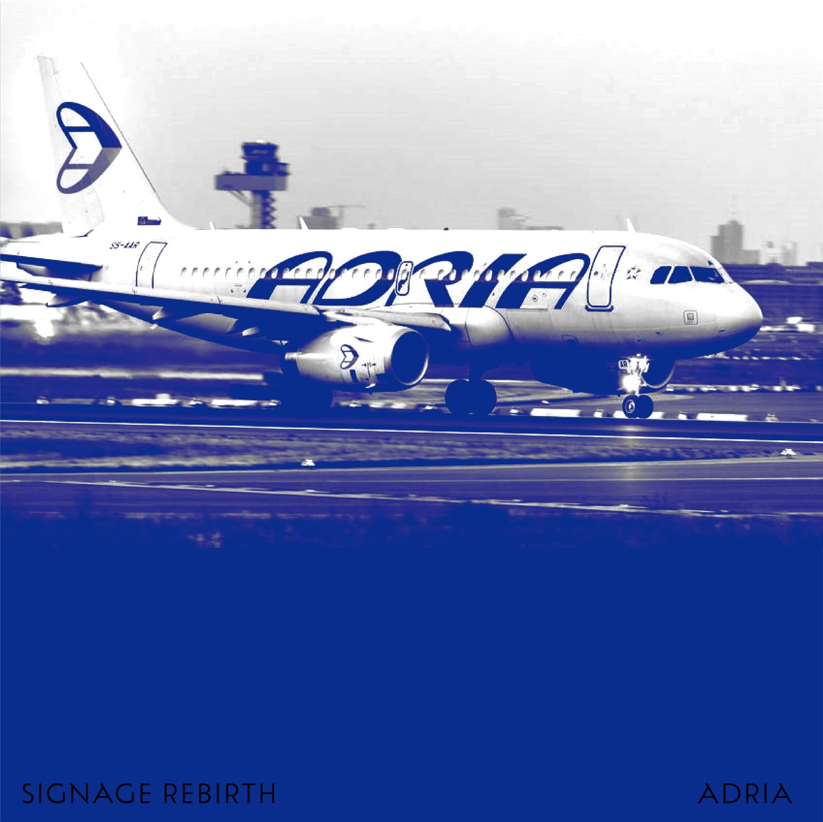
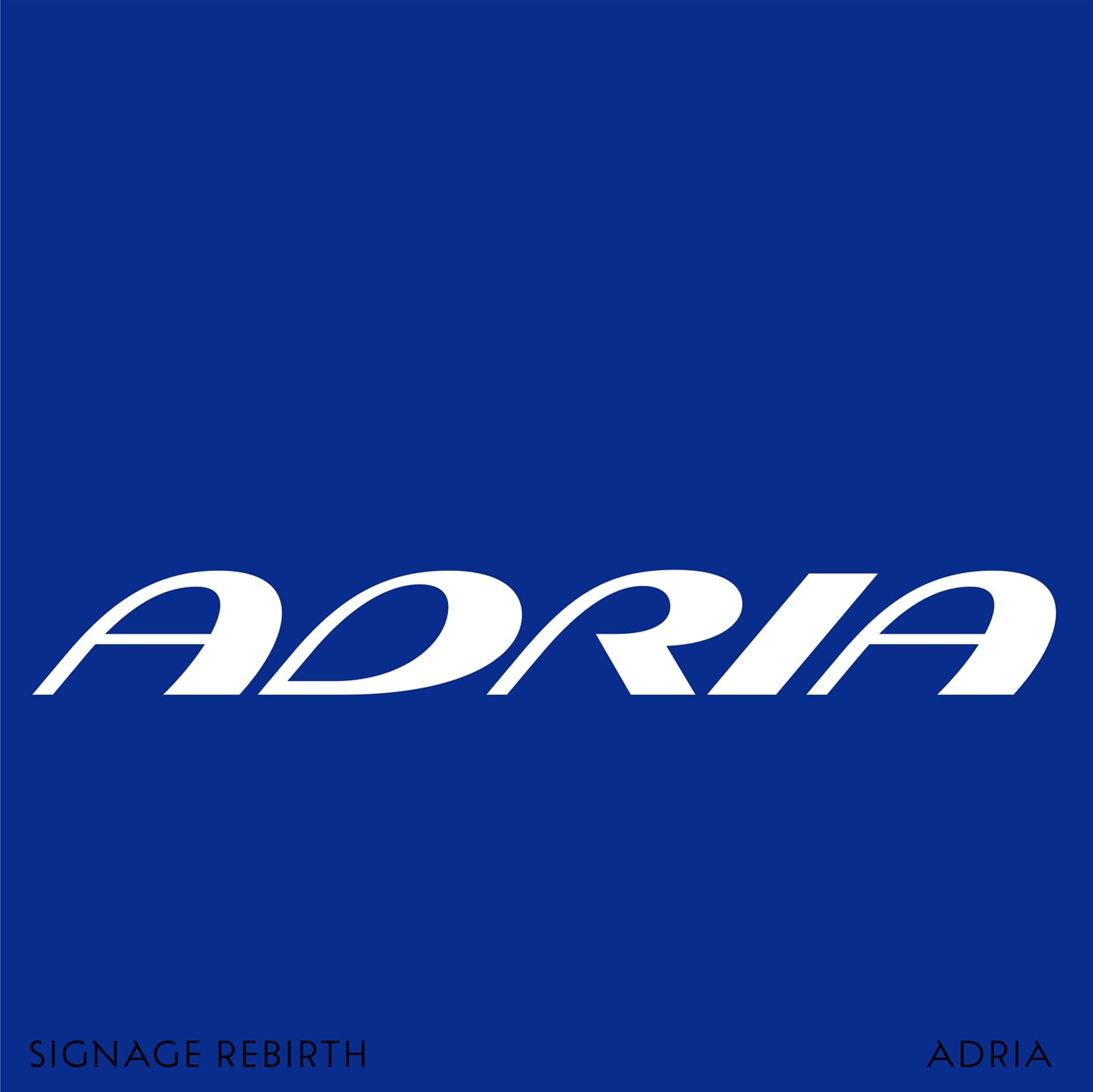
The Adria Airways logotype was the first Signage Rebirth project with a focus on unifying the contrast between strokes.
The Signage Rebirth project serves as a visual commentary on closed shops, restaurants and companies whose visual identities remain part of our collective memory. Many of these businesses no longer exist, yet their signage and branding continue to evoke a sense of nostalgia. Through Signage Rebirth, I am revisiting these identities, preserving what made them memorable while reinterpreting them through my own design perspective.
The project has led me deeper into the field of Slovenian sign painting and, through my work raising awareness of disappearing signs, I have received funding to research the history of sign painting in Slovenia. I will share more of this work in the future but in the meantime, here are some of the signs and logotypes that I’ve reimagined through my Signage Rebirth initiative.
Bonboníera
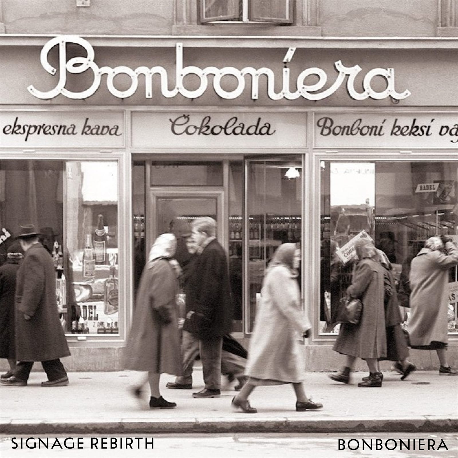
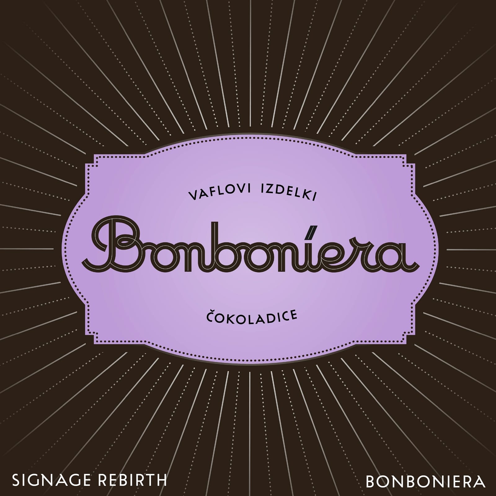
This is such a nice sign from the northern part of Ljubljana. The shop used to sell chocolates and sweets and so the lettering is therefore curvy, soft, and delicious.
Zastava
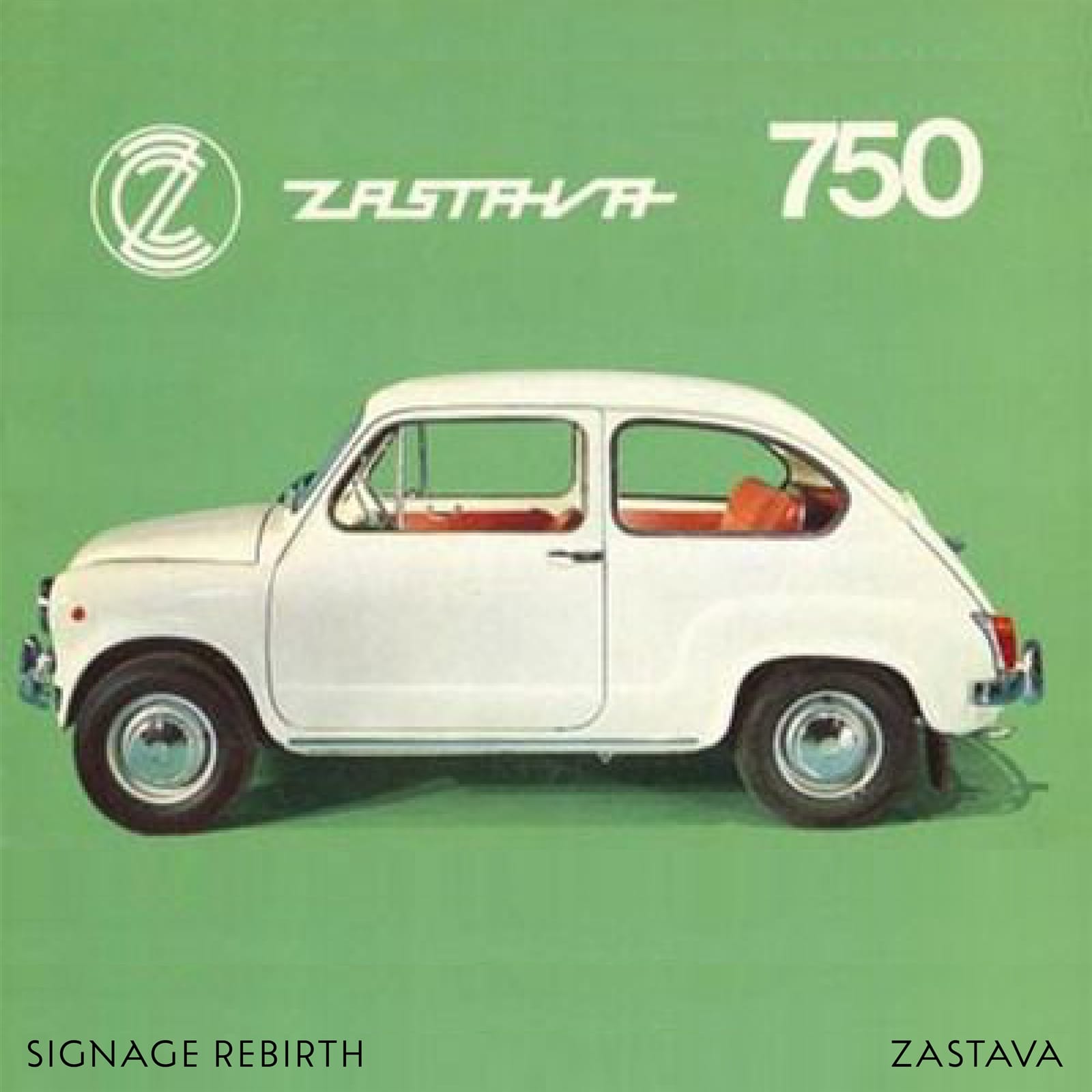
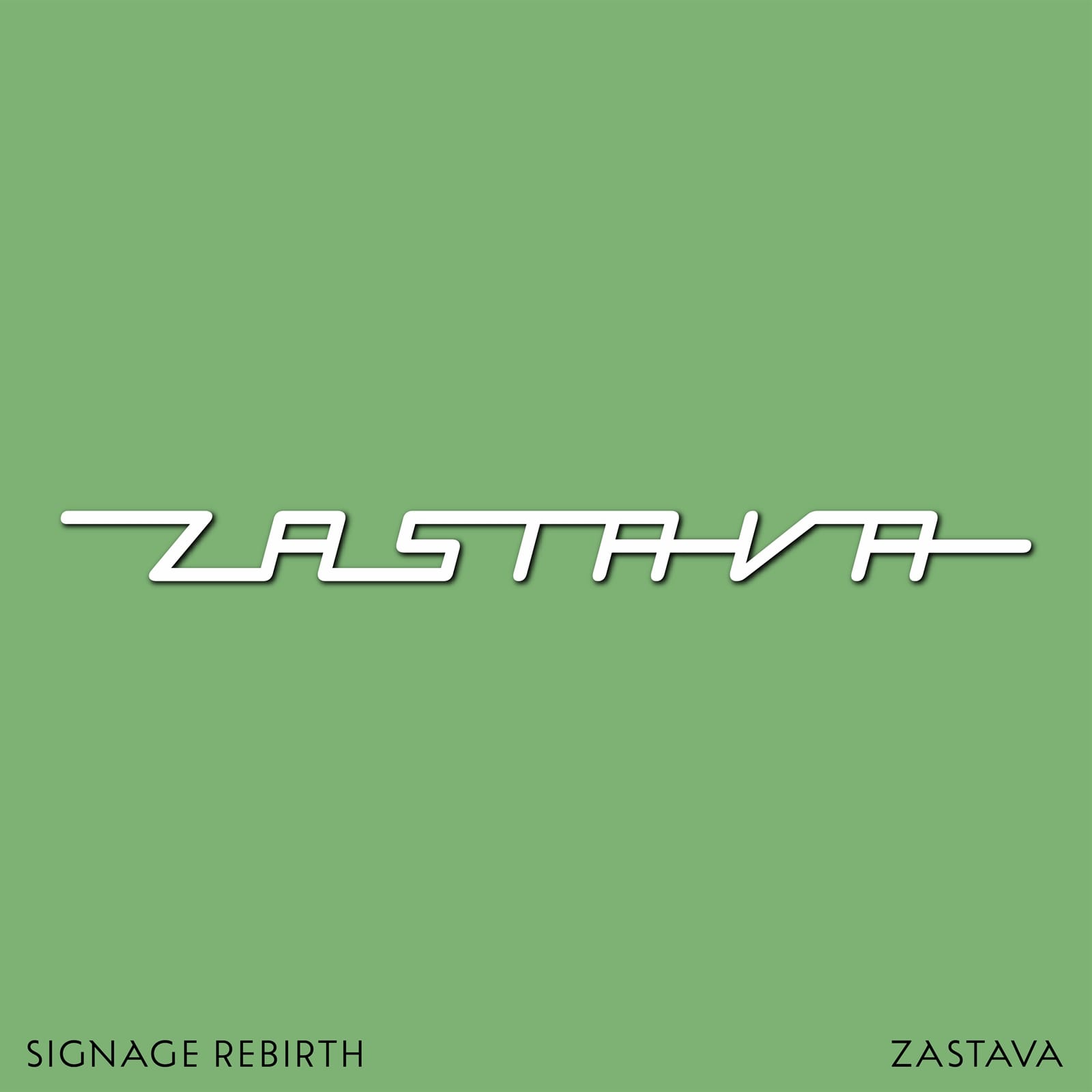
Zastava was an iconic Yugoslavian car manufacturer. (Prior to 1991, Slovenia was part of the former Yugoslavia.) I believe this version of the logo is one the earliest, used in the 1950s. The digitised letters stick together, which gives them a feeling of movement. Instead of the original sharp, squarish corners, I rounded them slightly to give them a softer touch.
Mura
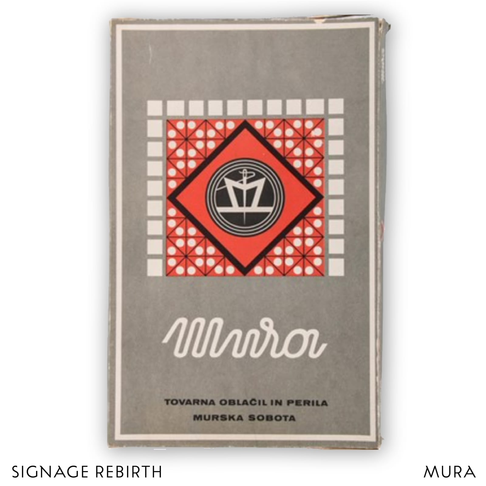
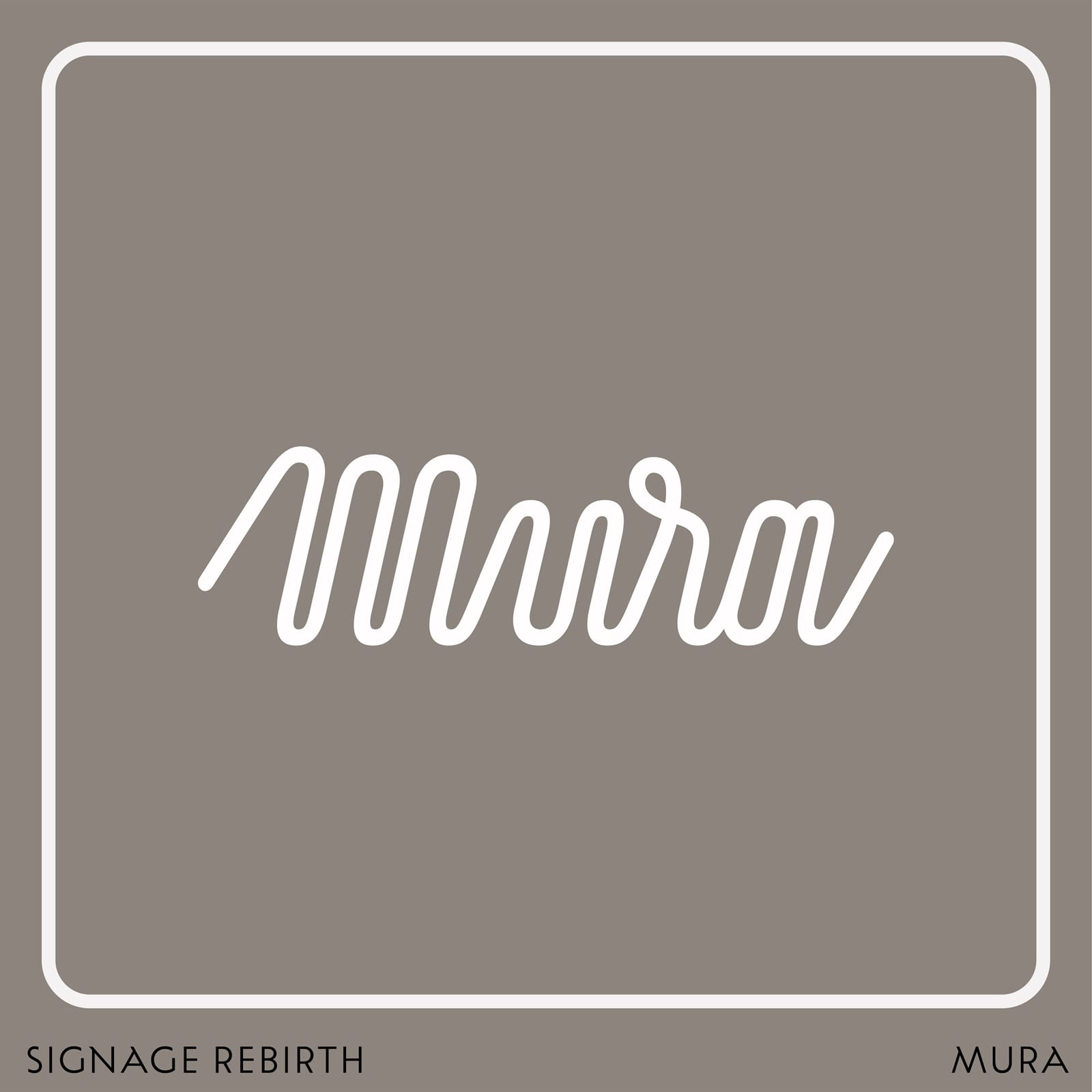
Mura was founded in 1925 in the town of Murska Sobota in northeastern Slovenia and was once one of Europe’s largest manufacturers of clothing for men and women. This logotype that formed the starting point for my work is, I believe, one of their earliest.
Mestna Hranilnica Ljubljanska
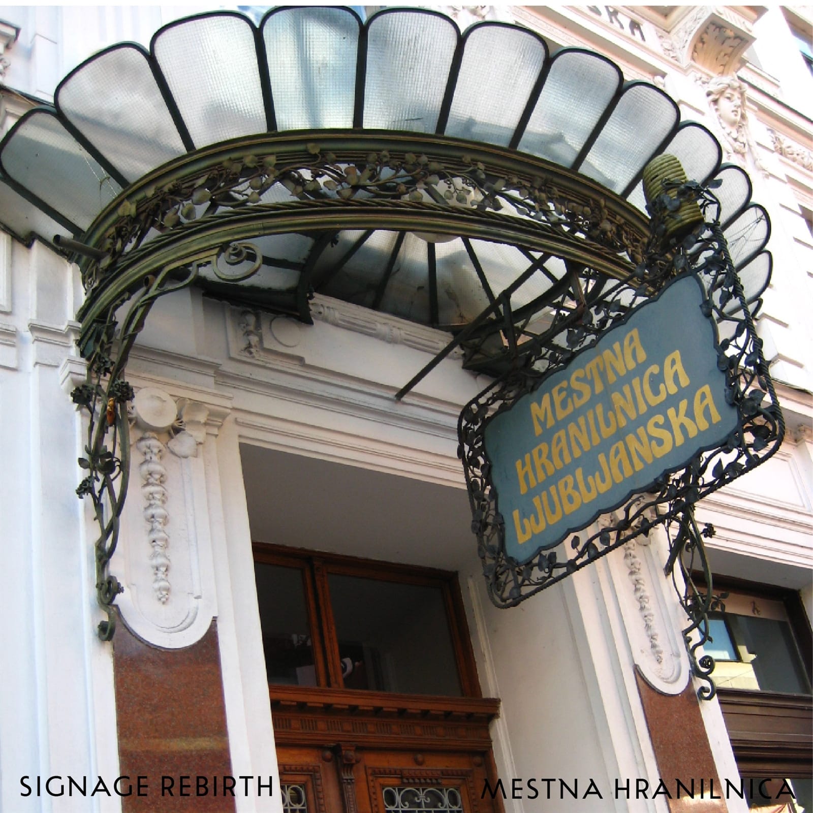
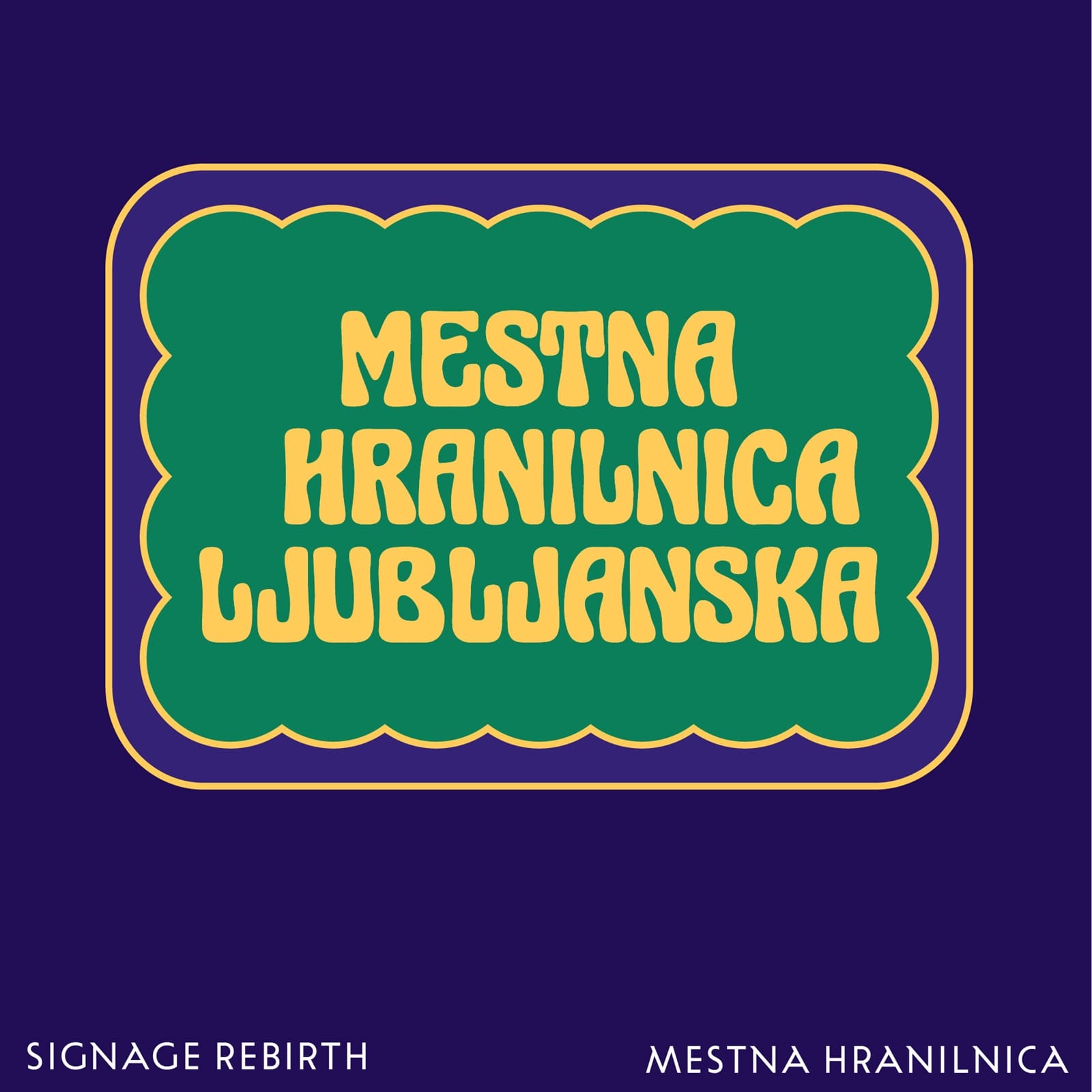
Mestna Hranilnica Ljubljanska — one of the first Slovenian financial institutions — was located in a building renowned for its Secession façade, highlighted by a glass and wrought iron canopy. Above the entrance, the original Secession sign structure remains, though the lettering has sadly changed over the years. Here is my contribution to its story, adding slight variations in repeating letters.
Astoria
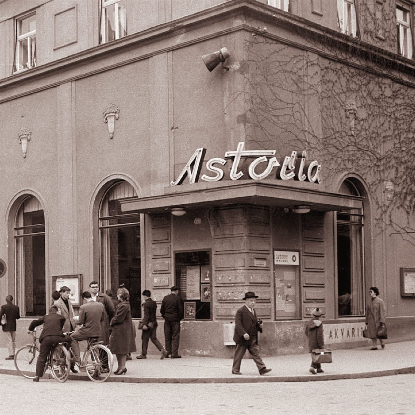
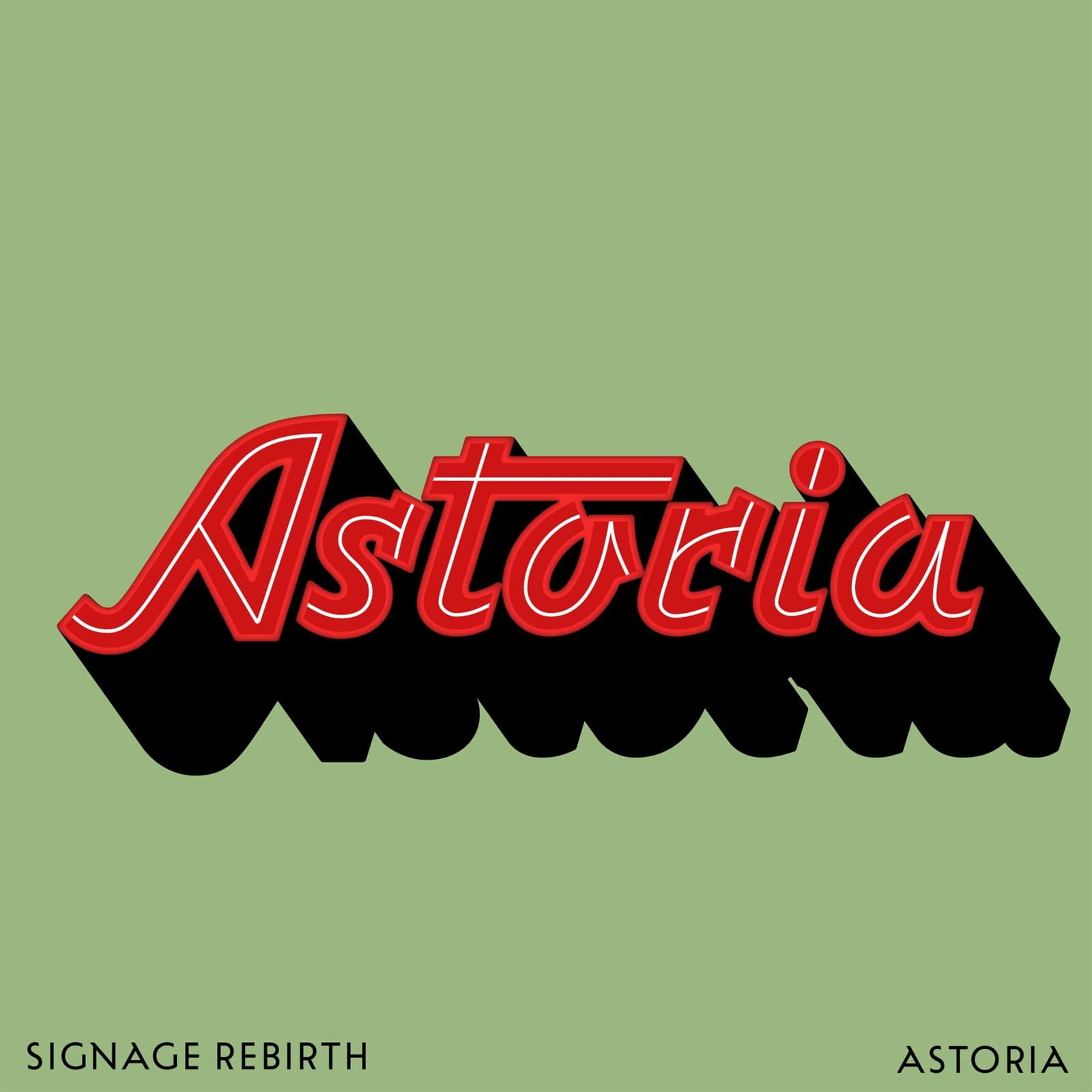
This sign is still in use on the Astoria coffee house in Maribor, eastern Slovenia, and the archival photo is from 1960. The Slovenian film, Kavarna Astoria (Cafe Astoria), set in Maribor before the second world war, was named after the cafe. For this reworking of the neon sign, I made some small refinements to the letters, with special attention given to the letter S to make it fit better within the composition.
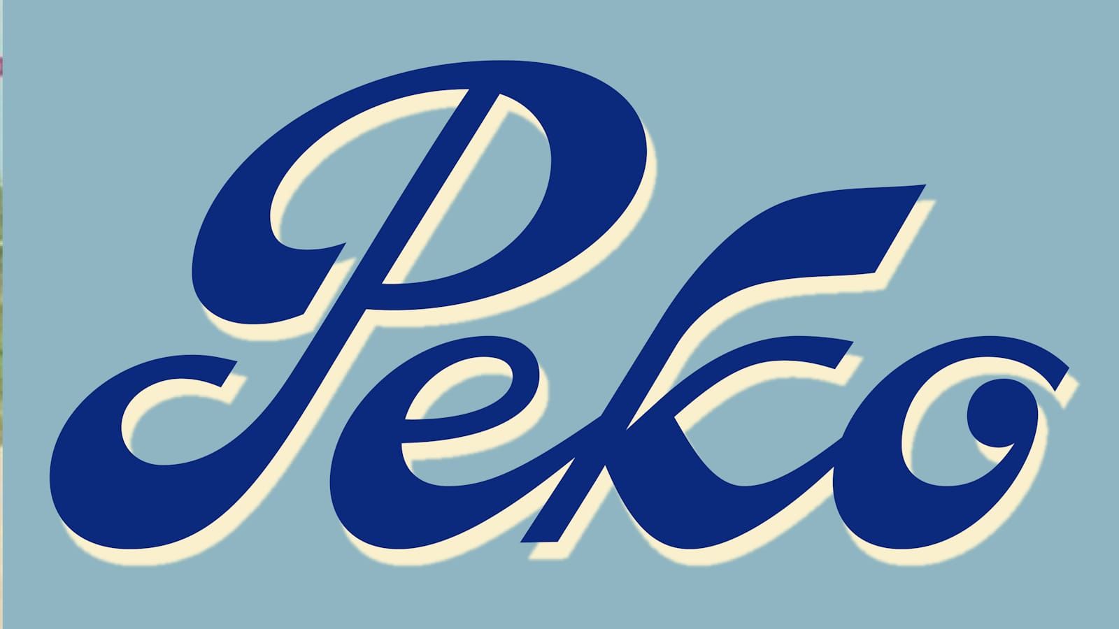
Peko
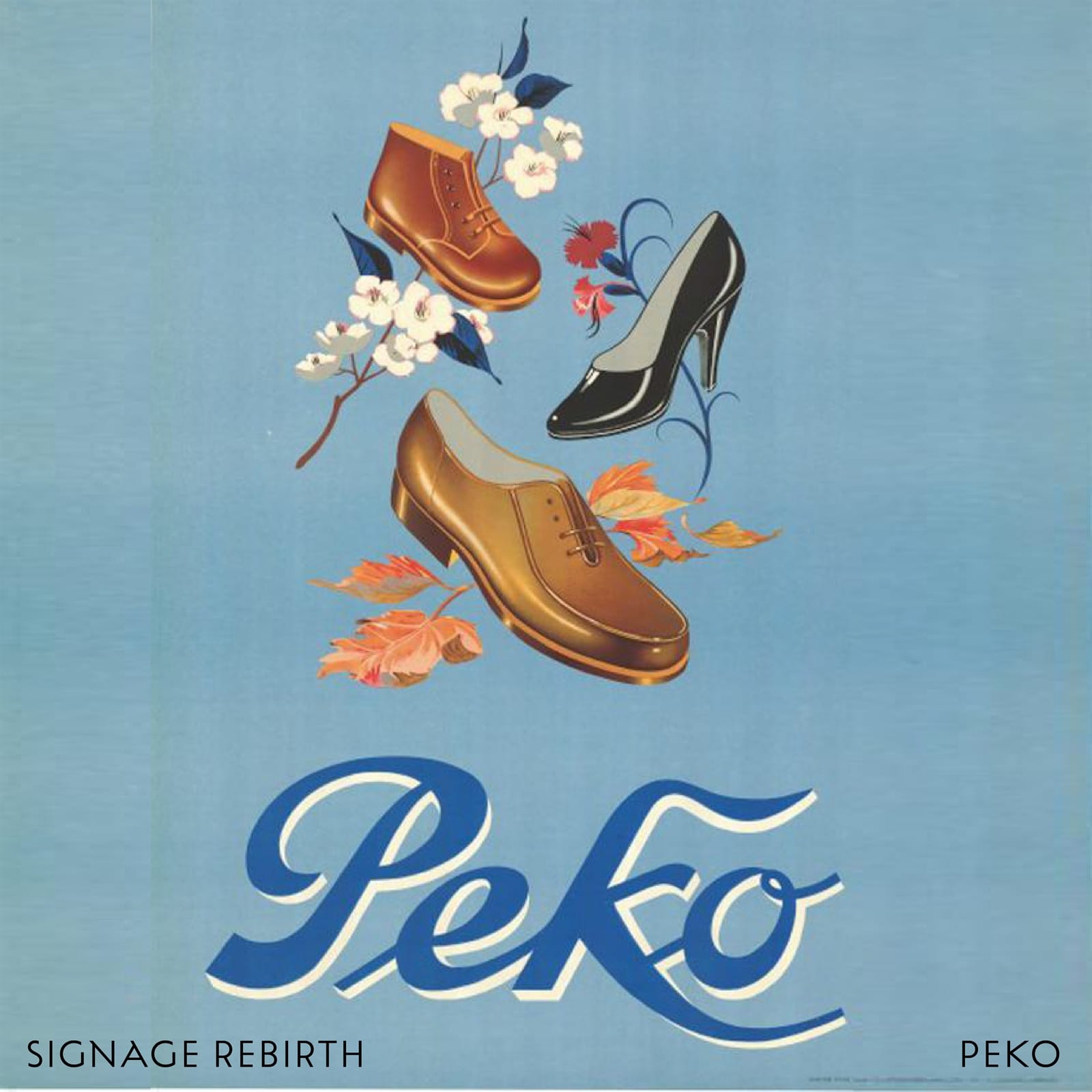
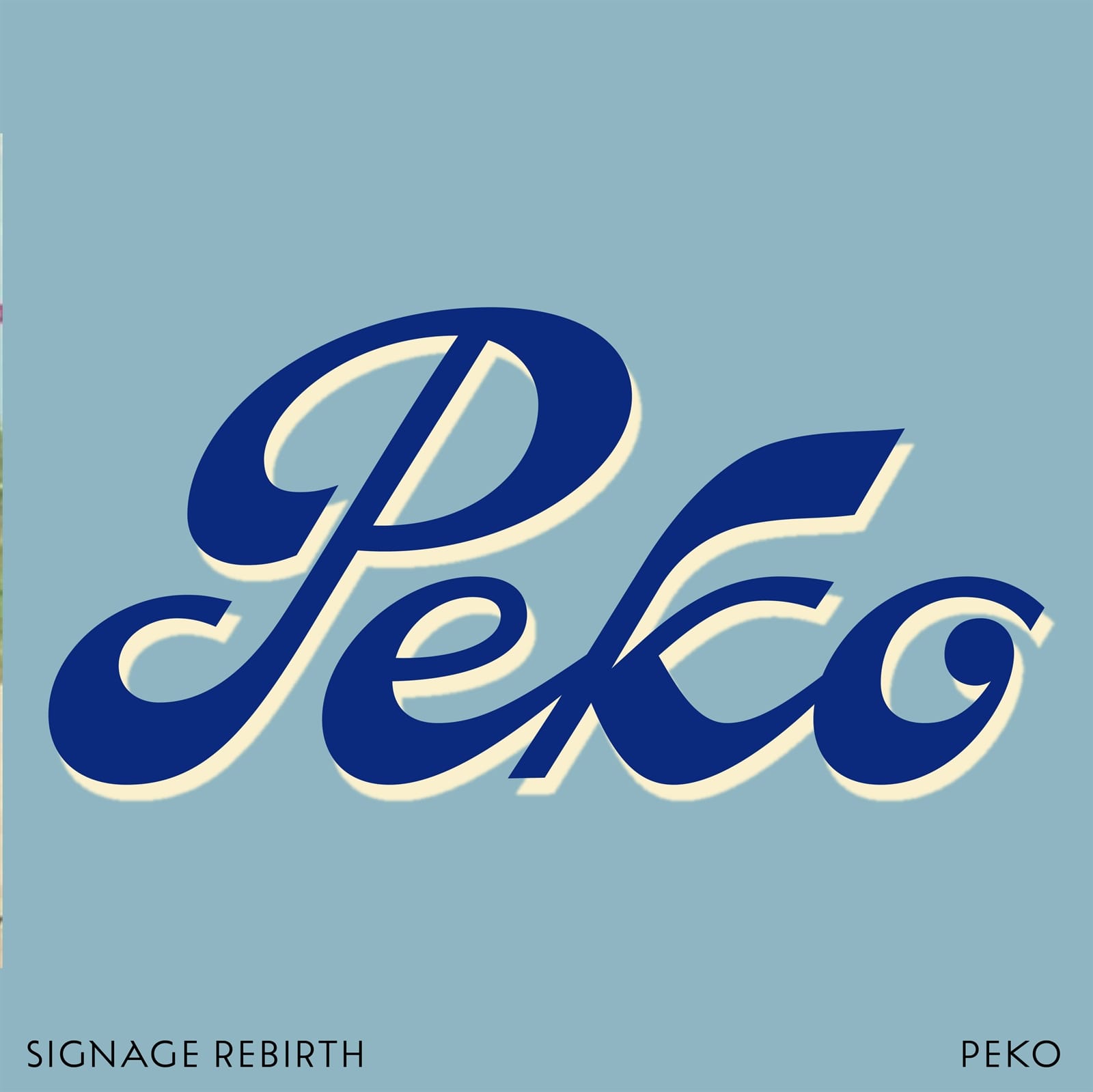
Peko (Peter Kozina) was one of the first Slovenian footwear manufacturers, established at the beginning of the twentieth century. The logotype has been redesigned a couple of times but those funky, brushy shapes are definitely still in our heads. I refined the contrast, while ensuring that the logotype is still instantly recognisable.
Gorenjka
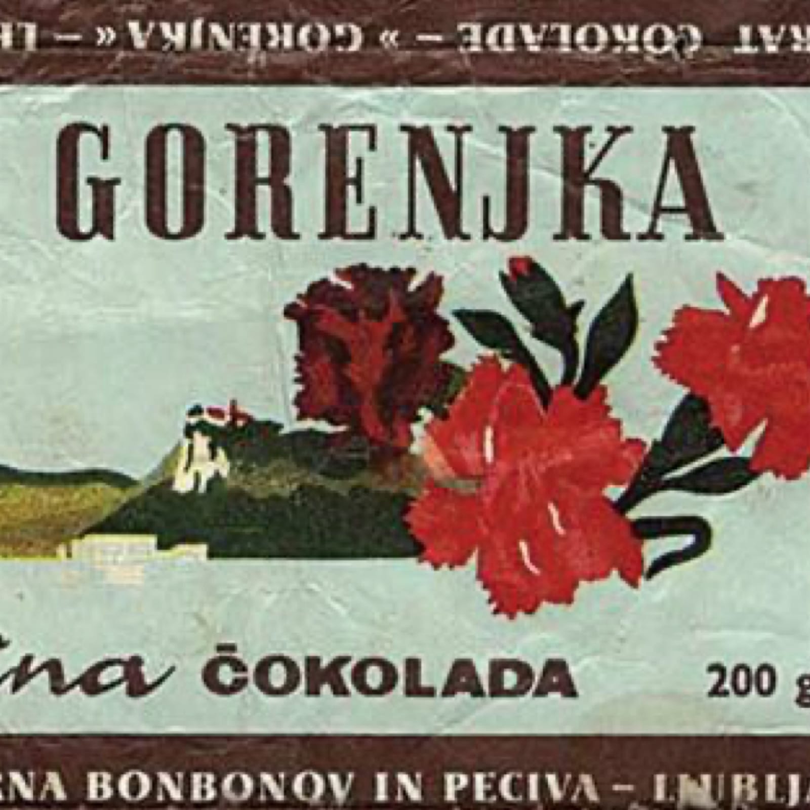
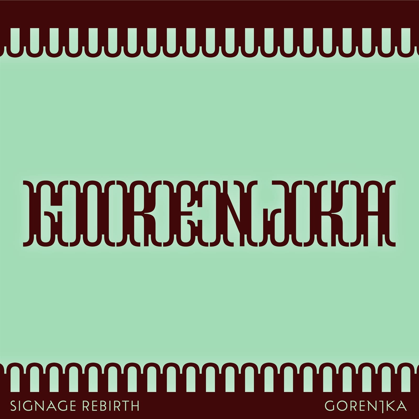
Gorenjka is delicious Slovenian chocolate with long history. I found this packaging that is not in use anymore but which employs such nice serif uppercase. I must admit I went a step further with this logotype, exploring the expressiveness of the shapes and pushing them a bit further than expected.
Ilirija
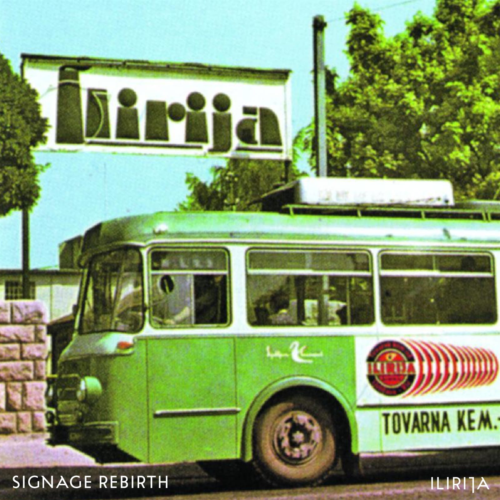
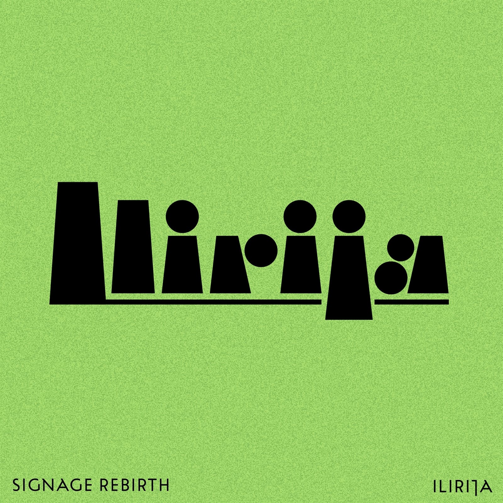
Founded in 1908 as the Chemical Products Factory Golob & Ko (Franc Golob and August Volk), Ilirija was a brand of shoe cream products. I redrew the letter shapes before refining them for greater consistency across the wordmark.
Polzela
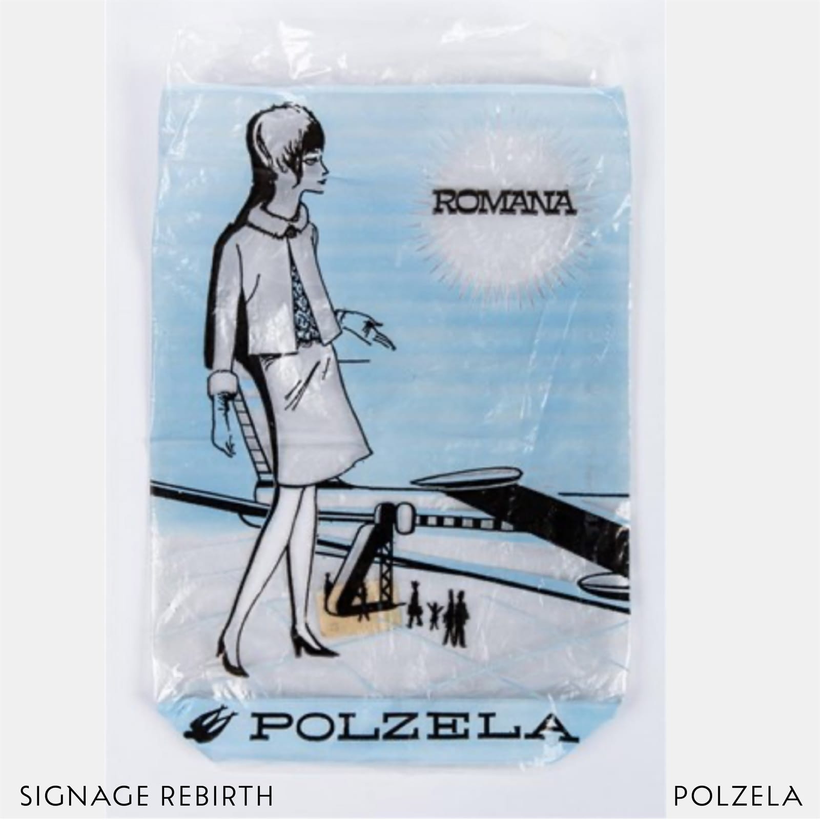
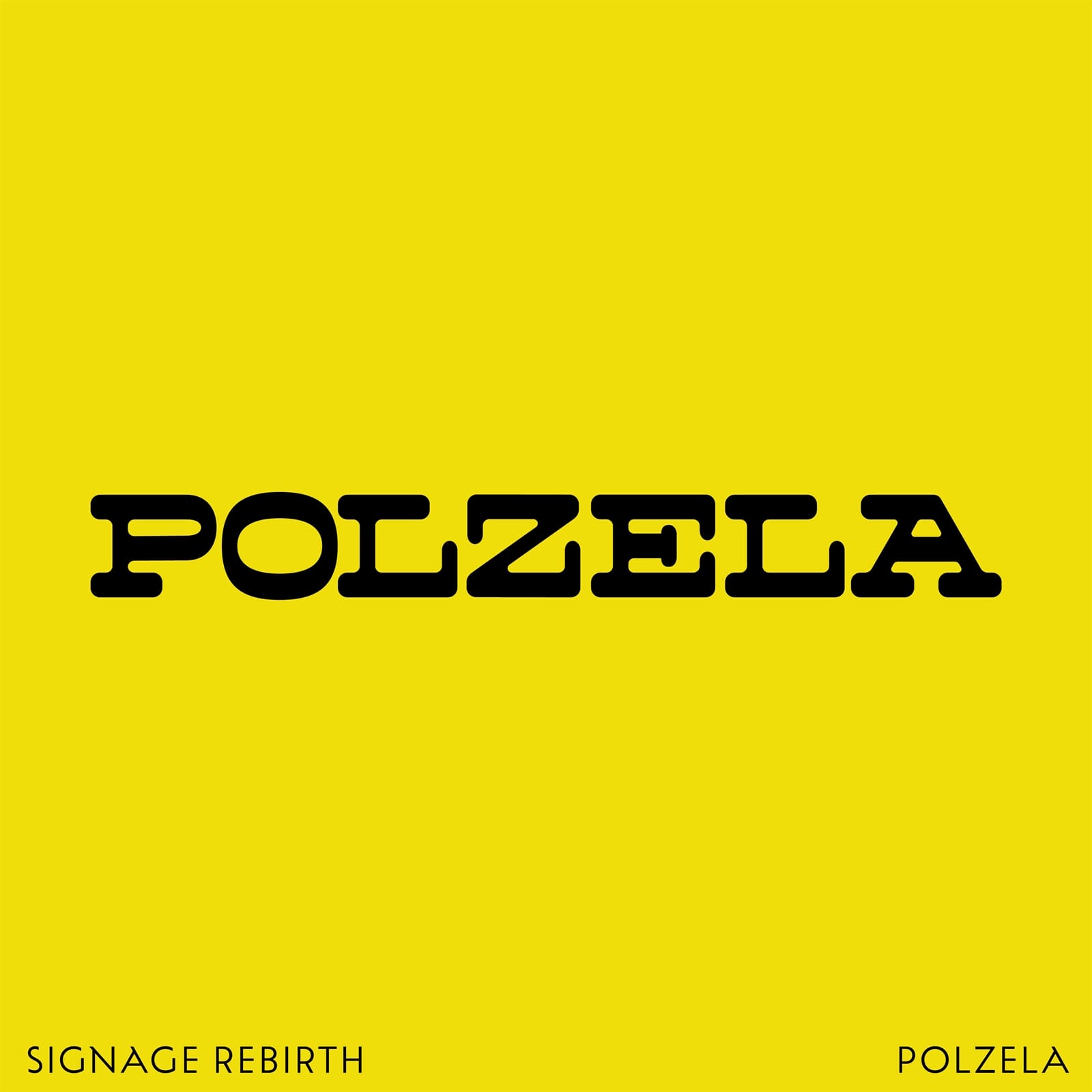
Polzela, founded in 1927, manufactured hosiery products including tights, socks, and leggings. For my reworking of the logotype, I increased the thickness of the horizontal strokes to emphasise the inverted contrast which is a distinctive feature of these monospaced letters.
Alpino
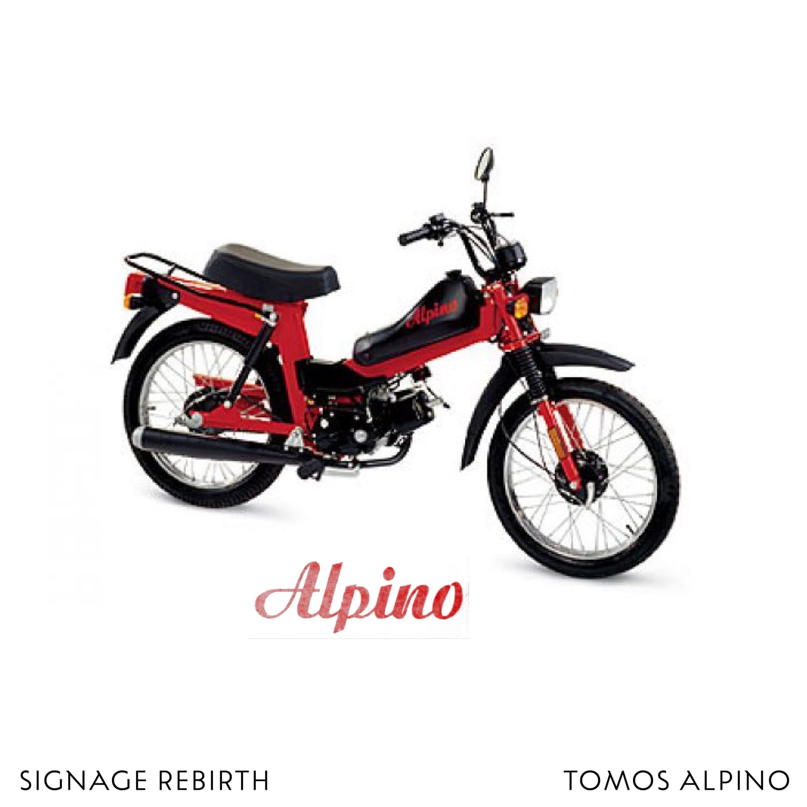
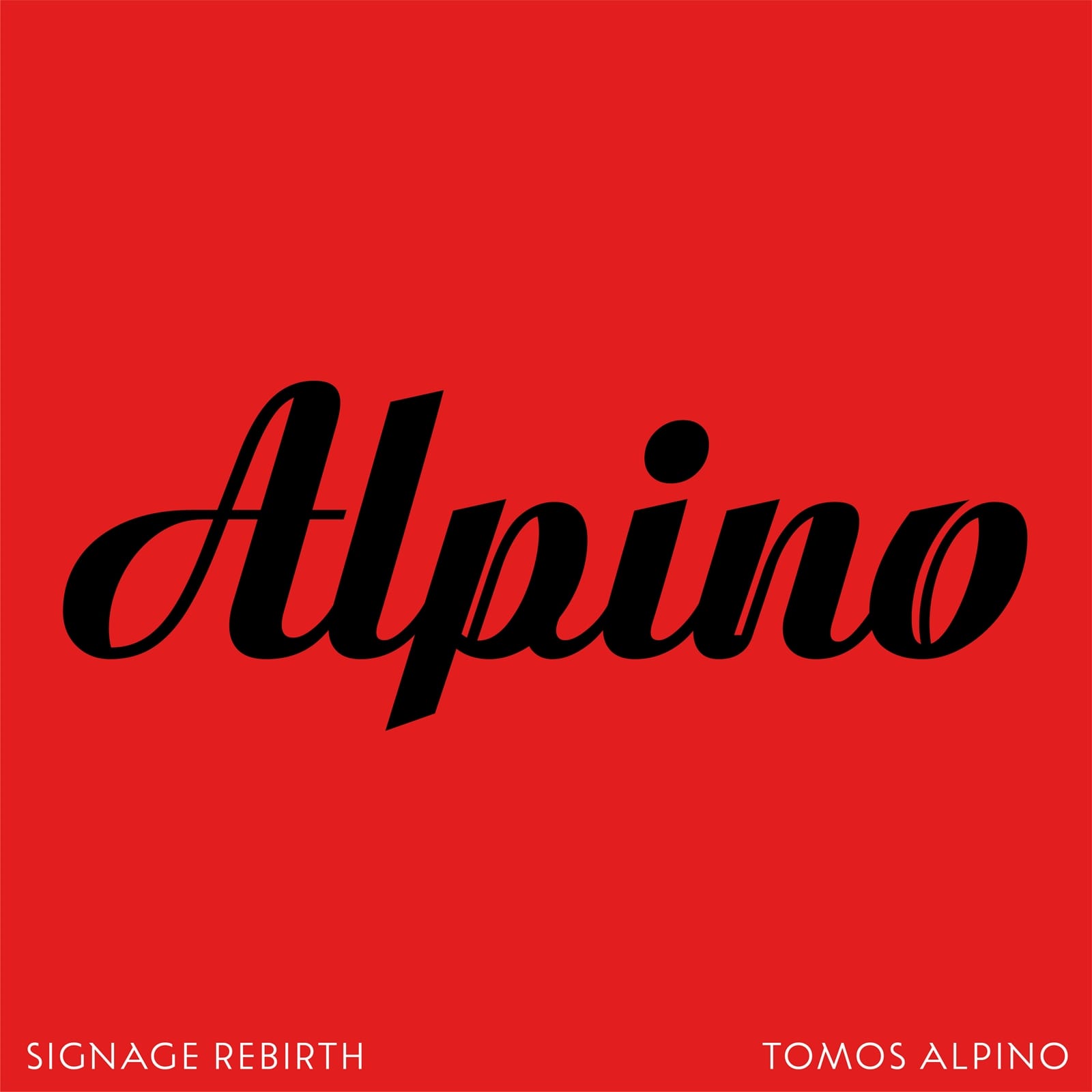
Tomos (TO for Tovarna, MO for motorjev, and S for Sežana) was a Slovenian moped manufacturer, and Alpino was one of their brands. The original lettering had a nice ink trap feature on the N, which caught my eye, and I applied this to some other letters while also refining the script-y curves.
Na-ma
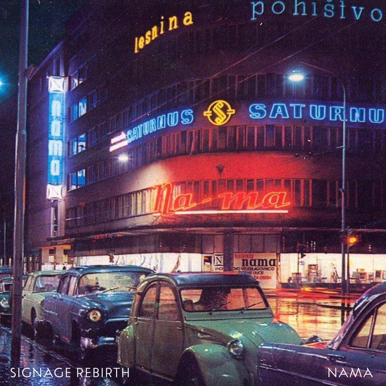
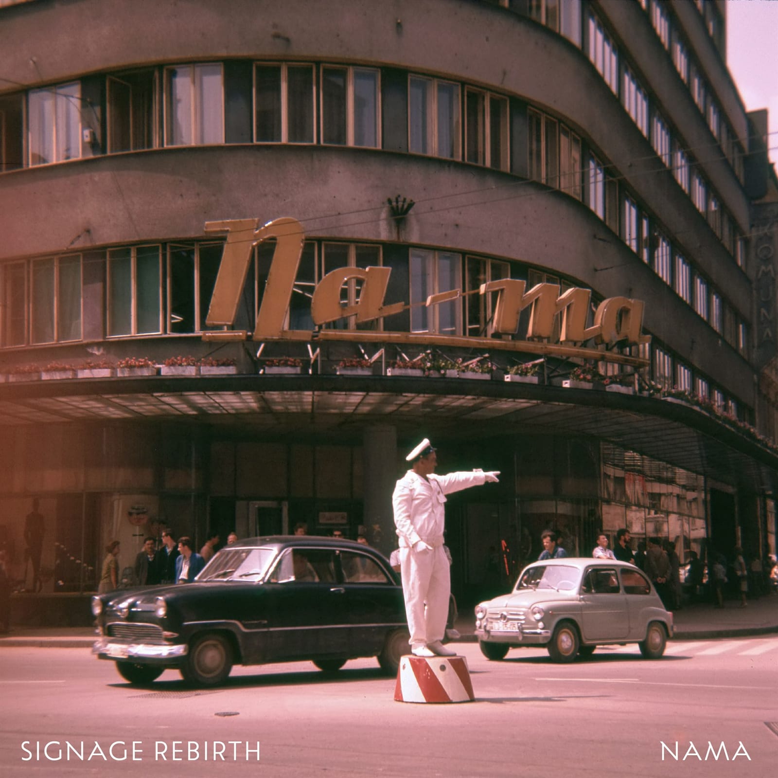
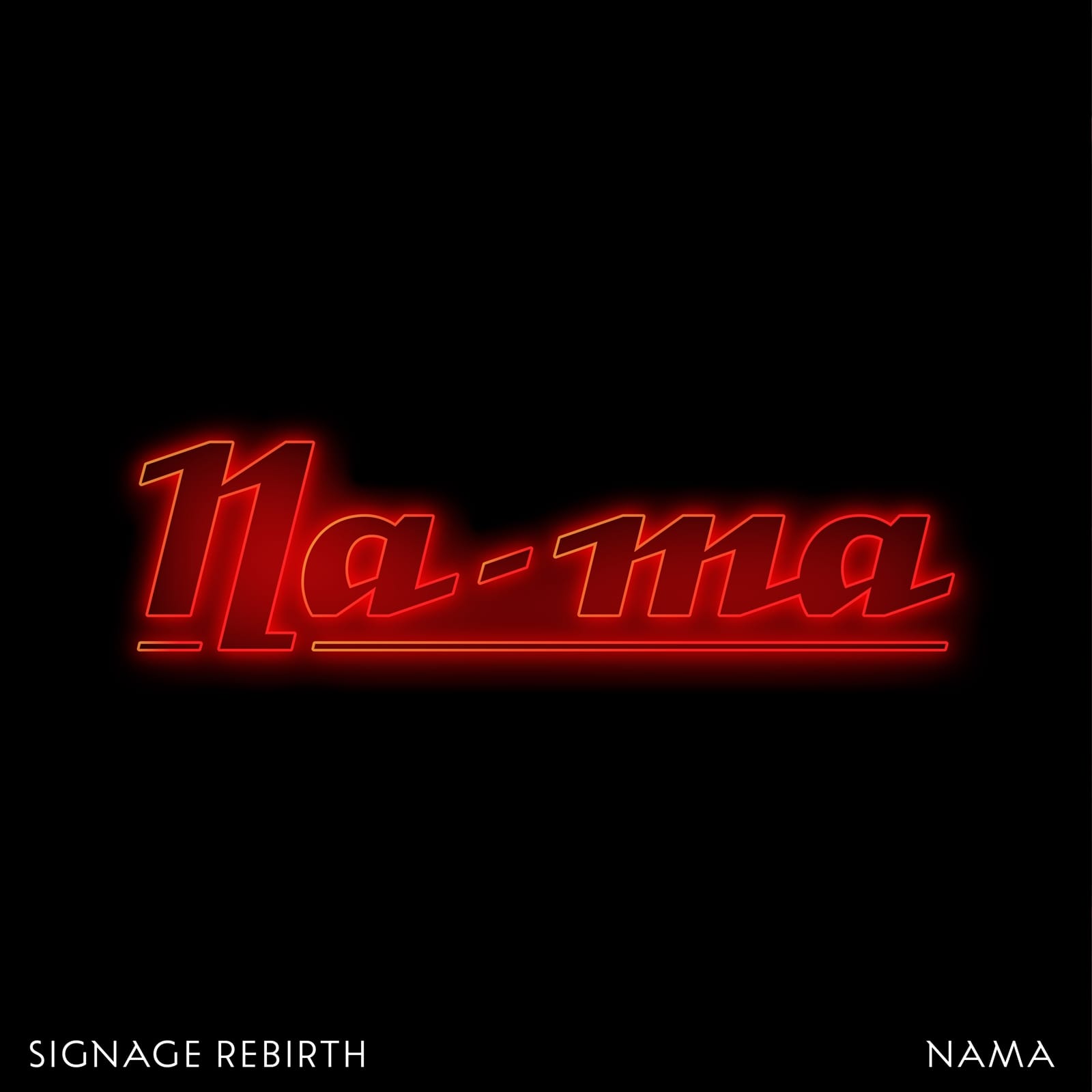
Na-ma (Narodni magazin, meaning National Store) was one of the first Slovenian department stores. This sign was used in the 1960s and has been redesigned several times. I digitised the neon sign and added a slight retouch. Can you find it?
Alja Herlah is a graphic designer specialising in typeface design, lettering, and calligraphy. She has worked with renowned studios in Berlin and London and her typefaces have received a number of Slovenian and international awards. Her work combines the design of type families and visual identities, with a strong emphasis on original typography.
Herlah teaches at the Academy of Fine Arts & Design in Ljubljana and, in 2023, founded Dotless Type, a platform dedicated to reviving almost forgotten typefaces by young Slovenian designers. She is also the co-founder of Type Salon, a foundry dedicated to creating distinctive typefaces and developing visual identities for cultural institutions and boutique businesses.
More Projects
 Better Letters