From A to Z: Rachel Joy’s Playful Alphabetic Explorations
Memories, games, artists, and experimentation have inspired Rachel Joy’s deeply personal alphabet.
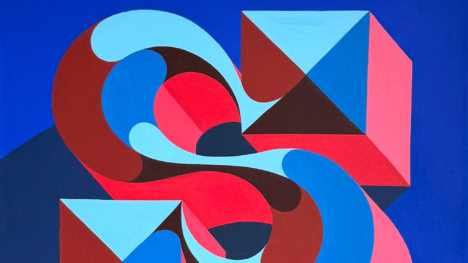
Freeing oneself from the constraints of client work can come in many forms. For Rachel Joy, it has recently involved designing and painting an alphabet laced with personal meaning and, in the process, working on canvas for the first time. She has been sharing the stories behind the letters in her periodic newsletter, and now here for BLAG readers.
Introducing the alphabet, Rachel refers to her intention to create “pieces that make you smile, coming from a place of play”. She didn't work in alphabetical order, with the earlier letters in the series inspired by “a trip down memory lane, thinking about times of play through my life”. These memories informed sketches of letters “that might work for that memory” before painting the final executions on 50 × 50 cm (20 × 20 in) pieces of stretched canvas.
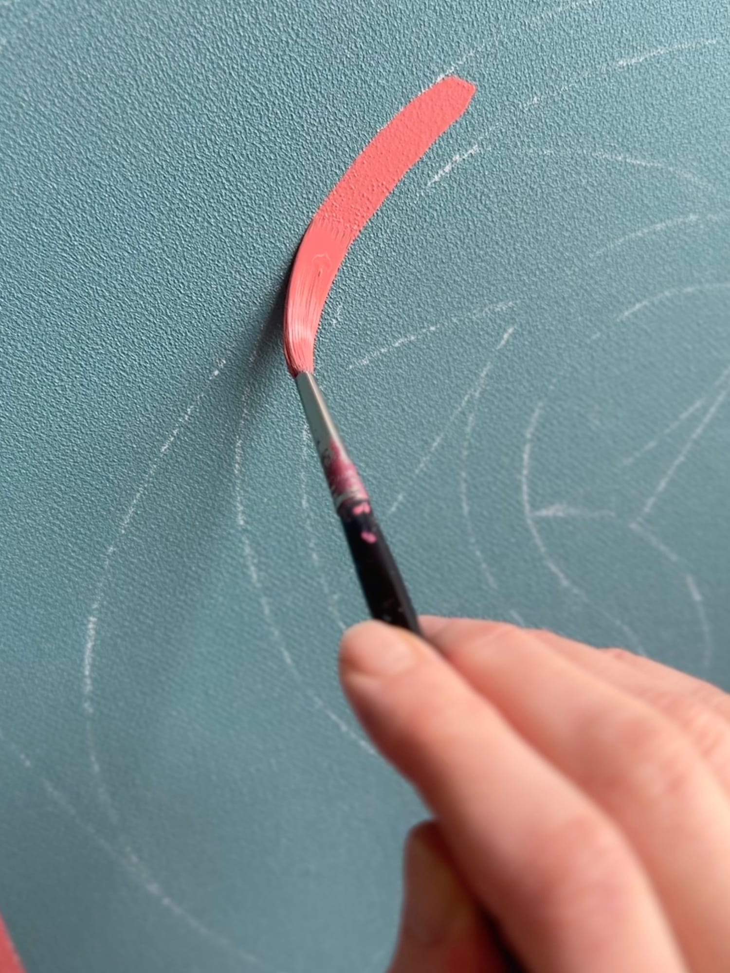
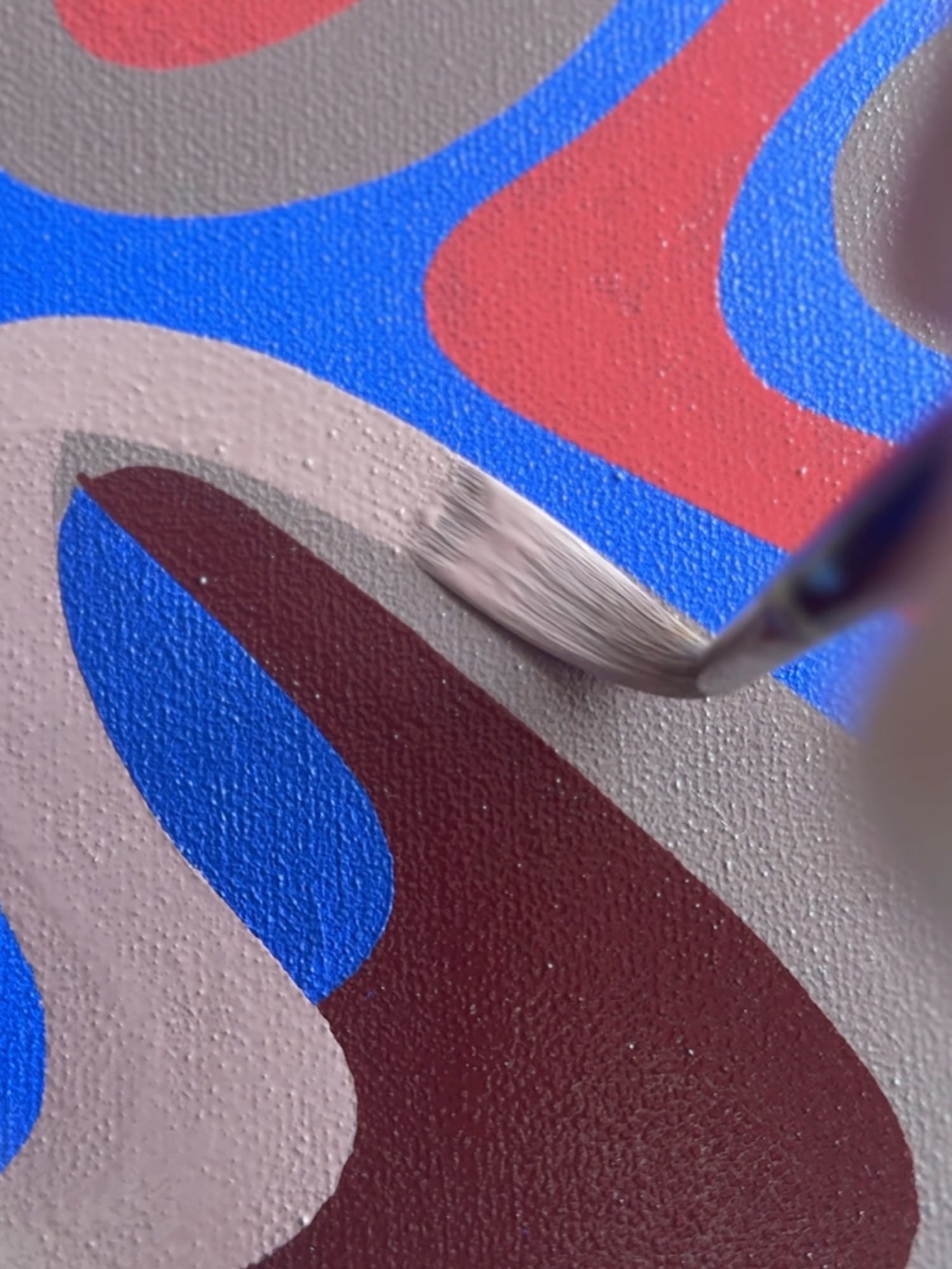
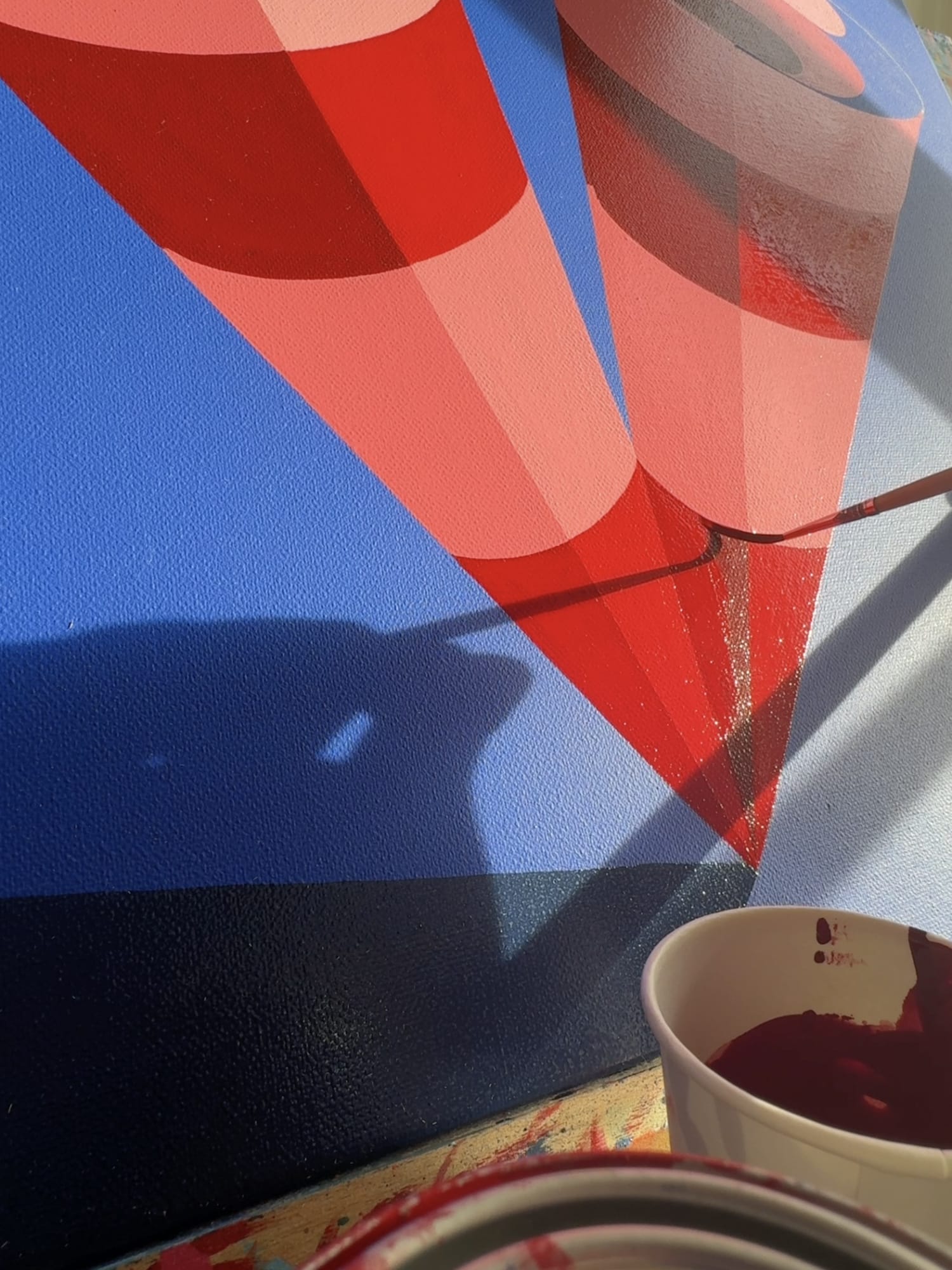
Work-in-progress on the G, K, and V respectively.
While those earlier letters were rooted in specific memories and sources of inspiration, “as I got closer to the end they became more about playing with the shape of the letter”. However, despite their different origin stories, the letters at large are given coherence through Rachel’s use of a consistent palette of blues, pinks, reds, and browns.
Here is a small selection of those origin stories and, if you see something you like, some of the original canvases are available in Rachel’s online shop, where you’ll also find her ‘TOGETHER’ mini-series.
The N
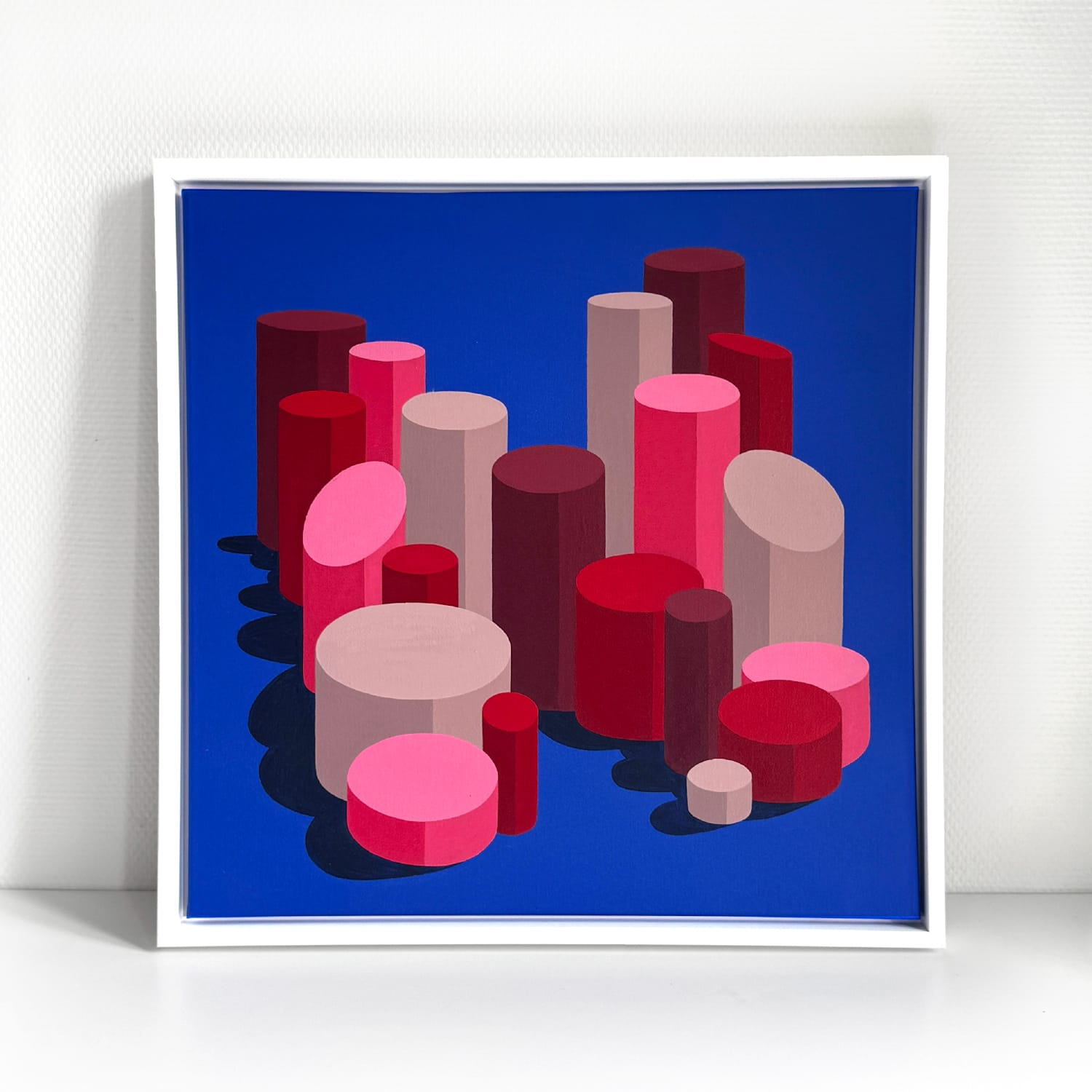
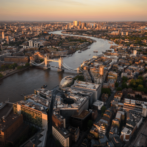
The cylindrical city.
“I love London, I grew up in south London and used to get the train into town with my parents at weekends and holidays to visit museums — mainly the Natural History Museum, we used to have membership cards that I was very proud of. I recently moved to Paris and wanted one letter to be rooted back in my hometown.
“I have fond memories of going on the London Eye in my teenage years. I remember the feeling of being high up and seeing the tops of buildings I only knew from the ground. More recently I felt this same feeling again at the top of the Shard. This N started as more square shapes looking more like buildings, but I wanted it to feel softer, so built a little city from cylinders instead.”
The Y
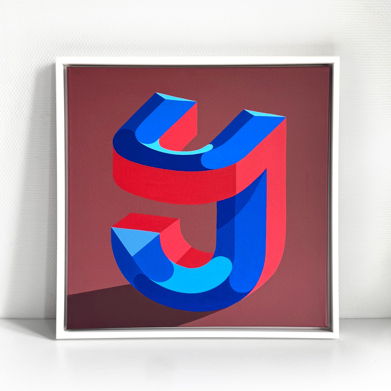
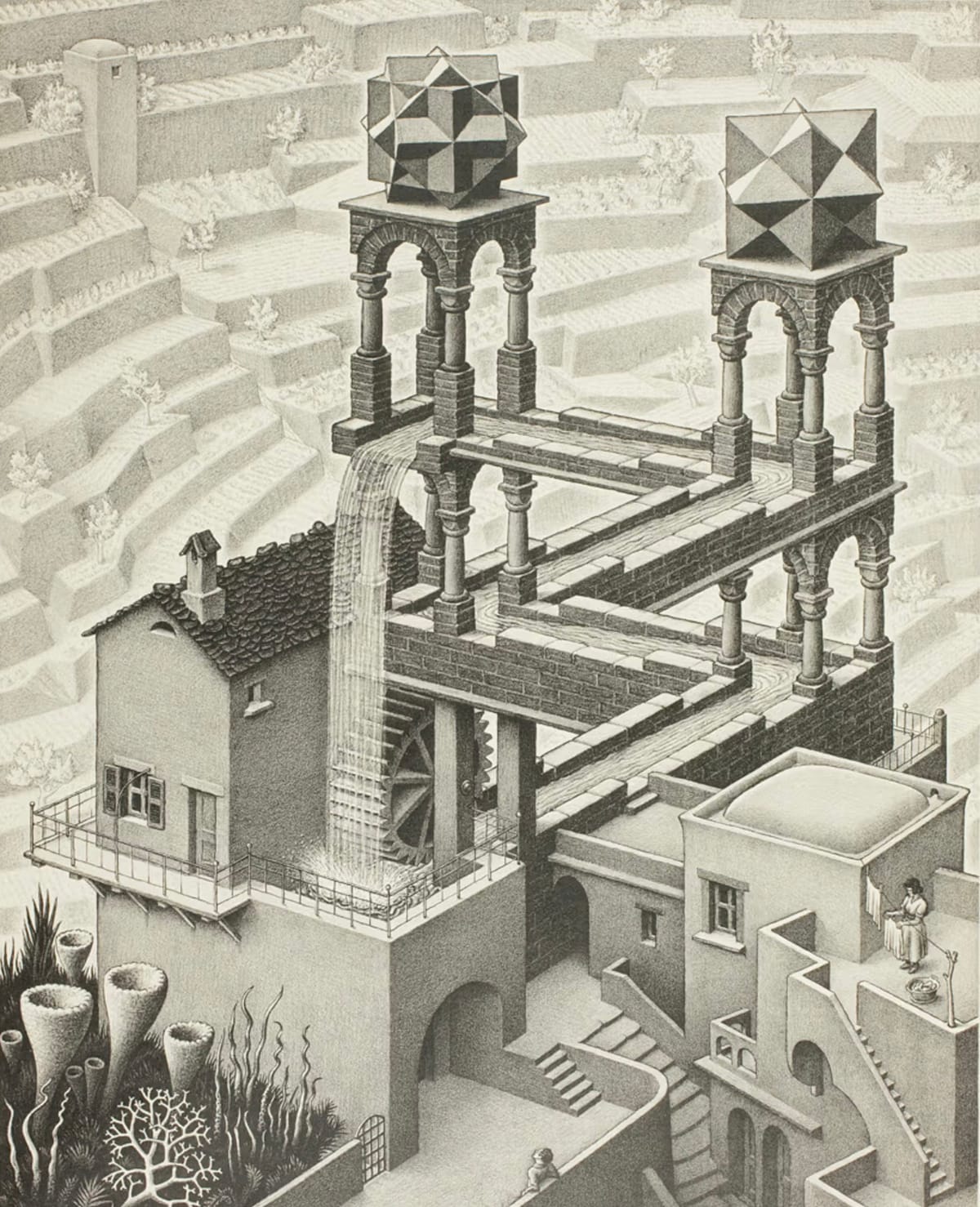
The enduring impact of M.C. Escher’s optical illusions.
“It’s funny the things that stick in your mind. When I was younger I remember staying over many times at a friend’s house who had ‘Waterfall’ by M.C. Escher on the wall in their bathroom. I used to, and still do, find it mesmerising. It was this piece and the general trickery of Escher that inspired my sketches for the Y.”
The L
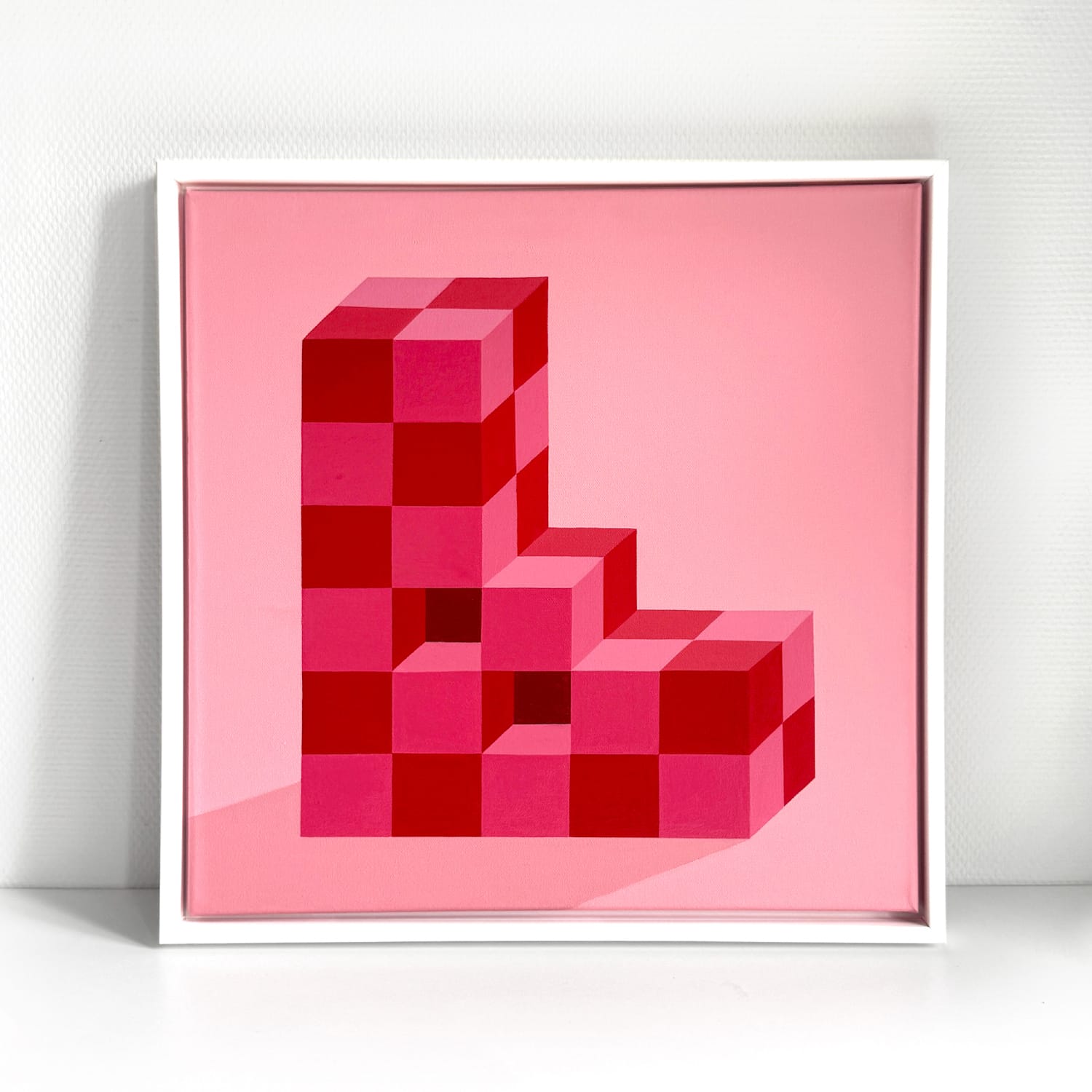
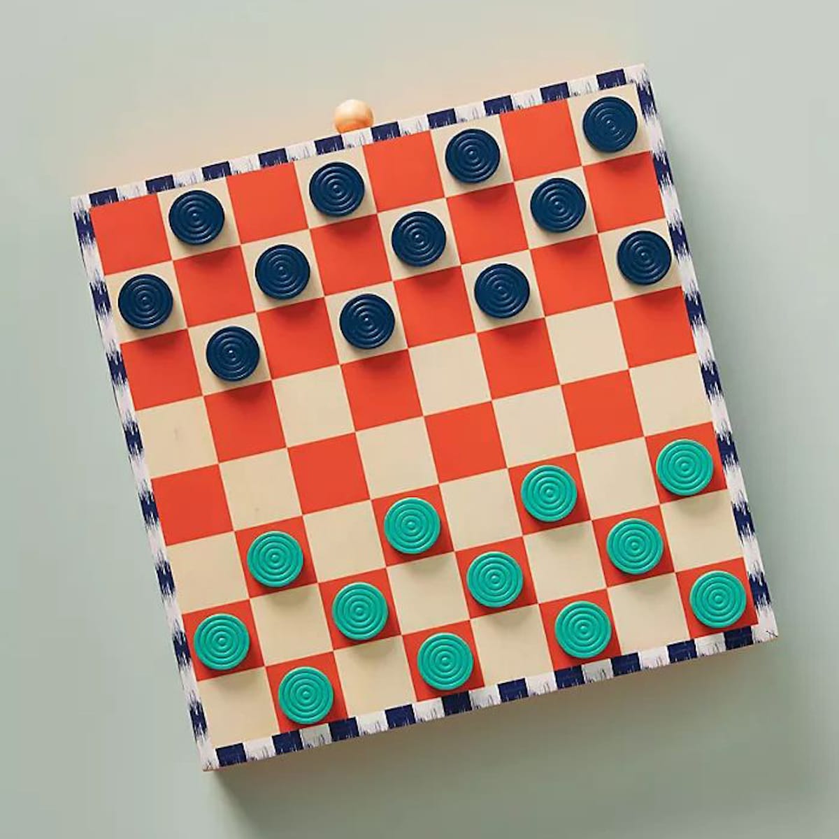
‘Check’ out the L and the hand-painted checkers board that inspired it.
“Board games were a big part of my childhood and that’s still the case today. During the Covid lockdowns, my husband and I hand-made a checkers board. I really enjoyed painting the squares; there was something therapeutic about it, so I knew I wanted to do a letter with repetitive squares. This became the three-dimensional checkers-board L.”
The O
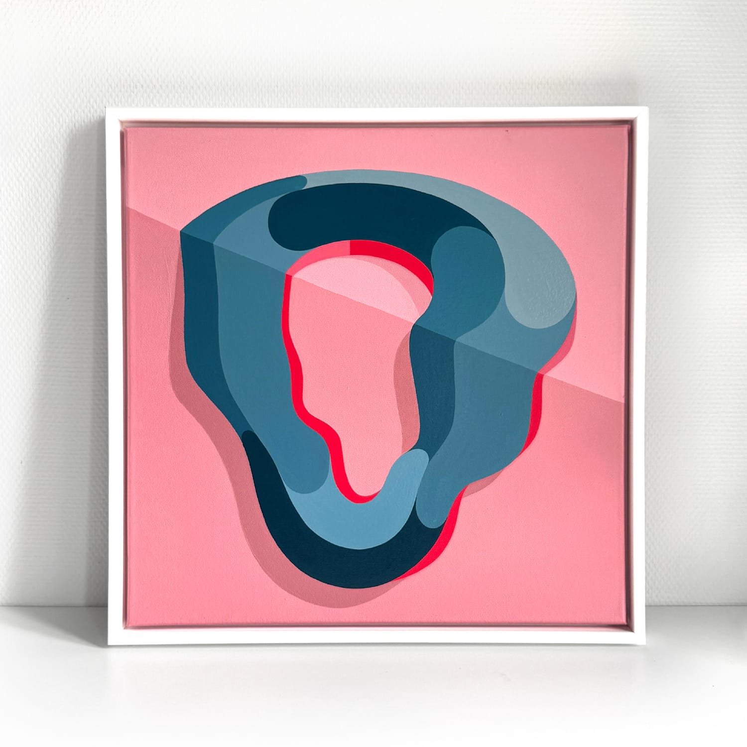
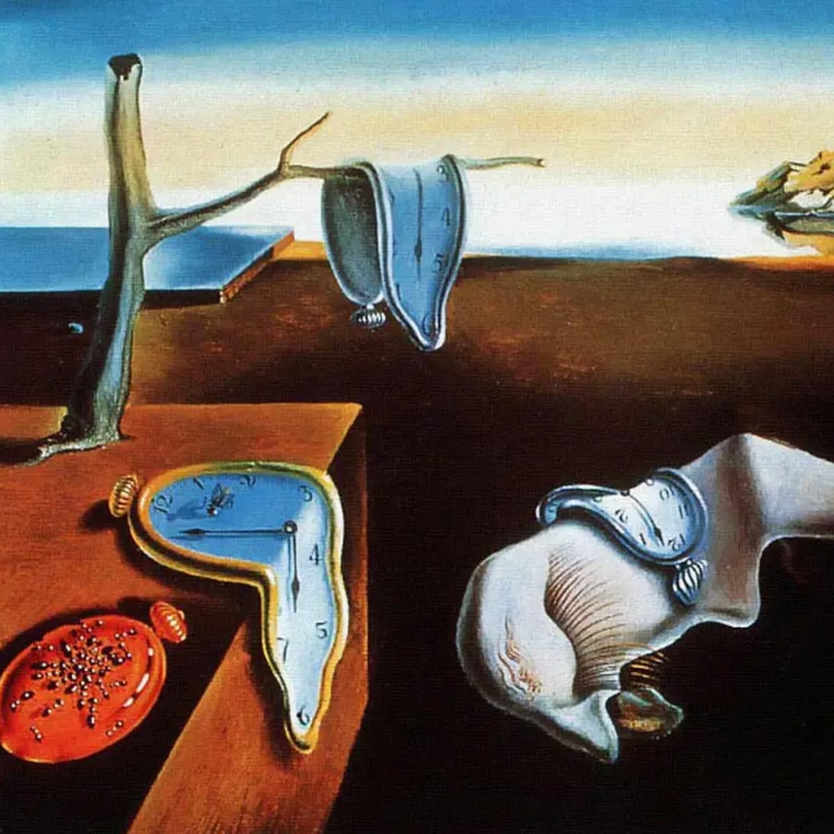
Rachel’s O and a detail from ‘The Persistence of Memory’ by Salvador Dalí.
“The O is a bit more obvious! Early in 2024 I got to go to the Dalí Museum in St. Petersburg, Florida. Seeing the wonderful world of Dalí’s mind gave me an opportunity to do something different with the prismatic lettering style I usually work with. Thanks Dalí.”
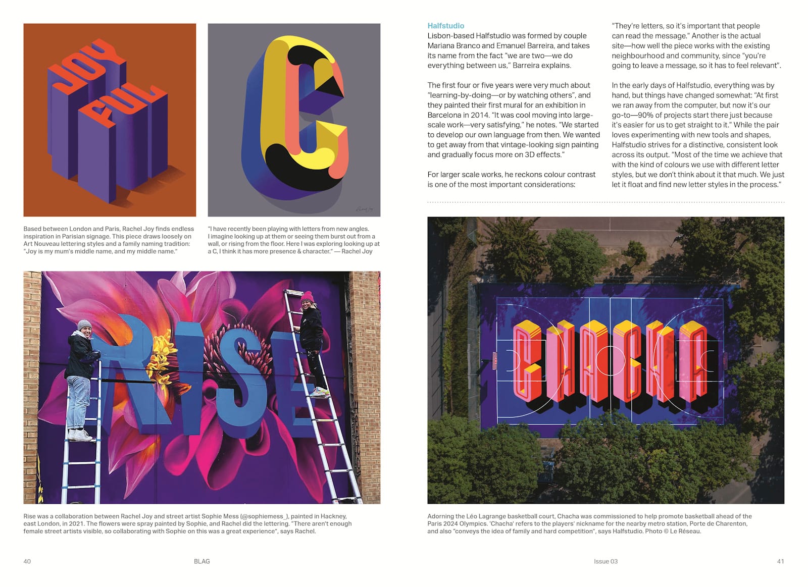
Rachel was one of the artists profiled in the BLAG 03 feature, ‘Tricks of the Eye: Optical Illusions in Murals’. Read it online or get a copy of the magazine itself in the online shop.
The Z
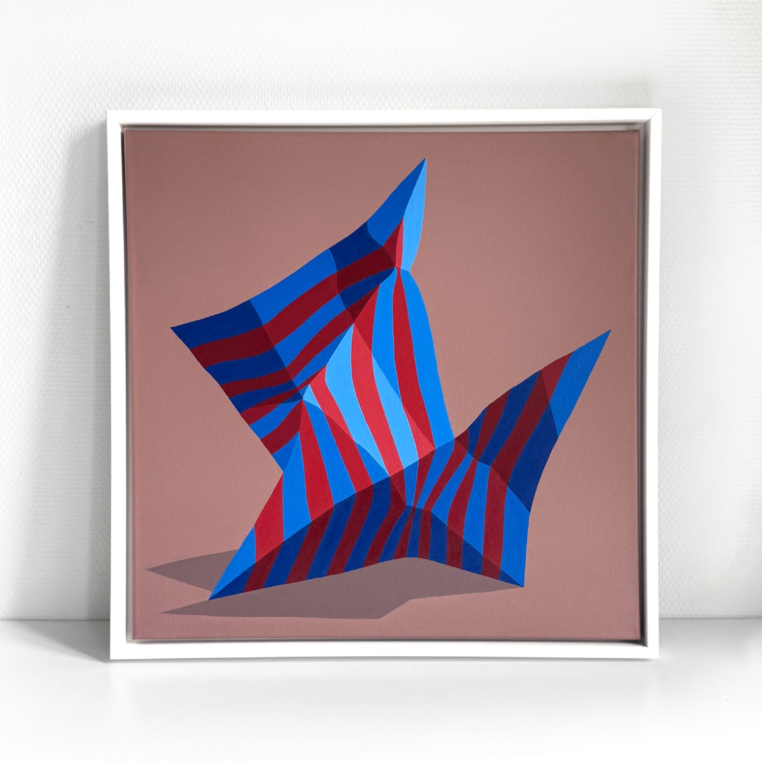
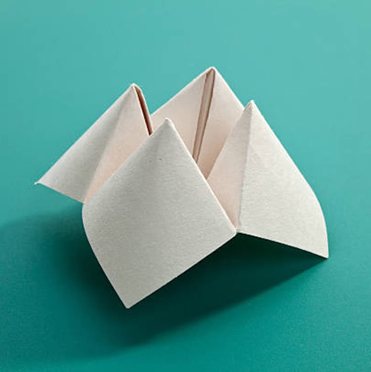
A folded fortune teller, and the letter Z it inspired.
“As with a lot of this alphabet, I went back to thinking about my childhood and play. We spent a lot of time making things, and I have many fond memories of playing with paper — pop-up books were a big go-to for me, and of course the classic paper fortune tellers. This Z started with me folding paper trying to make a Z shape, adding stripes in afterwards when I was drawing it up.”
The M
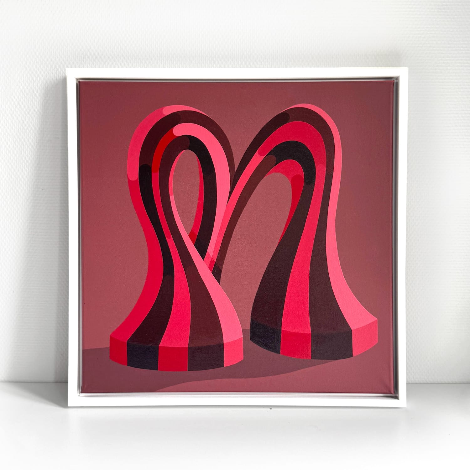
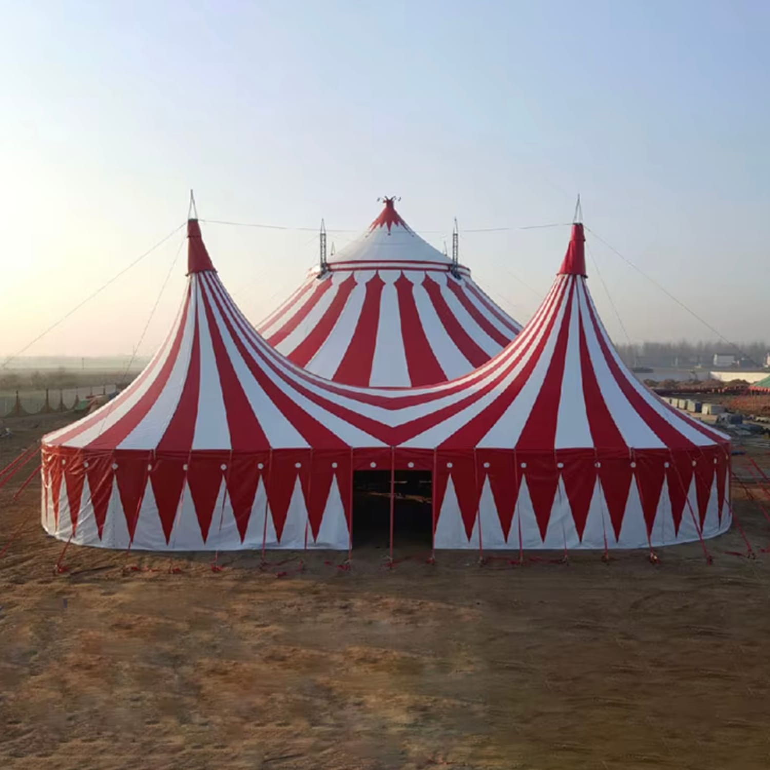
Mmmm, a stripy big top?
“I am really pleased with how this M came out and I’m excited to try some other letters in this same style. I can’t quite place how this one came about — it was one of the earlier ones — but let’s say straws, circus tents and a little bit of Alice in Wonderland thrown in for good measure.”
The T
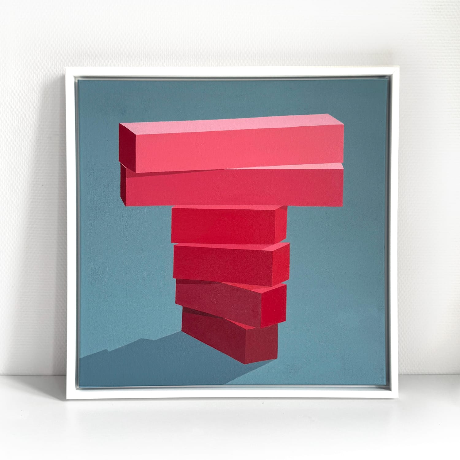
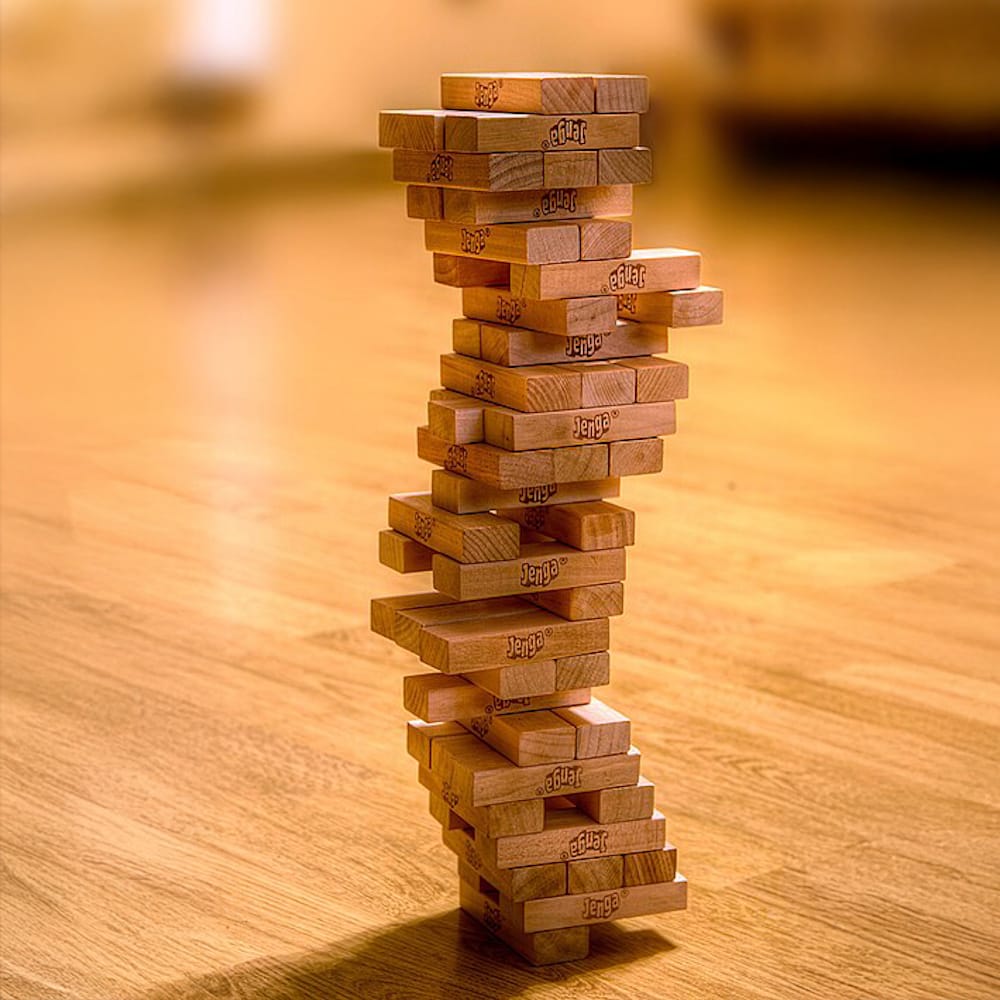
T is for Toppled.
“I am the middle of three kids in my family and spent hours of my childhood playing games with my siblings. (Board games continue to be an essential part of family time, now with my own children.) The T is a bit of an ode to a classic childhood game, and one we spent hours playing.”
The W
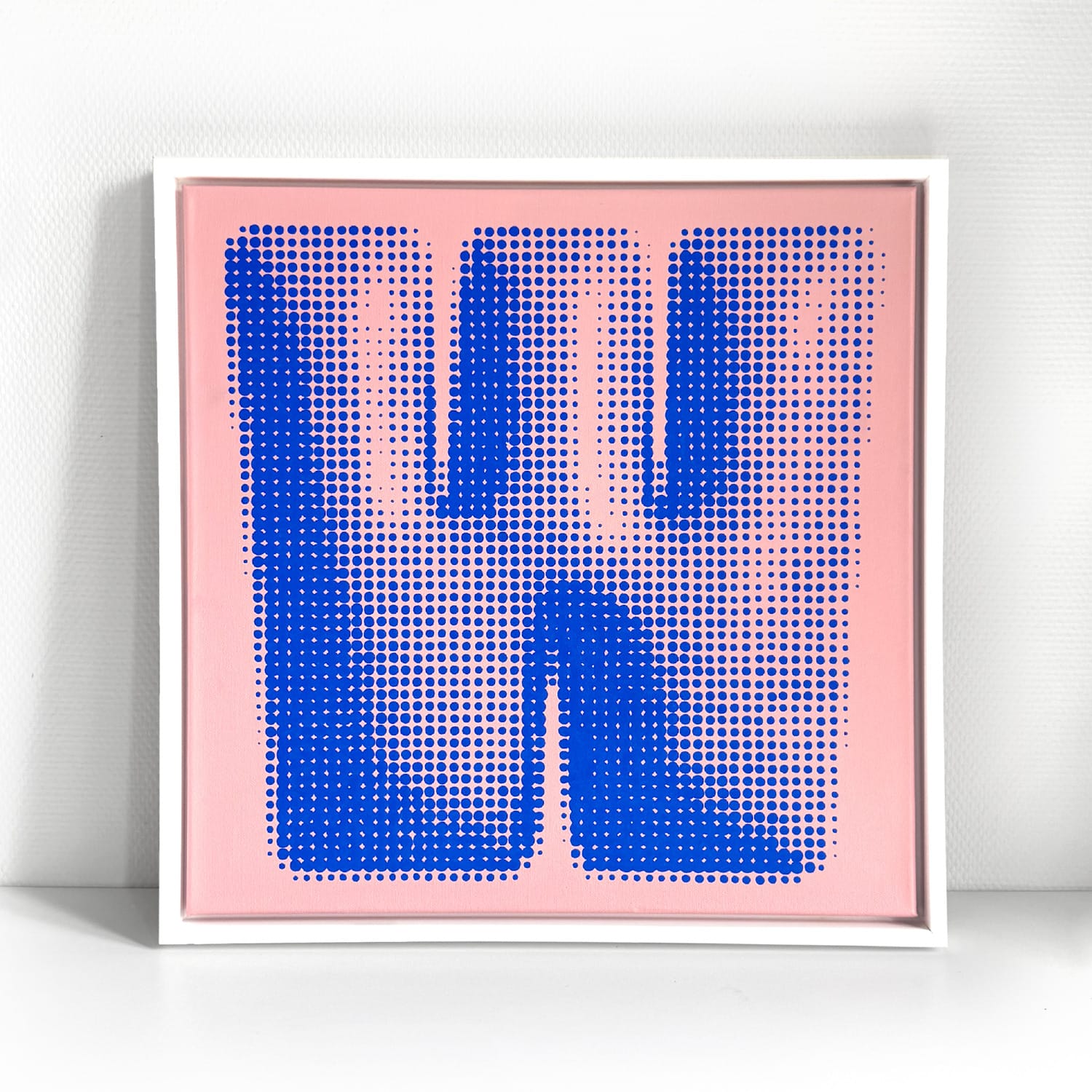
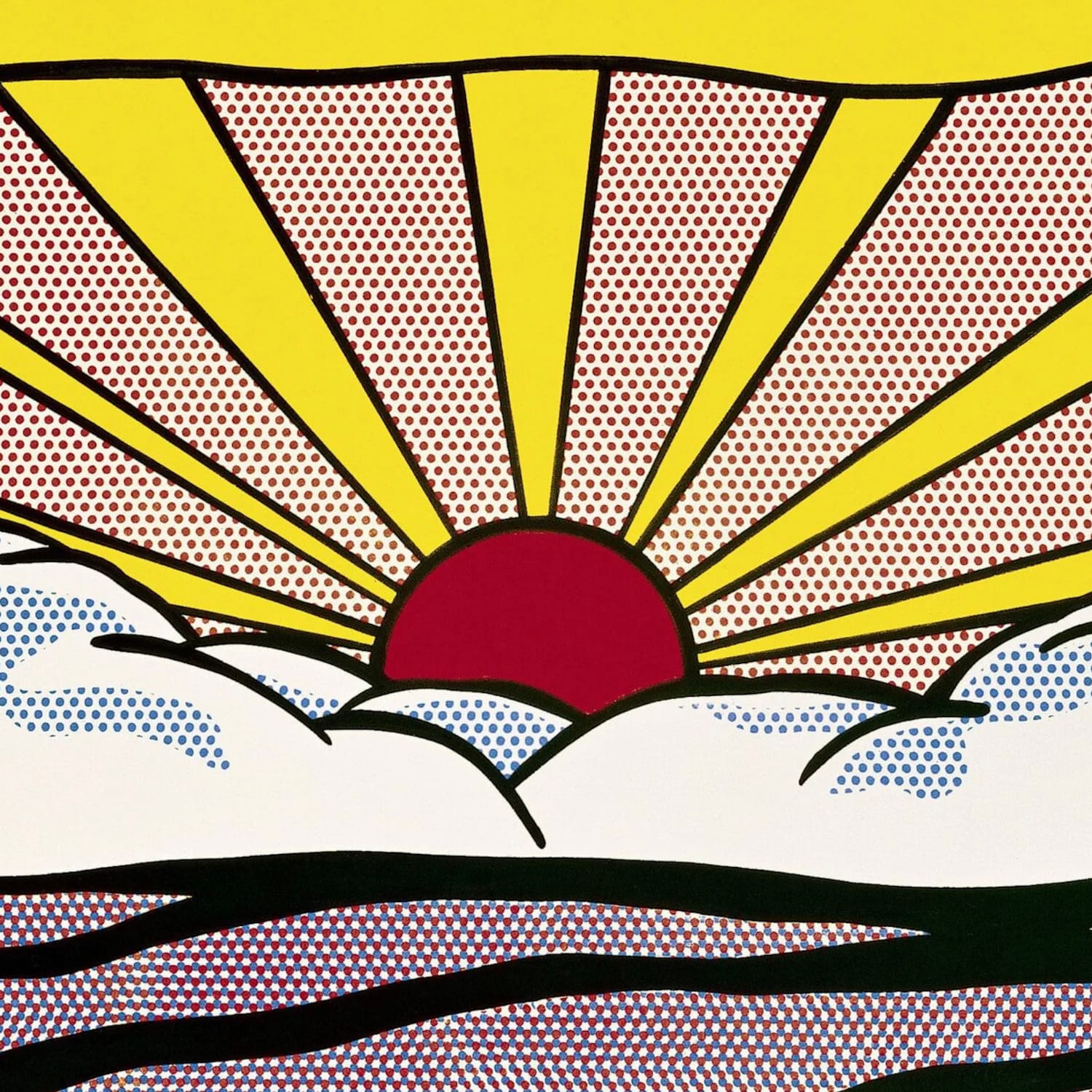
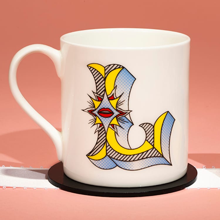
The dots on the W are drawn from Roy Lichtenstein’s work, such as this detail of his ‘Sunrise’ which references of the Ben Day printing process.
“The W came a bit later in the series. I had been on a trip to New York and really wanted to do a piece that felt like a piece of Pop Art, the art movement I feel most connected to in my work. So I have Roy Lichtenstein to thank for this one. I have to say I really enjoyed the repetitive process of painting this one; it felt like a meditation to sit and paint each dot individually.”
Lichtenstein (and Dalí) were also among the artists and artistic movements explored by Archie Proudfoot in his series for Tate Modern.
Playing Around
In the spirit of the collection, here’s BLAG rendered in Rachel’s alphabet.

And the Rest
See if you can figure out the sources of inspiration behind these letters that complete the alphabet...
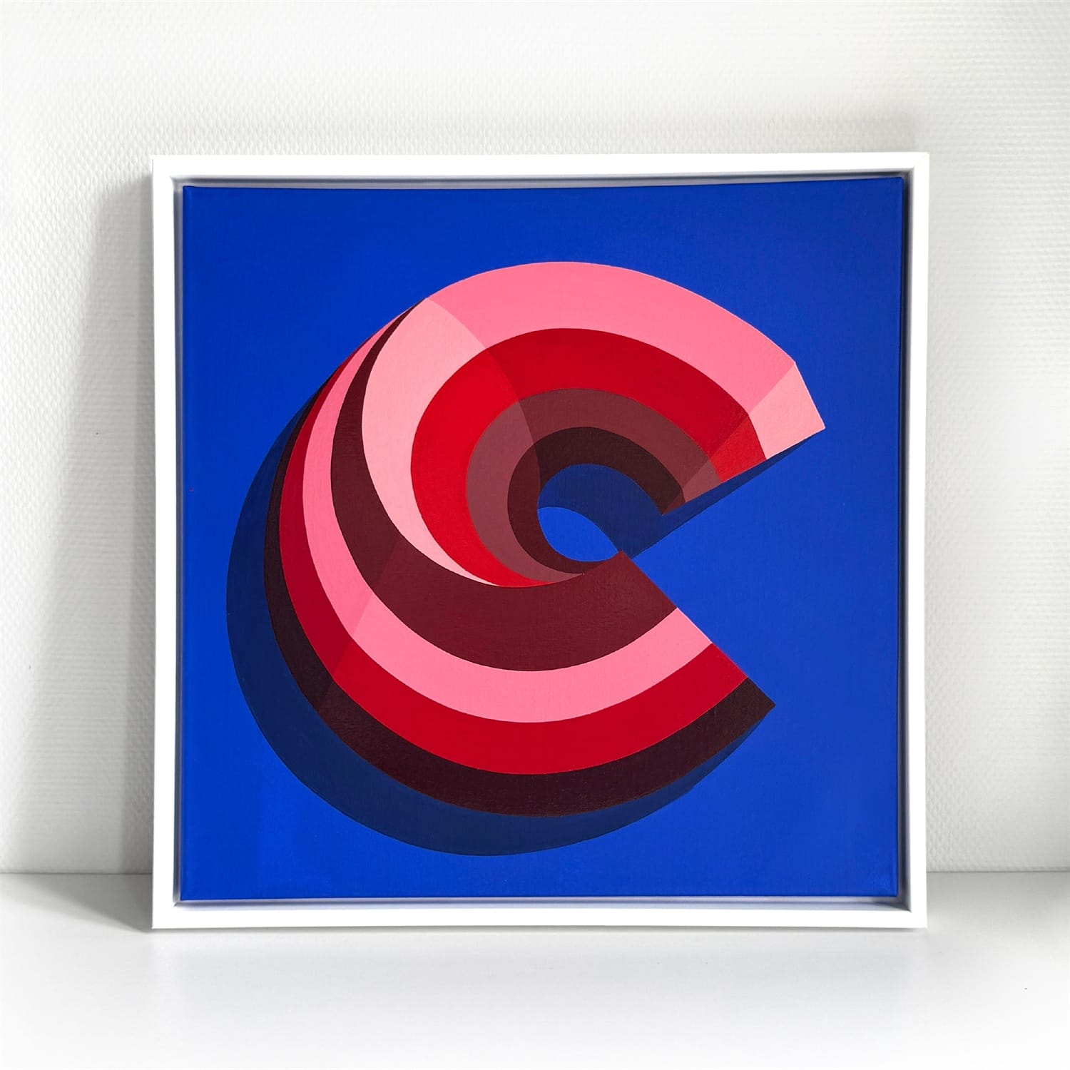
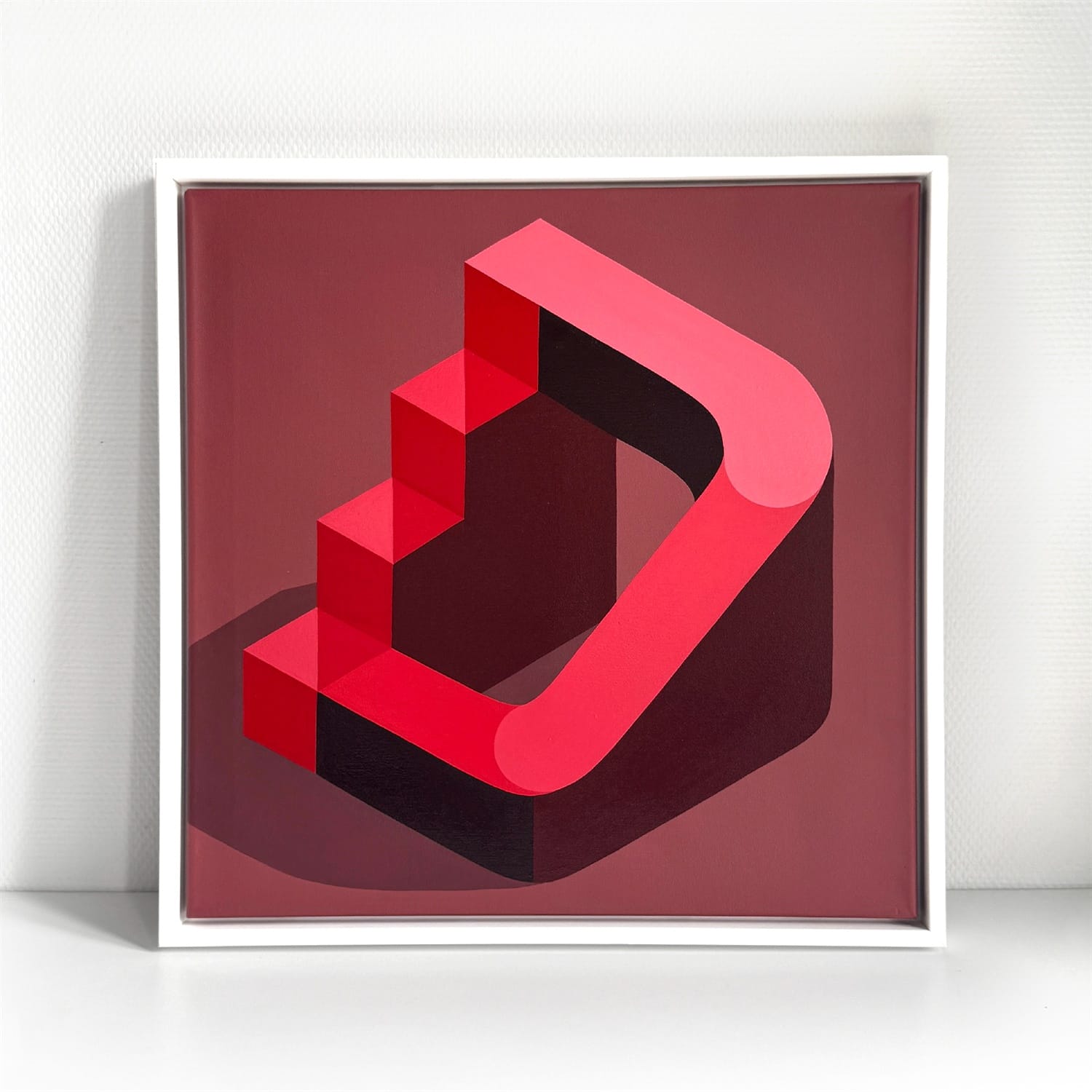
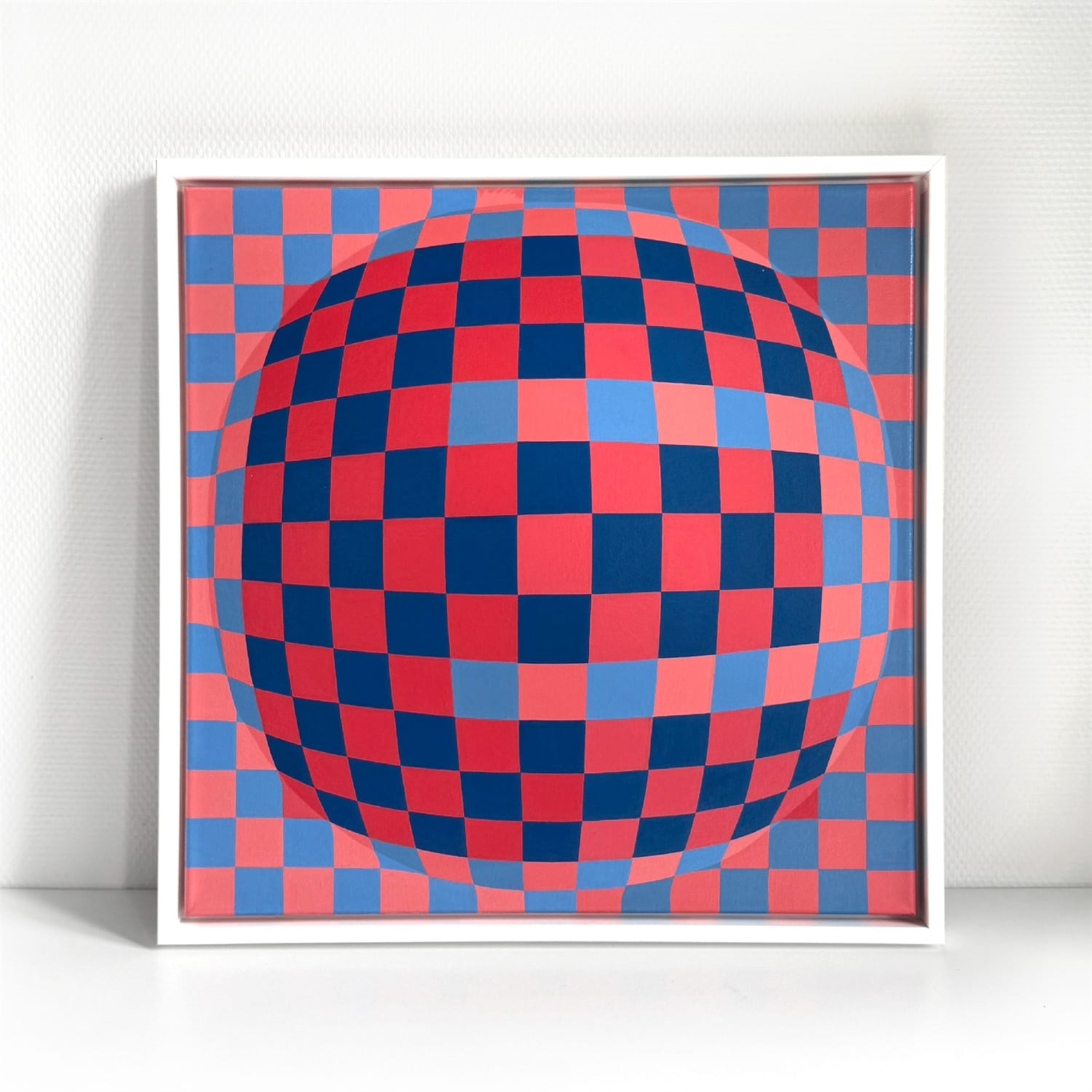
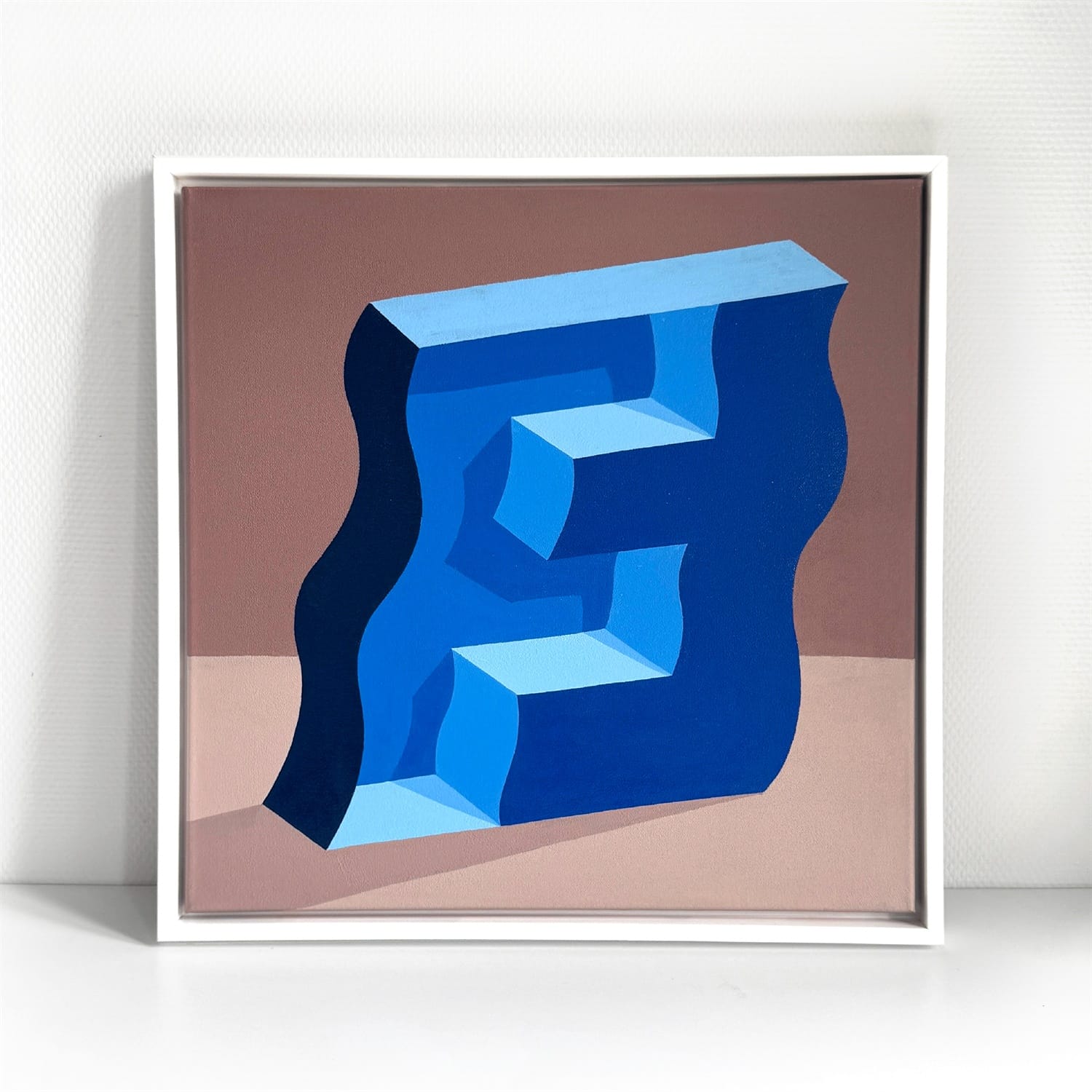
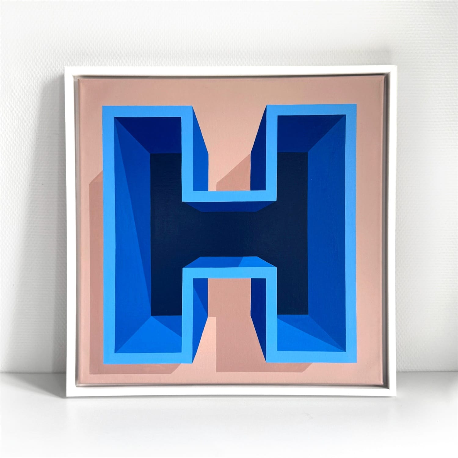
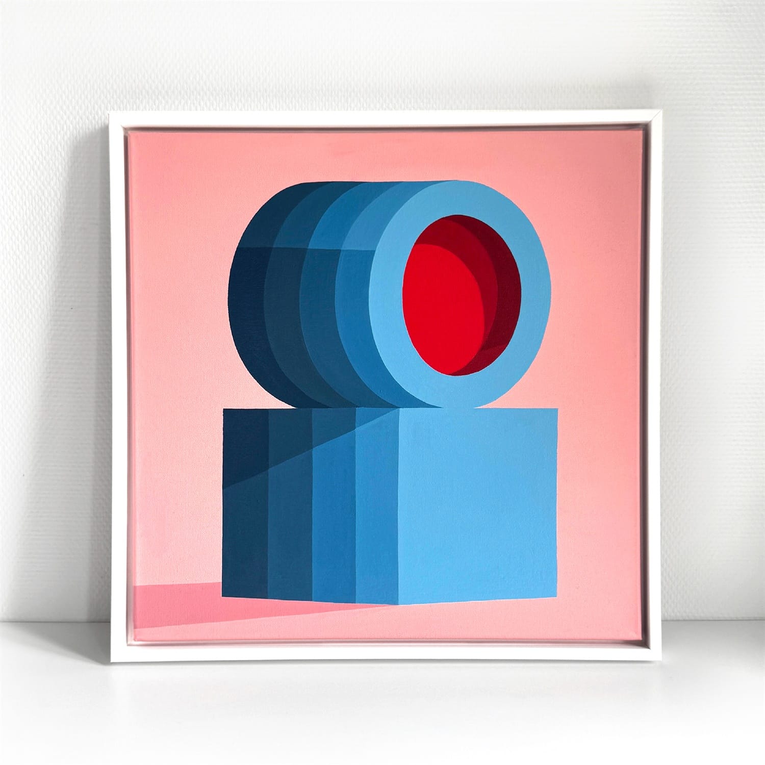
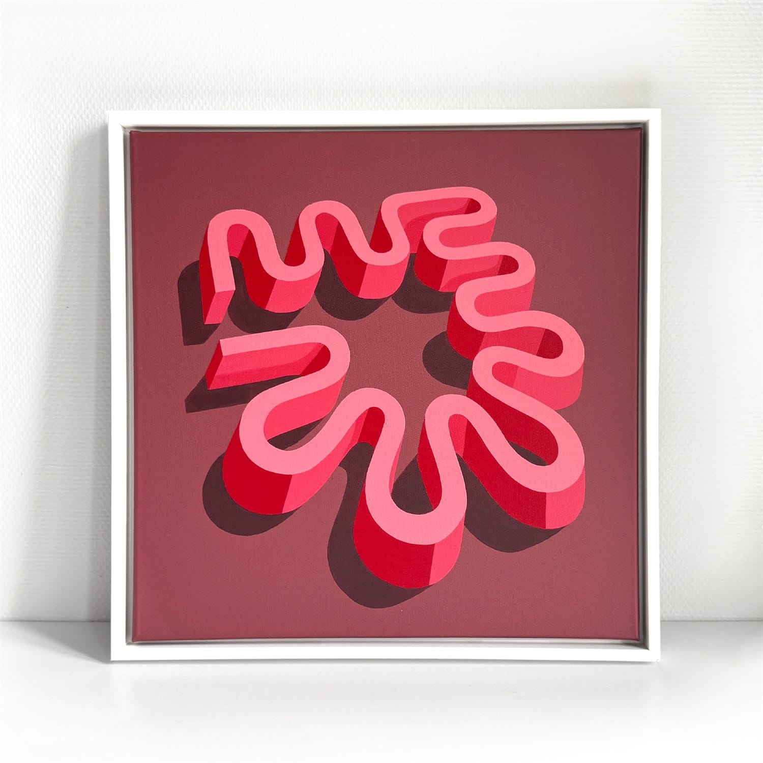
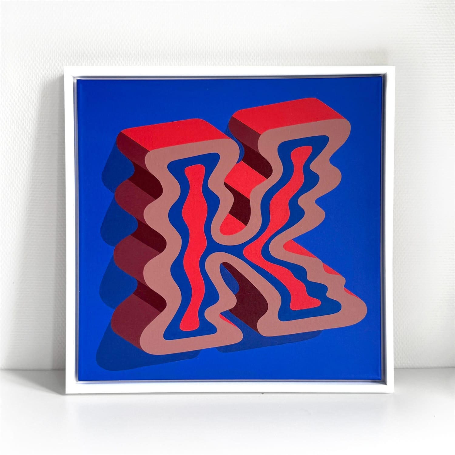
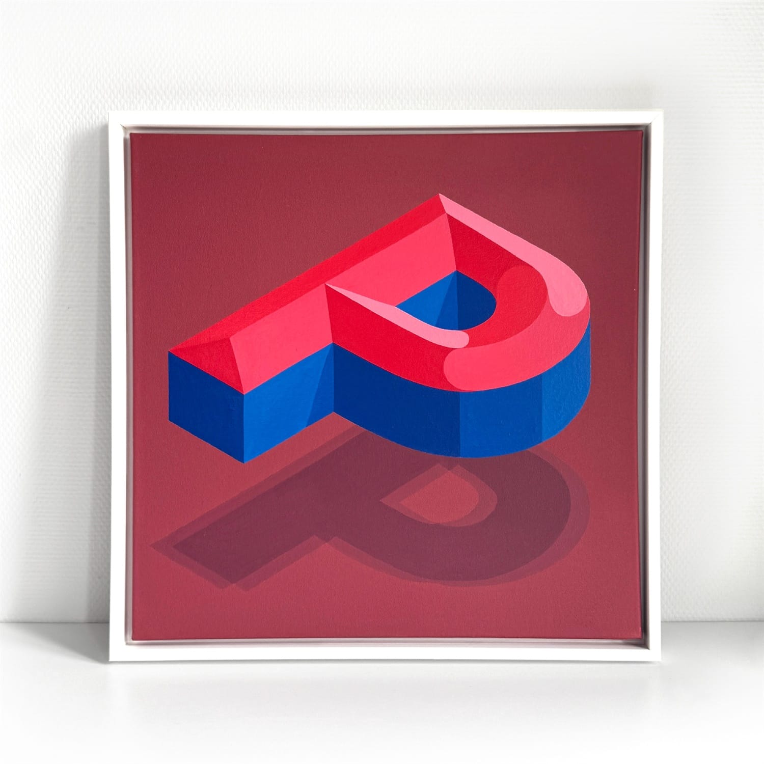
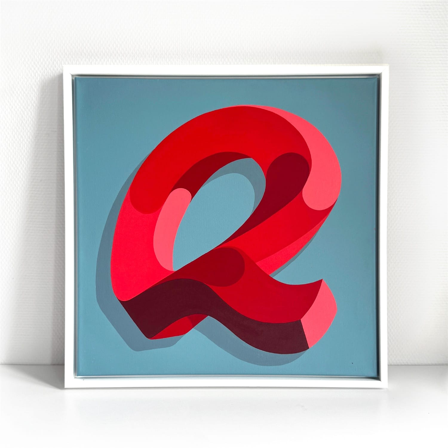
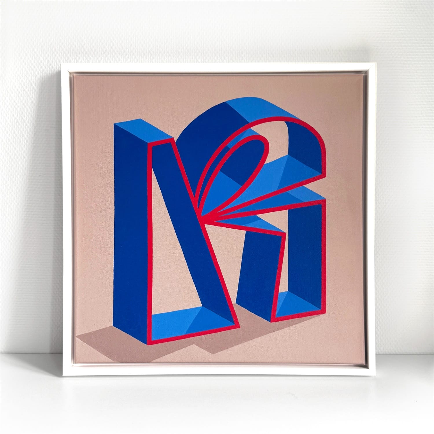
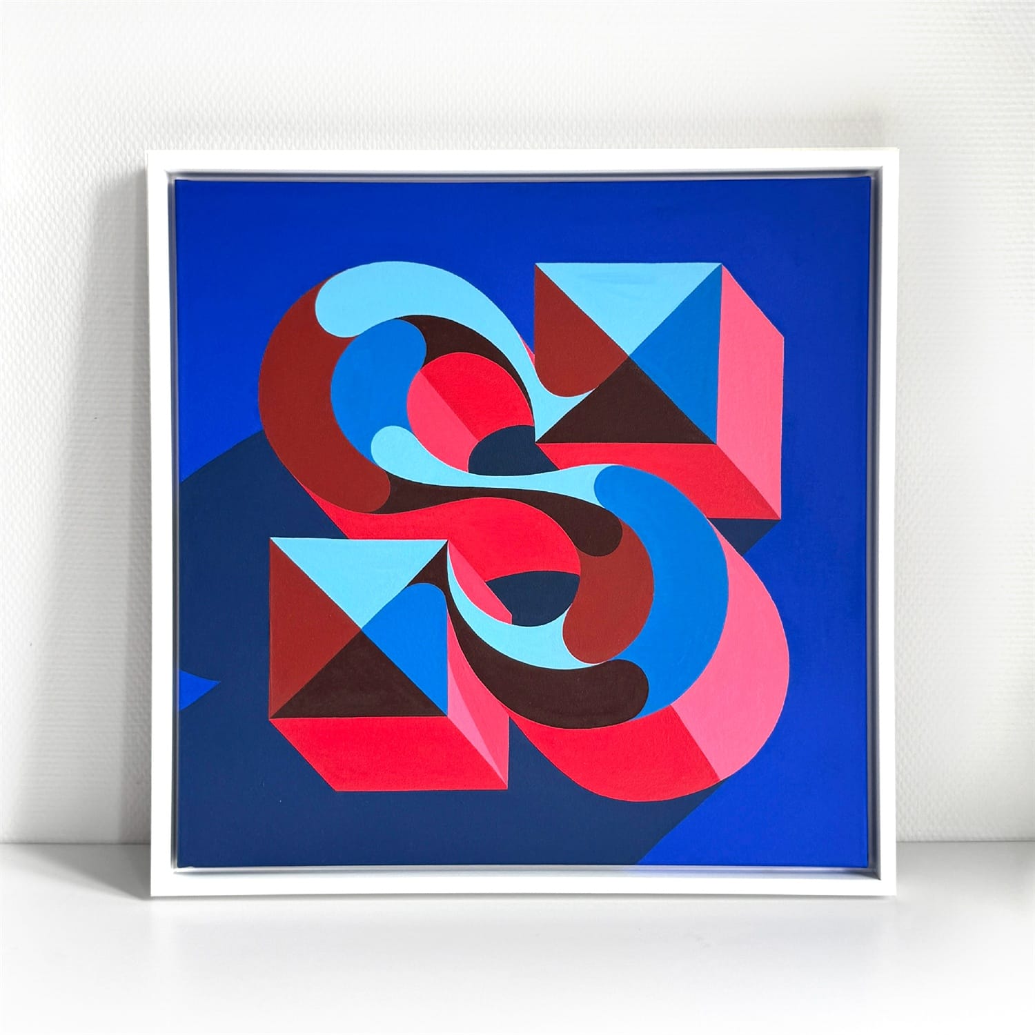
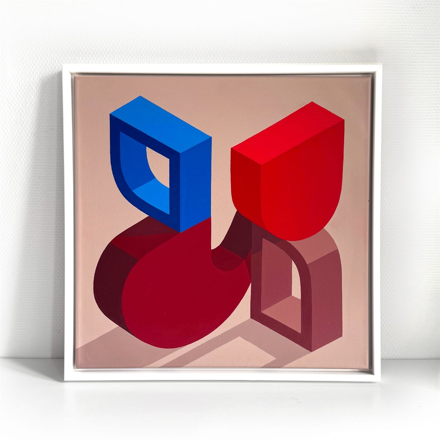
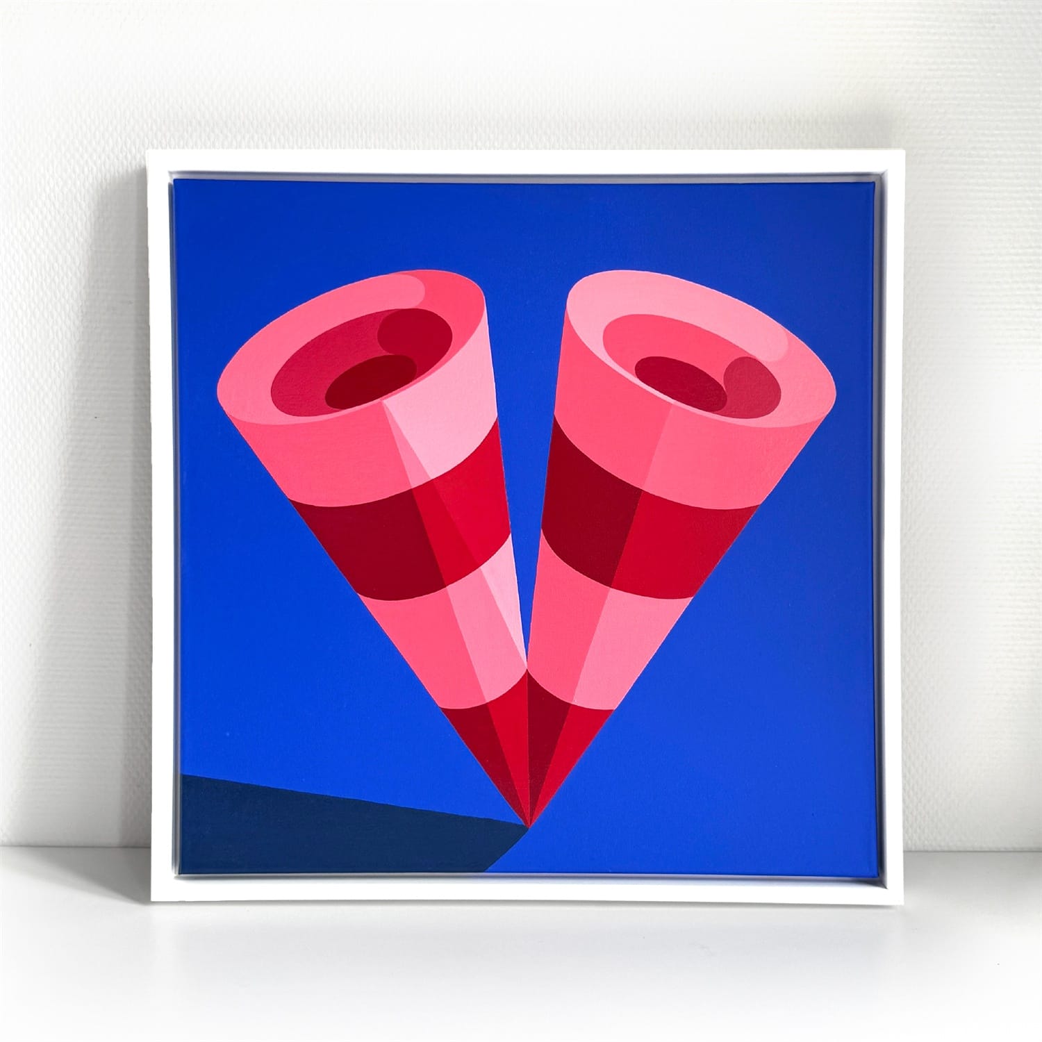
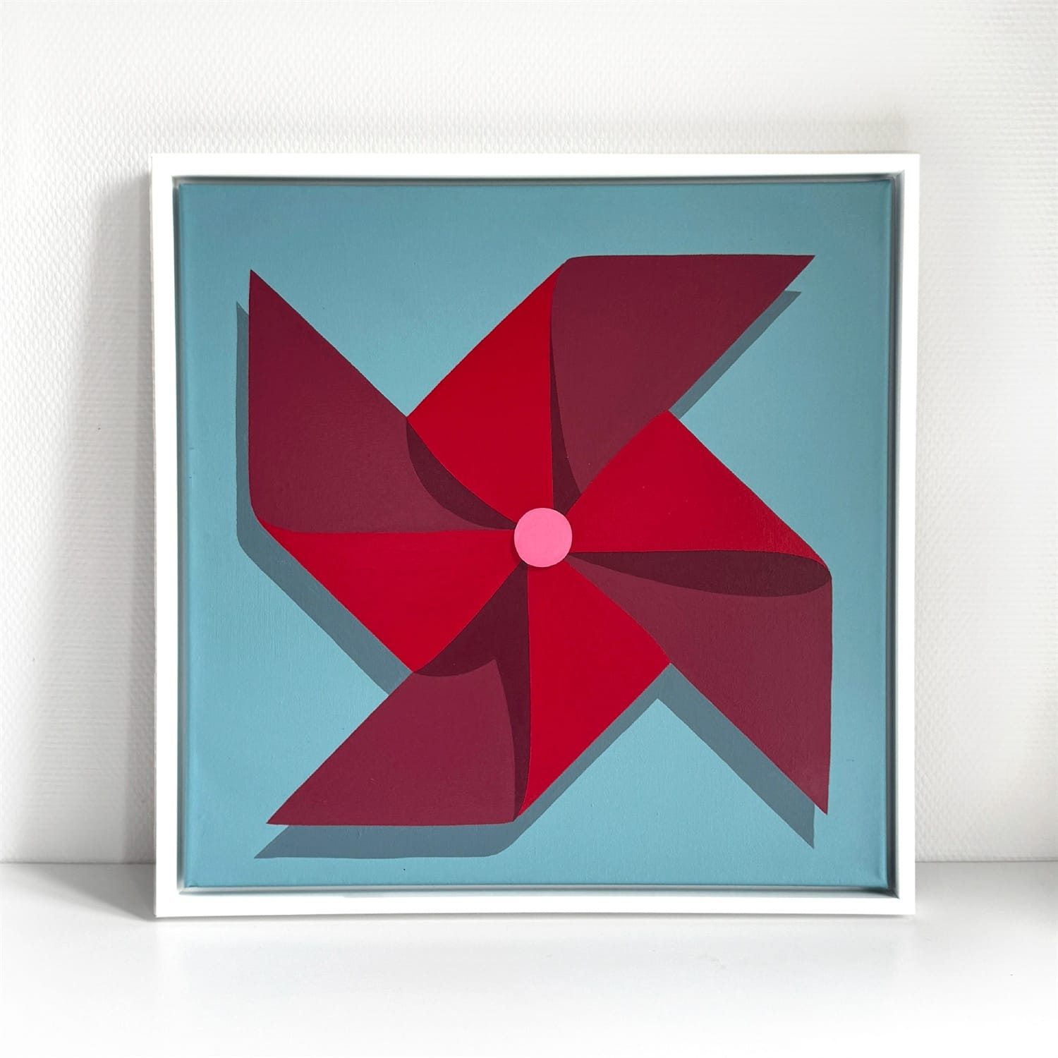
Each piece is 50 × 50 cm (20 × 20 in) painted in enamels on canvas.
More Projects
More People
