Two's Company in the Latest Culture+Typography Despatch
Nikki Villagomez's second book of found lettering examines the use of letterforms in combination.
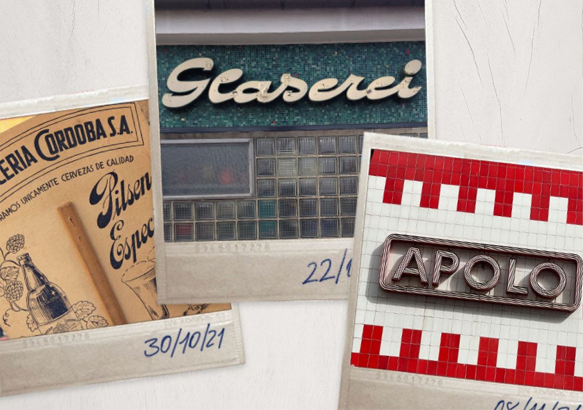
Nikki Villagomez's new book, Culture+Typography: Examples in Font Pairings, is grounded in the realm of found public lettering, exploring the myriad ways in which different letterforms are used in combination. She has kindly shared the following introduction to the book, which is available alongside Culture+Typography: How Culture Affects Typography, here on her website.

Culture+Typography: Examples in Font Pairings
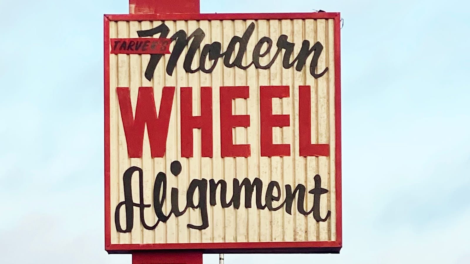
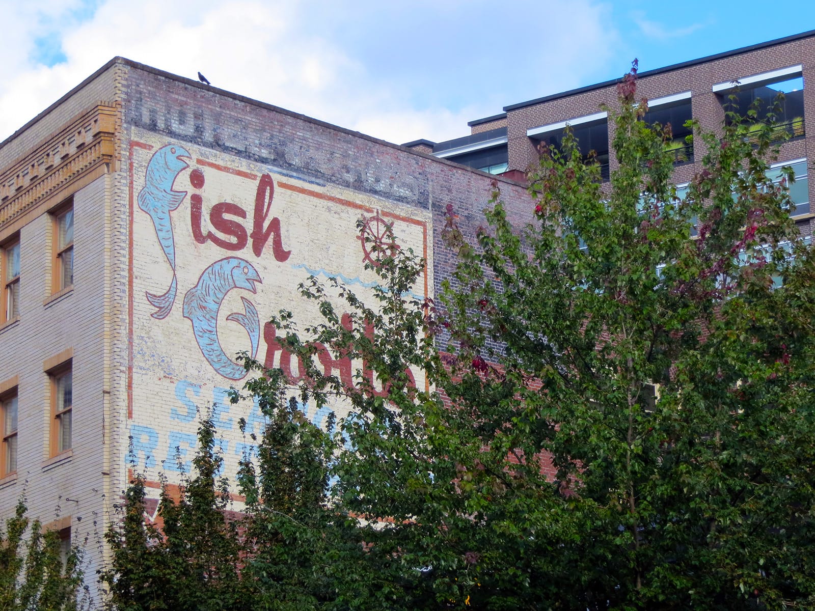
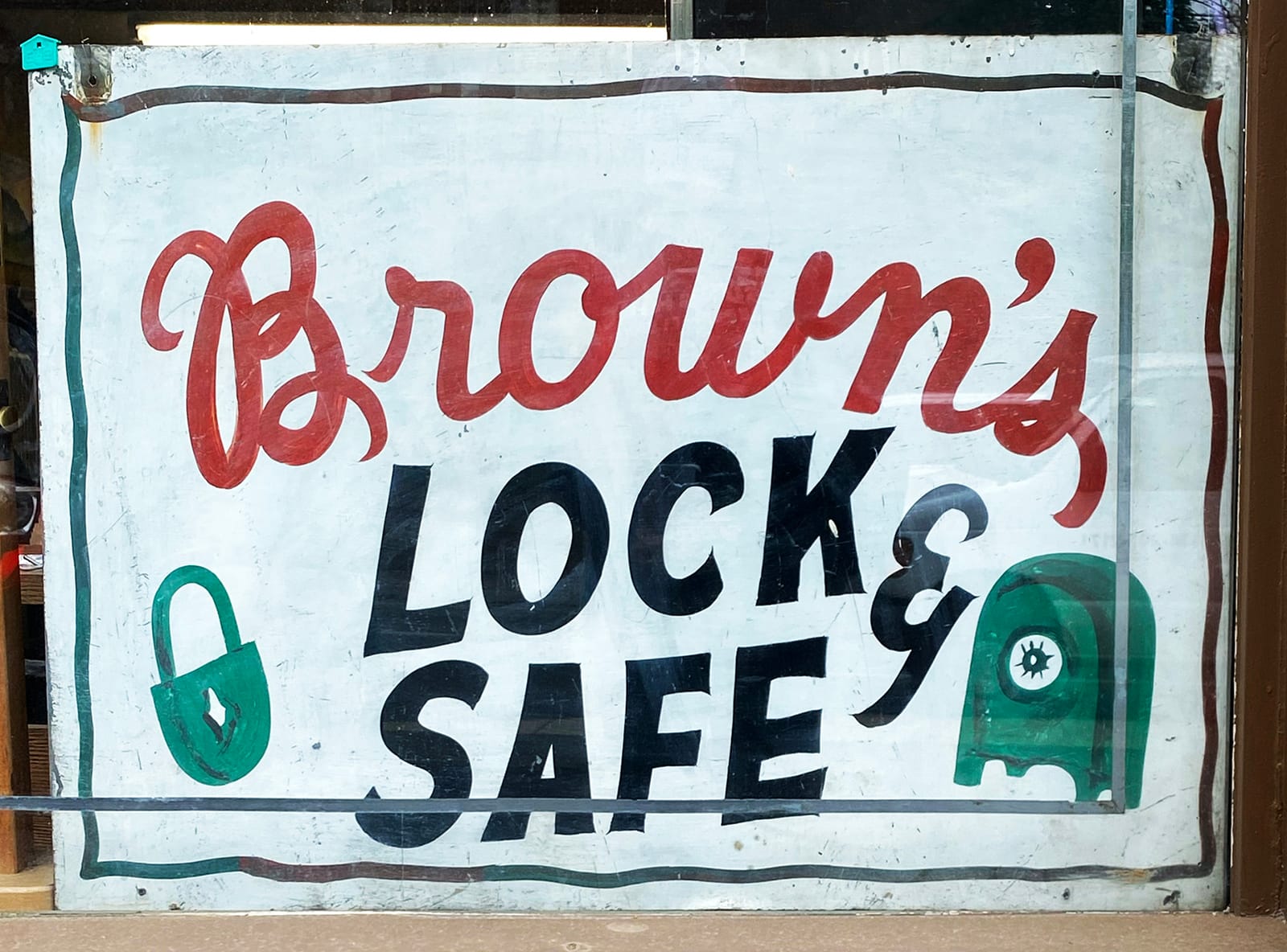
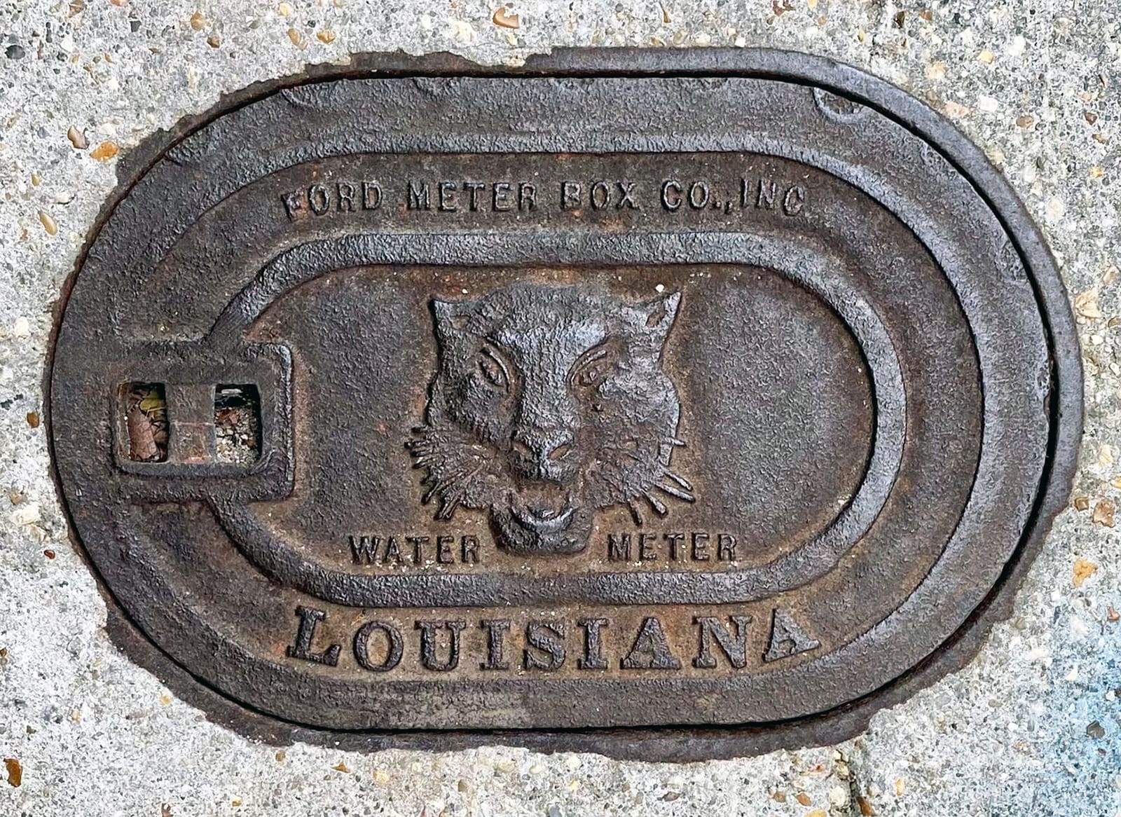
This publication is a continuation of my first book Culture+Typography: How Culture Affects Typography, with a specific focus on font pairings. I analyze historic signs, manhole covers, ghost signs, neon signs, and hand lettering from my travels to understand how combining different typefaces can either enhance visual impact or, in some instances, detract from it.
Through its practical examples and analysis, this book aims to provide readers with a comprehensive understanding of how to successfully pair fonts to influence design and communication across various contexts.
The following is an excerpt from the introduction.
Introduction
I published my first book, Culture+Typography: How Culture Affects Typography in 2015. It is comprised of a collection of pictures I had up until the time of publication and compares pictures from different parts of the country, organized by the chapters Ghost Signs, Manhole Covers, Graffiti, Hand Lettering, Signage, Neon Signs, Wayfinding and Cultural Observations.
As my research has grown and my travels have expanded, my desire to write another book became a goal of mine. I felt the need to document the pictures I have because, as I learned with my first book, about 80% of the signs have been destroyed, painted over, or removed. My book went from being a way to observe typography in different cities to being a cultural reference through historic documentation.
As I started brainstorming ideas for a second book, I knew right away what I didn’t want: a copy/paste of my first book with new pictures. However, I did want to keep the same topic, ‘Culture+Typography’, but looking through a different lens. I get frustrated when I can’t figure things out right away but I knew that it would come to me.
As I have continued my travels, there have been similarities in the questions I get asked at the end of my talks, like:
“Do you design your own fonts?” “What’s your most hated font?” “What cities have been the most impactful for your research?”
(The answers are No, Curlz, Albuquerque, New Mexico and San Antonio, Texas.)
But there has been one question that has come up often over the years and the topic has stuck in the back of my mind because it is one of the most challenging for my profession:
“Has your research helped your professional work, specifically with font pairings?”
Yes!
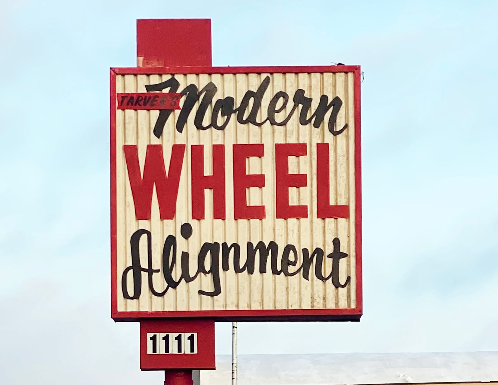
When I taught typography, pairing fonts was a struggle for students. Working as a professional, it’s also one of the things that easily trips people up. It’s hard to do, difficult to teach and tough to know if you’ve nailed it or not. What has worked for me is spending time looking at examples and identifying what I like (or don’t like) about font pairings. Over time, I noticed some themes starting to emerge which I then began documenting.

I realized I had plenty of content to create a book on the topic of font pairings in the hope that it will help others understand this elusive skill. I have identified five main categories to analyze, which are the chapters of this book: Ghost Signs; Manhole Covers; Hand Lettering; Neon Signs; and Building Signs.
In addition to showing font pairings, I also give historical information where I can. Finding typographic gems while I wander back alleys in cities brings me so much joy — I literally lose track of time — but researching the area, the history of a building or learning the date a sign was created gives me more insight into the background and helps me understand some of the decisions that were made at the time. Over the years, these discoveries have been one of my favorite aspects of the project.
In some instances, I’ll just show the pictures to help enable you to draw your own conclusions about the pairings, and I end each chapter by summarizing the key themes that have emerged and evaluating their pros and cons.

Culture+Typography: Examples in Font Pairings and Culture+Typography: How Culture Affects Typography can be ordered directly from Nikki Villagomez on her website, or by emailing nikkivillagomez@gmail.com.
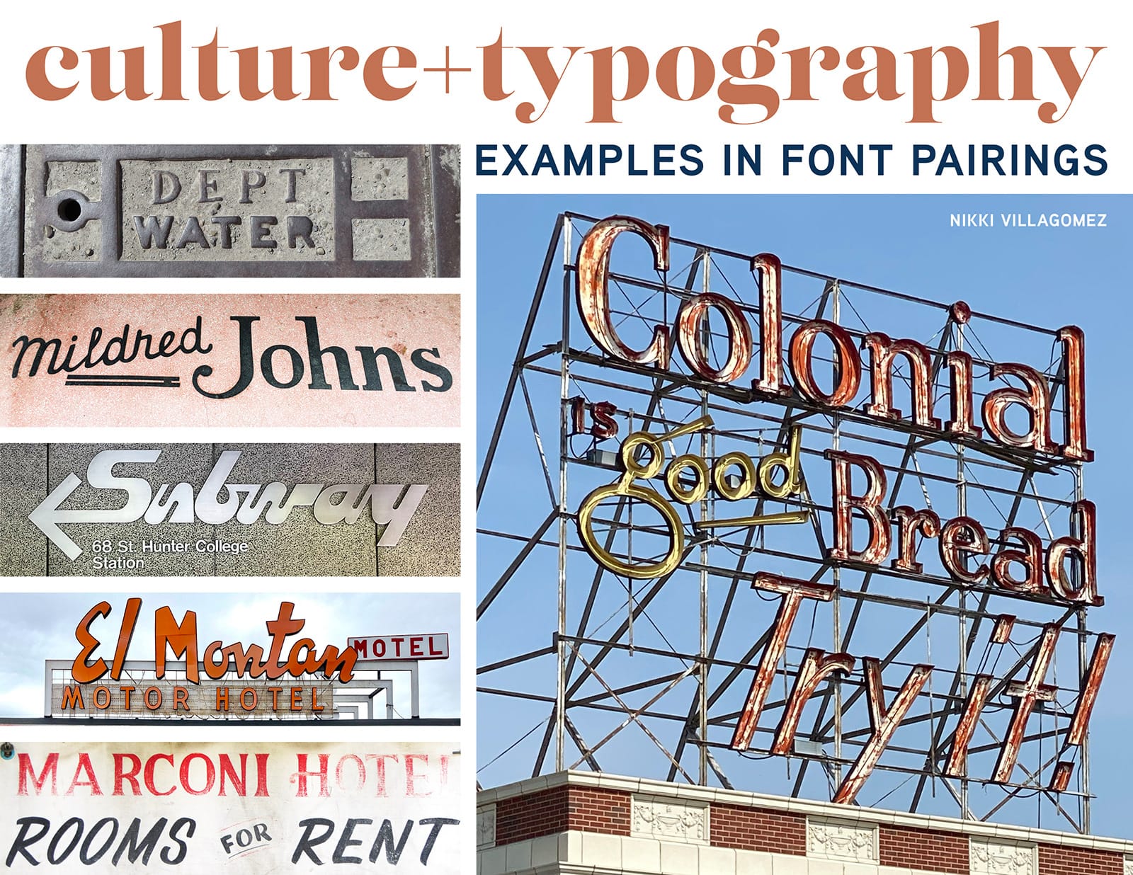
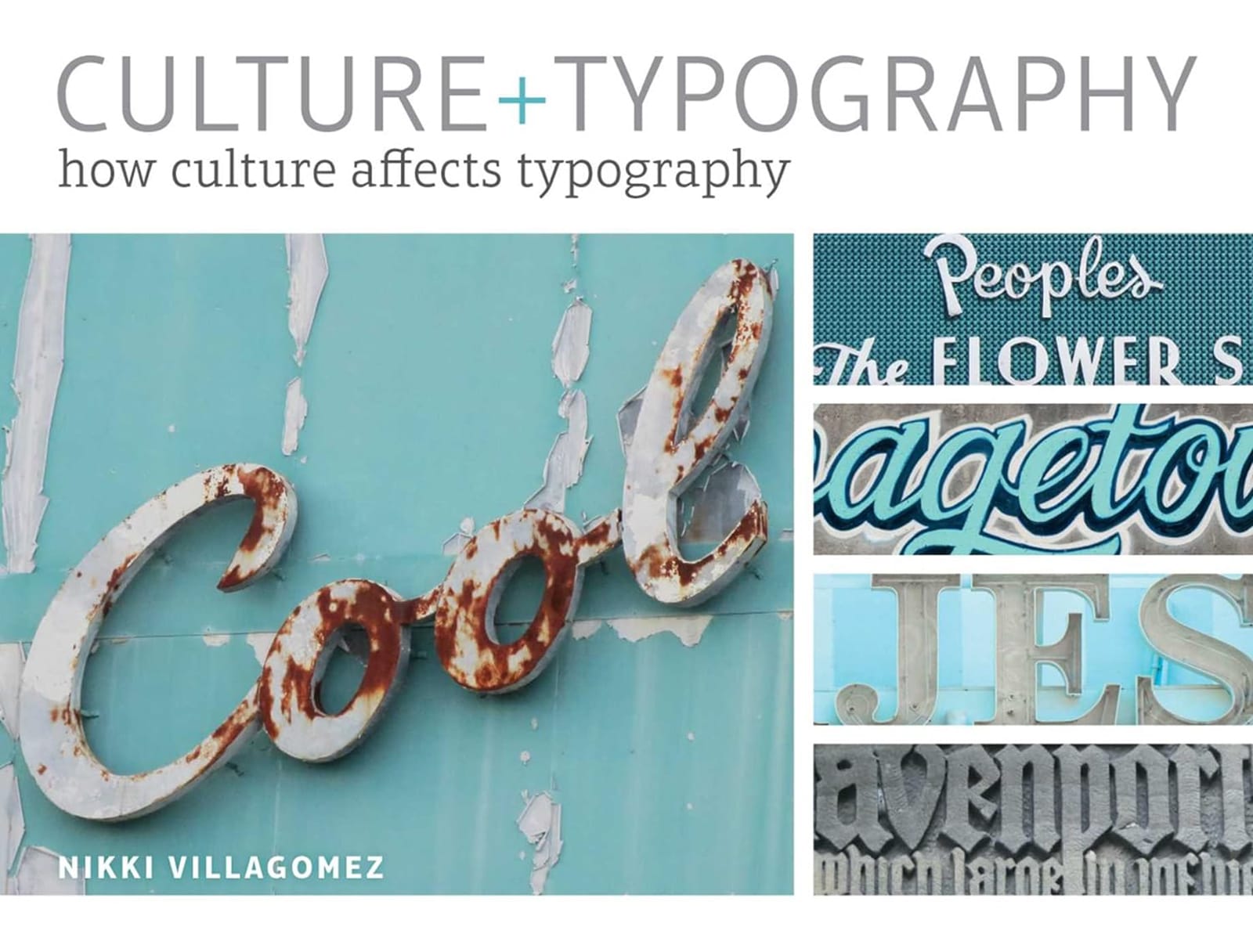
Nikki Villagomez's Culture+Typography books: Examples in Font Pairings and How Culture Affects Typography.
More Books
More Letter Hunting
