Chicago Sign Writing in The Origin of the Serif
Edward Catich draws parallels between Chicago sign painters of the 1920s and those in ancient Rome.

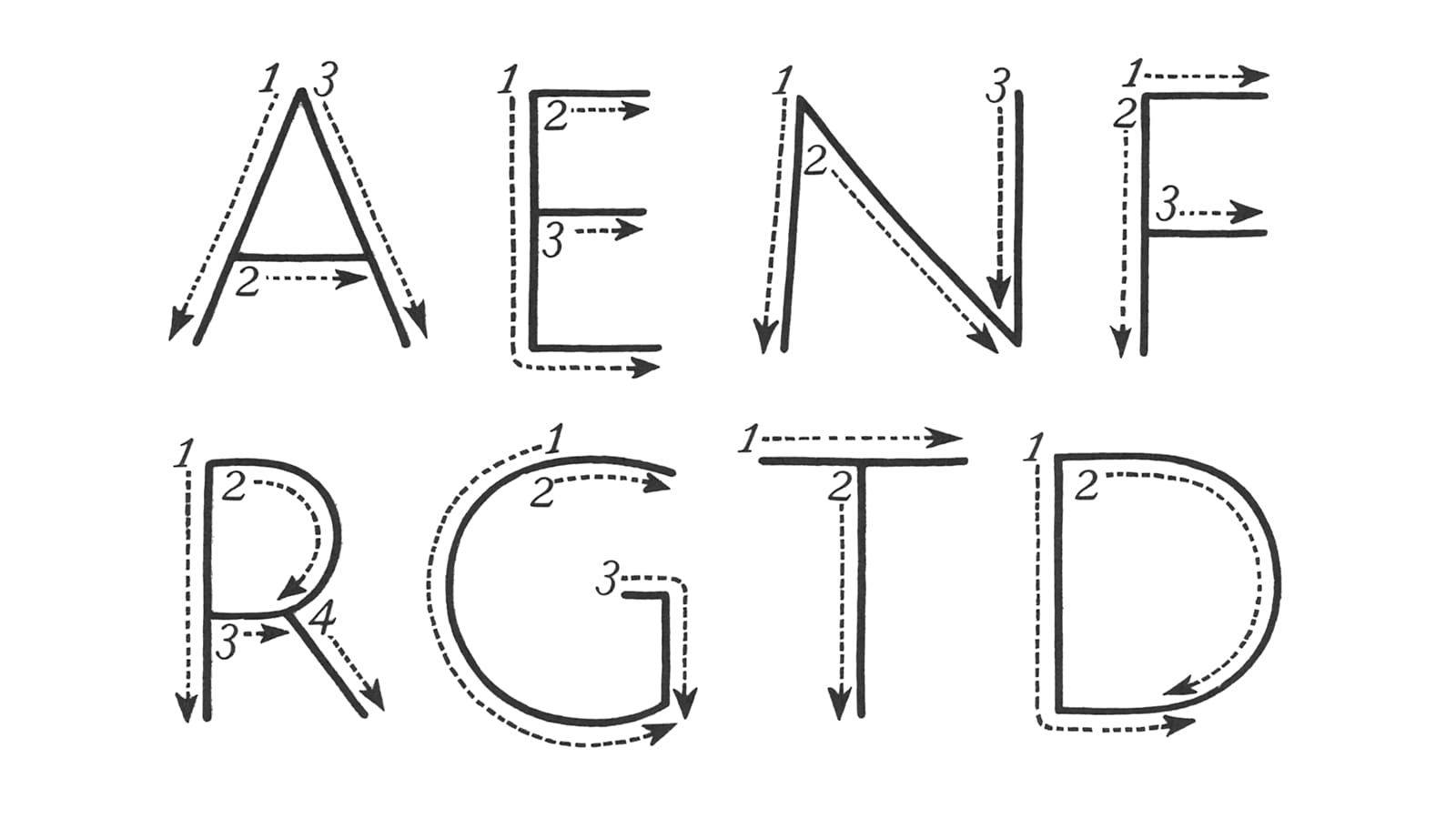
The Origin of the Serif is Edward Catich’s exposition of his theory that carved Roman inscriptions originated from hand-painted letterforms. His experience as a union sign painter in Chicago played no small part in developing the insights behind the theory, and the book sets out his arguments in great detail.
The final chapter, ‘Chicago sign writing’, advances the notion that, despite their two millennia of separation, early twentieth century Chicago sign painters and Roman letter painters were not so different in their abilities with respect to speed and brush handling. With the kind permission of St. Ambrose University, I am reproducing that chapter here for your benefit.
Chicago Sign Writing
By Edward Catich
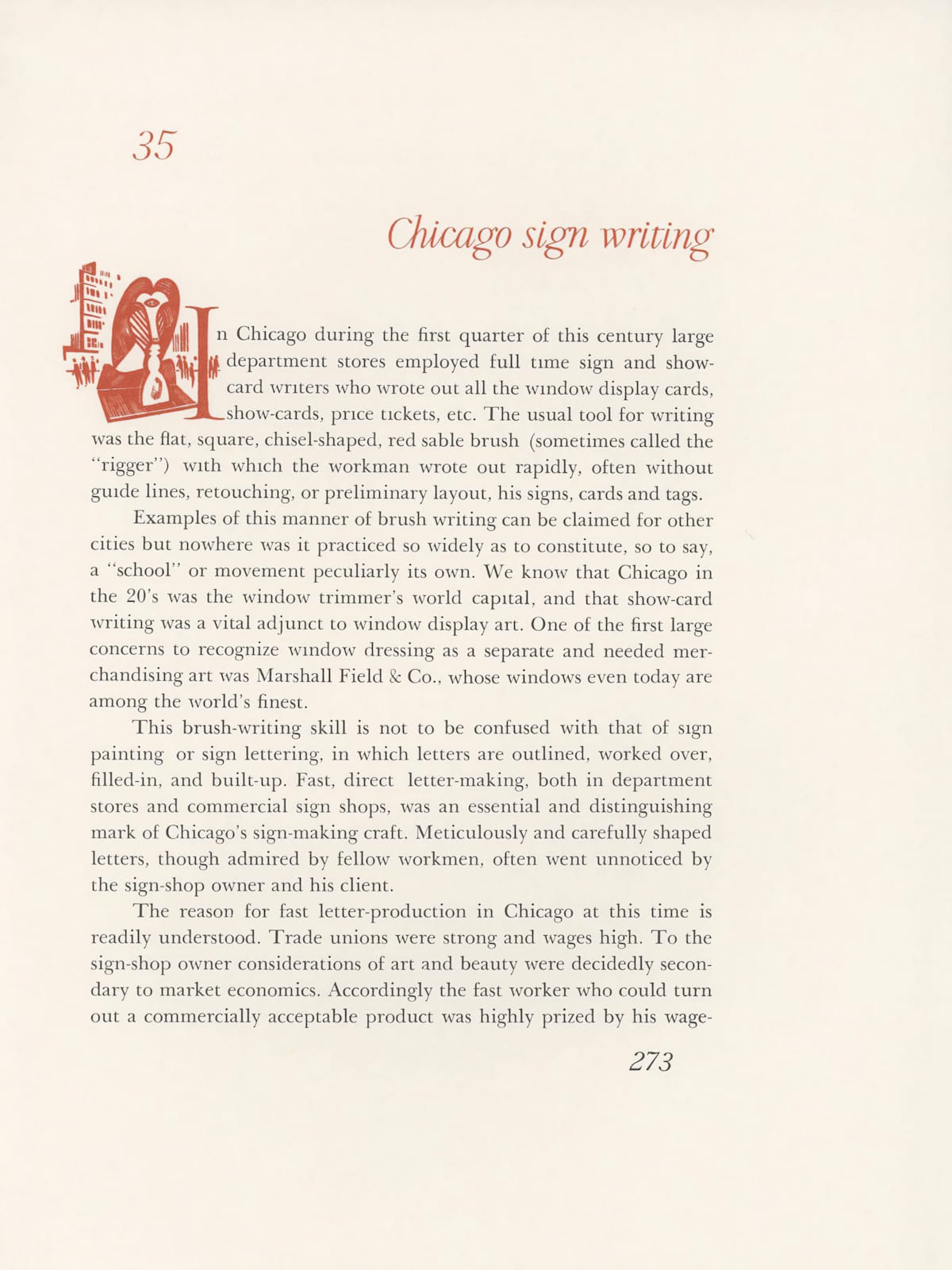
In Chicago during the first quarter of this century large department stores employed full time sign and show-card writers who wrote out all the window display cards, show-cards, price tickets, etc. The usual tool for writing was the flat, square, chisel-shaped, red sable brush (sometimes called the “rigger”) with which the workman wrote out rapidly, often without guide lines, retouching, or preliminary layout, his signs, cards and tags.
Examples of this manner of brush writing can be claimed for other cities but nowhere was it practiced so widely as to constitute, so to say, a “school” or movement peculiarly its own. We know that Chicago in the 1920s was the window trimmer's world capital, and that show-card writing was a vital adjunct to window display art. One of the first large concerns to recognize window dressing as a separate and needed merchandising art was Marshall Field & Co., whose windows even today are among the world's finest.
This brush-writing skill is not to be confused with that of sign painting or sign lettering, in which letters are outlined, worked over, filled-in, and built-up. Fast, direct letter-making, both in department stores and commercial sign shops, was an essential and distinguishing mark of Chicago’s sign-making craft. Meticulously and carefully shaped letters, though admired by fellow workmen, often went unnoticed by the sign-shop owner and his client.
The reason for fast letter-production in Chicago at this time is readily understood. Trade unions were strong and wages high. To the sign-shop owner considerations of art and beauty were decidedly secondary to market economics. Accordingly the fast worker who could turn out a commercially acceptable product was highly prized by his wage-and-price conscious employer, and, in times of stress and unemployment, was the man likely to hold his job.