This is How Signs in London's Heyday Were Painted
Full text and accompanying images from the 'Sign Production' chapter of Ghost Signs: A London Story.

Ghost Signs: A London Story is my book, jointly authored with Roy Reed and published in 2021 by Isola Press. There is a review inside BLAG 01, and here I am excited to share the 'Sign Production' chapter, one of seven that introduce a variety of ghost sign themes.
I have left out the specific stories of the individual signs which you can get by buying the book, either from the BLAG shop, or via the other options on the Ghostsigns site.
Ghost Signs: A London Story in the BLAG shop.
All photos are © Roy Reed, unless otherwise indicated.
Sign Production
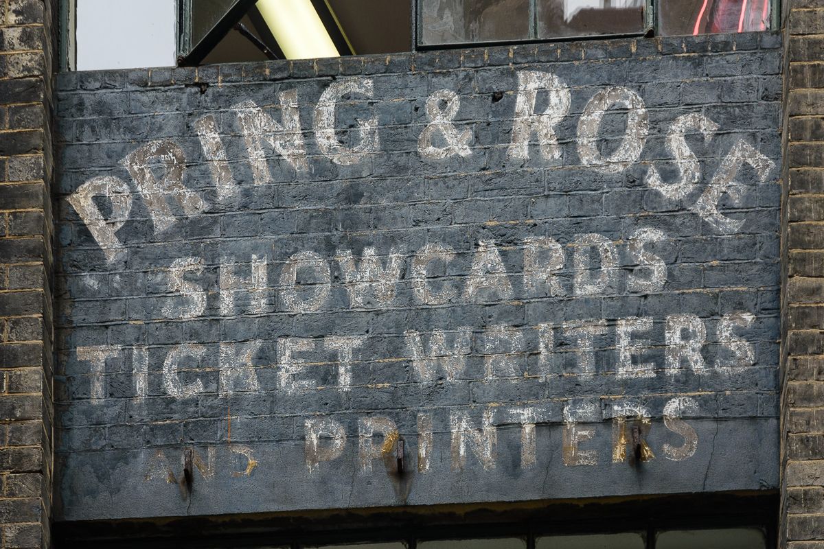
Once a wall was allocated for a painted sign, the next step was commissioning a signwriter, typically sole traders or partnerships plying their trade in a particular area. For bigger brands, the signwriters may have been employed by the larger outdoor contracting firms, or the work contracted to the signwriting department of a bigger sign company. In the case of Hovis, the company developed a thriving in-house signwriting business of its own (see p. 150).
Design and Layout
One advantage of paint over print is the ability to accommodate any size and proportion of wall. Painted designs can also take account of the relative visibility of different parts of the wall from the street, and copy can be set out on multiple panels for greater impact.

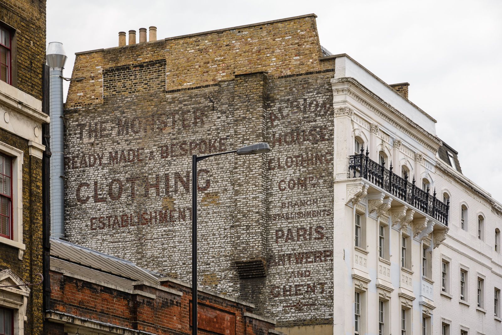
From left: Woolverton & Co., Lewisham Way SE4, occupying an awkwardly shaped wall to give maximum visibility to passing traffic; Cambria Coal | Bootmakers, Cambridge Gardens W10, with top panel lost while those below were protected by covering billboards; Albion House Clothing Company, Borough High Street SE1, set out to account for the chimney breast and relatively visibility of different parts of the wall.
The bigger brands would supply layouts based on artwork from their agencies. This applied equally to privileges (see p. 26) where the manufacturer’s logo would be tightly specified, with more flexibility given for lettering the retailer’s name. For smaller, local businesses, the signwriter often had more freedom when designing the sign.
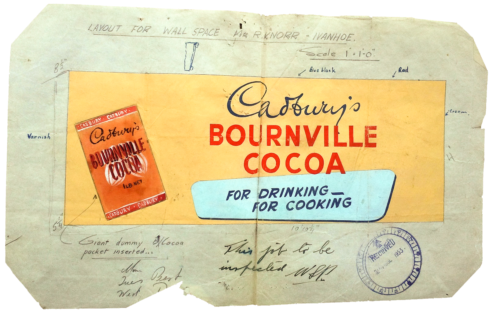
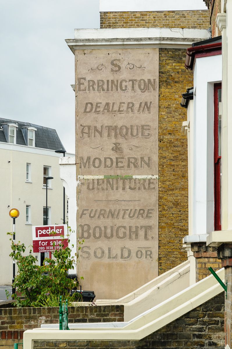
Left (courtesy of the Lewis & Skinner Archive): Scale drawing for a privilege sign on the shop of R. Knorr in Ivanhoe, Melbourne, Australia, 1955. Right: S. Errington, Dulwich Road SE24, with a variety of flamboyant lettering styles used by the signwriter.