“The Town is Our Portfolio”: No Plan on Main Street
Jesse and Dianne Kirsch work with sign painters to bring their hyperlocal branding projects to life.
Sign painters frequently collaborate with graphic designers and branding specialists, many of whom are important allies when it comes to championing the craft. A case in point is the husband and wife partnership of Jesse and Dianne Kirsch, whose work has helped to define the character of the Washington D.C. suburb of Takoma Park.
Trading as No Plan, the Kirsches have grown alongside Takoma Park’s thriving community of independent local businesses, giving many of these establishments their visual identity and character. Their work often involves partnering with sign painters, in addition to other specialist craftspeople, and I took the opportunity to ask Jesse about their business, process, and local impact.
Tell me about No Plan.
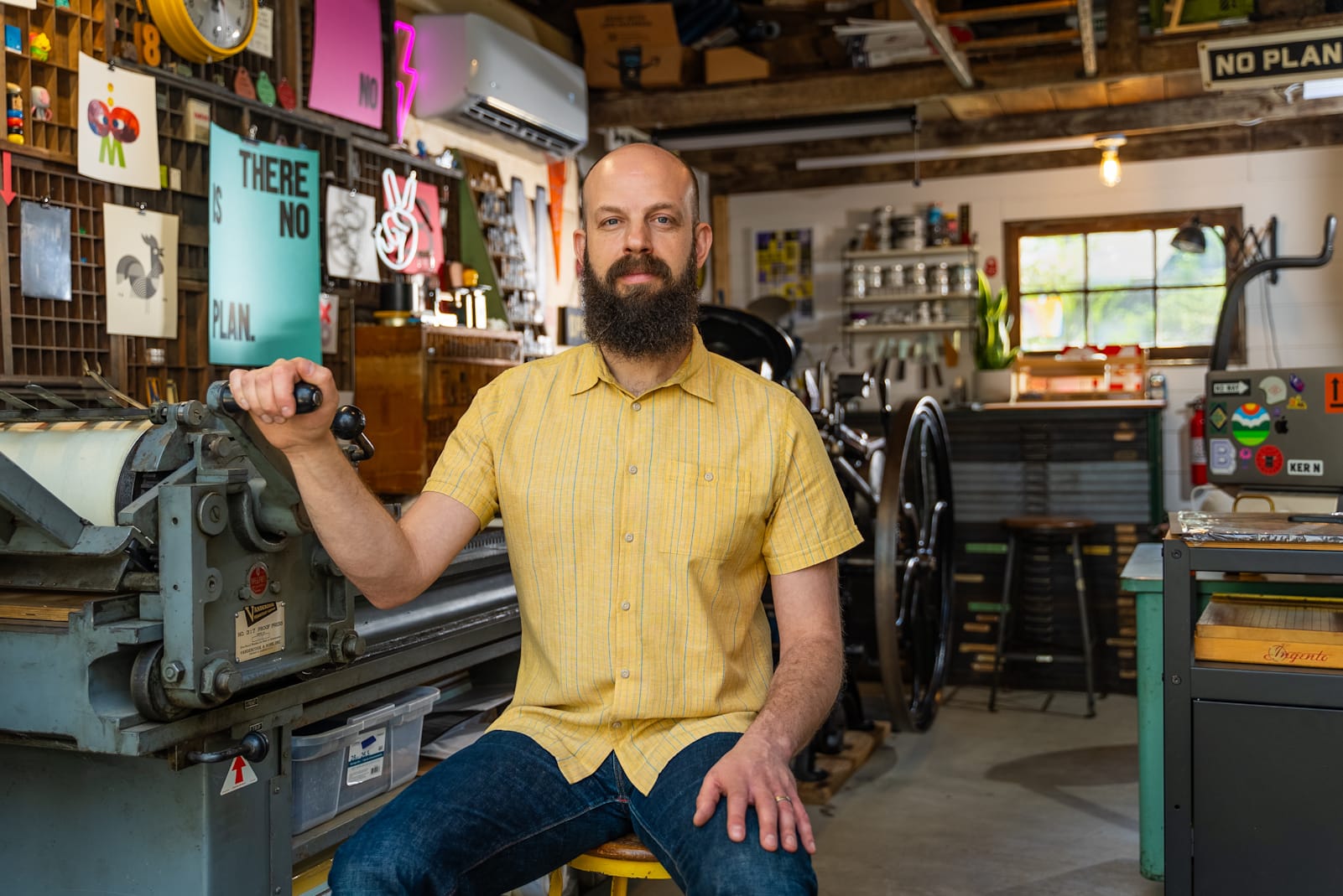
During the early days of the pandemic, I found myself working remotely from my garage and wanting a way to support the small businesses in town that were closed. I created a letterpress print campaign and sold over 400 prints, raising $10,000 for two city grants. This led to local businesses getting in touch for t-shirts and branding work, and things snowballed from there.
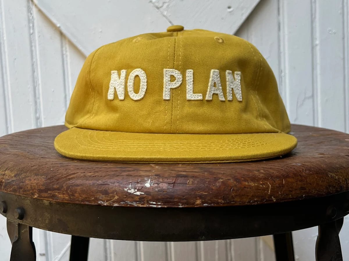
The team is me and my wife, Dianne, and the No Plan name comes from our approach: we embark on each project with a vision, an idea, and a general sense of how to get there, while remaining constantly open to the creative process and the twists and turns that can take us in new directions.
Dianne focuses on longform design (reports, booklets, etc), branding, and illustration. My sweet spots are branding, posters, letterpress, murals, and signage. I still work out of our detached garage, which is my design and letterpress studio, while Dianne is based in the home office to give each of us the space we need.
Tell me about what you describe as the “hyperlocal” nature of your business and work.
We live and work here in Takoma Park, which is a small progressive town that supports local community businesses above all. We feel the same, and strive to make a positive impact in our community — many of our clients are friends and neighbours, and we want to be partners in helping to bring their visions to life. Everything we do is to support the people, their businesses, and our town. We literally see our work every day, so it’s important that we are doing our best work and can be proud of what we put out there.
The result is that we have really begun to contribute to the town’s aesthetic and vibe, to the extent that we now tell potential clients to walk down Main Street if they want to get a sense of our work. We say the town is our portfolio.
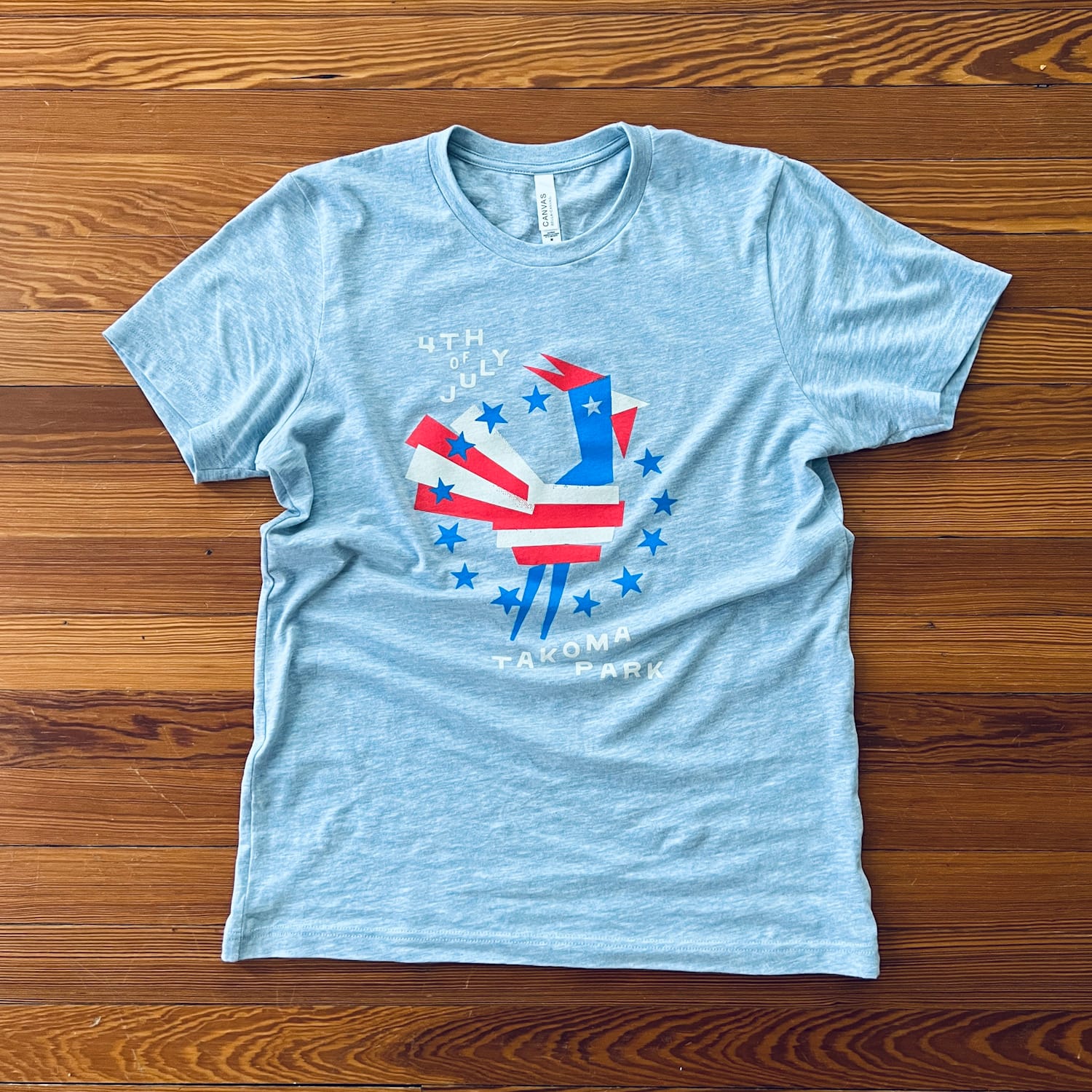
On Main Street itself we’ve worked on coffee shops, restaurants, a bookstore, a homeware shop, and a butchers. We’ve also developed Takoma Park shirts and merchandise, and done the branding for the annual street festival and other local events. This has led to us also working with the City of Takoma Park government on their design needs.
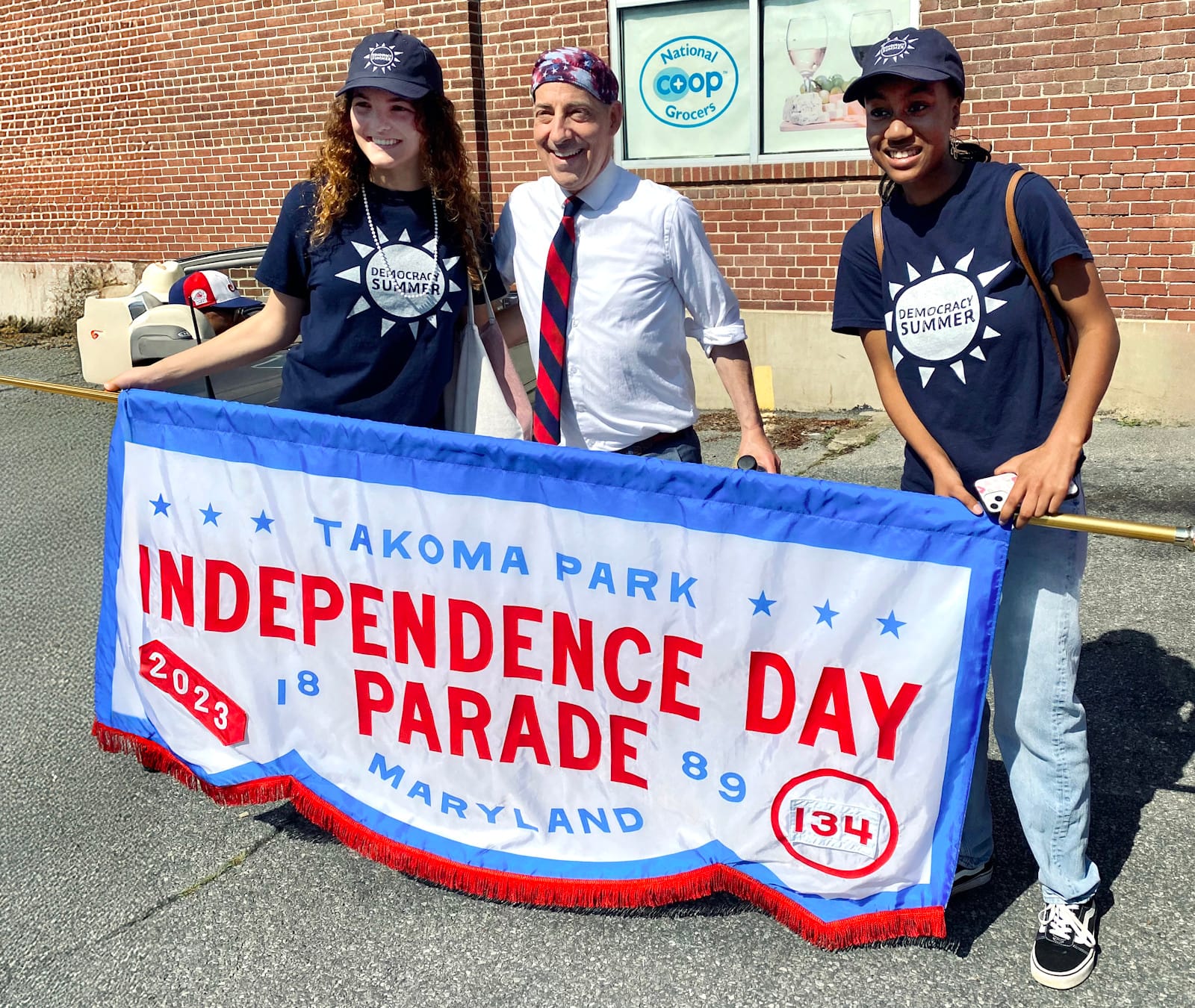
Work by No Plan for the 2023 Independence Day celebrations, including a photo opportunity with local United States Democratic Congressman Jamie Raskin.
Talk through your typical process and how you collaborate with clients to deliver the full spectrum of work that you do.
A lot of it starts out with just getting to know them [the client]. The majority are people we have gotten to know in our community over the years, so they’ve seen our work first-hand and reach out to use when they are ready to either start their own business or to work on a refresh.
Once we agree on the scope/budget/timeline, it starts with understanding their business, their goals, values, style, colour preferences, etc. This is done with a detailed questionnaire that we review together in-person to officially kick-off the project. This will also include a list of the different deliverables that they can select from, though sometimes they need to see the potential of certain applications through the actual design process. If they can’t afford to do everything at once we break it up into different phases.
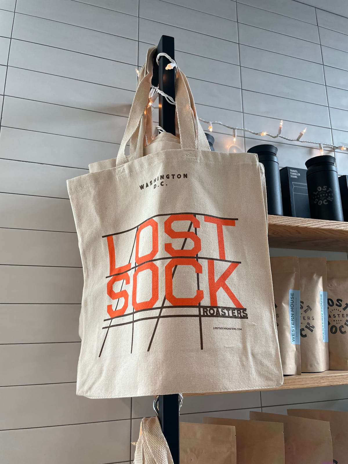
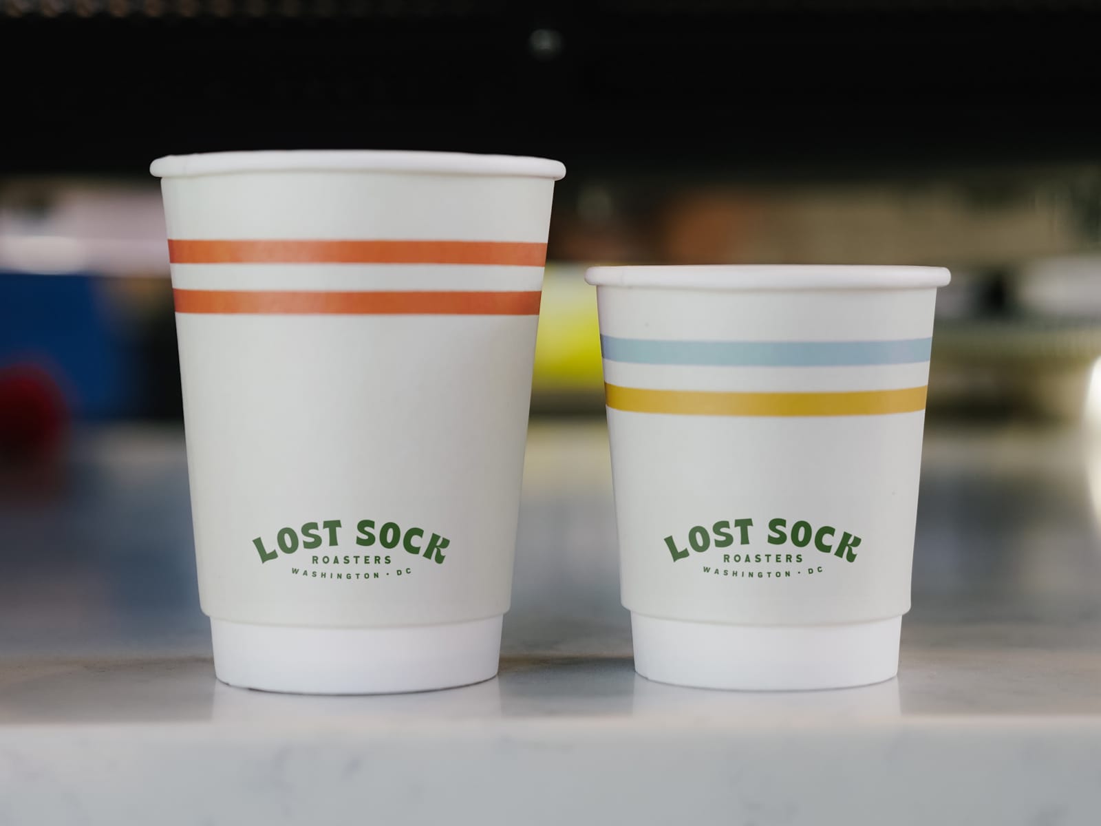
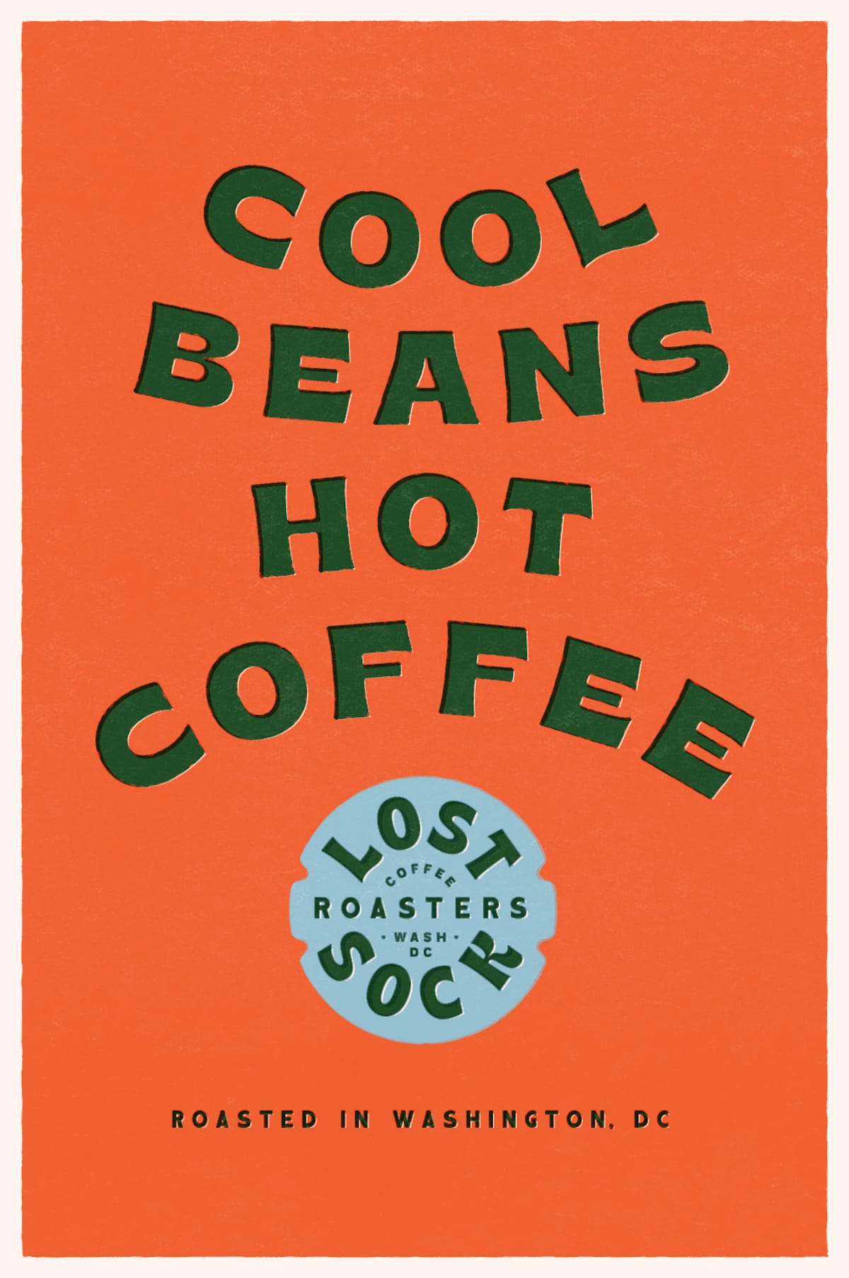
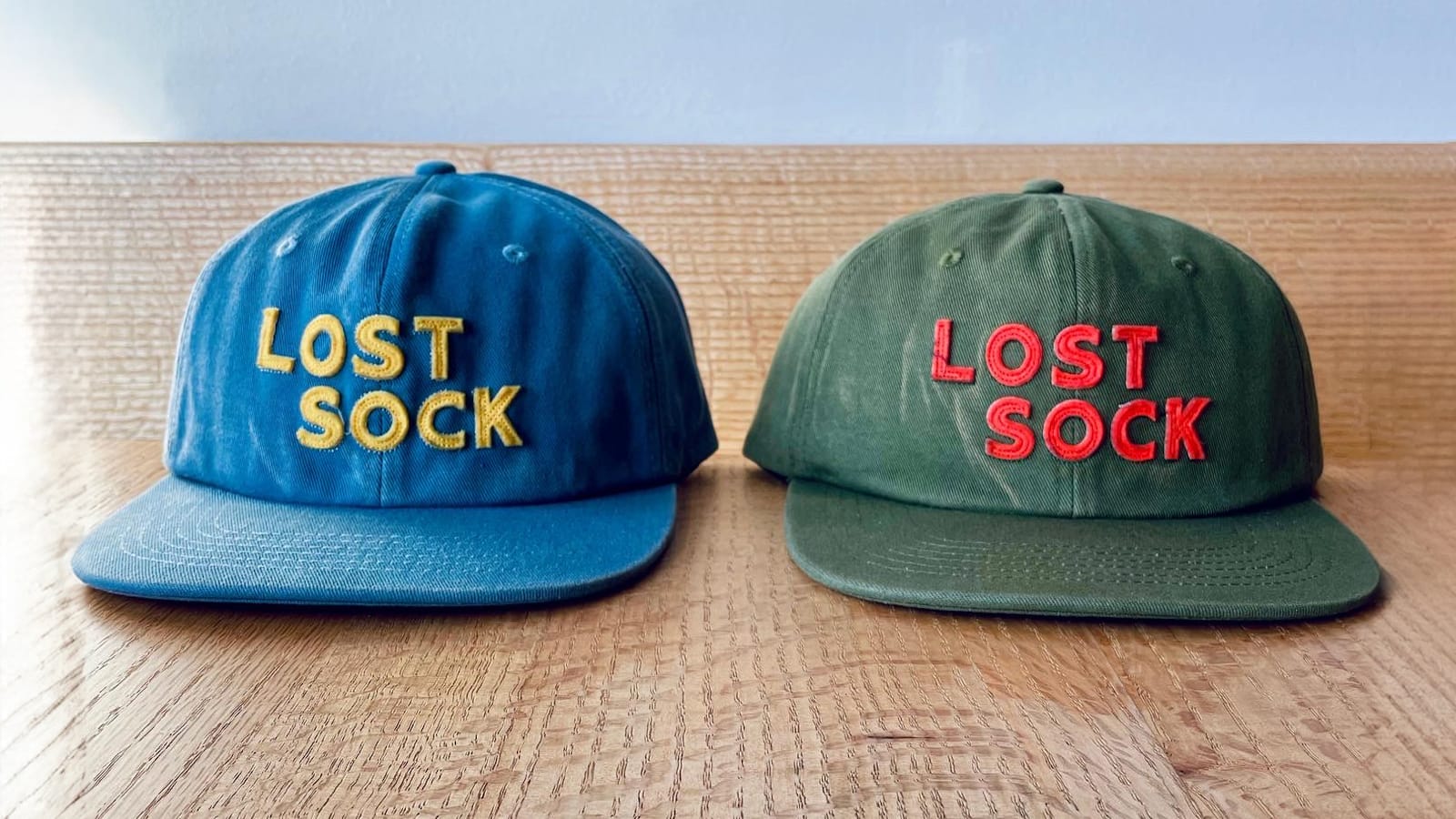
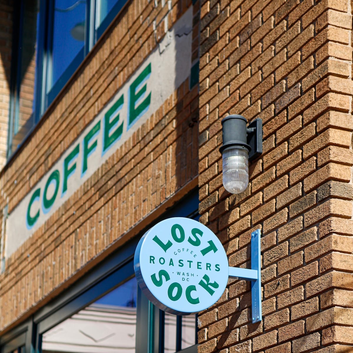
Work for Lost Sock Roasters across a variety of applications.
We take time to research the business, the industry, the competition, and look for inspiration. The character of the building itself also plays a role to make sure that the design and signage feel right for the space itself. I like to head to our local historical society to seek out information and photos from the location’s past where those are available.
Once we have a few directions we are feeling good about we will do an in-person presentation that shows the logo, visual language of the brand (colour, typography, illustration, etc), and how the work will translate to real-world applications such as signage, and print and digital materials. A logo never lives in a vacuum on a white background, so this stage is important for us and our clients to demonstrate how everything comes together, and to give a real sense of how the solution works for the business. Each element — sub-logos, seals, monograms, illustrations, icons, etc — needs to play a role in defining a larger brand identity that feels authentic.
After we’ve agreed on a final direction and made refinements and edits we move on to exploring all the different deliverables more thoroughly. This includes reaching out to sign painters and fabricators to get quotes and start the process of bringing everything to life.
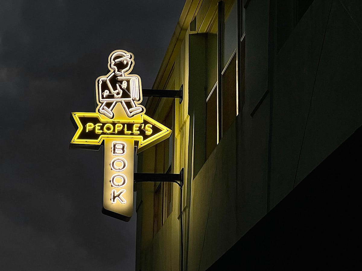
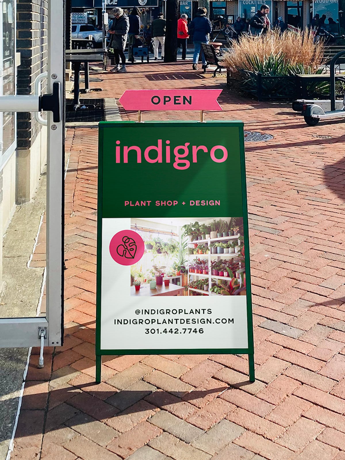
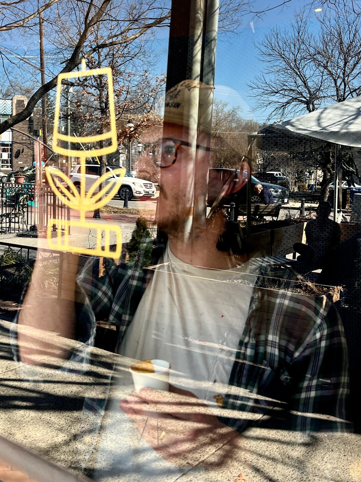
Neon and graphic work for People’s Book and indigro.
What are some of the challenges of working with these smaller, local businesses?
Budgets can be on the smaller side, so we’re usually working within tighter financial constraints! We typically overdeliver and there is often a need for ‘teaching moments’ with clients who know they need a logo, menu, etc. but don’t realise the amount of work that goes into creating a brand. It has gotten easier over the years as more businesses opening up can see the value in our approach through the work we’ve done for others in the town.
Another challenge is that it’s sometimes easier to sell a hand-painted or neon sign vs all the work that goes into the branding side. There is more perceived value in something hand-made that you can actually touch and see vs the digital phase where the time, labour and skill is largely hidden and less quantifiable.
Talk through how you collaborate with external skills and expertise to deliver your vision for projects.
Most of my design work is done digitally using illustrator, but I know that digital design doesn’t always translate well to the real world. There is a colder feeling when a sign is printed or put up in vinyl, where it is almost too perfect, taking the humanity out of the work. Printing used to have texture and imperfections due to the skill of the printer and the limitations of the equipment which now mainly needs to be emulated.
Knowing that the final piece will by painted by hand on a wall or window allows me to think about the way the type looks and feels. I ask myself if it looks like something that has been painted or could be painted. I like to push the boundaries and experiment with different type and layouts that aren’t strictly traditional, but that still need to have that quality that lends itself to the brush — I don’t want it to look like someone just painted a digital image. If it doesn’t look like it was done on a computer then I’ve done my job. It’s about imperfections and quirks versus uniformity and perfection.
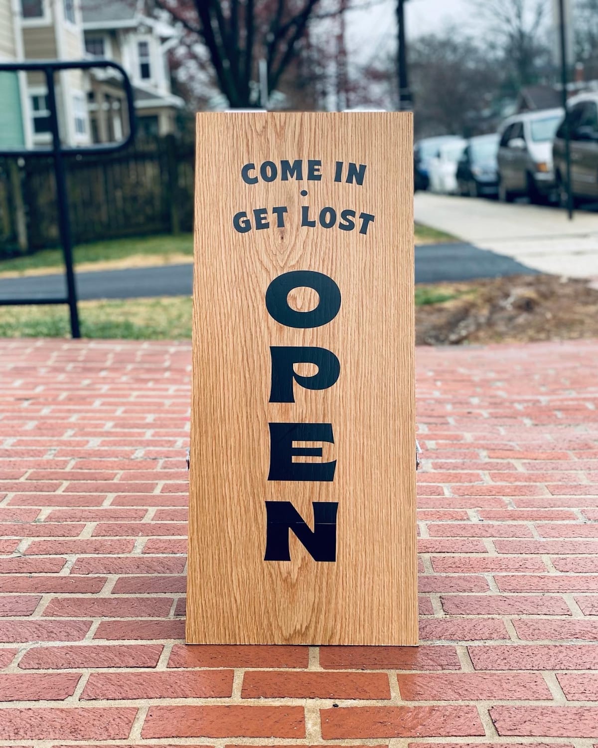
Signage is the main area that we seek out external expertise for. I will avoid vinyl and LEDs like the plague, as they just don’t have the same warmth as signs crafted by hand. While the majority of people don’t know the difference, it is still felt at a subconscious level, and that reflects on our clients. A good hand-lettered window, blade sign, A-frame, or open/closed sign, is so much more inviting, and the client’s reaction when they see the process of a sign going up, stroke by stroke, is priceless. It gives them a glimpse into the craft and all the skill and heart that goes into it.
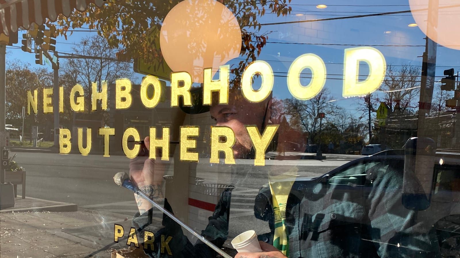
We work with a few (relatively) local sign painters for this type of work, including Ross Trimmer (Sure Hand Signs), Sean (Danaher Signs), and Rachel Fink. Ross did some beautiful gilded lettering for the SOKO Butcher Shop and we recently worked with Sean on the Laurel Leaf store. This houses three local businesses — a vintage bookstore, a furniture and homeware shop, and another selling houseplants — behind a single shopfront. Sean painted their logo onto the windows, including some real gold leaf for the block shadows. The clients we transfixed watching the process of it being put up and seeing the magic in the making.
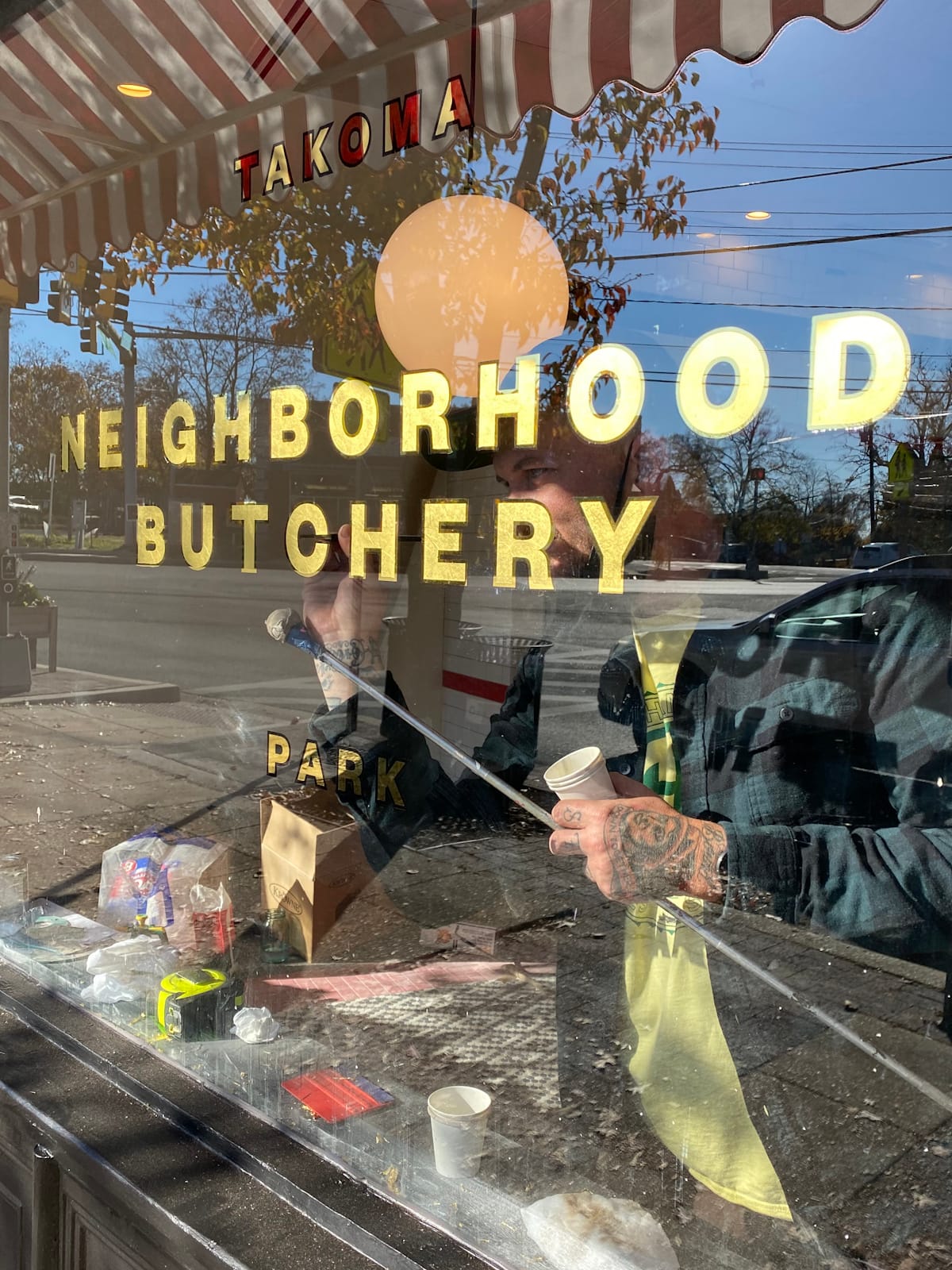
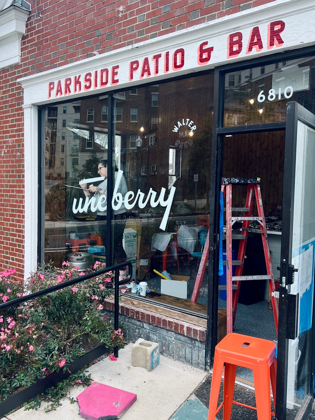
Ross at Sure Hand Signs finishing up the windows for SOKO Butcher, Rachel Fink at work on Juneberry Garage, and Sean at Danaher Signs painting the three-part Laurel Leaf identity.
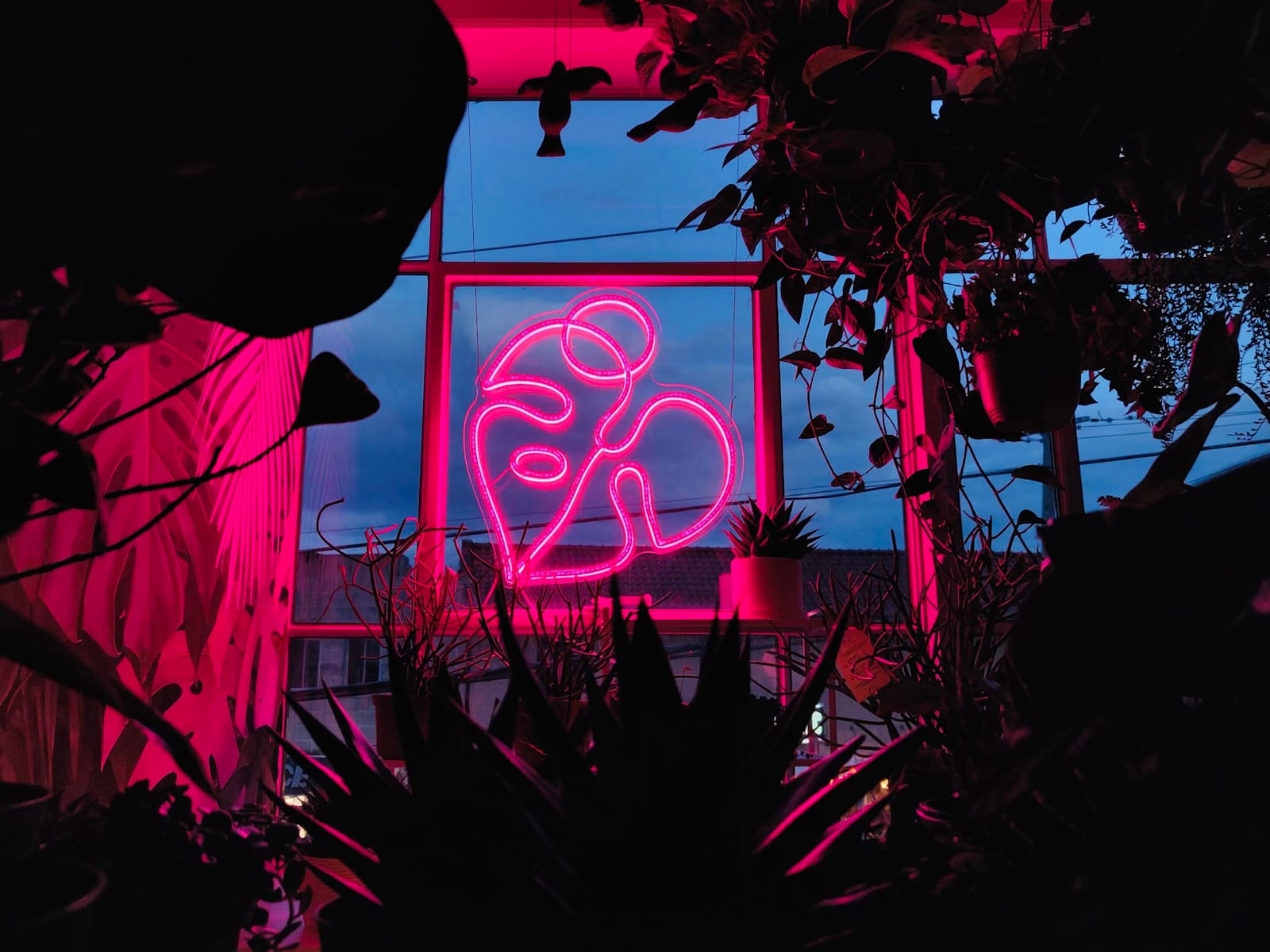
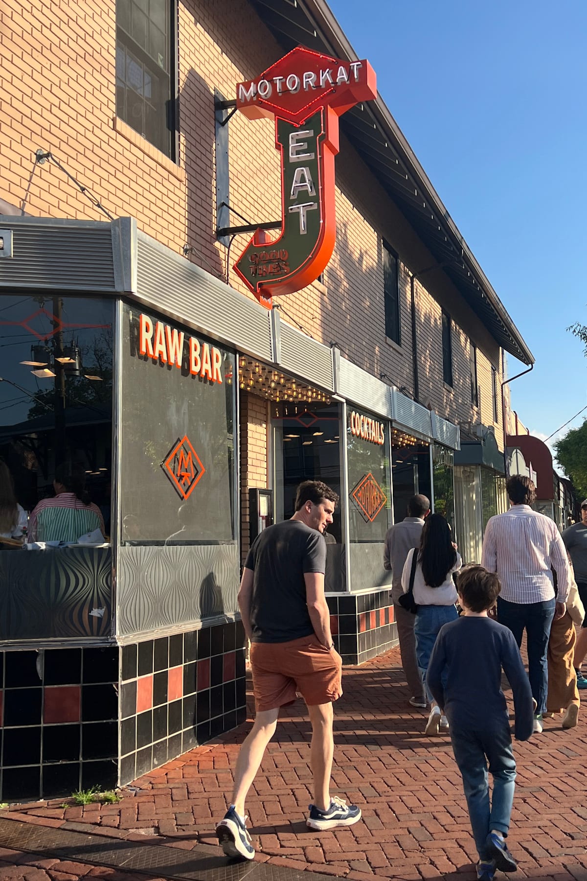
I also love a good neon sign, as nothing can replicate the glow and the craft of tubes that have been sculpted by hand. I work with Eric Rothwarf (Sky Neon Signs) in Philadelphia for neon and Takoma Park has had four new neon signs over the past two years as a result of this collaboration. These include the 2.5 m (8 ft) blade sign for the Motorkat restaurant, which I helped to name with reference to the local legend, Motor Cat. The windows of the restaurant are all hand-painted, with Ross at Sure Hand Signs brought in to deliver this element of our branding work.
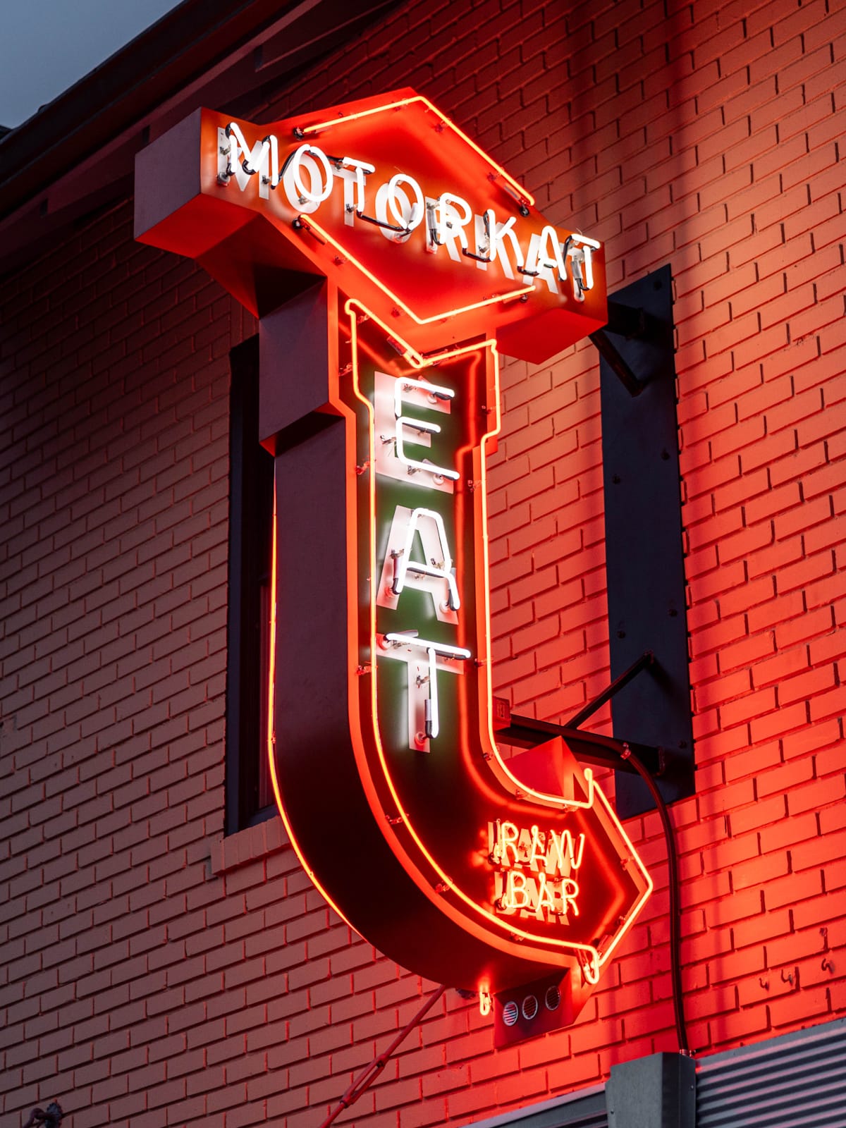
Night and day for the Motorcat neon by Eric at Sky Neon Signs.
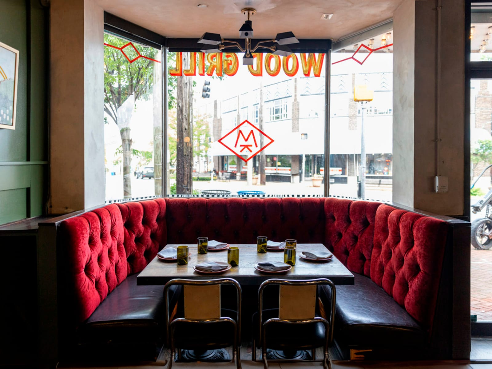
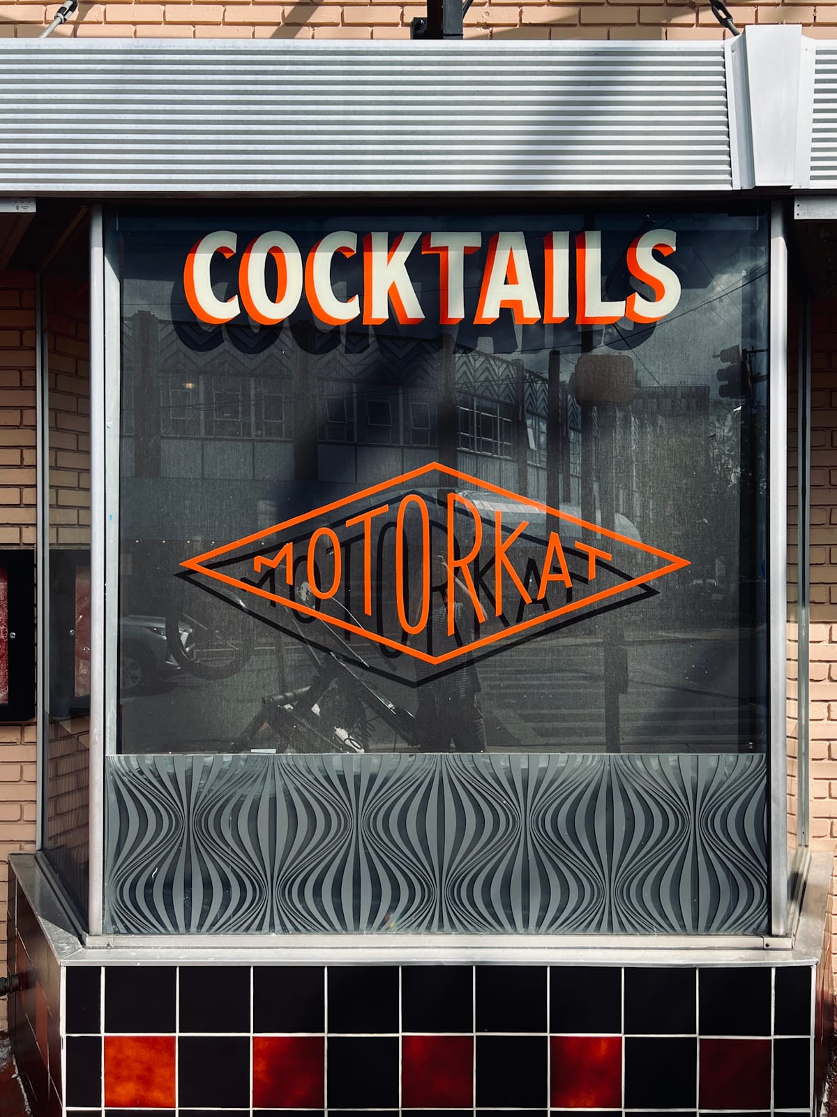
Inside and out for the hand-painted windows by Ross at Sure Hand Signs.
Although I’ve tried my hand at sign painting, and would like to give tube-bending a go, I appreciate the skill involved and enjoy these collaborations with the professionals. While we can’t go back to the days when everything on every high street was hand-done, we can bring some of that aesthetic into the present and the future through our work.
What has been the impact of No Plan’s approach for yourselves and the town?
The most rewarding part is seeing the impact it has on the community. It’s amazing to see people walking around with shirts we’ve designed, or dining and shopping in the establishments we’ve worked on. Takoma Park is all about local mom and pop businesses — there are no chains in town — so our work feels like a natural extension of that. We’ve been told multiple times that we are beautifying the town and creating a vibe. People are proud to live here, and I think that we have contributed to that in a small way.
I believe we have made more of an impact by being able to work on so many places in such close proximity, versus our output being spread out across a bigger area. Focusing our efforts at this smaller scale has allowed us to cut through the noise and stand out locally. While our work has digital origins, the final applications by hand, whether that’s printing, painting, or bending neon tubes, is what brings it all to life — the perfect imperfections epitomise the character of these small, hyperlocal businesses.
More People