Paid in Full: The Grocery Signs Behind Peter Paid’s Lyrical Lettering
Sign painting, grocery signs, graffiti, and Hip Hop culture inspire New York artist Peter Paid.

Peter Paid is a New York artist whose distinctive style will be more than familiar to those that follow him on Instagram. His work is rooted in Hip Hop culture, notably graffiti and DJing, but also in his past life as a commercial sign painter. Following his recent collaboration with Time + Tide Watches in SoHo, New York, I sent over a few questions to learn a bit more about him, his work, and his sources of inspiration.
Tell me a little about your back story and how you got into the work you do.
My backstory is a fairly long and interesting one. The CliffsNotes version would be: Born in 1970 and raised in Brooklyn, New York. Was a break dancer very early on, and transitioned into becoming a subway graffiti artist. While writing graffiti, I attended the High School of Art & Design in New York City. While there and still practicing my graffiti, I also became a DJ. A few years (and lots of practise) later, it led to me spinning at some of NYC’s most popular nightclubs.
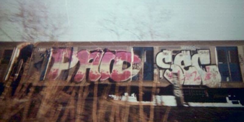
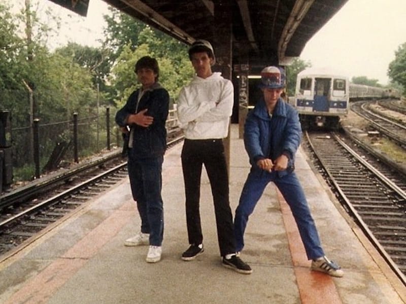
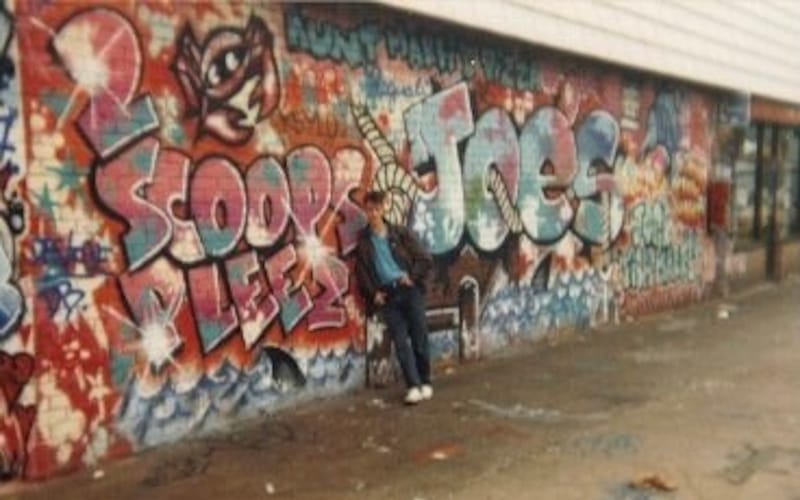
Peter’s formative years within New York’s graffiti scene of the 1980s.
This was around 1990. I was still living at home, and home-life wasn’t really that great. Aside from growing up poor, on welfare and food stamps, etc., there was daily fighting with my mom. Being a DJ, I was told that I was “unproductive to society” and needed to find a “real job”. Through a neighbourhood friend, I landed an apprenticeship at a small, one-man sign shop. Being an artist, and specifically graffiti art, lettering has always been at the forefront of my interests, and signage was the perfect commercial outlet.
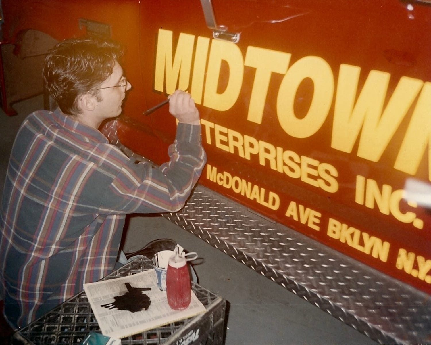
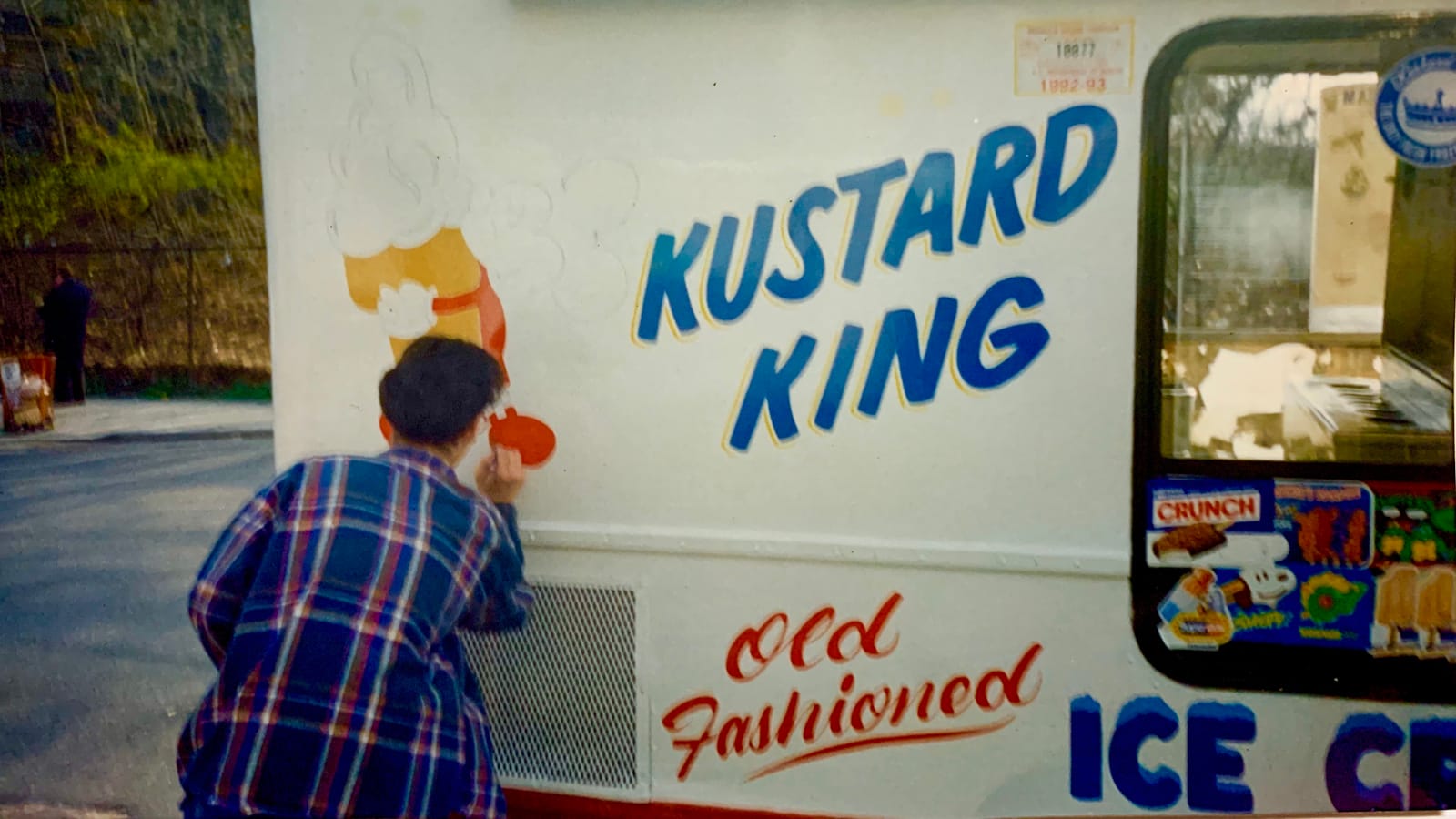
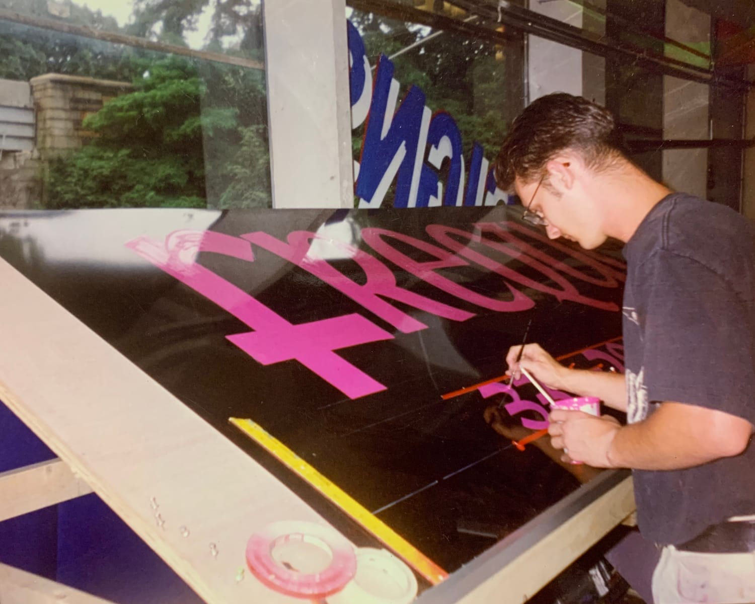
Lettering and pictorial sign work after finding a ‘real job’.
About five years into my sign painting journey, I had the opportunity to open up a small shop with a local friend. He’d handle the business end, and I’d handle the production side. We primarily focused on paper signs for local businesses. Though I was capable of producing virtually any type of sign, paper signs were my passion. They were relatively quick to paint, and because of the low-cost for me to fabricate, the profit was all my labour.
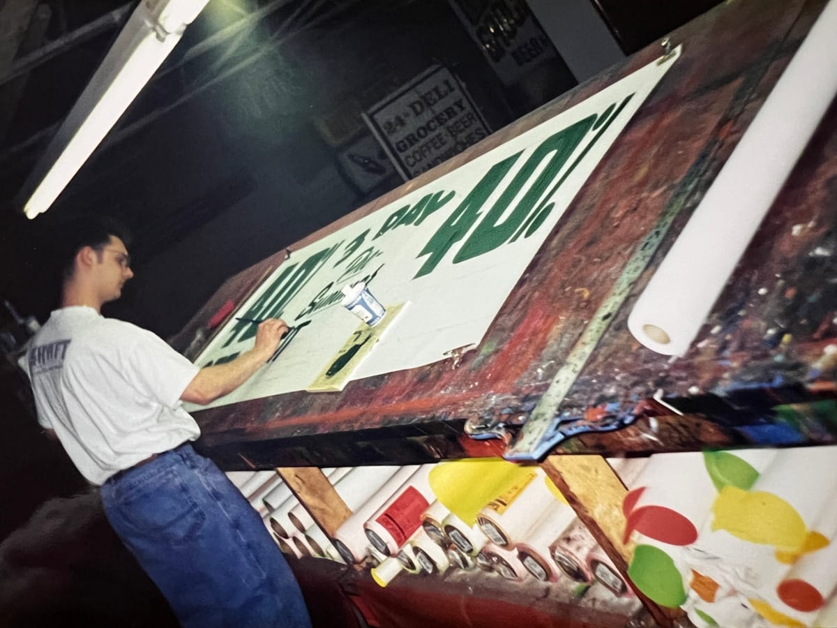
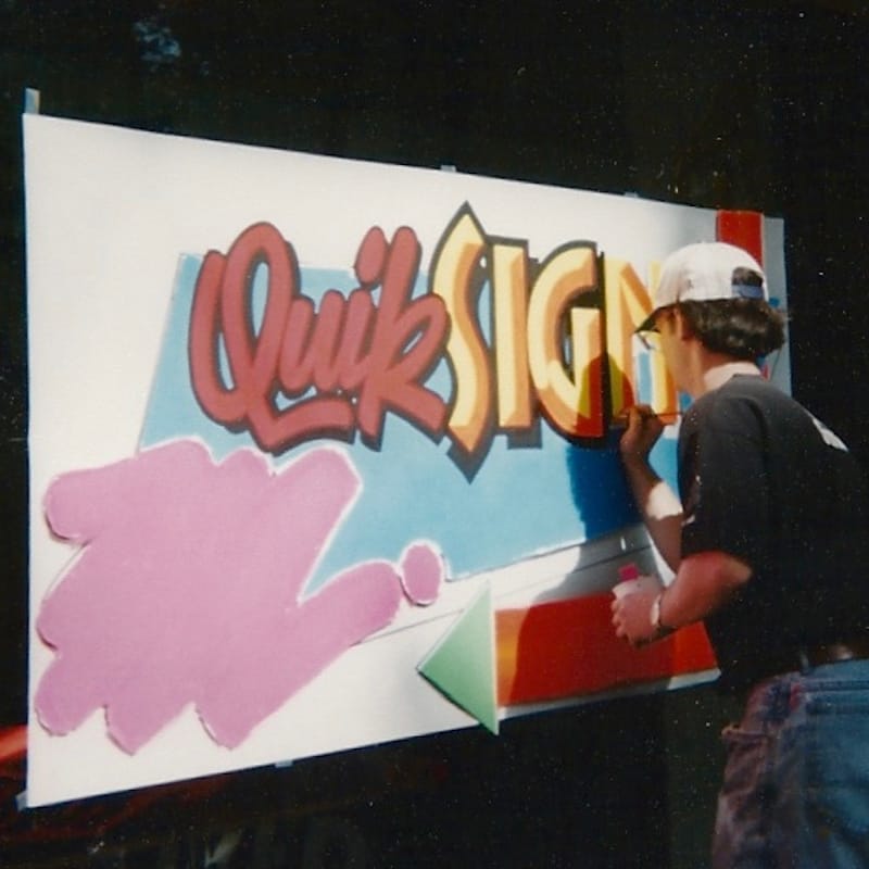
Working on paper and at speed as a commercial sign painter.
It wasn’t long until mom and pop stores in south Brooklyn were my art gallery. Every major avenue was filled with store windows showcasing my work. Because most businesses would change their signs weekly or bi-weekly depending on sales, it was an ever-rotating display. Fast forward a bunch of years and the sign shop closed down because, well, there’s a reason the saying ‘don’t mix business with friendship’ exists...
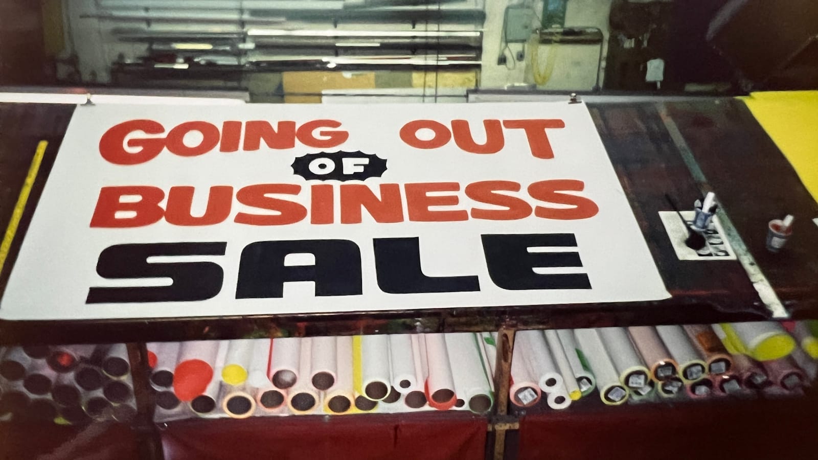
Because of being burned out on business ownership, I took a break mentally and went to work for other sign shops. During this stretch, I would occasionally paint small 20 × 25 cm (8 × 10 in) canvases with graffiti on them and they would sell on a friends website where they showcased the work of a dozen or so other local graffiti writers.
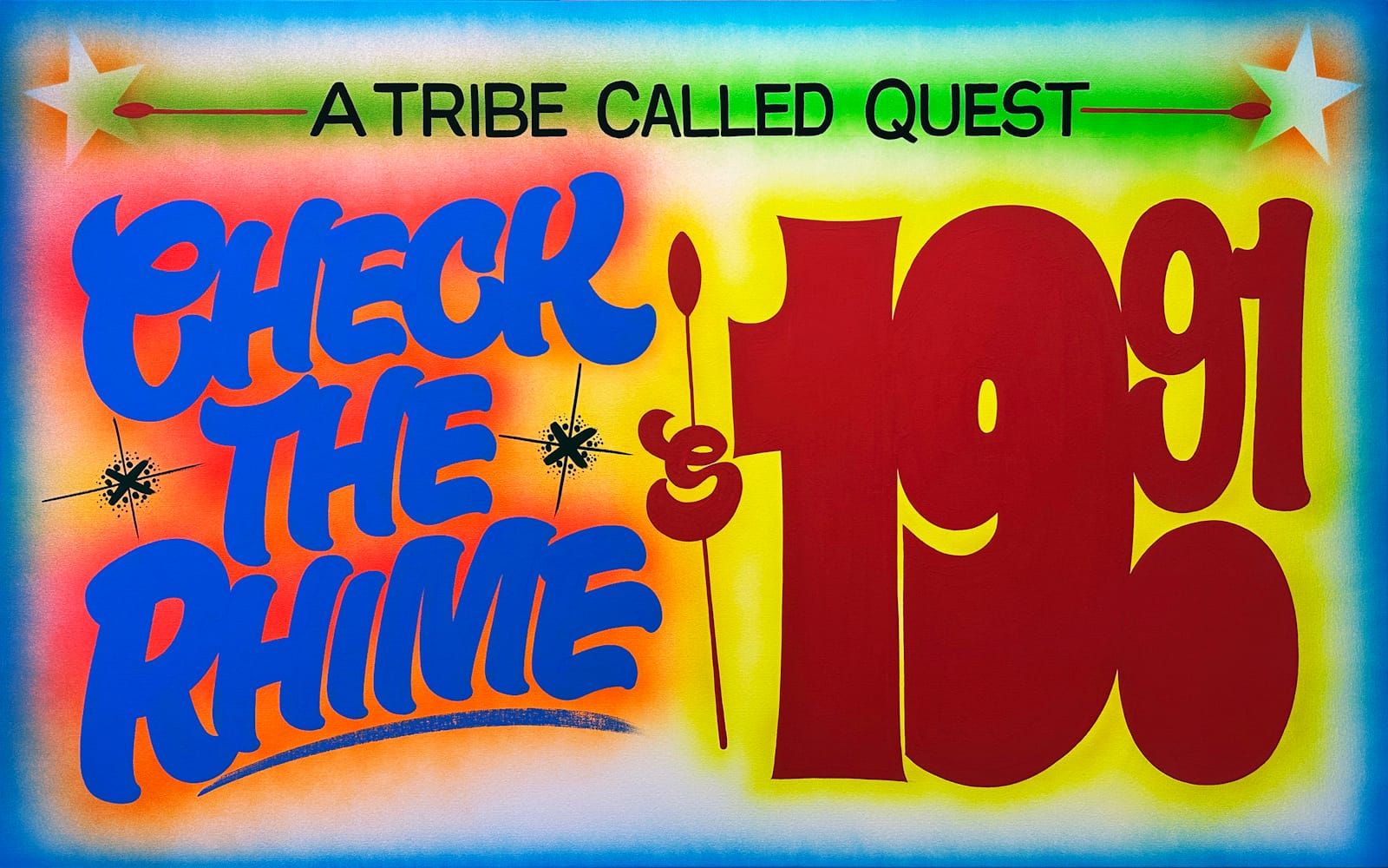
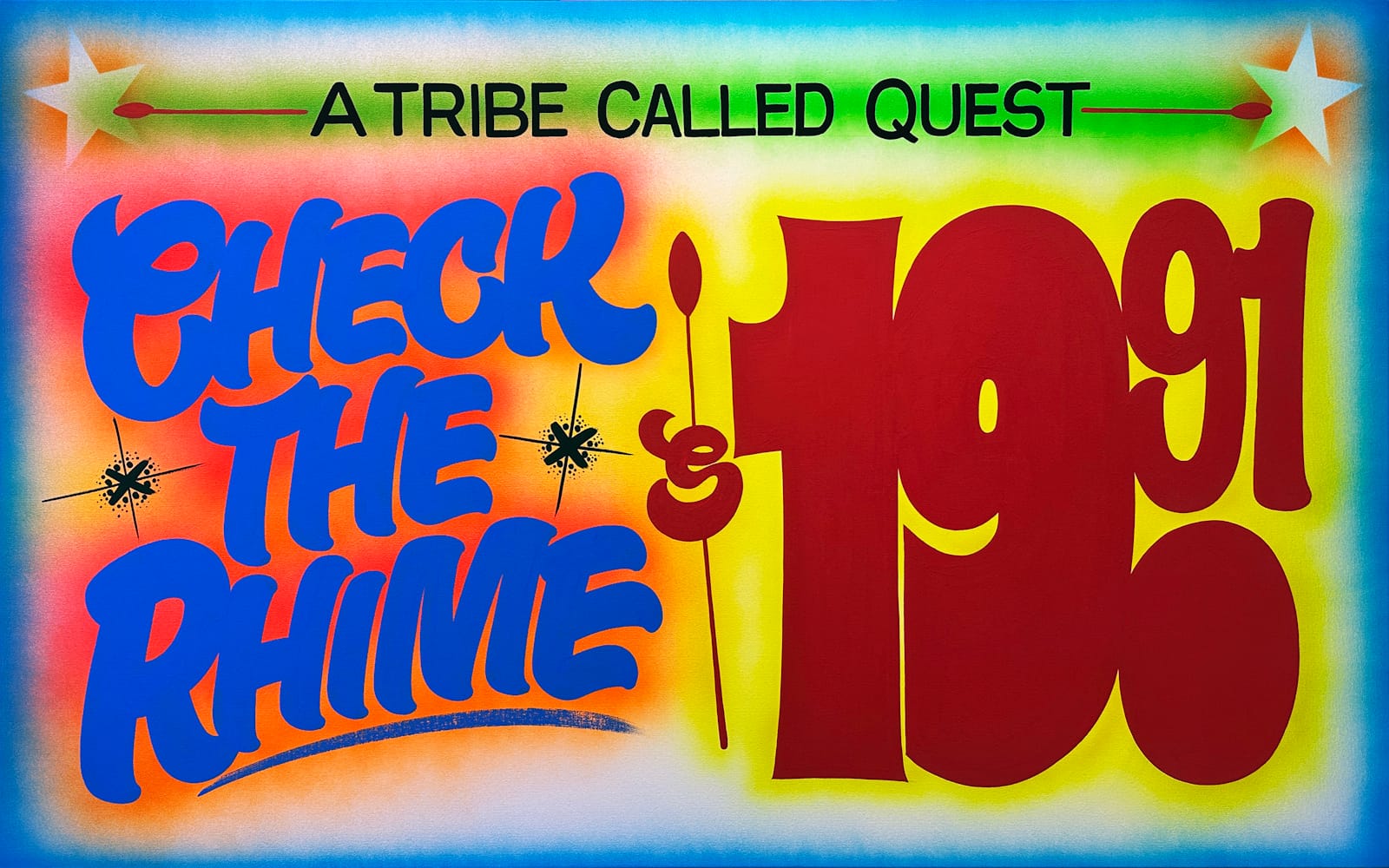
In 2018, while painting some of those small canvases, I had an idea: why not paint one the same way I painted paper signs back in the day? Being that music was (and is) such a huge part of my life, with Hip Hop being at the forefront, I decided to paint the title of a song by A Tribe Called Quest: ‘Lyrics To Go’. In place of a ‘price’, I did the song’s release year, displayed as $19.93.
A lightbulb went off and I started painting a whole series in this style, and couldn’t keep up with demand. After a lot of hustle and grind, I’ve been able to get my artwork in the collections of very prominent figures in the music and art world.
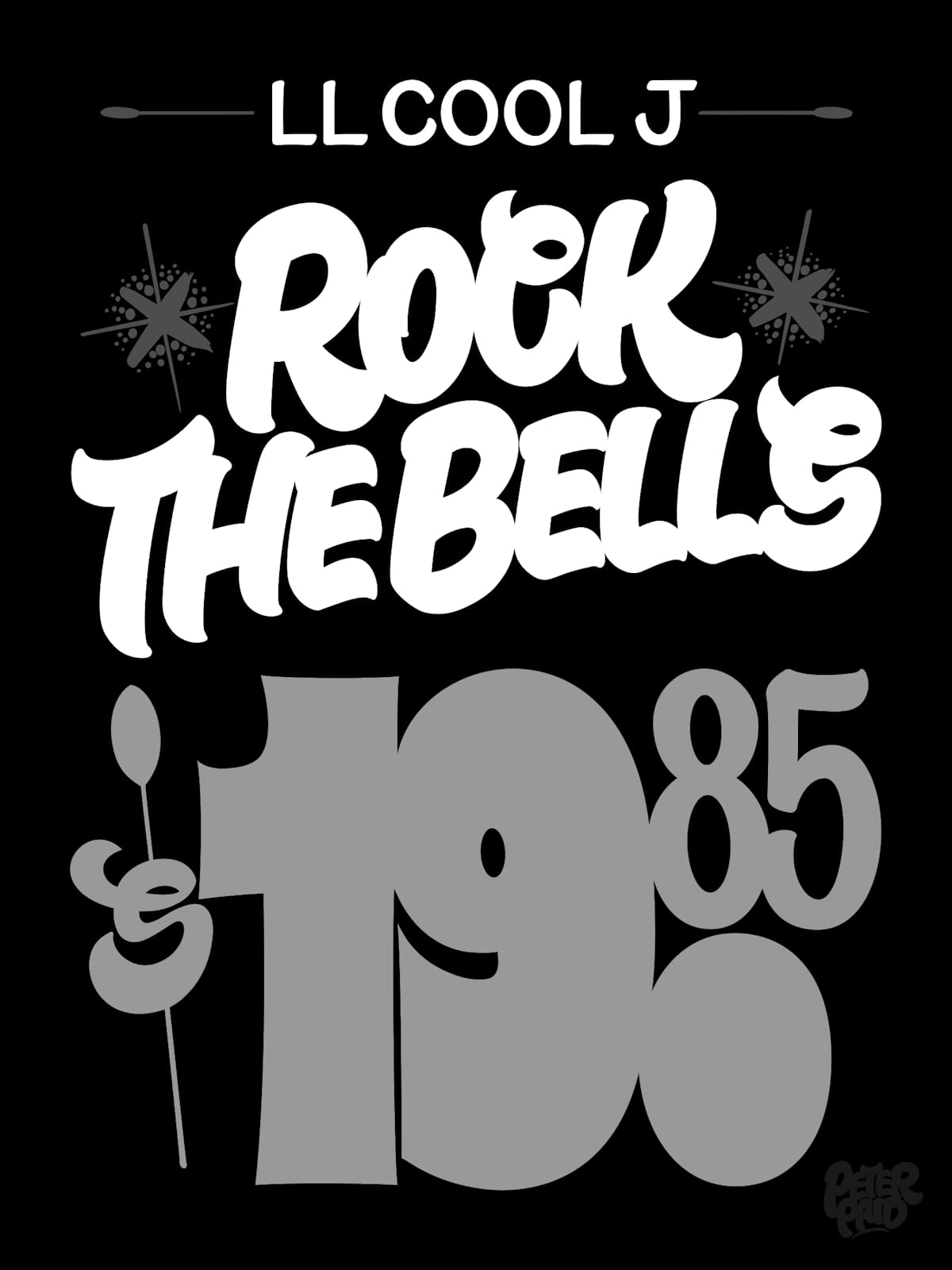
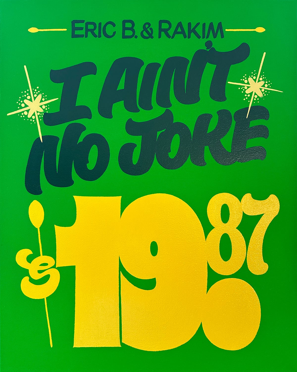
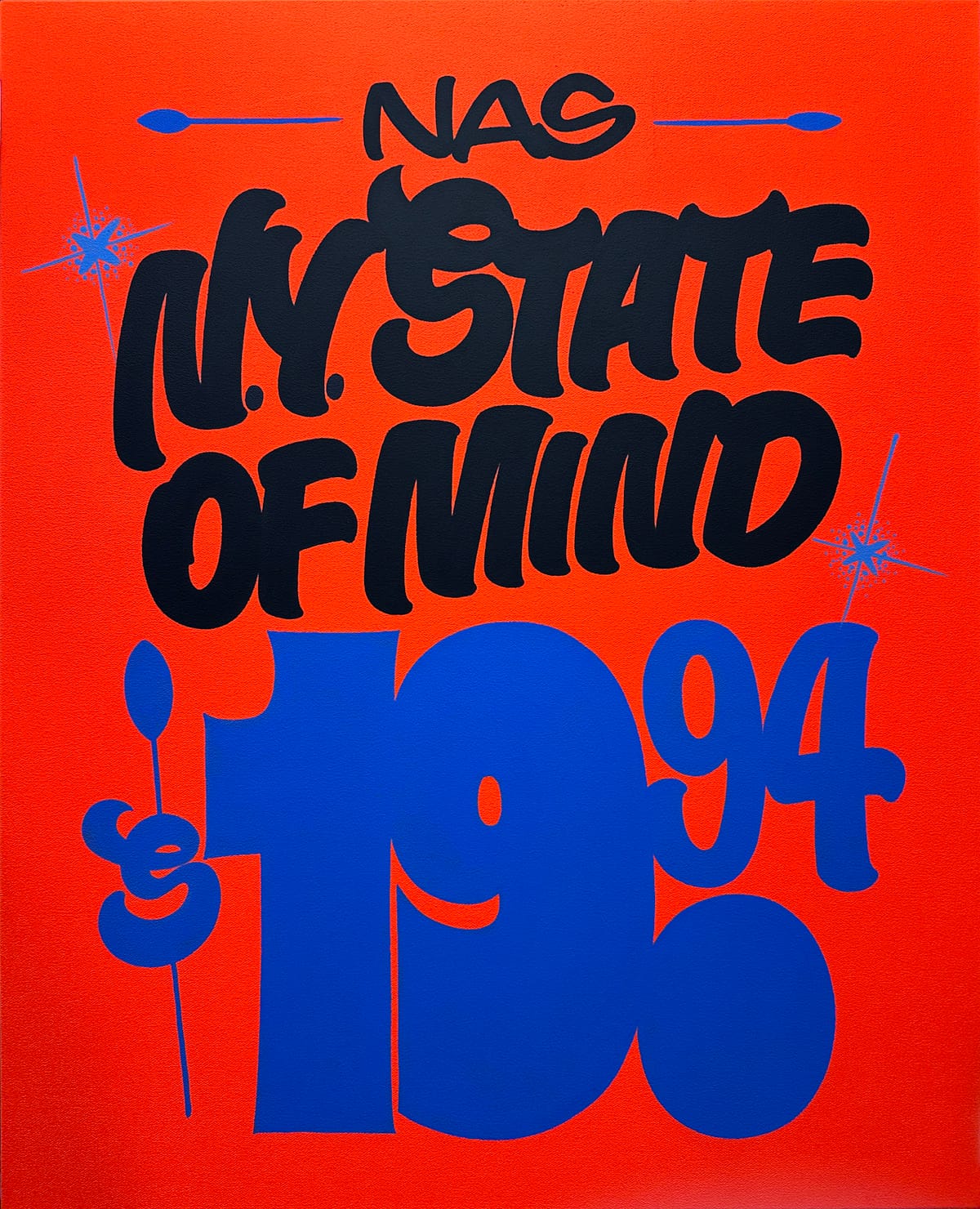
Tributes to classic Hip Hop tracks delivered in the grocery sign format.
Describe your style and influences in your own words.
My style is definitely that old school classic bodega-style paper sign. I’ve always been a proponent of keeping it simple. When I had my sign shop, I’d tell clients all the time, “Paper signs are meant to convey the message fast, and simply. Someone driving by your store needs to catch at a glance that chicken cutlets are $2.99/lb.”
This is the same methodology I use with my artwork. I follow the same formula today: bright, vibrant colours, with a simple and clean layout. Only now the subject matter has changed, and my work is on canvas instead of paper.
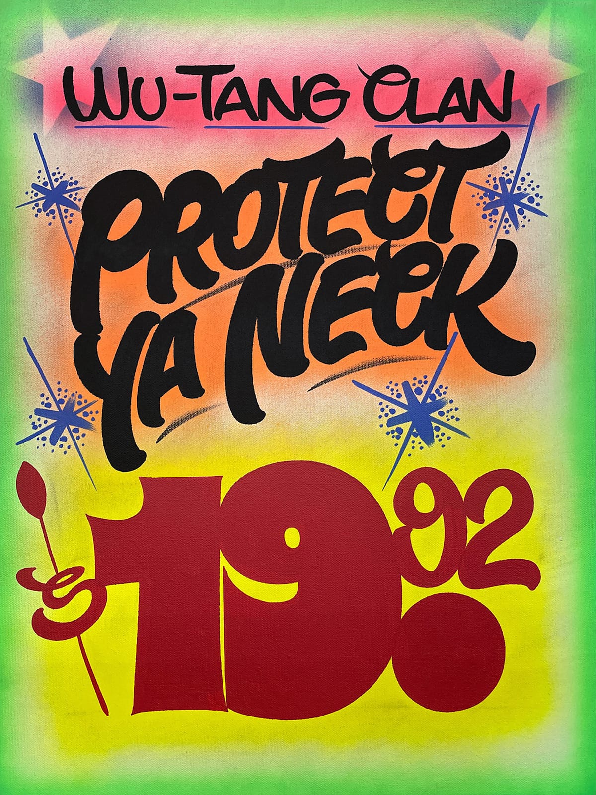
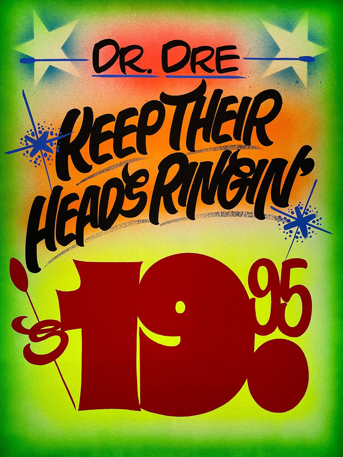
1990s Hip Hop tracks rendered on canvas.
Regarding influences; definitely the work I saw around Brooklyn during the 1980s and 1990s. There was an older sign painter from Canarsie, Brooklyn, I believe named Monte, whose work I’ve always loved. He had his own style, which to me was instantly recognisable.
How did the collaboration with Time + Tide Watches come about?
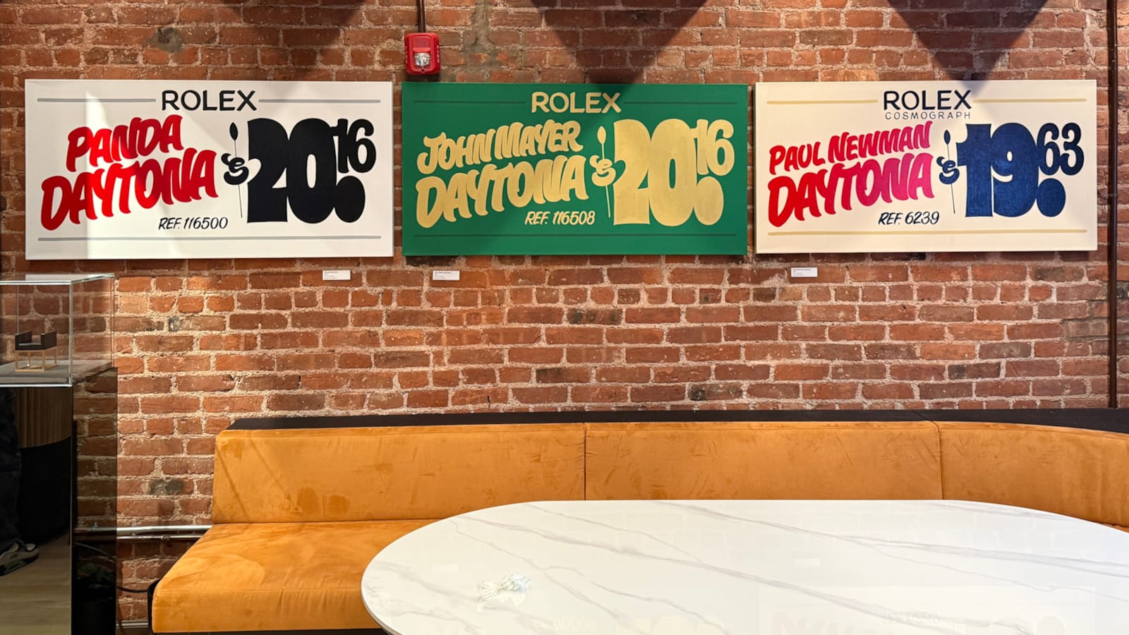
In the summer of 2025, I was in the studio and felt that I wanted to pull the lens back a little and focus on another interest of mine: watches and, specifically, high horology. While working on the series, it was becoming apparent to me that showcasing these pieces in a traditional gallery might not be the best approach. While art collectors and enthusiasts might appreciate the work itself, they wouldn’t necessarily understand why I chose $57.11 as the ‘price’ for the Patek Philippe Nautilus. (Watch people will know instantly that this is the model reference number for the 5711 series.)
Because there are so many amazing watches for me to pay homage to, I chose personal favourites, along with iconic classics that I know resonate with the watch community.
Time + Tide (T+T) had opened a boutique in SoHo, NYC and I decided to pay them a visit just to check out their new digs. In casual conversation with one of the sales people who was showing me a watch with an Aventurine dial (a glass dial with metallic flecks that mimic stars in the night sky), I mentioned that I’d just finished a canvas the day before with a tribute to the Audemars Piguet Starwheel, which also has an Aventurine dial. I showed her a picture and she immediately introduced me to the general manager who absolutely loved what I was working on.
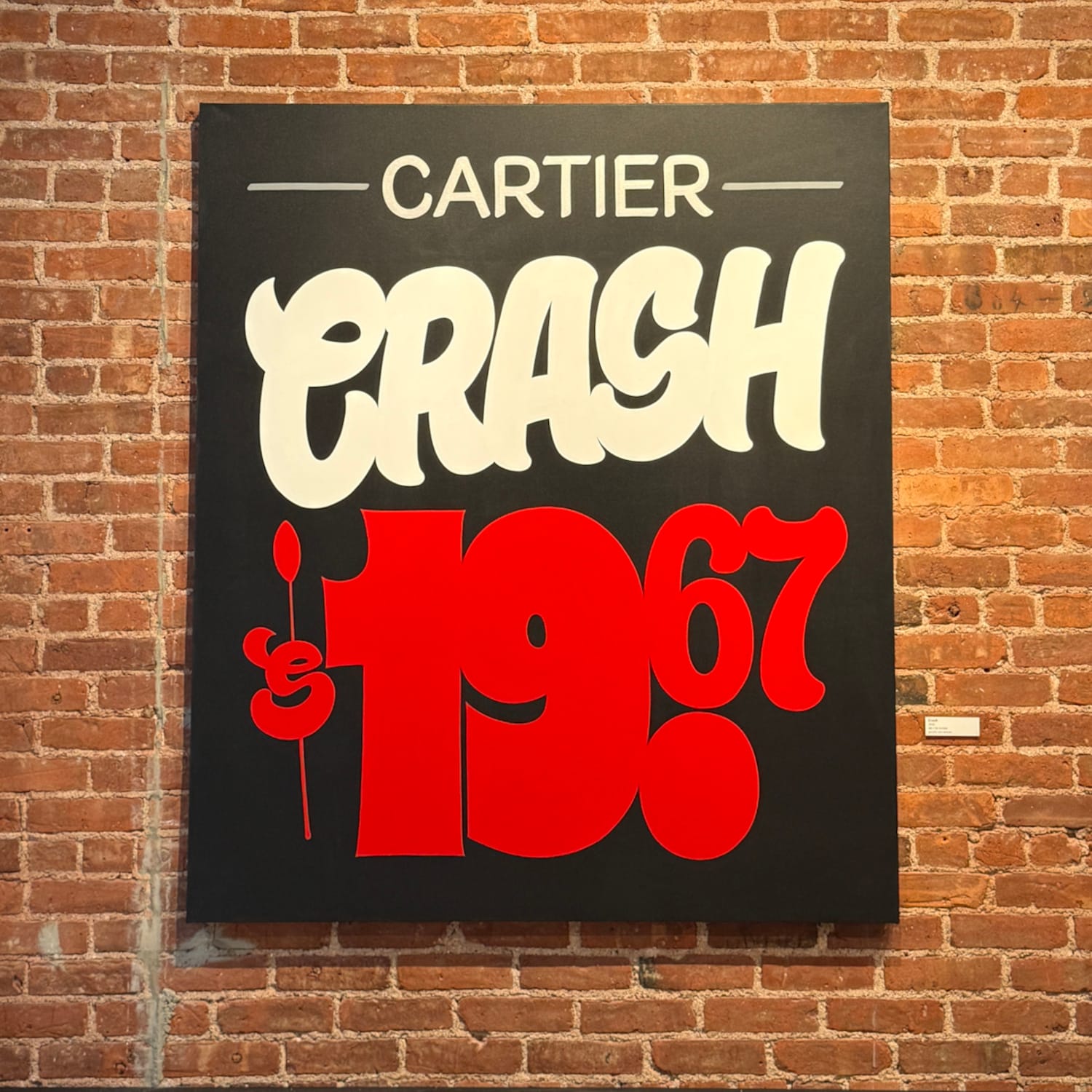
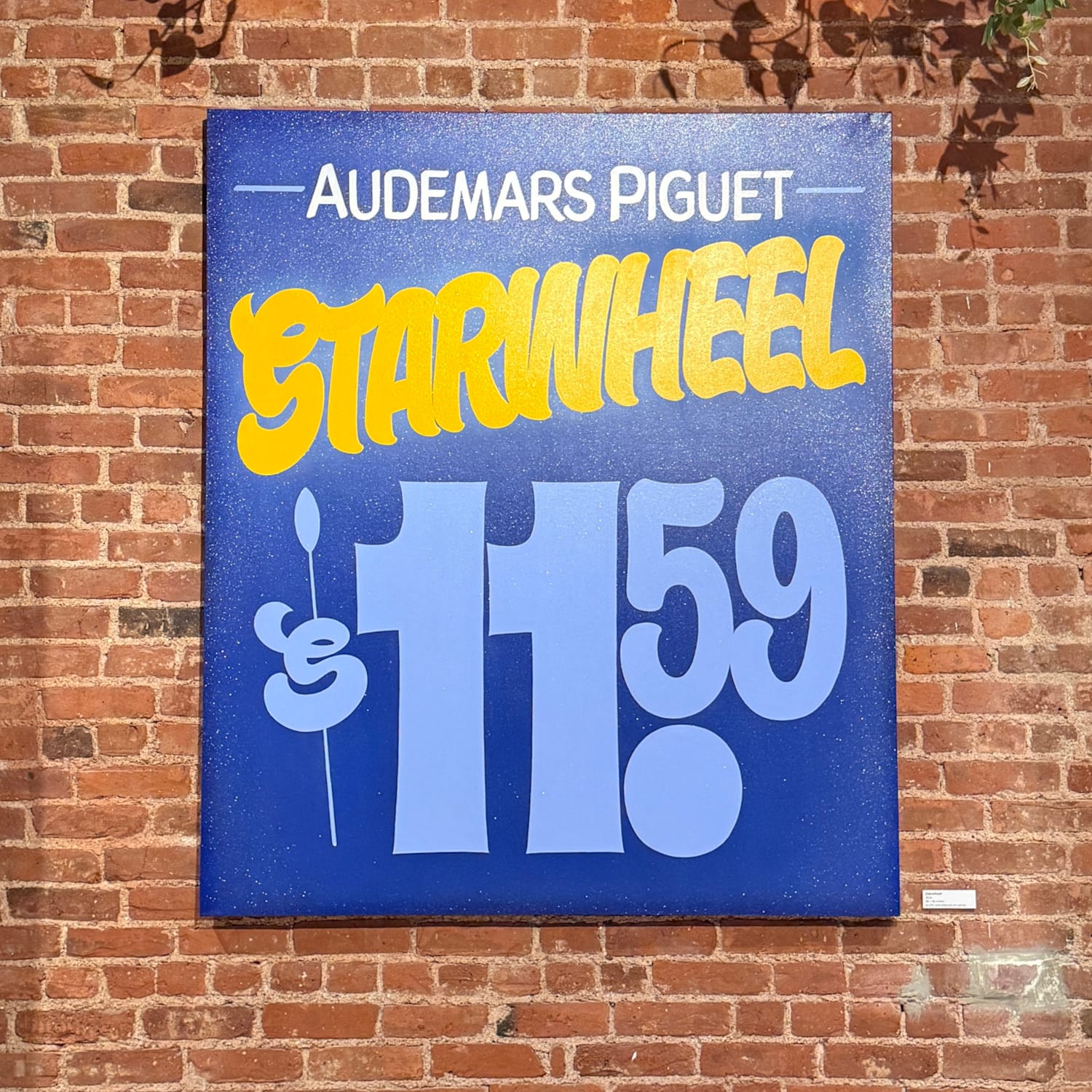
Two of the horology pieces from the collaboration with Time + Tide in New York.
T+T is loaded with large, exposed-brick wall spaces, perfectly suited to display my artwork, so we worked out the logistics, and decided on a date for the exhibition. Because of the artwork sizes and wall spaces available, I chose 12 pieces to showcase, though the series at the time of the event was at 19, and at the time of me typing this, I’m at 21, with piece number 22 starting today!
Tell me a bit about the paints you use and what you did differently for this exhibition.
Since I learned the art of sign painting back in 1990, I’ve always used 1 Shot Poster Colors for my paper signs. I kept that same formula when transitioning into the fine art world. (Why fix what isn’t broken, right?)
Well, a few years back 1 Shot discontinued their line of Poster Colors. I’ve tried to buy up all of the remaining stock that I could get my hands on. Realising that at some point, the well is going to run dry. I tried experimenting here and there with substitutes. Ronan makes a Japan Color which is their version. They sent me a bunch of cans to try out. It’s great stuff but it isn’t the same. There is just something about the way that 1 Shot flows like silk off the brush, where the Ronan just didn’t. It’s 99% there. But that remaining 1% is huge to me.
I dabbled a little with the idea of switching to acrylics. For health reasons alone, the switch was justified. Golden makes a really great quality acrylic paint, so I went that route, but coverage is not the same as 1 Shot. I now have to do multiple coats to get the vibrancy and opacity that I want and expect, but the drying time enables me to tackle that aspect quicker if needed. The acrylic switch was a learning curve for sure. The technique is the same, but because the paint feels, moves, and covers differently, it took a little getting used to.
What future plans do you have for this and/or any other outlets for your work?
Currently, I’m continuing to build this collection. I’m having so much fun exploring this new avenue, and, quite frankly, I just love to paint. The fact that I’m able to marry passions of mine makes me extremely lucky.
With that said, I’m working on making connections to bring this complete series down to Miami this December for Art Basel 2026. Watch culture down in Miami really is a big deal, so I’m doing what I can to get more eyes on this collection.
More People
 Better Letters
More Projects
 Better Letters
More Events
 Better Letters