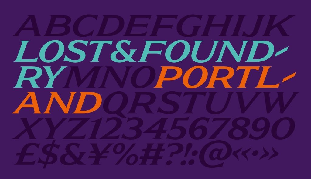
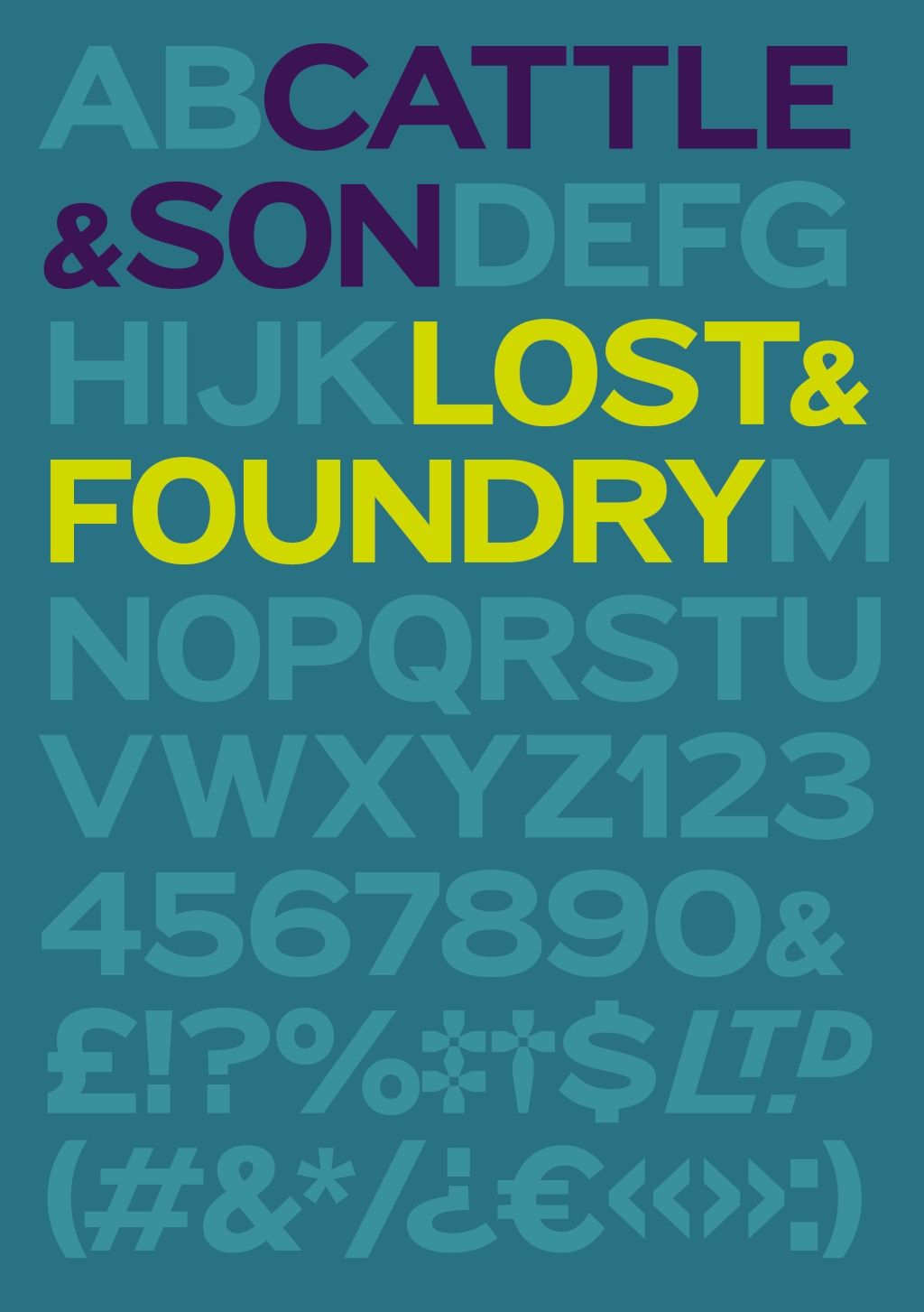
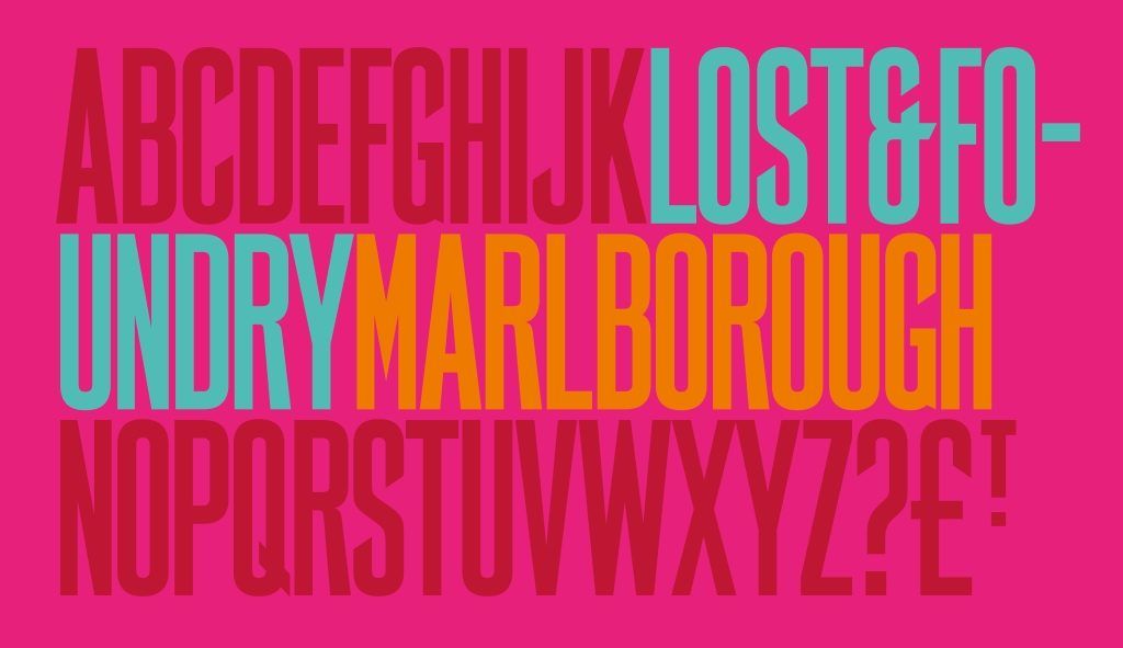
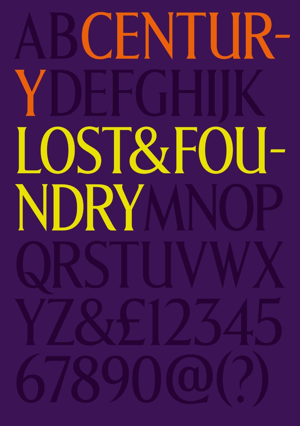
Lost & Foundry from Fontsmith
Hand-painted, ceramic, enamel and moulded signs in Soho inspire Lost & Foundry typefaces from Fontsmith.

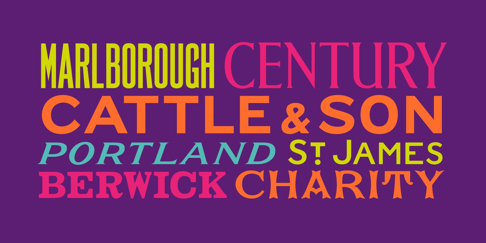
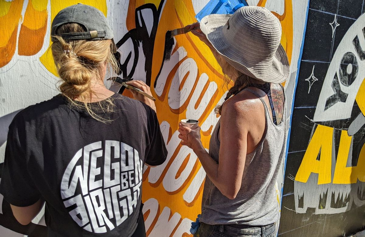
Earlier this year I attended the launch of Lost & Foundry, a collection of fonts created and published by Fontsmith in collaboration with advertising agency M&C Saatchi. They are inspired by various of pieces of historic signage in Soho, and funds raised from their sale all goes to support the charitable work of the House of St Barnabas. They are available to buy from £15 each, or as a bundle of seven for £70.
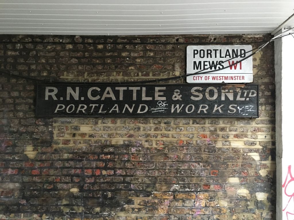
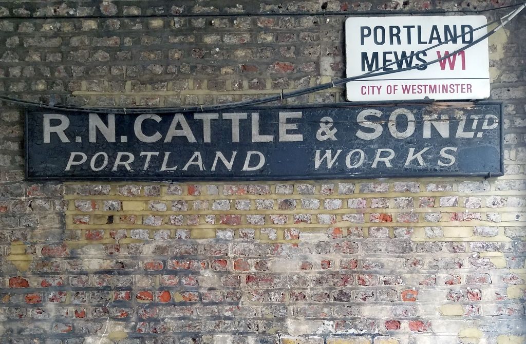
In particular I was interested in the two fonts (FS Cattle and FS Portland) that have been derived from this enduring survivor in Portland Mews. (My photo above from earlier this month shows that the graffiti on this ghost sign has recently been painted out in black.) The challenge for designers Stuart de Rozario and Pedro Arilla on these, and the other fonts in the collection, was working with incomplete character sets. This involved a process of trying to get into the head of the original sign makers/writers to imagine how they would have treated the letters and numerals not present on the surviving signs.
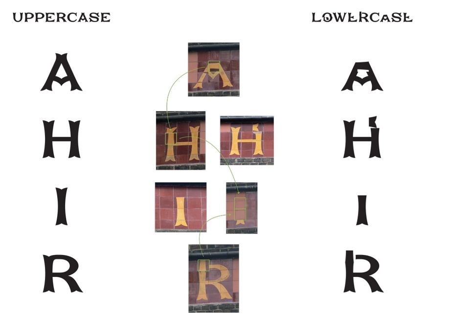
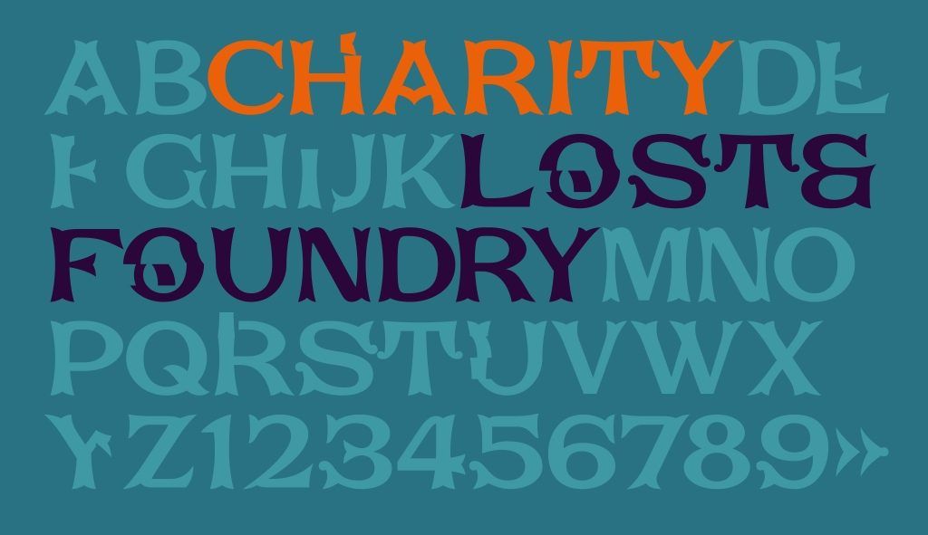
Another interesting example from the collection is FS Charity which is derived from the ceramic work on the House of St Barnabas itself. When this was revealed in 2014 it posed something of a mystery as to why the letters were so mixed up, with portions appearing in other parts of the strip that sits above the first floor windows on both Soho Square and Greek Street. It would seem that at some point after its original installation it had to be repaired and those responsible were less than diligent in their efforts…
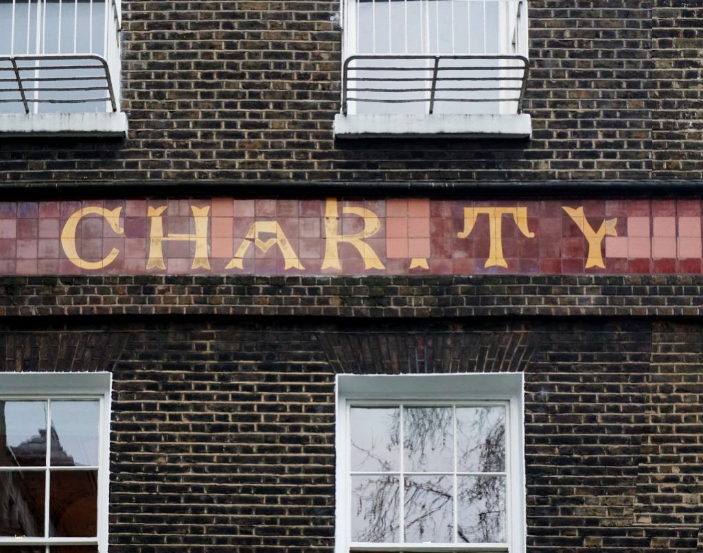
The letterforms have been interpreted in two ways for the design of the resulting font, with the corrected shapes forming the uppercase, while the lower case remains true to the current form of the sign.
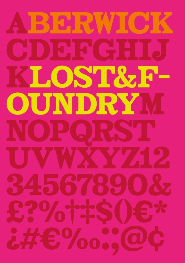
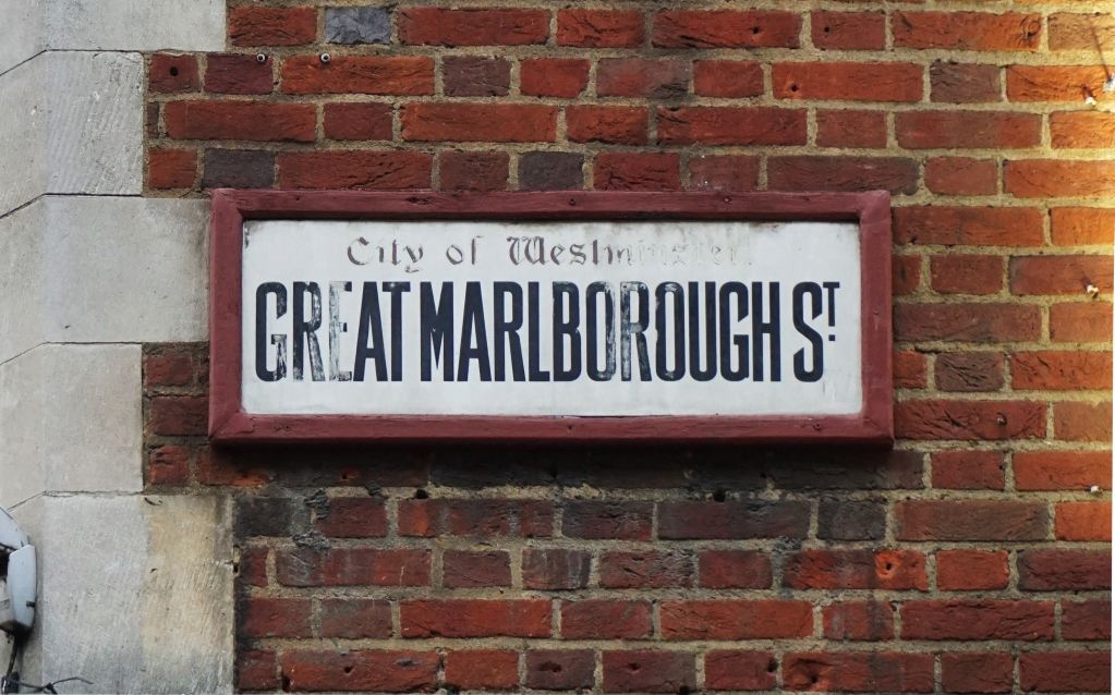
Two of the fonts (FS Berwick and FS Marlborough) are inspired by historic pieces of street signage. (See also London Street Signs.) Little is know about the origins of the distinctive angled terminals on the Great Marlborough Street sign so any insights into those would be appreciated…
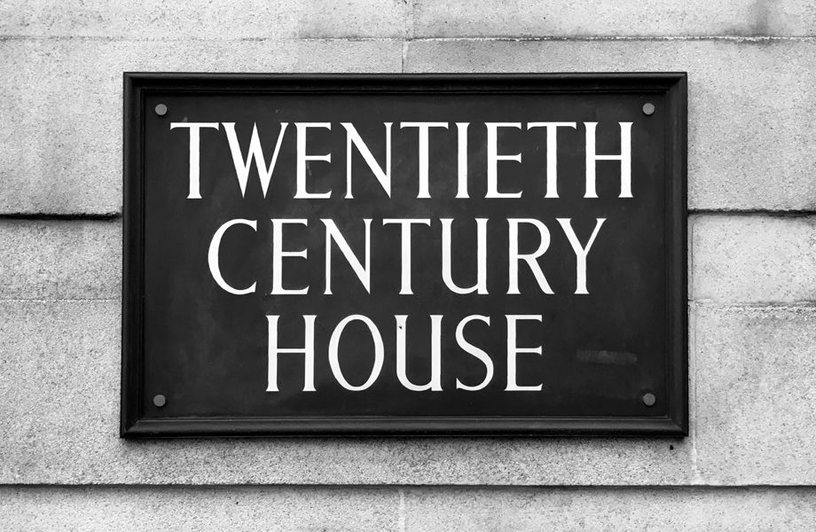
Back to painted forms and we have FS Century, inspired by a piece of 1940s signwriting.
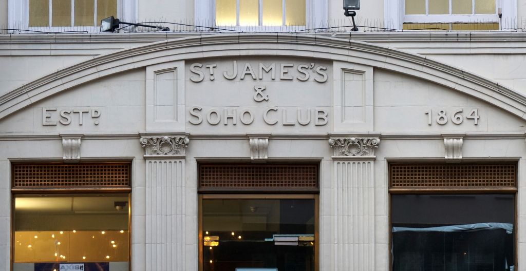
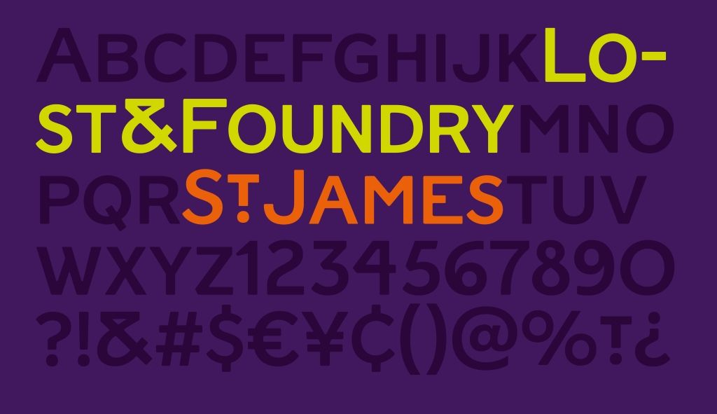
And then finally FS St James which is derived from the relief lettering still visible on Greek Street.
The Lost & Foundry fonts are available to buy for £15 each, or as a bundle of seven for £70. Read more about them on the Fontsmith blog.
More Projects
 Better Letters