Amsterdam Lettering and Typography Through the Ages
A remarkable digital archive highlights 150 years of lettering and typography in the Dutch capital.


Since 2019, Arno Verweij has been documenting Dutch lettering and typography via his daily posts to the Amsterdam Typography and Netherlands Typography websites. His work now constitutes a significant archive, with over 4,000 photographs across the two sites. These are mapped and accompanied by descriptive data that enriches the raw photographic material.
Coinciding with city of Amsterdam’s 750th anniversary in 2025, Arno used the digital image bank of the Amsterdam City Archives to seek out archival photographs containing signage and other forms of lettering. His selection now constitutes a special section of his Amsterdam site, currently numbering 1,850 images. Spanning a period of around 150 years, the oldest items are a pair of pictures taken by the British photographer Benjamin Brecknell Turner in 1857.
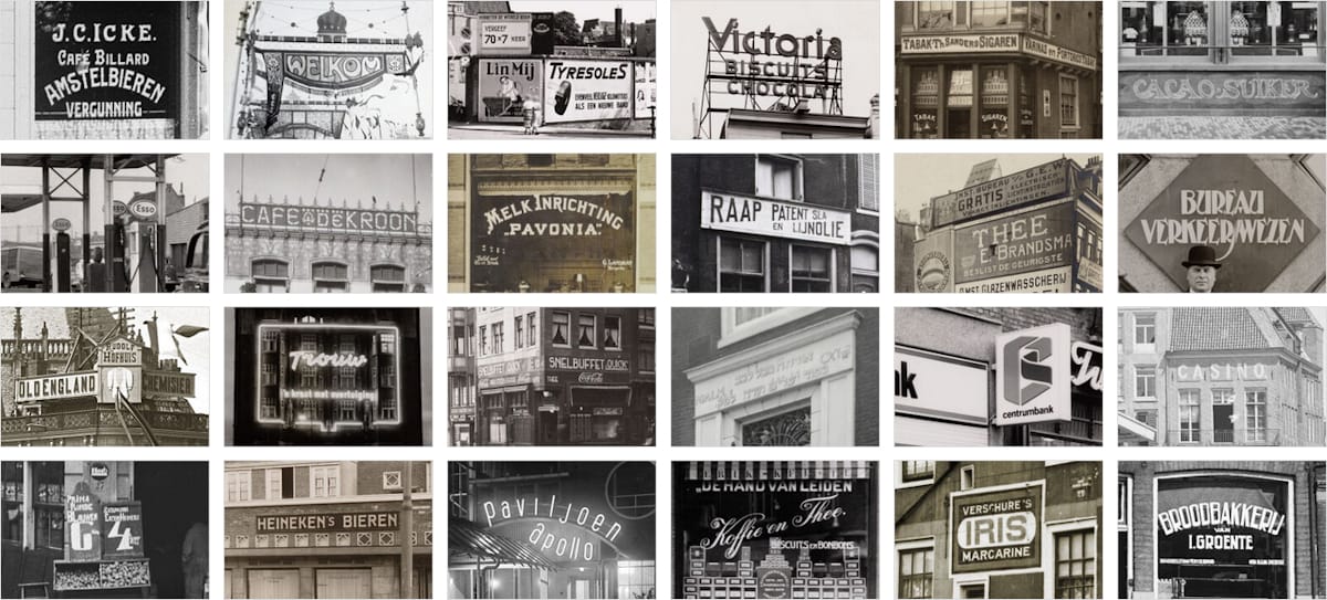
Arno refers to the photos giving “an impression of the city’s rich history through the lens of typography” and there truly is a remarkable diversity of letterforms and media contained within the collection.
Here I have selected a mere 1% of the total (presented in chronological order) to whet your appetite. I also encourage you to browse the wider collection and discover your own treasures within it.
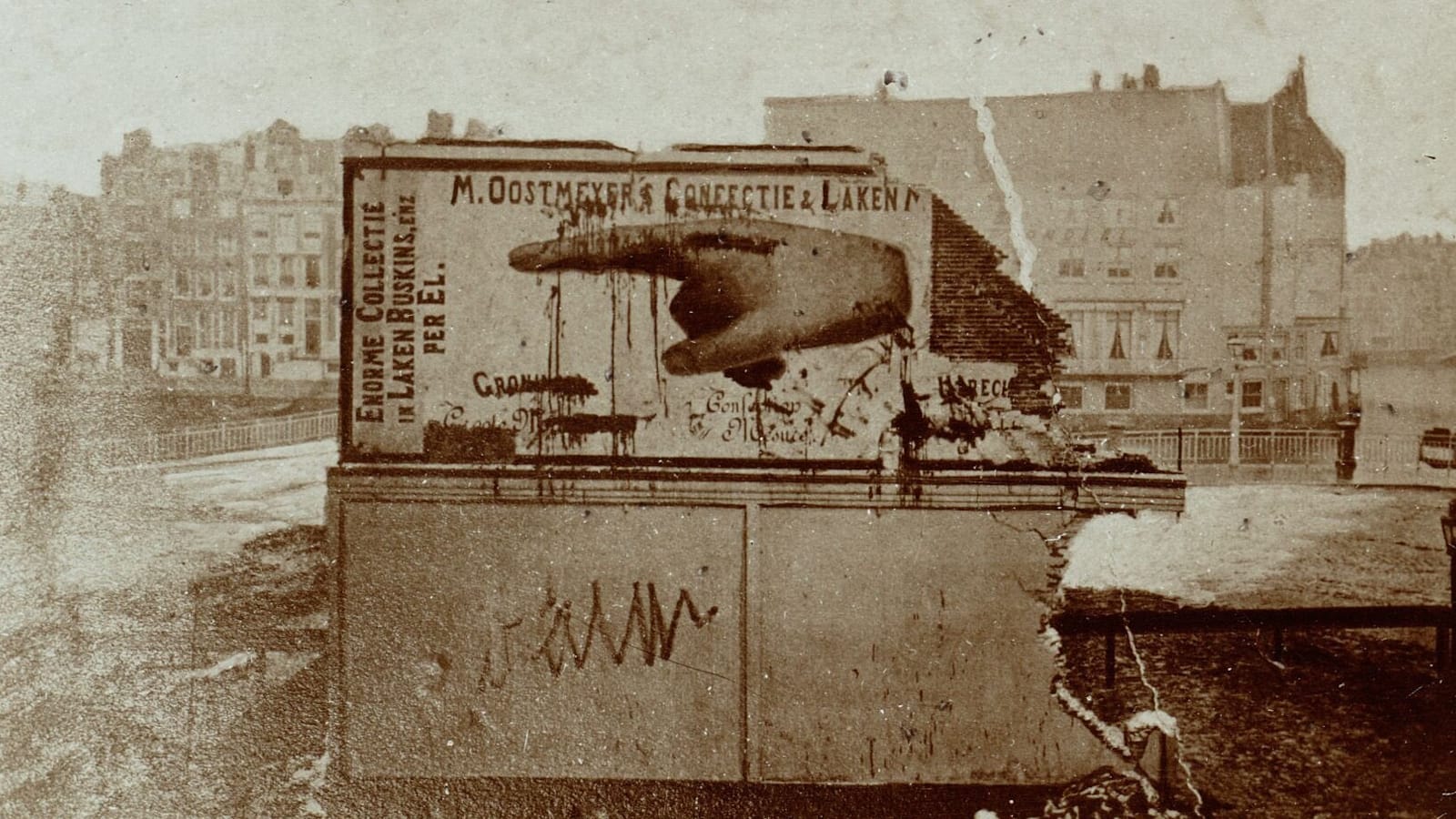
M. Oostmeijer
The 1877 destruction of the ‘Oostmeijer wall’ by students was a notable event, with this photo taken shortly afterwards.
J.D. Dieker
Workers posing with branded carts loaded with the the products of J.D. Dieker’s mineral water factory in 1891.
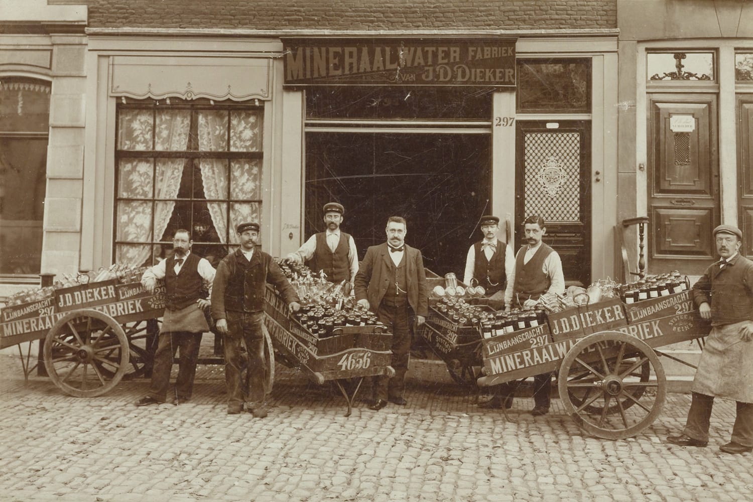
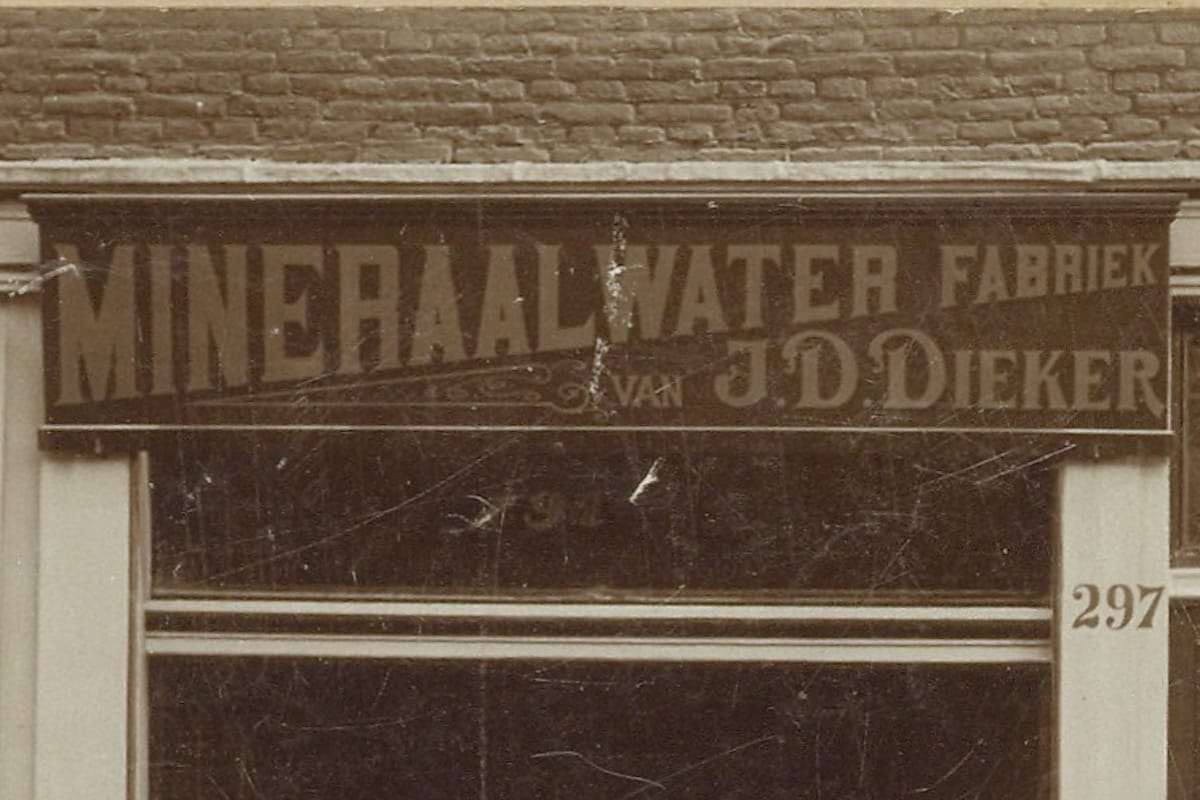
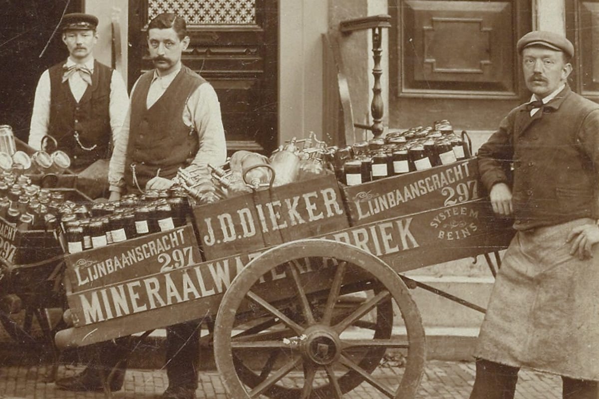
The fascia sign and a closer look at one of the carts.
Goederson’s Meubelmagazijn
In many cases the signs aren’t the subject of the photograph, such as this one of a military exercise in around 1898 that happened to take place in front of a huge mural sign for a furniture shop.
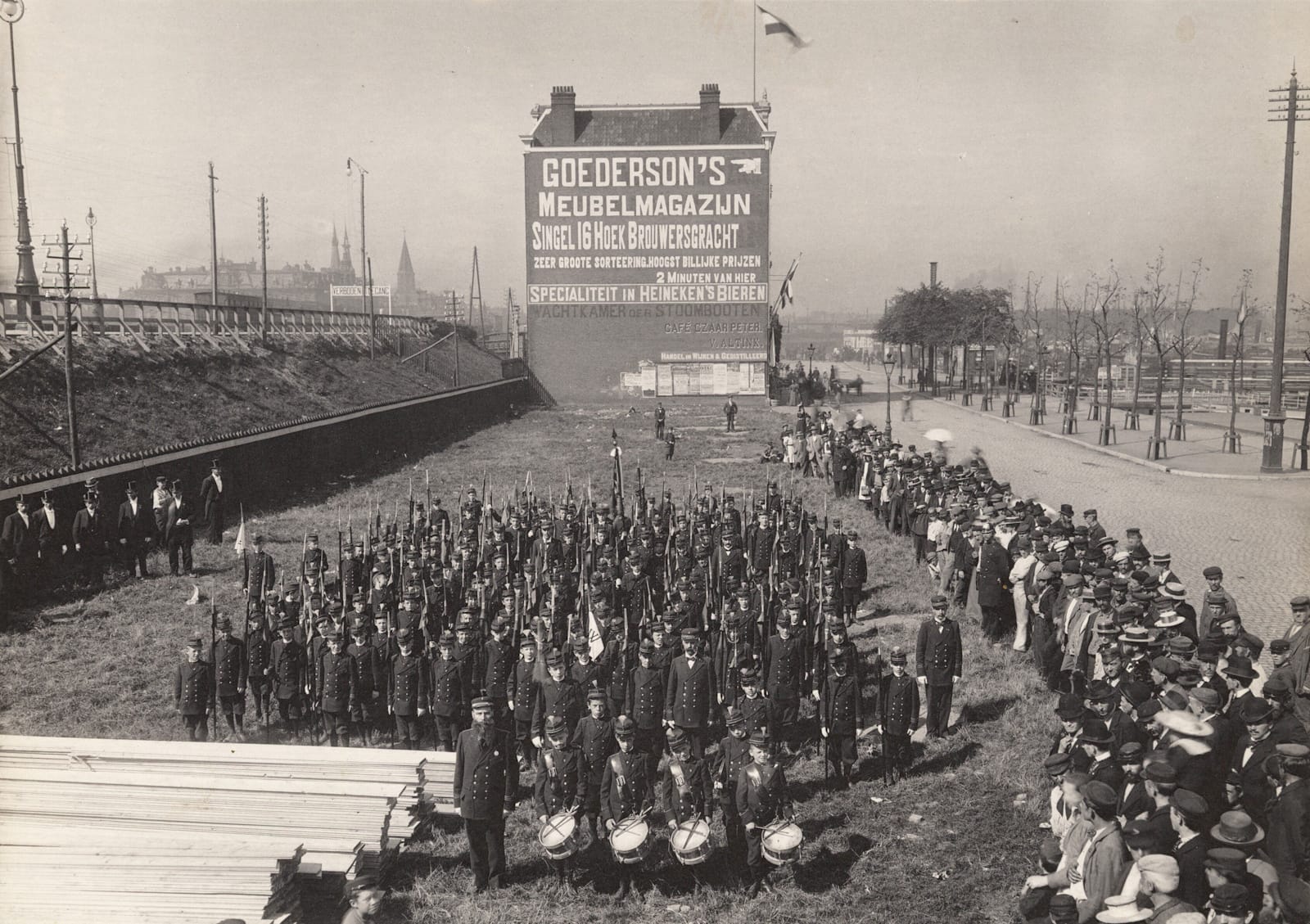
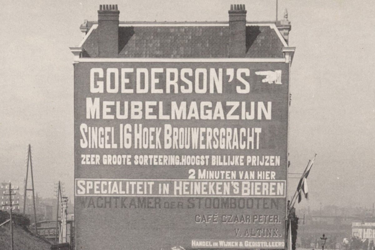
A crowd gathers to watch a military exercise and a closer look at the lettered wall in the background. Amsterdam Typography 465 / City Archives OSIM00004004397.
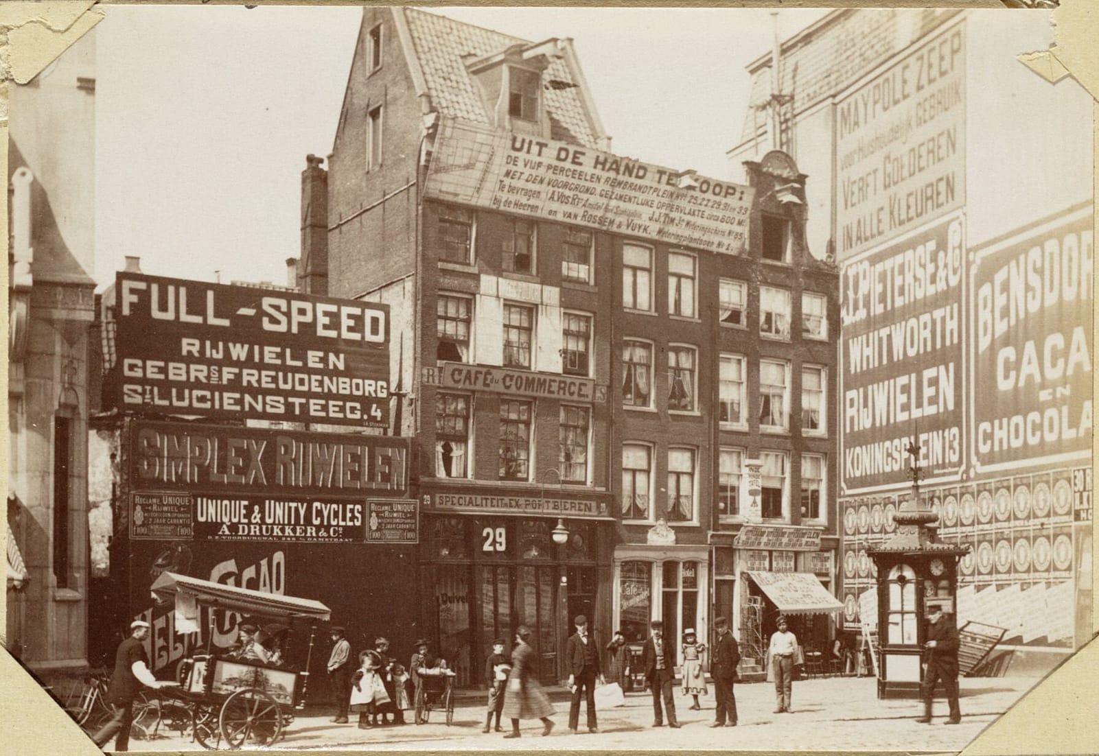
Signs, Signs, Signs, c.1900
This turn-of-the-century scene shows that overwhelming volumes of advertising are nothing new. The abandoned building on the far left of the image is promoting a variety of bicycle brands.
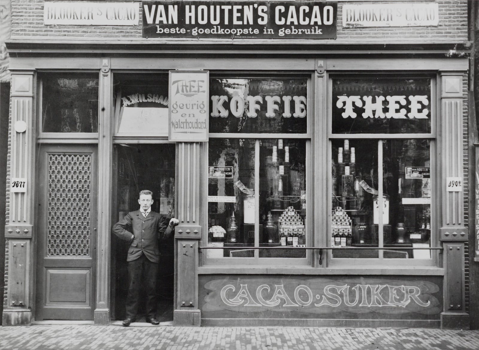
Albertus Wilshaus
This tea house embraced signs of all kinds to promote the goods available within. The photo is dated 1902 and presumably that’s Albertus himself standing proudly in the doorway underneath his name on the transom.
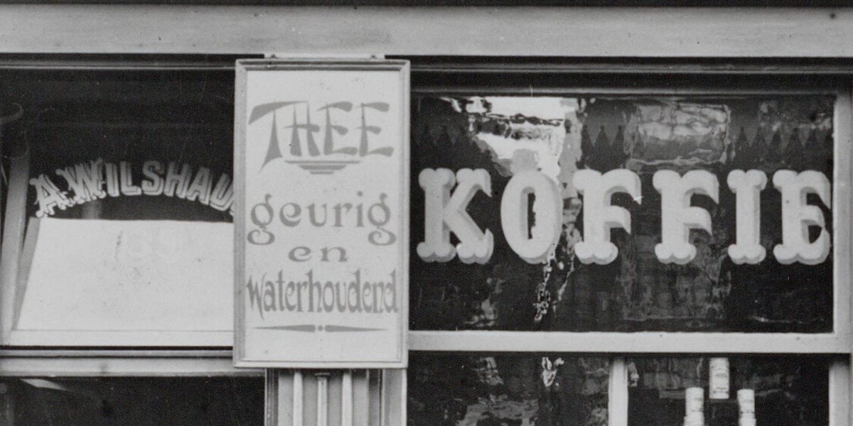
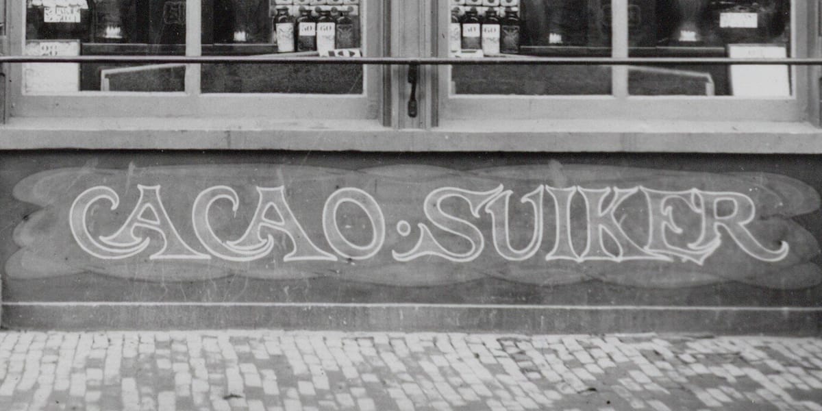
‘Chop Suey’, Tuscans, and a touch of Art Nouveau among the myriad letterforms on Wilshaus’ shopfront.
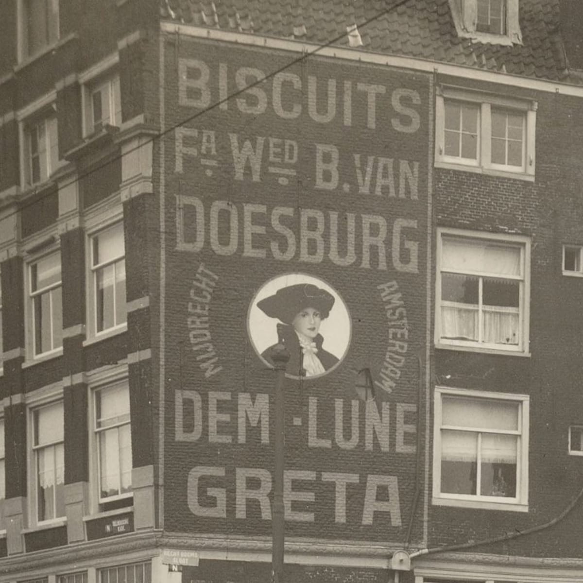
Biscuits Fa. Wed. B. van Doesburg
This 1918 photograph captures a wonderful piece of biscuit (cookie) advertising, including a beautiful pictorial portrait in the centre. “Dem-Lune” is from the French demi-lune (half moon) and refers to the semi-circular shape of the biscuits themselves.
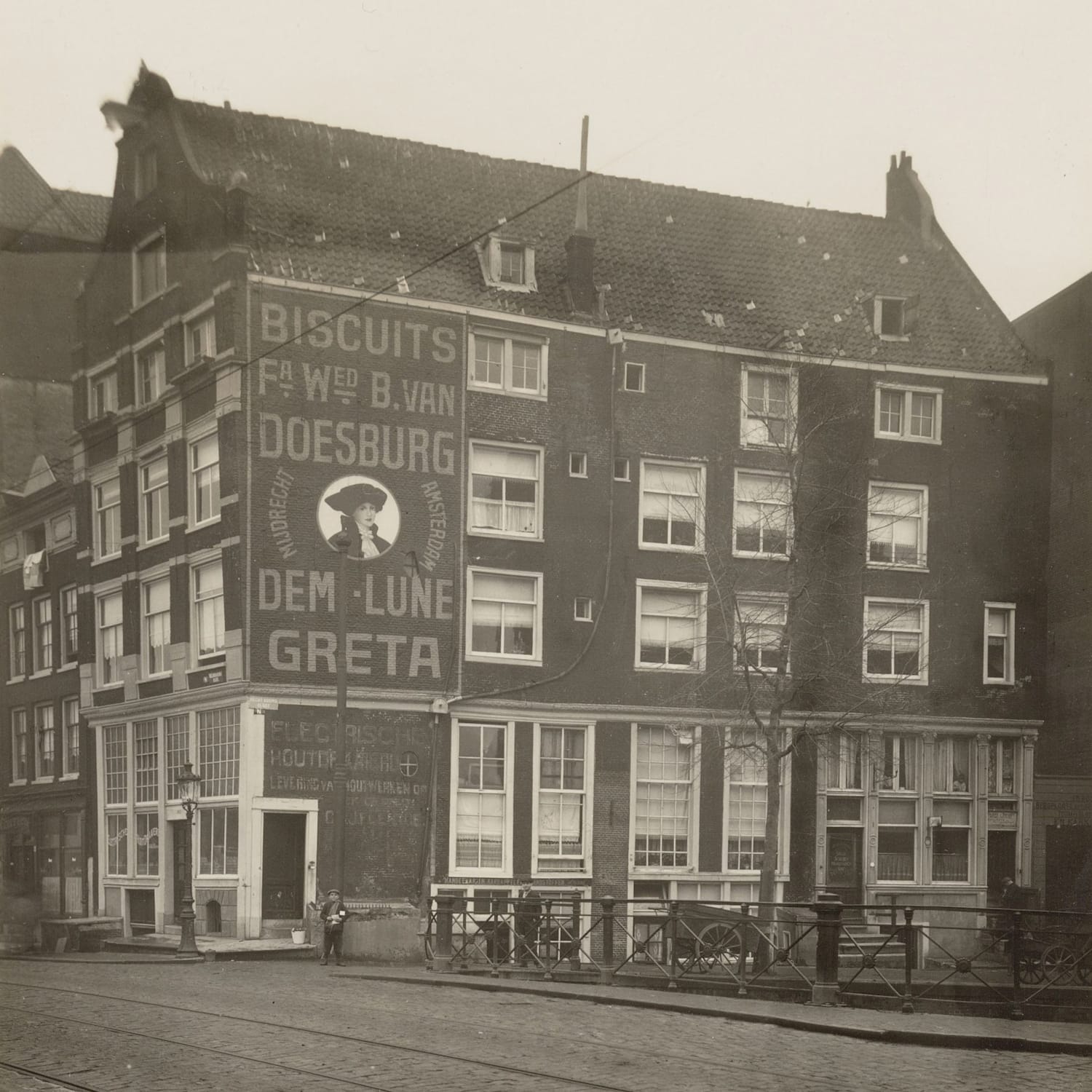
Amsterdam Typography 218 / City Archives 010118000054. Photographer: Cornelis G. Leenheer.
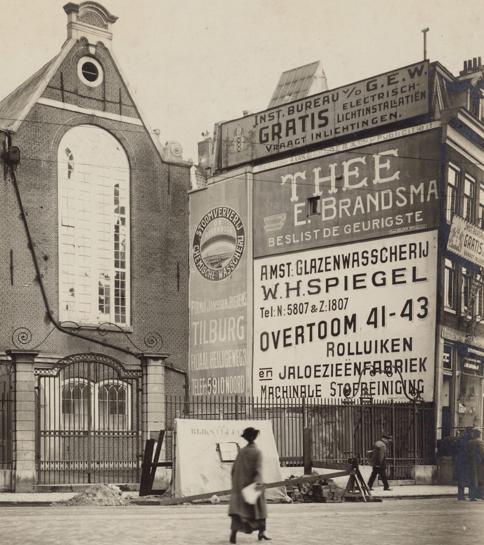
Wall of Brands, c.1920
Among the advertisers taking advantage of this prominent wall are the dry cleaners Tilburg and window cleaners W.H. Spiegel.
Windsor Castle
This oversized walking hand from around 1920 was just one of a series of similar sales promotions for the Windsor Castle brand of cigarettes.
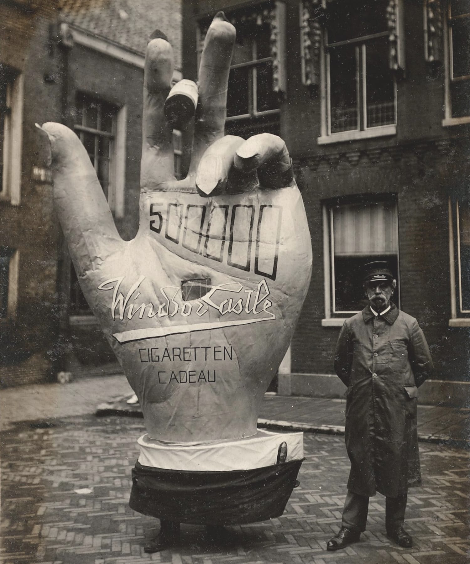
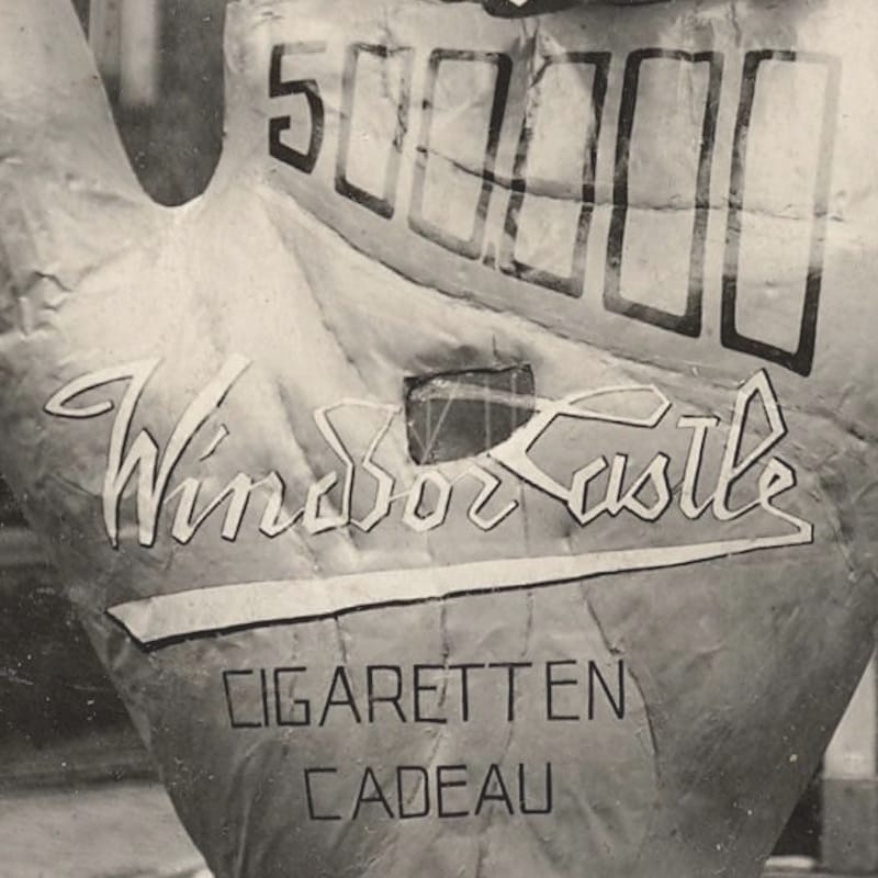
Amsterdam Typography 404 / City Archives B00000032209.
Abdulla Cigarettes
More tobacco advertising comes in the form of this building wrapped in an advertisement for Abdulla Cigarettes. Below that are signs advertising the Frankfurt Trade Fair of 1925 and a radio appliances shop.
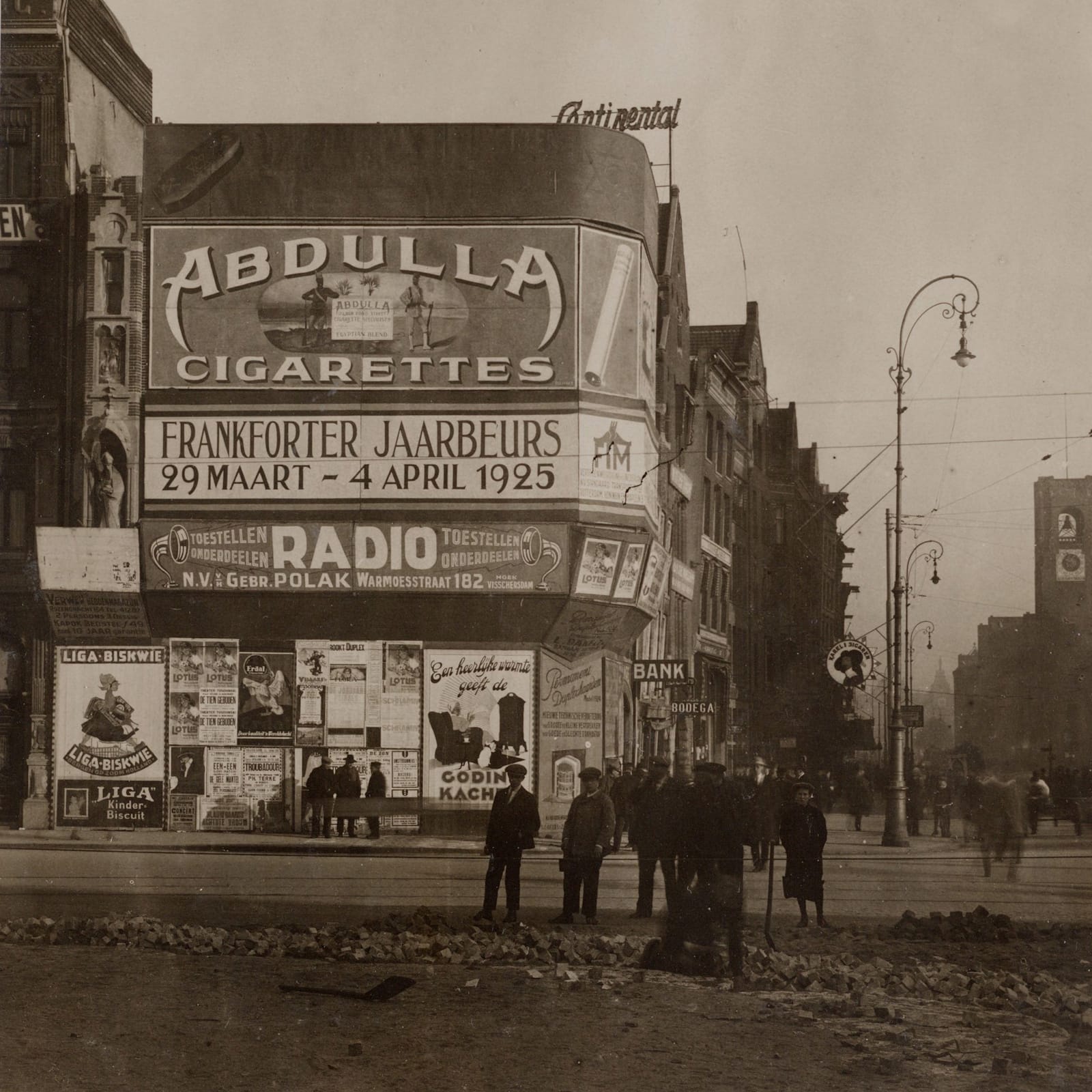
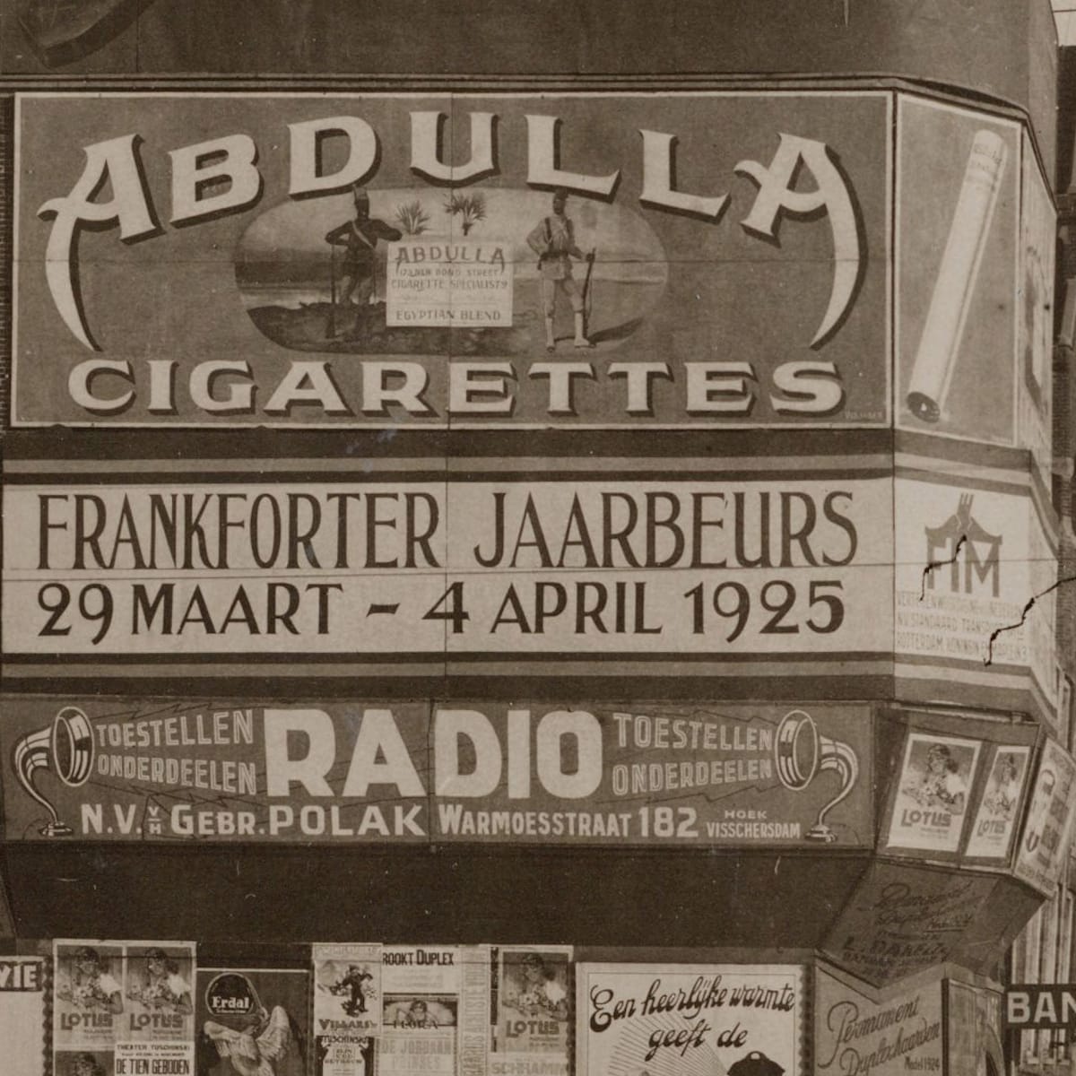
Amsterdam Typography 3 / City Archives 5221FO000014. Photograph: Dienst Bouw- en Woningtoezicht, Afdeling Reclametoezicht.
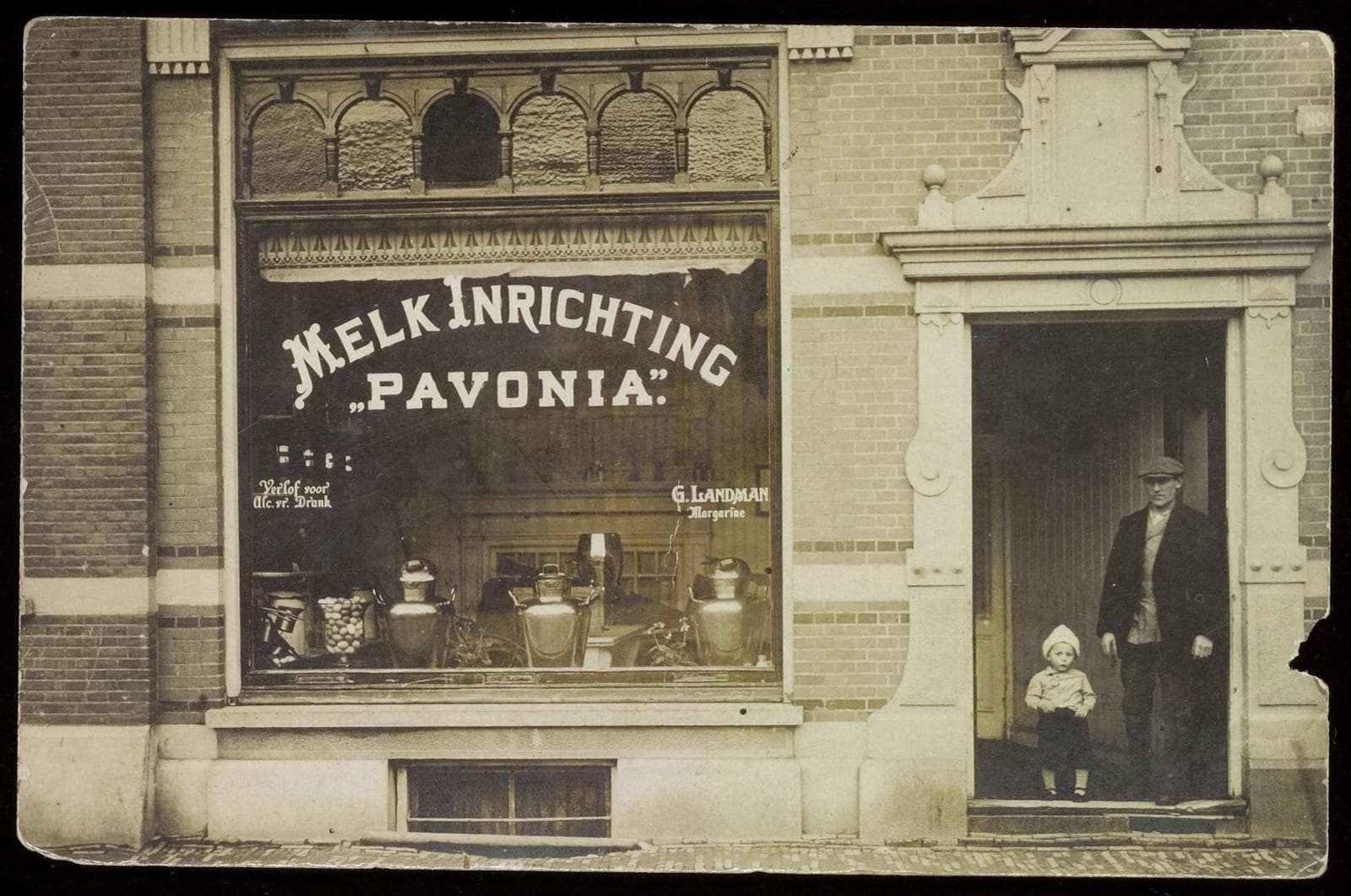
G. Landman
Also from around 1925, Gerrit Landman poses in the doorway with his eldest son, also Gerrit, while the window lettering advertises their Pavonia dairy shop.
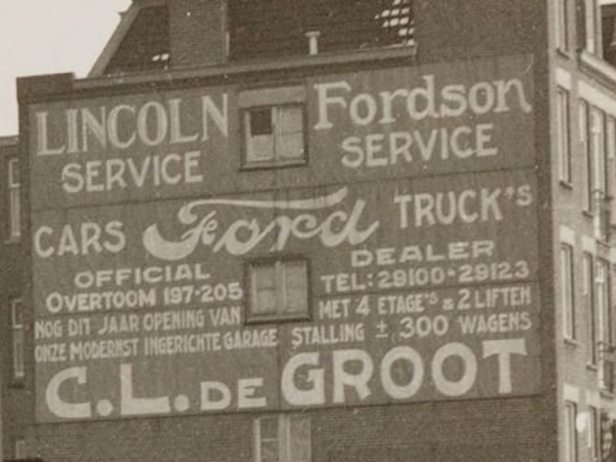
C.L. de Groot
Not a car in sight in front of this large advertisement for the C.L. de Groot dealership and the brands available there in 1927
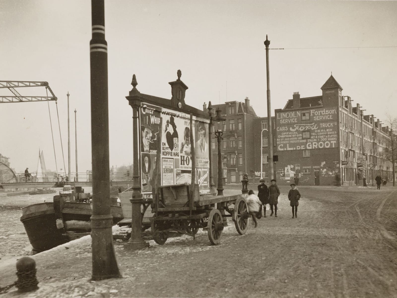
Amsterdam Typography 988 / City Archives 5221F2000837. Photograph: Dienst Bouw- en Woningtoezicht, Afdeling Reclametoezicht.
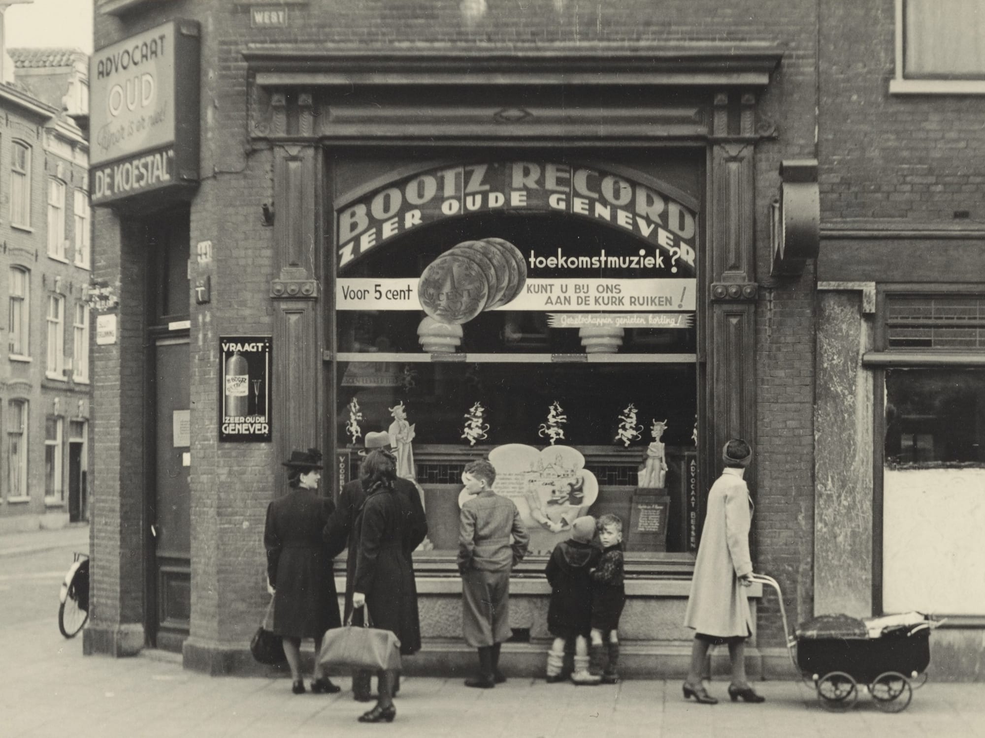
De Koestal
One of my favourite images in the collection is this one of an off licence (liquor store) photographed in 1943. Most prominent is the sign advertising Bootz Record Jenever, which could be sampled (literally ‘smell the cork with us’) for five cents.
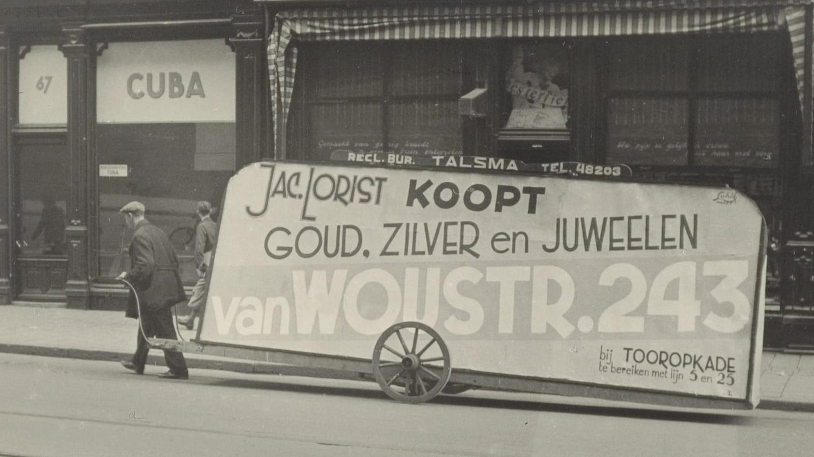
Van Woustraat 243
Also during the Second World War in 1943 is this human-powered moving billboard advertising a jeweller.
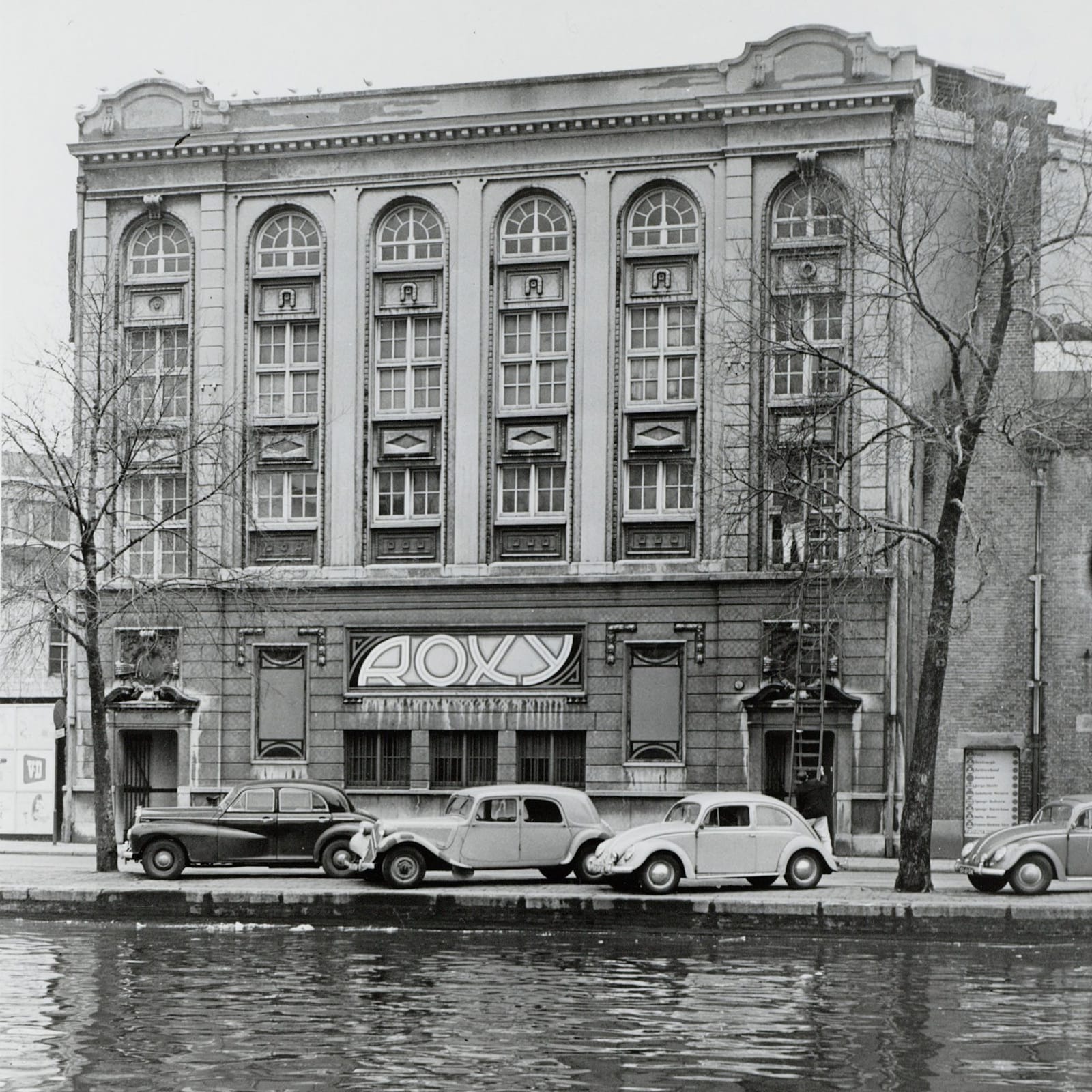
Roxy Theatre
This novel piece of lettering is set off beautifully by the assembled cars and the grandeur of the building that frames it in 1957.
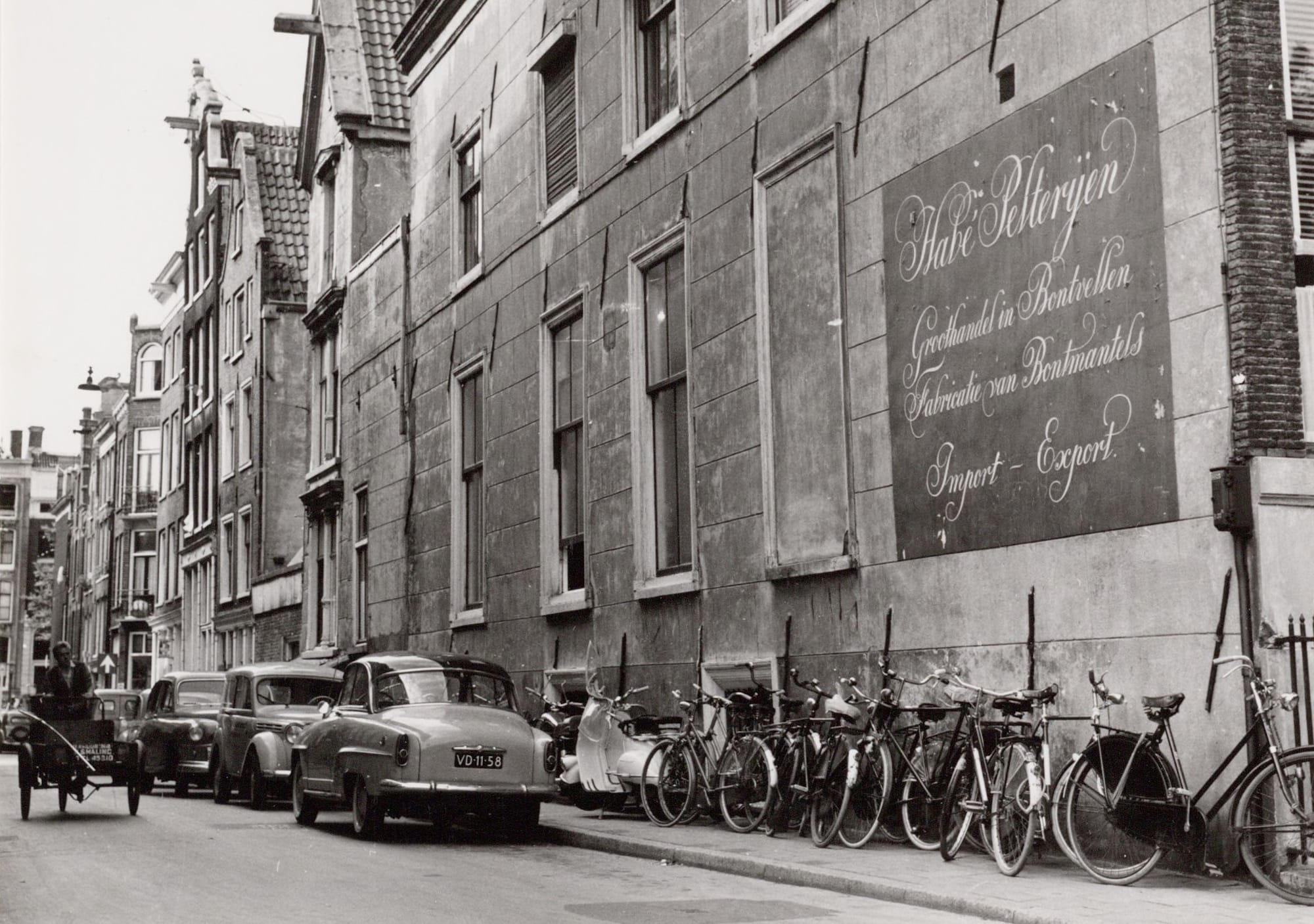
Habé Pelterijen
It wouldn’t be Amsterdam without some krulletters (curly letters), like these advertising the Habé Pelterijen fur factory and wholesaler in 1958.
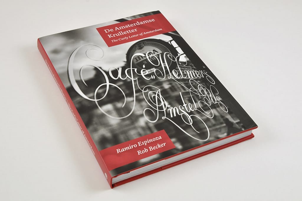
If you’d like to learn more about Amsterdam’s krulletters (curly letters), then Ramiro Espinoza’s book on the style is available from the BLAG shop.
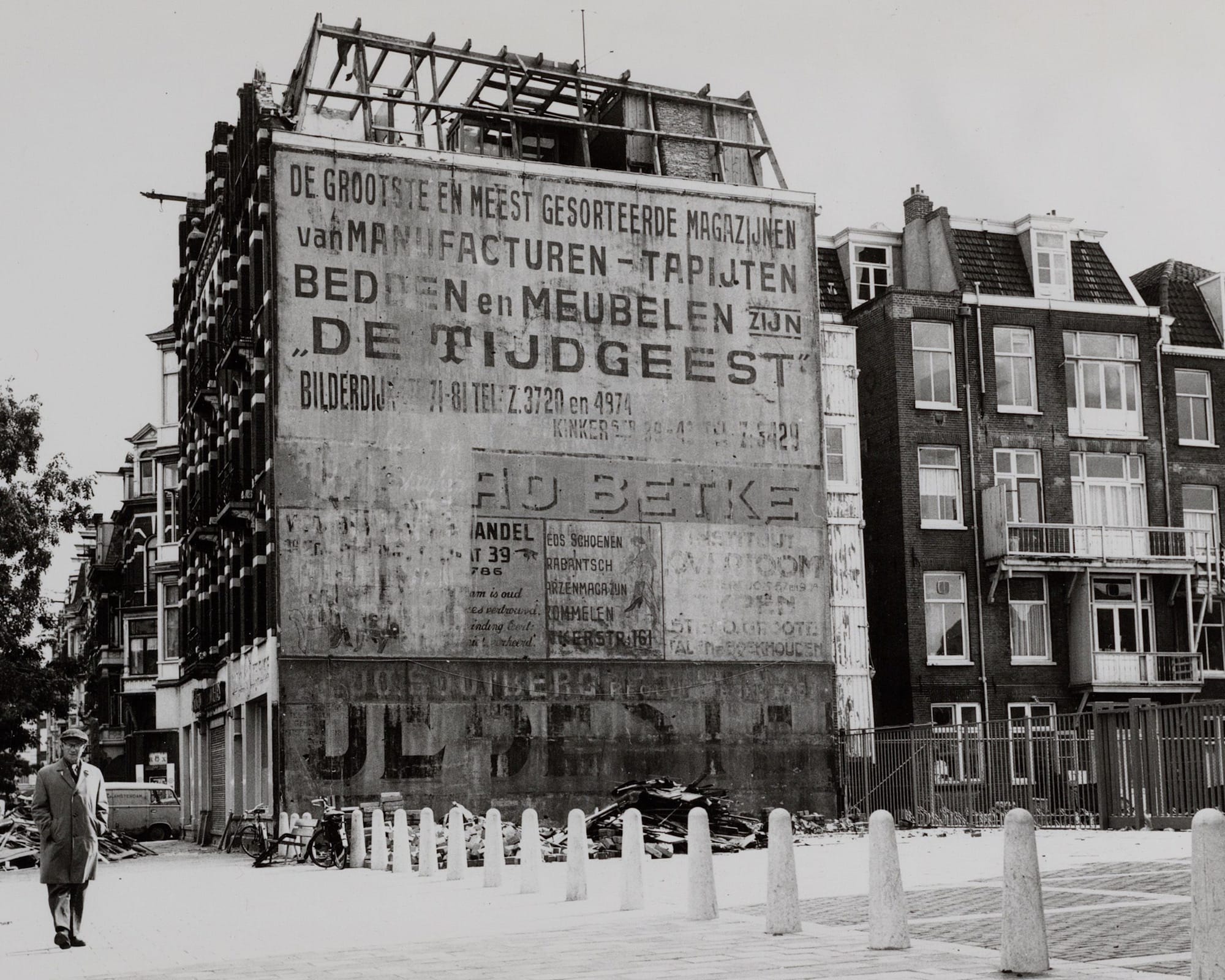
De Tijdgeest
Ghost signs in 1965, with layers in palimpsest. The uppermost portion of the wall advertised a manufacturer and retailer of soft furnishings, including bedding and carpets with the slogan De Tijdgeest (the zeitgeist).
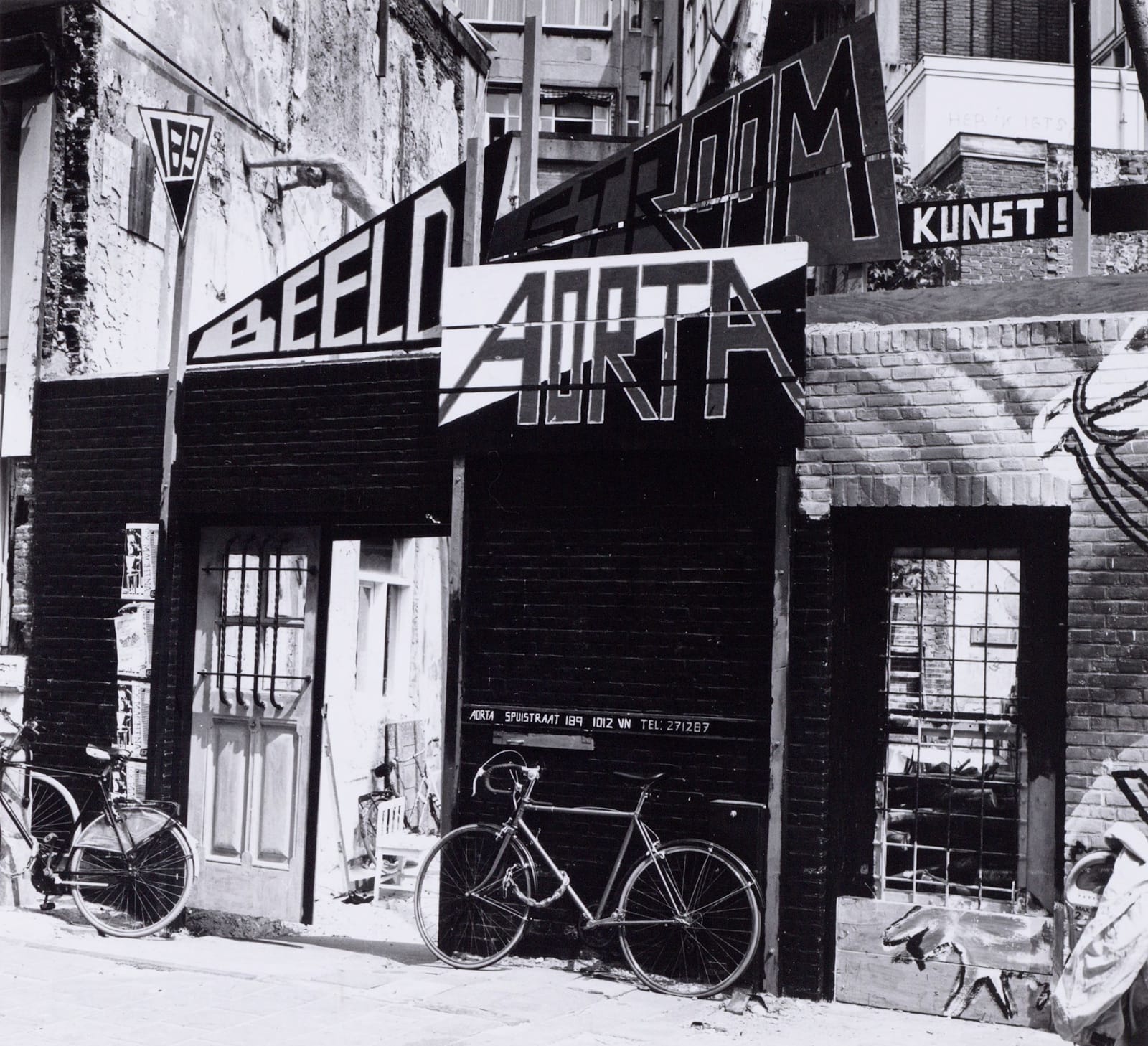
Beeld Stroom Aorta Kunst!
These wedge-shaped signs were promoting the Beeldstroom (stream of images) exhibition at the Aorta gallery in 1982. (Kunst translates to art.)
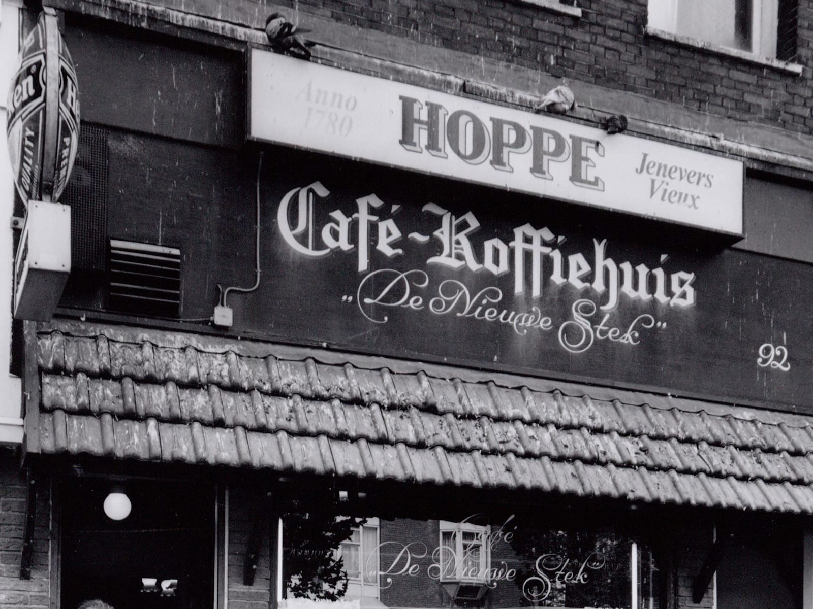
De Nieuwe Stek
And, to finish up, some more curly letters (fascia and window) for this café photographed in 2002. The lettered name translates as ‘The New Place’.
More History
More Amsterdam