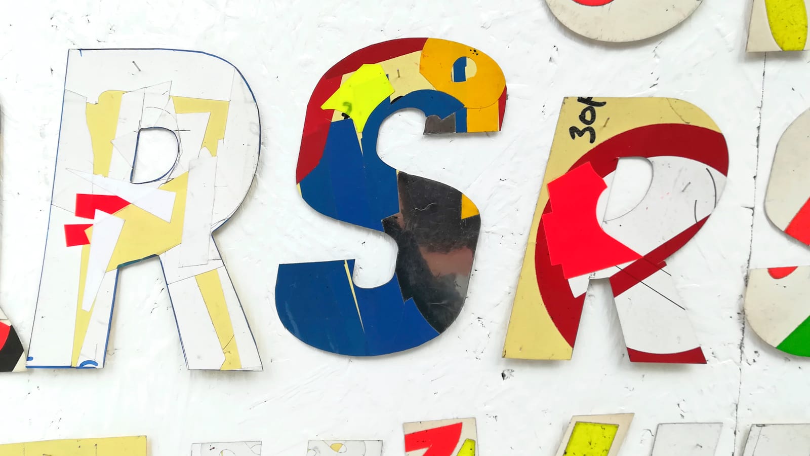
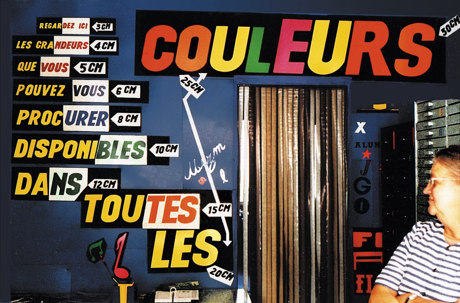
Peeling Back the Layers of Chrystel Crickx's Typographic Legacy
Chrystel Crickx's novel contribution to lettering and type history is celebrated in a new book.

Serendipity is a wonderful thing, and at last year's Benelux Letterheads I received a message from Olivier Bertrand (@surfacesutiles) about a book he was working on. It's subject is Chrystel Crickx, who just happened to ply her unique lettering trade in Brussels.
Seizing the moment, we lined up an impromptu visit from fellow Crickx Research Group member David Le Simple to talk to the assembled Letterheads about this one-of-a-kind 'typographic letterer'. I've kept in touch with Olivier, and the book project, ever since, and am delighted to share this preview of what's inside.
